
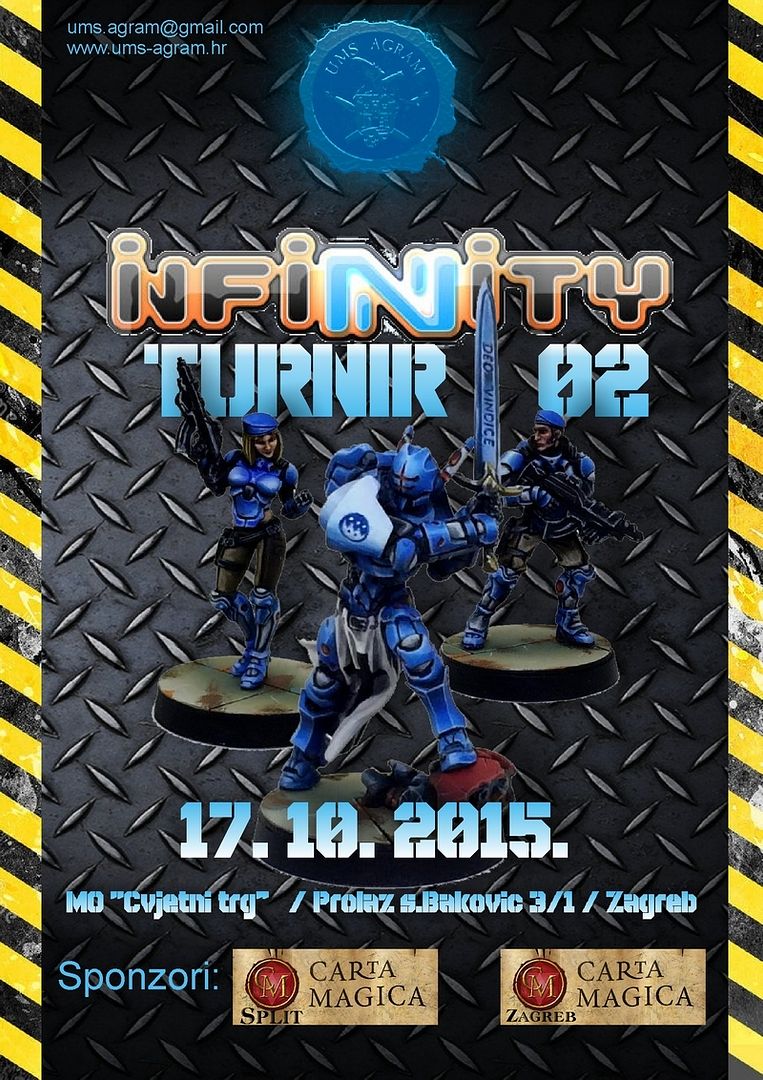
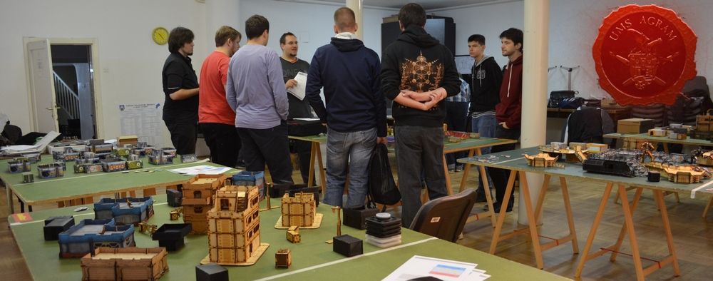
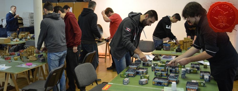
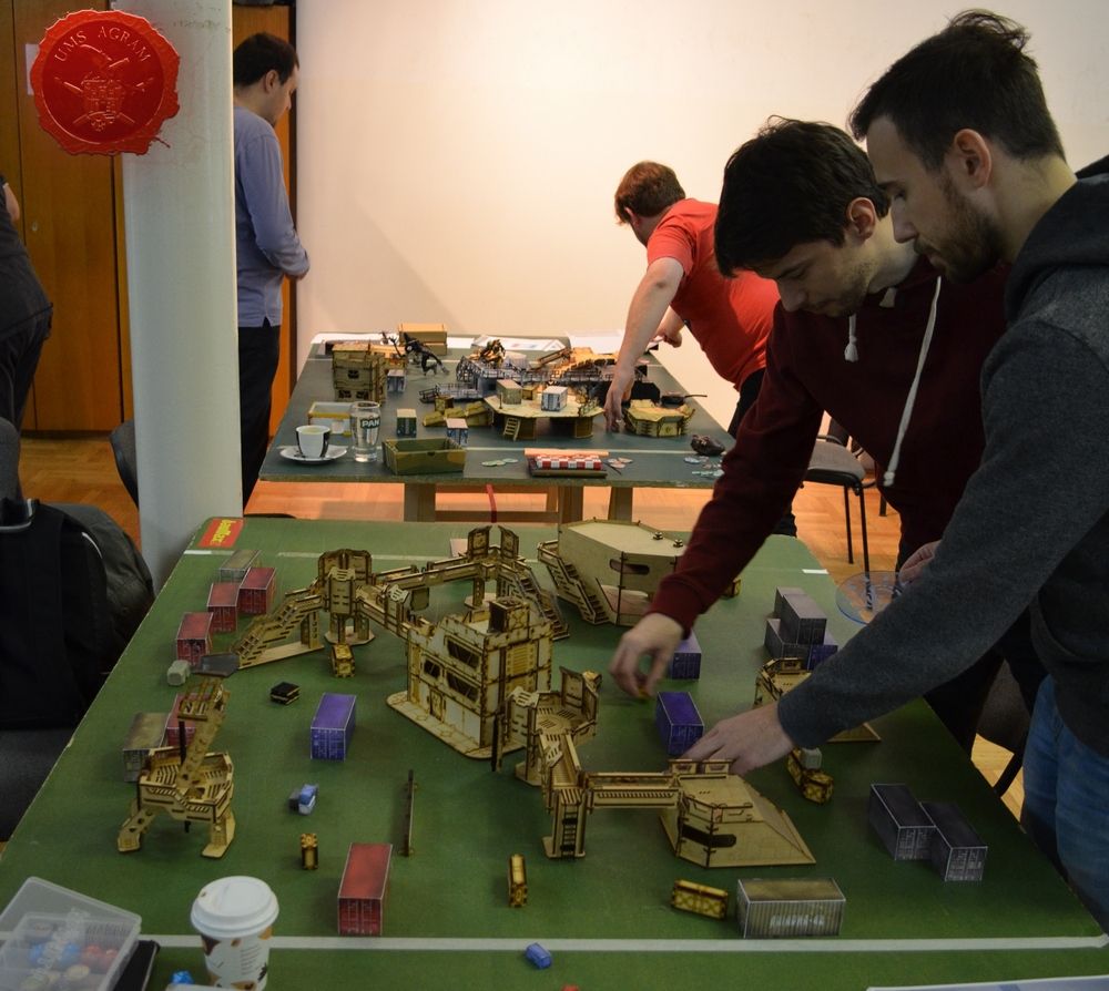
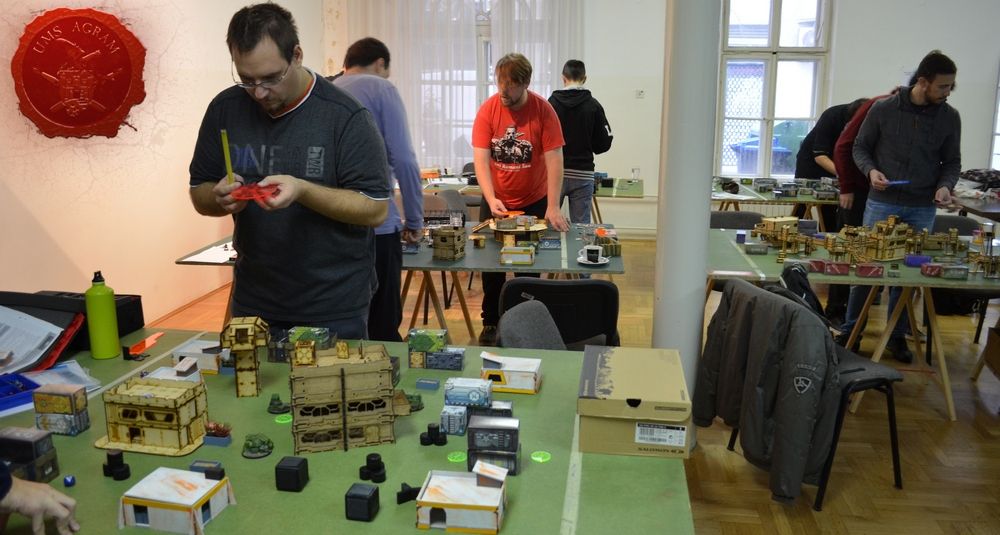
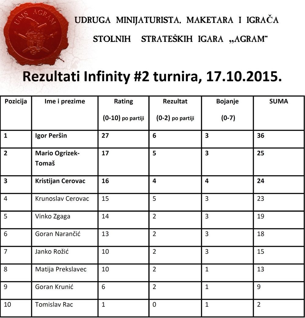
Infinity #2 turnir, 17.10.2015.
Najnoviji članci
-
Agram Group Build #7 – Amon Hen, dio 5
array(2) { ["Article"]=> array(10) { ["id"]=> string(3) "530" ["member_id"]=> string(2) "64" ["title_eng"]=> string(39) "Agram Group Build #7 – Amon Hen, pt.5" ["title_hrv"]=> string(40) "Agram Group Build #7 – Amon Hen, dio 5" ["mask_eng"]=> string(32) "agram_group_build_7_amon_hen_pt5" ["mask_hrv"]=> string(34) "agram_group_build_7_amon_hen_dio_5" ["content_eng"]=> string(4850) "Krunoslav Belinić, 15.10.2026.Agram Group Build is back. For this seventh installment, the team decided to create a gaming board/diorama for Amon Hen. To that end, we fulfilled a childhood dream and acquired the original Forge World Amon Hen terrain (released around 2000) along with the accompanying set of miniatures. This series of articles will document the entire project—from crafting the terrain to assembling and painting the miniatures.
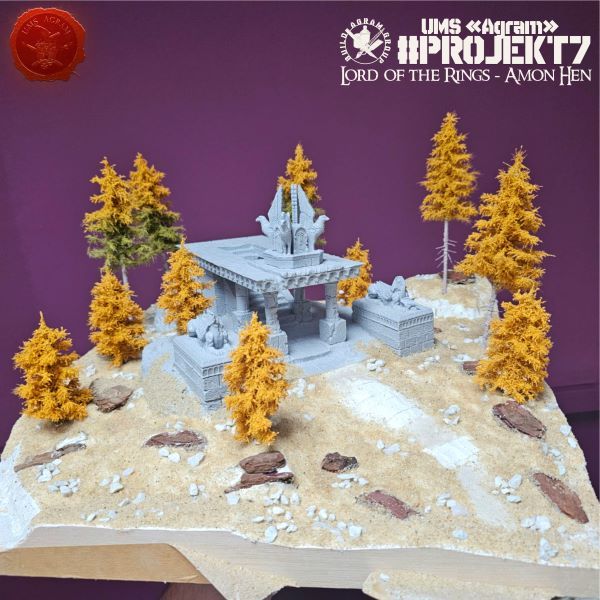
The plan last time was to also build a balsa wood frame, but unfortunately, the balsa got misplaced during the move following the renovation of the space, so we had to postpone it. Now, it’s time to get it done.
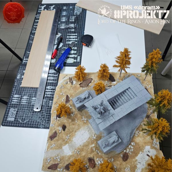
We cut the balsa wood into four 50 cm pieces. Afterward, we measured the highest points of each side, marked the balsa accordingly, and cut it to the desired dimensions.
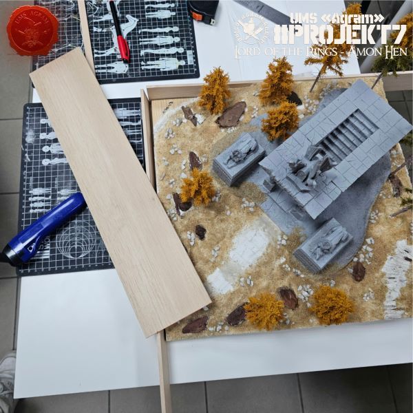
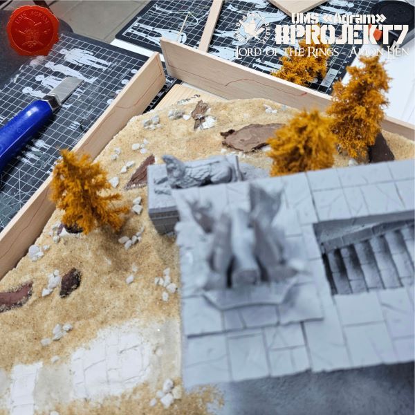
Then we traced the relief onto the balsa frame and carefully cut it out.
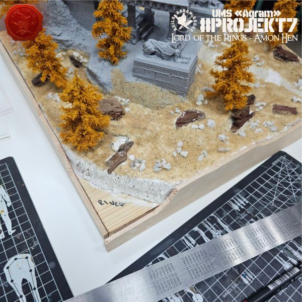
The final step was cutting each corner at a 45-degree angle to create a neat frame joint.
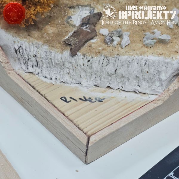
Next came the gluing of the frame. We bonded the sides using PVA glue, while the joints where one frame side met another were secured with superglue.
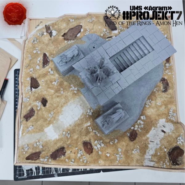
We filled the gaps between the balsa wood frame and the terrain we created last time with DAS modeling clay.
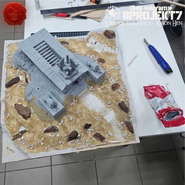
Finally, we coated the top surfaces of the frame and the air-drying clay infill with PVA glue, and sprinkled over it the same sand we had used for the rest of the board.
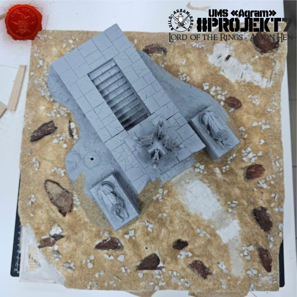
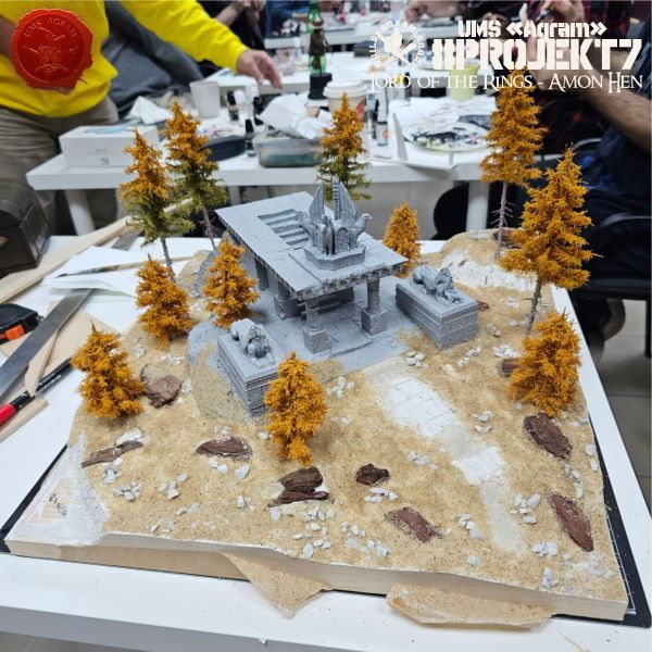
And that’s it for this time. Next week, it’s time for painting.
" ["content_hrv"]=> string(4765) "Agram Group Build se vraća. U svojoj sedmoj instalaciji, ekipa je odlučila izraditi igraću tablu / dioramu za Amon Hen. Za tu potrebu, ispunili smo si dječačke sne i nabavili originalni Forge World teren Amon Hena (izašao negdje cca 2000.) sa setom pripadajućih figura. Ova serija članaka pratit će izradu cijelog projekta – kako izrade terena, tako i sastavljanja i bojanja figura.
Plan za prošli put bio je da napravimo i okvir od balze, ali na žalost u selidbi nakon renovacije prostora, negdje smo zagubili balzu tako da smo to odgodili. Sad je došao red na to.
Odrezali smo balzu na četiri komada od 50cm. Nakon toga izmjerili smo najviše dijelove pojedine strane i tako označili balzu te ju prerezali na željene dimenzije.
Potom smo ucrtali reljef na okvir od balze i pažljivo ga izrezali.
Zadnji korak bilo je zarezivanje svakog kuta pod 45 stupnjeva tako da dobijemo uredan spoj okvira.
Tada je uslijedilo lijepljenje okvira. Stranice smo zalijepili PVA ljepilom dok smo spojeve stranice okvira na drugu stranicu okvira zalijepili superljepilom.
U rupe između okvira od balze i terena kojeg smo napravili prošli put ubacili smo DAS glinamol.
Na kraju smo gornje plohe okvira i popune od glinamola premazali PVA ljepilom te na to posipali isti pijesak koji smo koristili za ostatak table.
I to je bilo to za ovaj put. Sljedećeg tjedna ide bojanje.
" ["created"]=> string(19) "2026-10-15 10:05:42" ["modified"]=> string(19) "2026-10-15 10:05:42" } ["Member"]=> array(10) { ["id"]=> string(2) "64" ["group_id"]=> string(1) "1" ["first_name"]=> string(9) "Krunoslav" ["last_name"]=> string(8) "Belinić" ["first_name_mask"]=> string(9) "krunoslav" ["last_name_mask"]=> string(7) "belinic" ["username"]=> string(5) "Kruno" ["password"]=> string(40) "eb3fda45fbec0258e90d809803b10491c548b22f" ["born"]=> string(19) "2015-01-18 09:19:00" ["created"]=> string(19) "2015-01-18 09:20:39" } } -
Agram Group Build #7 – Amon Hen, dio 4
array(2) { ["Article"]=> array(10) { ["id"]=> string(3) "529" ["member_id"]=> string(2) "35" ["title_eng"]=> string(39) "Agram Group Build #7 – Amon Hen, pt.4" ["title_hrv"]=> string(40) "Agram Group Build #7 – Amon Hen, dio 4" ["mask_eng"]=> string(32) "agram_group_build_7_amon_hen_pt4" ["mask_hrv"]=> string(34) "agram_group_build_7_amon_hen_dio_4" ["content_eng"]=> string(4716) "Marko Paunović, 08.10.2026.Agram Group Build is back. For this seventh installment, the team decided to create a gaming board/diorama for Amon Hen. To that end, we fulfilled a childhood dream and acquired the original Forge World Amon Hen terrain (released around 2000) along with the accompanying set of miniatures. This series of articles will document the entire project—from crafting the terrain to assembling and painting the miniatures.
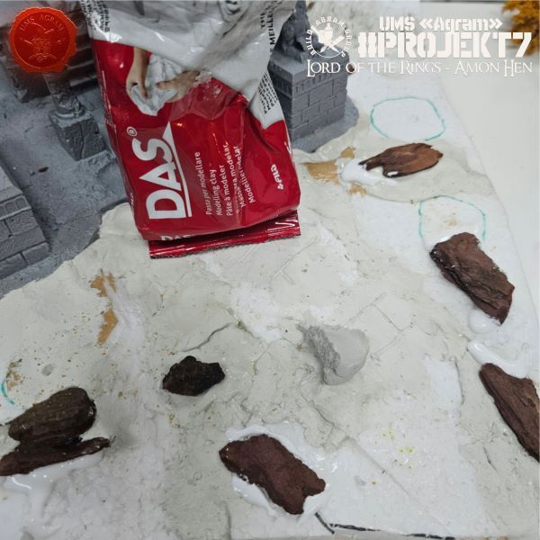
After inspecting the now-dry terrain base, we realized that a few slopes needed to be added and some gaps filled in. Therefore, we repeated the process of applying DAS modeling clay over the PVA glue coating.
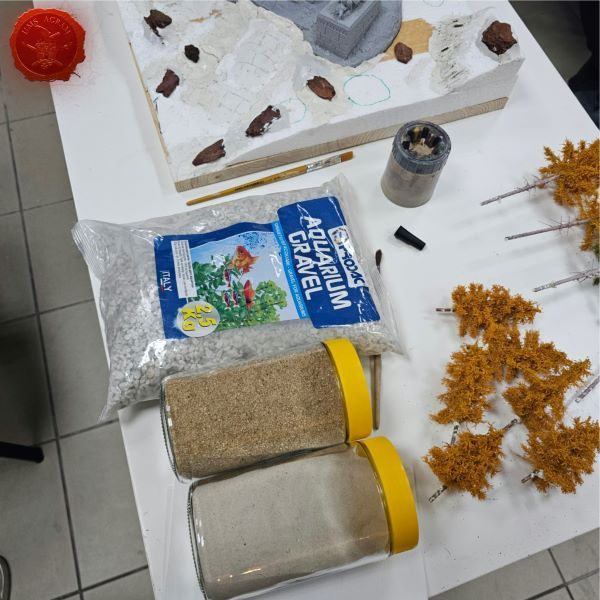
The next step was adding texture. We opted for three different grain sizes of sand and gravel. You can find all these varieties at pet stores. The finest grade is for chinchillas, while the coarsest gravel is actually intended for aquariums.
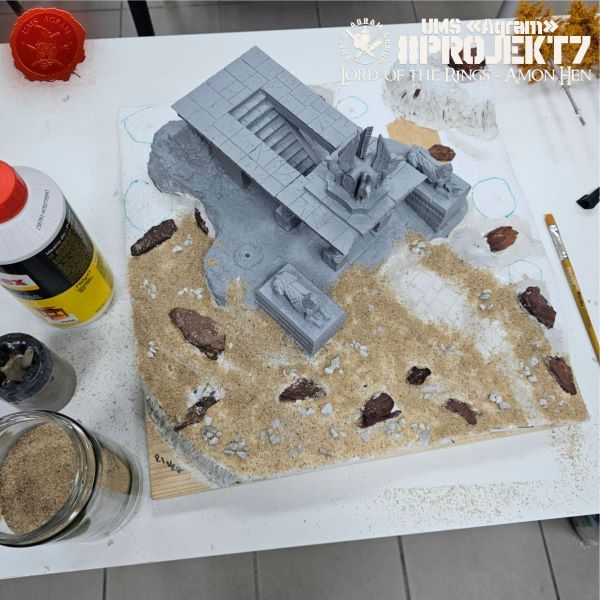
Applying the texture was actually very simple. We coated part of the base with PVA glue (slightly diluted so it would spread easily with a brush). Onto the PVA coating, we sprinkled first the gravel, then the larger granules, and finally the small granules (though only in patches).
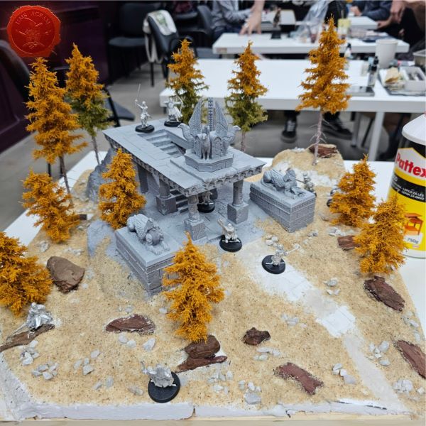
Then we put the trees back to see how everything works as a whole.
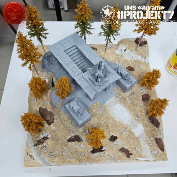
Since Kruno has finished processing the metal figures, we decided to check the layout of the diorama with the figures placed on it—so here it is from several angles.
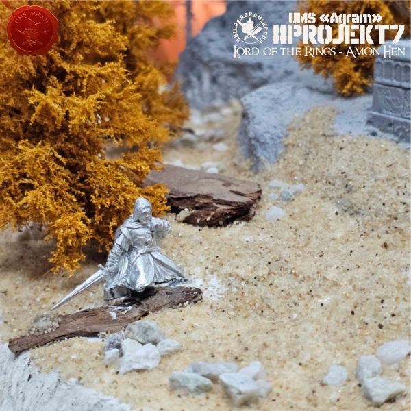
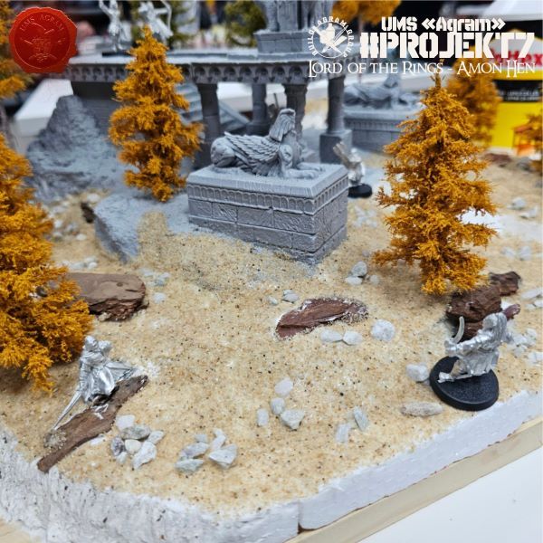
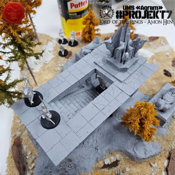
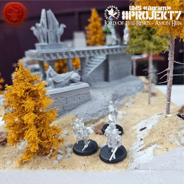
" ["content_hrv"]=> string(4717) "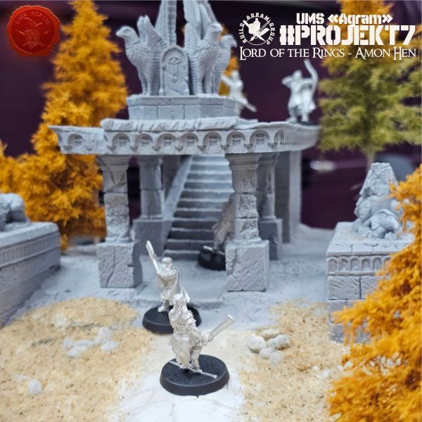
Agram Group Build se vraća. U svojoj sedmoj instalaciji, ekipa je odlučila izraditi igraću tablu / dioramu za Amon Hen. Za tu potrebu, ispunili smo si dječačke sne i nabavili originalni Forge World teren Amon Hena (izašao negdje cca 2000.) sa setom pripadajućih figura. Ova serija članaka pratit će izradu cijelog projekta – kako izrade terena, tako i sastavljanja i bojanja figura.
Nakon pregleda sada osušene baze terena, uvidjeli smo da se na nekim mjestima treba dodati koja kosina, zapuniti koja rupa. Stoga smo ponovili isti postupak postavljanja DAS glinamola na premaz od PVA ljepila.
Sljedeći korak bilo je dodavanje teksture. Odlučili smo se za tri različite granulacije pijeska/šljunka. Sve te verzije možete naći u dućanima za kućne ljubimce. Najmanja granulacija je za činčile, dok je najveći šljunak zapravo za akvarije.
Postavljanje teksture je zapravo bilo jako jednostavno. Premazali smo dio baze sa PVA ljepilom (malo razvodnjenim tako da se lagano razmazuje kistom). Na premaz od PVA ljepila posipali smo prvo šljunak, pa onda veći granulat i na kraju mali granulat (ali samo mjestimično).
Potom smo vratili drveće da vidimo kako funkcionira sve kao cjelina.
S obzirom da je Kruno završio sa obradom metalnih figura, odlučili smo provjeriti i raspored diorame sa figurama na njoj pa evo iz nekoliko kutova.
" ["created"]=> string(19) "2026-10-08 08:17:15" ["modified"]=> string(19) "2026-10-08 08:17:15" } ["Member"]=> array(10) { ["id"]=> string(2) "35" ["group_id"]=> string(1) "1" ["first_name"]=> string(5) "Marko" ["last_name"]=> string(9) "Paunović" ["first_name_mask"]=> string(5) "marko" ["last_name_mask"]=> string(8) "paunovic" ["username"]=> string(5) "marko" ["password"]=> string(40) "3bd37b326d19d1880d3b93a4b32e8fb3a90fa122" ["born"]=> string(19) "2033-03-07 20:35:00" ["created"]=> string(19) "2009-06-02 20:37:03" } } -
Agram Group Build #7 – Amon Hen, dio 3
array(2) { ["Article"]=> array(10) { ["id"]=> string(3) "528" ["member_id"]=> string(2) "64" ["title_eng"]=> string(39) "Agram Group Build #7 – Amon Hen, pt.3" ["title_hrv"]=> string(40) "Agram Group Build #7 – Amon Hen, dio 3" ["mask_eng"]=> string(32) "agram_group_build_7_amon_hen_pt3" ["mask_hrv"]=> string(34) "agram_group_build_7_amon_hen_dio_3" ["content_eng"]=> string(3297) "Krunoslav Belinić, 01.10.2026.Agram Group Build is back. For this seventh installment, the team decided to create a gaming board/diorama for Amon Hen. To that end, we fulfilled a childhood dream and acquired the original Forge World Amon Hen terrain (released around 2000) along with the accompanying set of miniatures. This series of articles will document the entire project—from crafting the terrain to assembling and painting the miniatures.

Last time, we created and attached large volumes to the base and roughed out the terrain contours. To prevent the Styrofoam from warping while the PVA glue dried, we had secured it to the wooden base with masking tape. Therefore, the first task was to remove the excess masking tape.

Then, using PVA glue and DAS modeling clay, we created gradual transitions and built up slopes on the "steps" made of Styrofoam.

Next, we added stone structures using tree bark. At the same time, we utilized the texture of the bark, pressing it into the DAS clay in certain places to create the added texture of rocky surfaces.


That concludes the construction phase for now. Before applying the texture, the DAS modeling clay needs to dry thoroughly. Next up is the texturing process, along with some touch-ups to the relief where the stone structures were placed.
" ["content_hrv"]=> string(3309) "
Agram Group Build se vraća. U svojoj sedmoj instalaciji, ekipa je odlučila izraditi igraću tablu / dioramu za Amon Hen. Za tu potrebu, ispunili smo si dječačke sne i nabavili originalni Forge World teren Amon Hena (izašao negdje cca 2000.) sa setom pripadajućih figura. Ova serija članaka pratit će izradu cijelog projekta – kako izrade terena, tako i sastavljanja i bojanja figura.
Prošli put smo napravili i dodali velike volumene na bazu te napravili grube obrise terena. Kako se ne bi stiropor svinuo tijekom sušenja PVA ljepila, učvrstili smo ga krep trakom za drvenu bazu. Stoga, prvi posao bio je maknuti višak krep trake.
Zatim smo koristeći PVA ljepilo i DAS glinamol izradili postepene prijelaze i iskonstruirali kosine na „stepenicama“ dobivenim od stiropora.
Potom smo dodali kamene strukture koristeći koru od drveta. Istovremeno smo iskoristili i teksture u kori i utisnuli na pojedinim mjestima u DAS glinamol kako bismo dobili dodatnu teksturu kamenih stijena.
Time je lagano završila gradnja za ovaj put. Prije nanošenja teksture, treba ostaviti DAS glinamol da se dobro osuši. Sljedeći put na redu je tekstura uz mjestimično popravljanje reljefa na mjestima gdje smo postavili kamene strukture.
" ["created"]=> string(19) "2026-10-01 09:43:15" ["modified"]=> string(19) "2026-10-01 09:43:15" } ["Member"]=> array(10) { ["id"]=> string(2) "64" ["group_id"]=> string(1) "1" ["first_name"]=> string(9) "Krunoslav" ["last_name"]=> string(8) "Belinić" ["first_name_mask"]=> string(9) "krunoslav" ["last_name_mask"]=> string(7) "belinic" ["username"]=> string(5) "Kruno" ["password"]=> string(40) "eb3fda45fbec0258e90d809803b10491c548b22f" ["born"]=> string(19) "2015-01-18 09:19:00" ["created"]=> string(19) "2015-01-18 09:20:39" } } -
Agram Group Build #7 – Amon Hen, dio 2
array(2) { ["Article"]=> array(10) { ["id"]=> string(3) "527" ["member_id"]=> string(2) "35" ["title_eng"]=> string(39) "Agram Group Build #7 – Amon Hen, pt.2" ["title_hrv"]=> string(40) "Agram Group Build #7 – Amon Hen, dio 2" ["mask_eng"]=> string(32) "agram_group_build_7_amon_hen_pt2" ["mask_hrv"]=> string(34) "agram_group_build_7_amon_hen_dio_2" ["content_eng"]=> string(7011) "Marko Paunović, 24.09.2026.Agram Group Build is back. For this seventh installment, the team decided to create a gaming board/diorama for Amon Hen. To that end, we fulfilled a childhood dream and acquired the original Forge World Amon Hen terrain (released around 2000) along with the accompanying set of miniatures. This series of articles will document the entire project—from crafting the terrain to assembling and painting the miniatures.
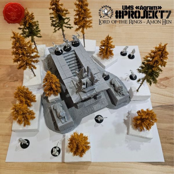
After cutting the board in the previous article, it was time to create the terrain. We decided to achieve the necessary height—or volume—by using Styrofoam. The choice of material was dictated by the availability of Styrofoam; had we possessed that amount of extruded polystyrene (XPS) foam, we certainly would have chosen it due to its ease of shaping. We arranged the Styrofoam sheets to cover the entire surface of the board, gluing them down with PVA glue and reinforcing the joints with masking tape. Next, we placed the assembled Amon Hen model in position and traced its outlines.


The next step was cutting out the rough shape of the terrain and arranging tall vegetation across the diorama to establish the outlines of the final look.


After marking the placement of the trees, we decided to glue the Styrofoam terrain piece onto the board. We used PVA glue for this as well, and to ensure firm contact, we secured the edges with masking tape so the Styrofoam wouldn't warp while drying. Finally, we constructed a ramp for the temple entrance.


In the meantime, Kruno was working on the preparatory work on the figures.

KRUNO: "The deal was to clean the figures of excess metal and dirt. I haven't dealt with metal miniatures too much, so it was an interesting challenge for me. It's not much different from cleaning rubber or plastic miniatures. Of course, a new scalpel blade is needed and pliers come in handy. Although it is not obligatory, I also performed the ancient miniaturist rite of consecration of a new blade and sacrificed a few drops of blood to the Gods of miniaturism and state games. It seems that they were satisfied with the victim, because there were no problems. Excesses are neatly and nicely positioned for quick removal and if any trace remains it fits into the texture or folds of the model. There were very few heads, and even those that were seen were easily leveled with a knife."

" ["content_hrv"]=> string(6921) "
Agram Group Build se vraća. U svojoj sedmoj instalaciji, ekipa je odlučila izraditi igraću tablu / dioramu za Amon Hen. Za tu potrebu, ispunili smo si dječačke sne i nabavili originalni Forge World teren Amon Hena (izašao negdje cca 2000.) sa setom pripadajućih figura. Ova serija članaka pratit će izradu cijelog projekta – kako izrade terena, tako i sastavljanja i bojanja figura.
Nakon rezanja table u prošlom članku, došao je red na izradu terena. Visinu, odnosno volumen, smo odlučili dobiti korištenjem stiropora. Odabir materijala je uvjetovala dostupnost stiropora. Da smo imali tu količinu stirodura, sigurno bismo ga odabrali zbog jednostavnosti obrade. Stiroporne daske smo posložili tako da pokriju cijelu površinu table. Zalijepili smo ih koristeći PVA ljepilo, a spojeve dodatno učvrstili koristeći krep traku. Potom smo stavili složenu maketu Amon Hena i ucrtali obrise
Sljedeći korak bilo je izrezivanje grubog oblika terena i slaganje visoke vegetacije po diorami – tako da dobijemo obrise konačnog izgleda.
Nakon označavanje gdje ide koje drvo, odlučili smo zalijepiti stiroporni teren na dasku. To smo također odradili pomoću PVA ljepila – a za dodatan pritisak, rubove smo pritisnuli koristeći krep traku tako da se stiropor ne deformira tijekom sušenja. Na kraju smo izradili i kosinu za prilaz u hram.
Za to vrijeme, Kruno se bavio pripremnim radovima na figurama.
KRUNO: "Dogovor je bio da očistim figure od viška metala i srha. Nisam se previše bavio metalnim minijaturama, pa mi je to bio zanimljiv izazov. Nije puno drugačije od čišćenja rezinskih ili plastičnih minijatura. Naravno, potrebna je nova oštrica na skalpelu i kliješta dobro dođu. Iako nije obavazeno obavio sam i drevni minijaturistički obred posvećivanja nove oštice i pritom žrtvovao par kapi krvi Bogovima minijaturizma i stateških igara. Izgleda da su bili zadovoljni žrtvom, jer nije bilo problema. Viškovi su uredno i lijepo pozicionirani za brzo uklanjanje i ako i ostane koji trag uklapa se u teksturu ili nabore modela. Srhova je bilo vrlo malo, a i oni koji su se vidjeli lako su se poravnali nožićem."
" ["created"]=> string(19) "2026-09-24 09:00:59" ["modified"]=> string(19) "2026-09-30 06:37:56" } ["Member"]=> array(10) { ["id"]=> string(2) "35" ["group_id"]=> string(1) "1" ["first_name"]=> string(5) "Marko" ["last_name"]=> string(9) "Paunović" ["first_name_mask"]=> string(5) "marko" ["last_name_mask"]=> string(8) "paunovic" ["username"]=> string(5) "marko" ["password"]=> string(40) "3bd37b326d19d1880d3b93a4b32e8fb3a90fa122" ["born"]=> string(19) "2033-03-07 20:35:00" ["created"]=> string(19) "2009-06-02 20:37:03" } } -
Natpisi za vaše baze
array(2) { ["Article"]=> array(10) { ["id"]=> string(3) "526" ["member_id"]=> string(2) "35" ["title_eng"]=> string(23) "Signs for your plinths " ["title_hrv"]=> string(21) "Natpisi za vaše baze" ["mask_eng"]=> string(22) "signs_for_your_plinths" ["mask_hrv"]=> string(20) "natpisi_za_vase_baze" ["content_eng"]=> string(4401) "Marko Paunović, 24.09.2026.This article will cover creating nameplates for your display figure bases. I have been considering the option of printed nameplates for quite some time, and these are the results I achieved after a bit of effort and research.
The 3D engraved nameplates I usually use are quite expensive (around €10 apiece) and require preparation, ordering from an engraving studio, and waiting for the work to be completed. Consequently, my practice has been to place only one or two orders a year, mostly before our "Black Queen" event. Another major drawback is that these nameplates are made of plastic and cannot be bent, which automatically rules out round plinths.

After a bit of research, the results showed that miniaturists quite often use printed paper signs. What I saw in person was that these signs are very glossy, and online research revealed that they are printed on photo paper. So, I decided to try it out myself. First, I created the design for the sign.

Before looking for a photo studio, I decided to print it out on plain paper first to see what it looked like.


Even when I put up those signs on plain paper, the result wasn't bad.

The hardest part of the whole process was finding a photo studio. It is incredible how few of them there are (that aren't just photocopy shops). I managed to find one relatively close to where I work and ordered two sets of two 10x15 cm photos—I decided to get two copies of each shot just in case something went wrong and I needed a backup.

In total, the four photos cost me just under €2.00 (one-fifth of the price of a single plastic, engraved sign).

The final result on the bases is more than satisfactory! Would bang 10/10.
" ["content_hrv"]=> string(4472) "
Ovaj članak će se baviti izradom natpisa za baze za vaše display figure. Već dulje vrijeme razmišljam o opciji printanih natpisa i ovo su rezultati do kojih sam došao nakon malo truda i istraživanja.
3D gravirani natpisi koje normalno koristim podosta su skupi (10ak € po komadu) i zahtijevaju pripremu pa naručivanje u nekom studiju za graviranje pa čekanje da oni to odrade. Tako da mi je do sada praksa bila jedna do dvije narudžbe godišnje, uglavnom prije našeg Black Queena. Drugi glavni nedostatak je da su ti natpisi plastični te se ne mogu savijati što automatski isključuje okrugle baze.
Nakon malo istraživanja, rezultati su pokazali da minijaturisti dosta često koriste printane natpise na papiru. Ono što sam uživo vidio jest da su to jako sjajni (glossy) natpisi, a online istraživanje je pokazalo da su to natpisi na foto papiru. Stoga, sam odlučio isprobati kako to funkcionira. Prvo sam napravio dizajn natpisa.
Prije potrage za foto studijom, odlučio sam isprintati prvo na običan papir da vidim kako to izgleda.
Čak i kada sam postavio te natpise na običnom papiru, rezultat nije bio loš.
Najteži dio cijelog procesa bila je potraga za foto studijom. Nevjerojatno je koliko ih malo ima (a da nisu fotokopiraone). Uspio sam naći jedan relativno blizu mjesta gdje radim te naručio izradu dva puta po dvije fotografije 10x15cm – odlučio sam za svaki slučaj svaku fotku dva puta napraviti tako da ako nešto pođe u krivo da imam rezervu.

Sveukupno su me 4 fotografije ispale nešto ispod 2,00€ (jedna petina cijene jednog plastičnog, graviranog natpisa).
Završni rezultat na bazama je više nego zadovoljavajuć! Would bang 10/10.
" ["created"]=> string(19) "2026-09-24 08:34:44" ["modified"]=> string(19) "2026-09-24 08:34:44" } ["Member"]=> array(10) { ["id"]=> string(2) "35" ["group_id"]=> string(1) "1" ["first_name"]=> string(5) "Marko" ["last_name"]=> string(9) "Paunović" ["first_name_mask"]=> string(5) "marko" ["last_name_mask"]=> string(8) "paunovic" ["username"]=> string(5) "marko" ["password"]=> string(40) "3bd37b326d19d1880d3b93a4b32e8fb3a90fa122" ["born"]=> string(19) "2033-03-07 20:35:00" ["created"]=> string(19) "2009-06-02 20:37:03" } }











Najnoviji izvještaji s bojišta
- Kill Team - Blooded vs. Vespid Stingwings 28.02.2025., GW - Warhammer 40.000, i Antoni Pastuović (Imperial Guard)
- Dark Angels protiv T'au Battlereport 22.04.2022., GW - Warhammer 40.000, Borna Pleše (Space Marines) i Kristijan Kliska (Tau Empire)
- Sisters of Battle protiv Ultramarines 17.11.2021., GW - Warhammer 40.000, i Nino Marasović (Space Marines)