
Painting a Floral Kimono
In the next article, my brother, Petar, will explain how he painted the kimono on the Tetsuha & Wakaba miniature sculpted by CobraMode. If you're interested, follow him on PlaySupport.
PROBLEM
Everyone knows that contrast is key when painting miniatures. This doesn't just apply to values and colors, but also to the level of detail that the model has. If you have an incredibly painted or sculpted model that is completely covered in various details and textures, all your hard work is for naught. The brain simply can't absorb all that overwhelming visual information and the model turns into a blurry mass - it's unpleasant to look at.
The solution is to have areas that are almost completely devoid of detail, so that the observer's eye can "rest" in those places and better perceive the richness of detail in the neighboring areas. To me, however, this is unacceptable. Usually my strategy for creating great models is to simply paint them very quickly, so at least one will win a medal. Lately, however, I have been wanting to invest an unreasonable amount of time in a single model, and to do that I need a way to get as much detail in as possible without the model becoming that aforementioned mass.
IDEA
As with many of my miniature problems, the solution came from a product specifically designed for women and has nothing to do with this hobby – wedding dresses.
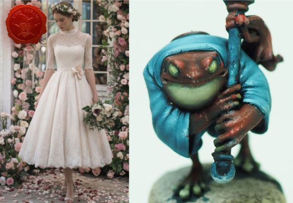
Wedding dresses are often completely covered in intricate embroidery, yet they don’t appear overly saturated. This is because both the embroidery and its background are the same color, so all of these details blend into the background and become very subtle. In this project, I wanted to see if I could achieve something similar – painting white embroidery on a white surface. If I could, I could use this effect to create a model that at first glance gives a balanced impression of detail, but upon closer inspection reveals that it is even more impressive than it first appeared. In short, I want people to react with: “This looks even better than I thought!”
PROCESS
I chose a model that was covered in clothing without any unnecessary details. I started with a base of “white” that was very subtly shaded, because I knew I would add more highlights and shadows later after I finished the embroidery. I played it safe – better to have to highlight more than have the details become invisible.
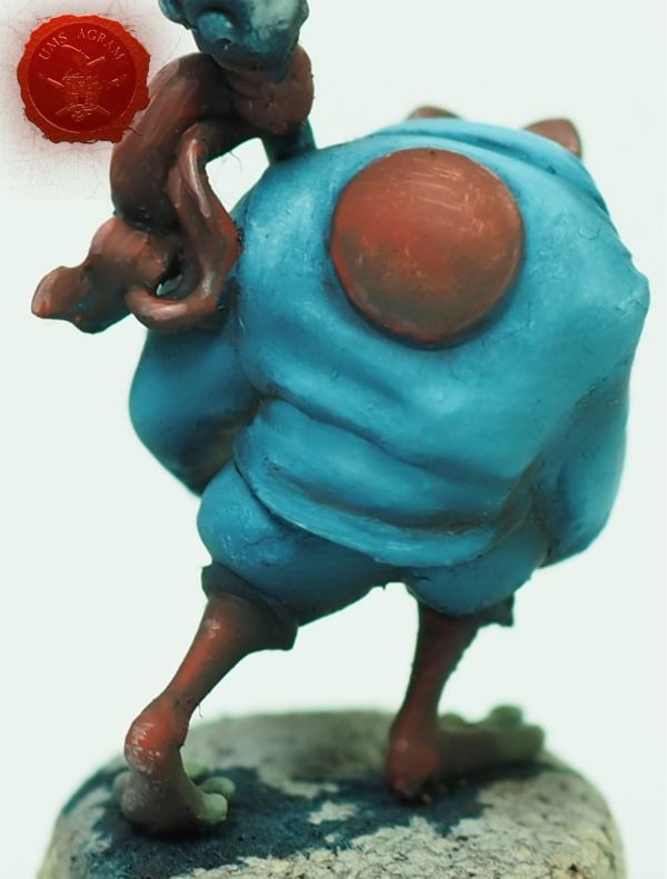
The model is very small, so I had to choose a simple enough pattern to draw. After a few hours of looking at references of embroidered kimonos, I decided on a floral pattern. I decided that three different repeating flowers would be enough for an interesting pattern.
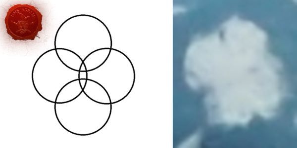
I tried a few variations on the pattern before finding three that looked good and were simple enough. I wanted to keep the flowers as small as possible, so simple shapes were the best choice. I settled on:
- Four simple dots that make up a flower
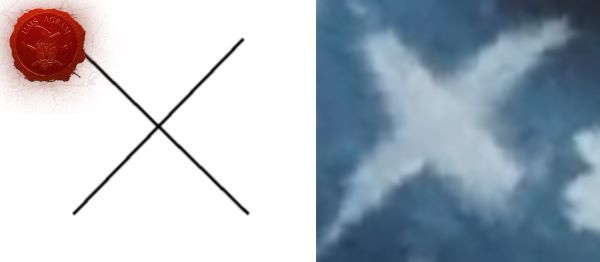
- X shape (at first I tried to sharpen the ends, but quickly gave up - it's more important to keep it small than realistic)
- A star (in my head it's a dandelion)
Once the shapes were selected, all that was left was to repeat them. To do this, I mixed a little bit of the shadow color with white, because I wanted to highlight them later. Of course, none of the shapes turned out perfectly symmetrical, but that's not a problem because we're talking about fabric that stretches and deforms.
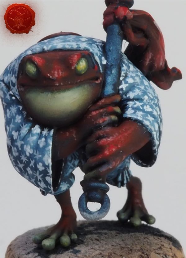
The most important thing in this process is to get the paint to the right consistency. If you thin it too much, it will start to run all over the model and stain it instead of painting it. If it's too thick, it won't come off the brush. Note: I used oil paints. It's probably possible with acrylics, but the paint would probably dry on the tip of the brush a lot.
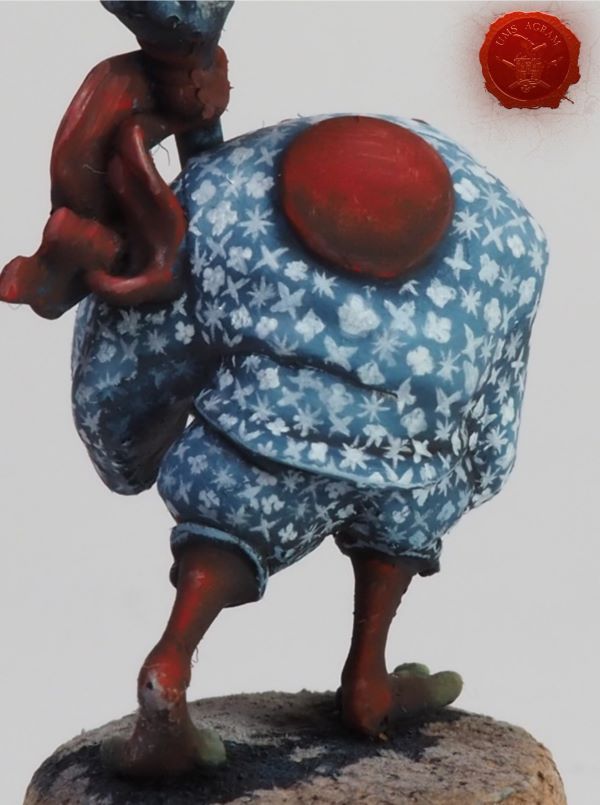
After many hours, the sample was ready.
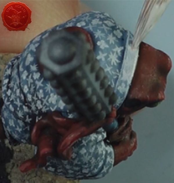
During the process I realized that the initial layer should have been lighter, because although this looks good, it doesn't feel like "white on white" to me. The next step was to add additional shading and highlighting to the kimono to make everything look whiter. For this I used semi-transparent oil paints, applied and then feathered with a dry brush.
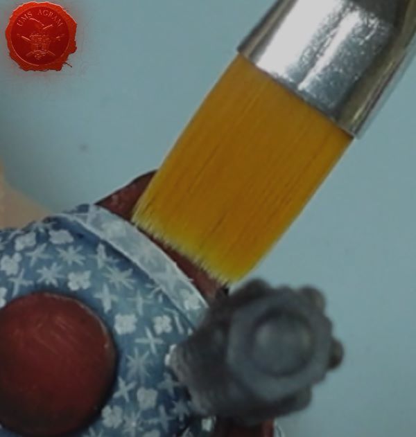
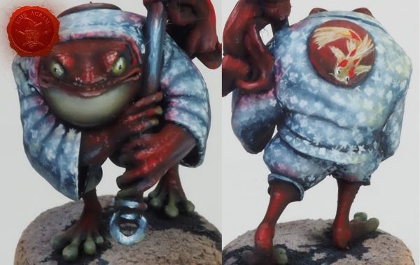
Once that layer dried, I added the reflected colors from the surrounding surfaces. With that, the floral kimono was complete!
CONCLUSSION
While I think I learned a lot from this project and the initial idea had great potential, in the end I didn't quite get it right. I don't think the kimono looks completely white. If I were to do this again, I would start with an even lighter base and actually paint all the patterns in a darker color first. Then I would go over them with a lighter tone to create more depth to the embroidery.
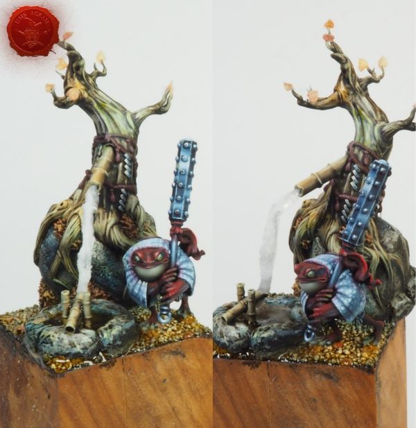
Nevertheless, the result is quite nice, and I promise the next one will be even better! Here is the model when the rest is finished and placed on a cute base.
Latest articles
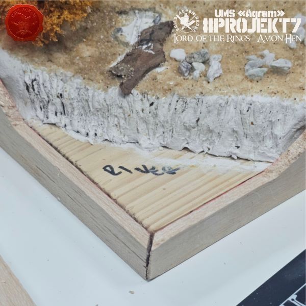
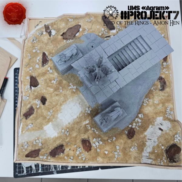
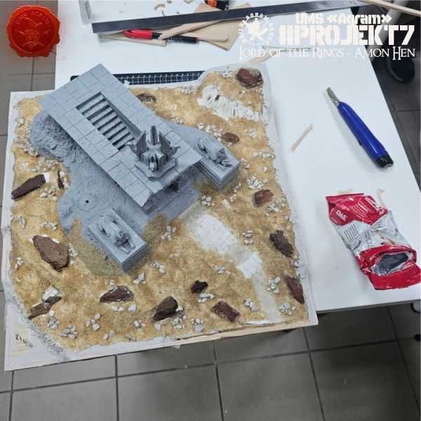
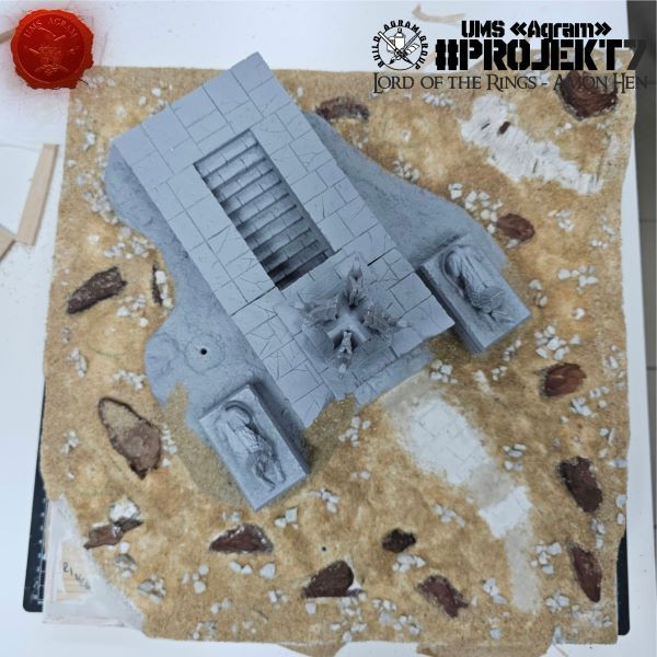
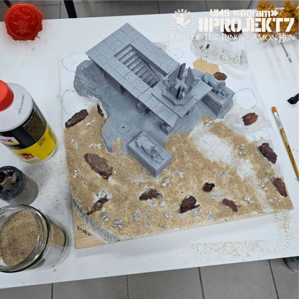
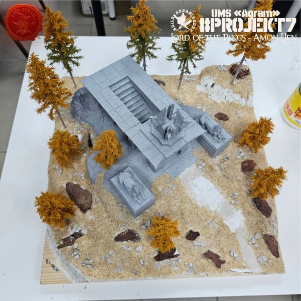
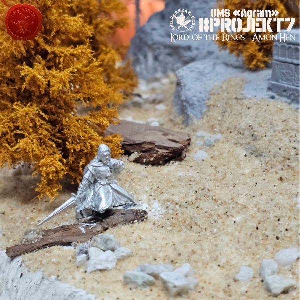
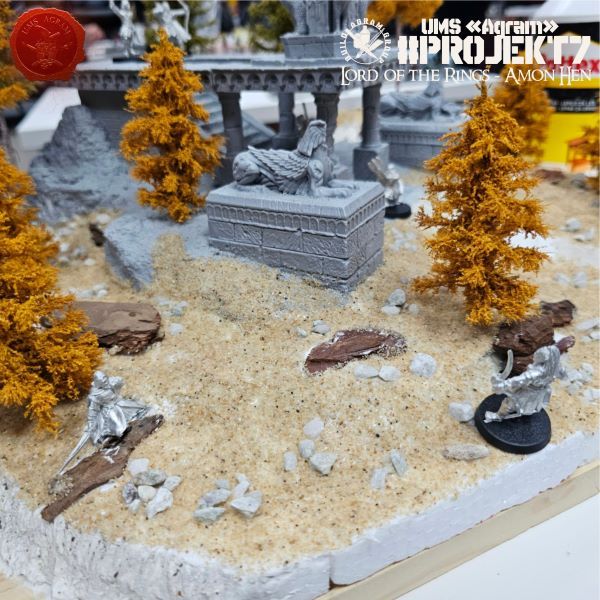
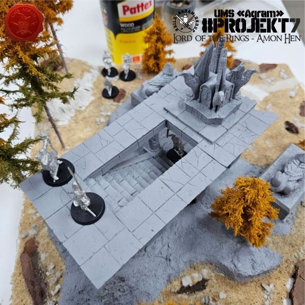
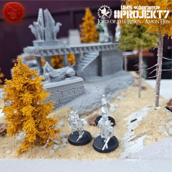
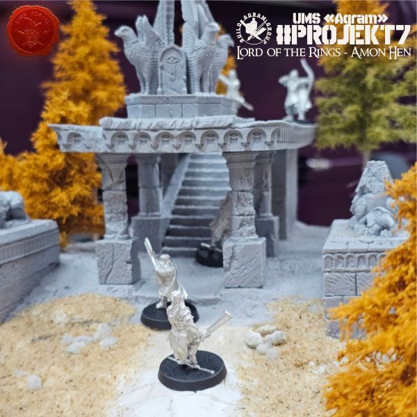
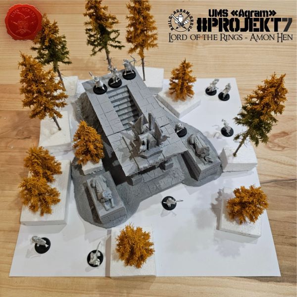
- Agram Group Build #7 – Amon Hen, pt.5 Krunoslav Belinić, 15th October 2026
- Agram Group Build #7 – Amon Hen, pt.4 Marko Paunović, 8th October 2026
- Agram Group Build #7 – Amon Hen, pt.3 Krunoslav Belinić, 1nd October 2026
- Agram Group Build #7 – Amon Hen, pt.2 Marko Paunović, 24th September 2026
- Signs for your plinths Marko Paunović, 24th September 2026




Latest battle-reports
- Kill Team - Blooded vs. Vespid Stingwings 28th February 2025, GW - Warhammer 40.000, and Antoni Pastuović (Imperial Guard)
- 22nd April 2022, GW - Warhammer 40.000, Borna Pleše (Space Marines) and Kristijan Kliska (Tau Empire)
- 17th November 2021, GW - Warhammer 40.000, and Nino Marasović (Space Marines)