
How To Build A Fantasy Peasant House
This article will be depicting the design and build process of one of the types of terrain I made - scratch-built peasant houses.
Materials:
• polystyrene
• balsa wood (1mm, 2mm)
• DAS clay
• MDF base
• pelt of a teddy bear
• masking tape
• PVA glue
• superglue
• pins
• wooden toothpicks
• wire
• blister pack
• insect net
• water-based acrylic paint
Tools:
• hobby knife
• clippers
• brushes
• sculpting tools
• ruler
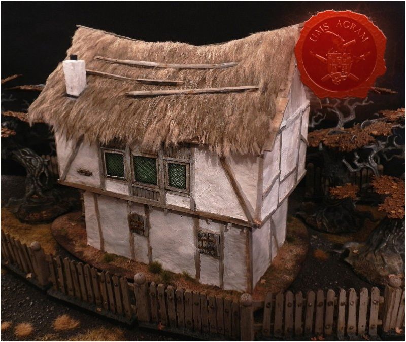
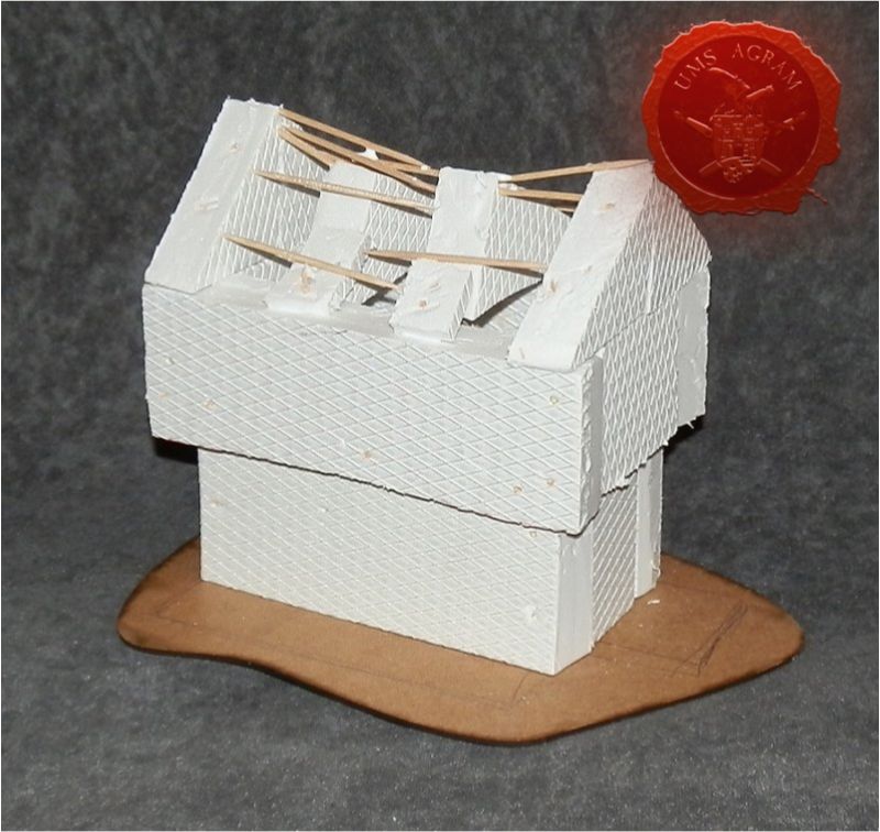
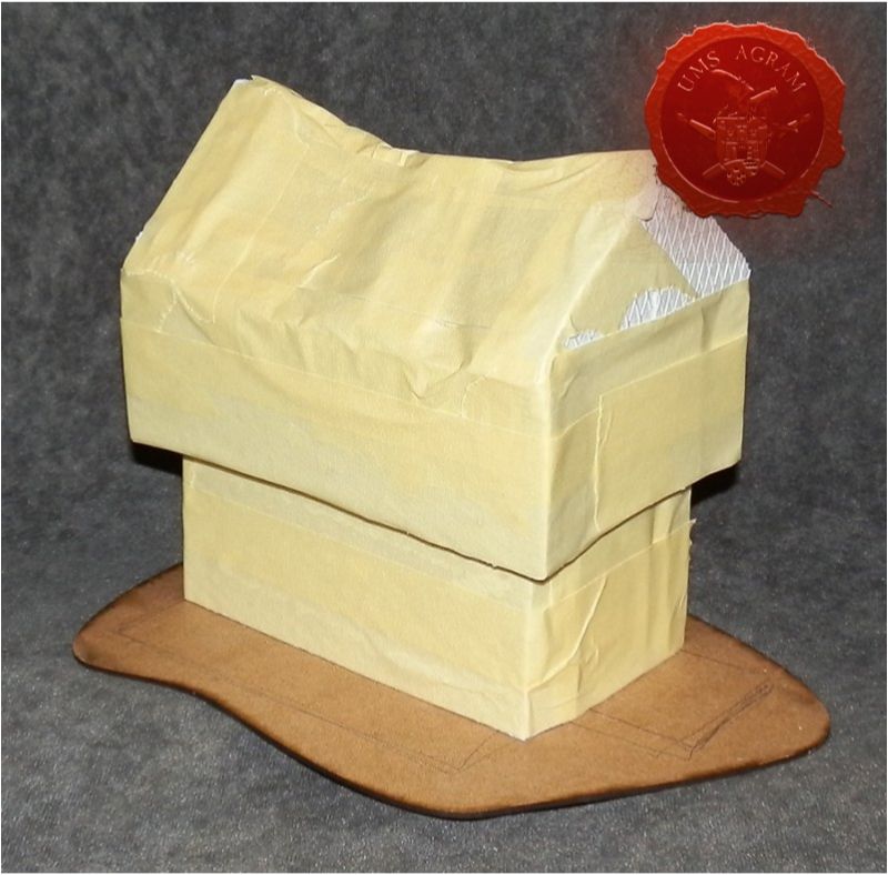
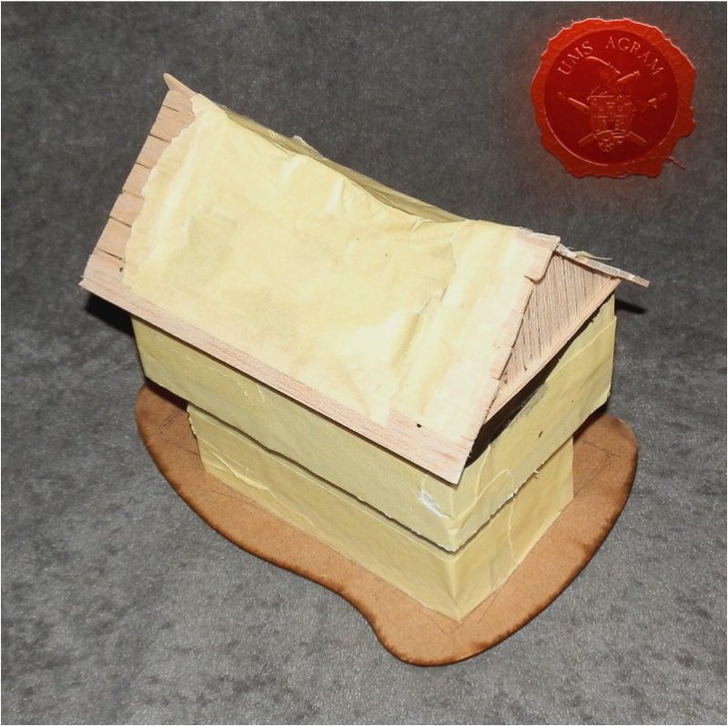
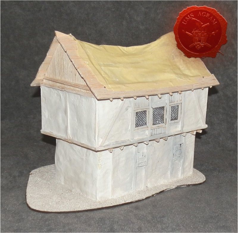
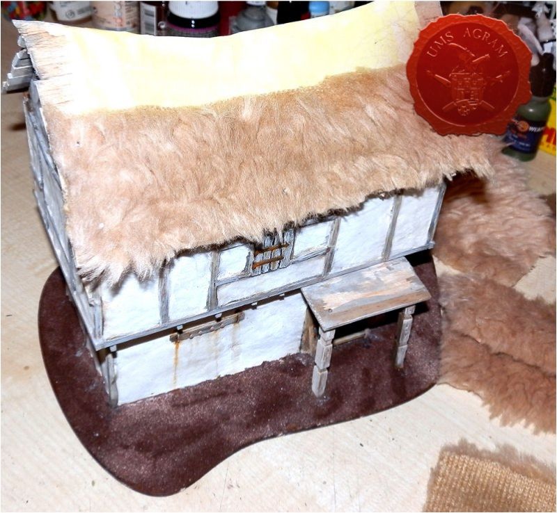
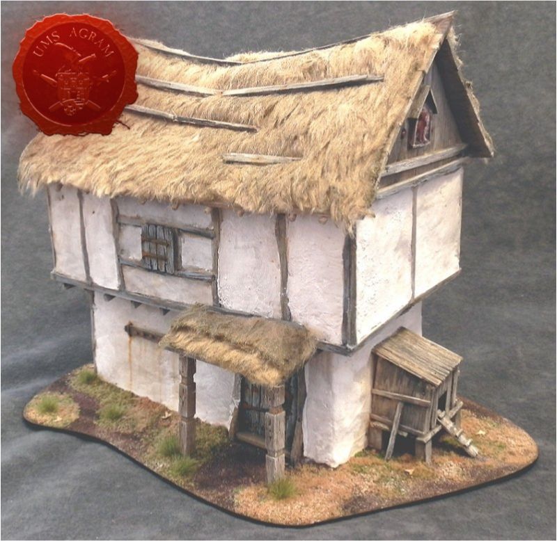
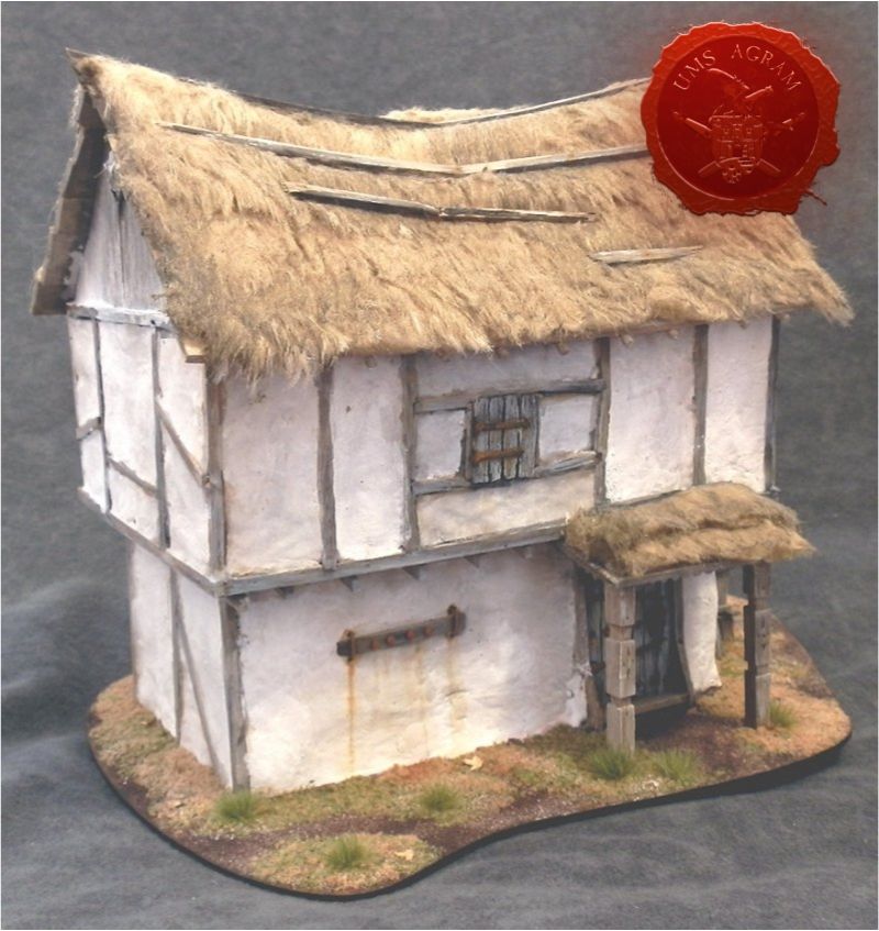
The core shape of the house was assembled from polystyrene and toothpicks, and covered with masking tape. It all stands on a flat MDF base. This underlying construction is sturdy and easy to build upon, so it's a good choice if the house is closed, with no built and playable interior. It is deliberately slightly crooked and irregular, with a sagging roof, which all gives character to a fantasy building.
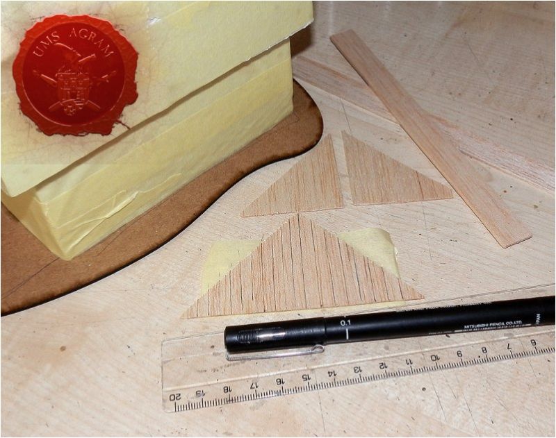
Next, I grabbed 2mm balsa and got started on the wood of the roof. Only the parts of the wooden roof structure that would be visible are important. No need to bother with the rest since it will be covered with thatch. This way you save on both time and material.
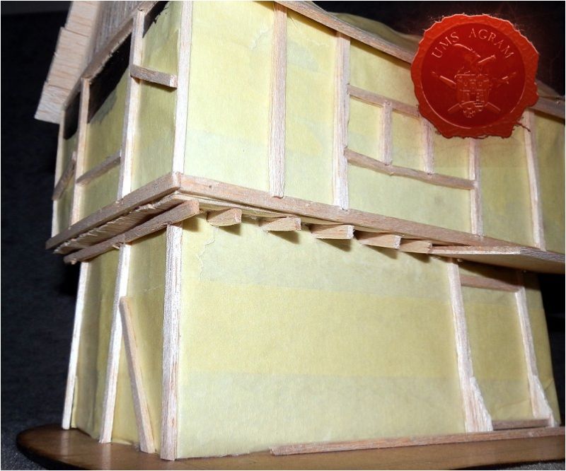
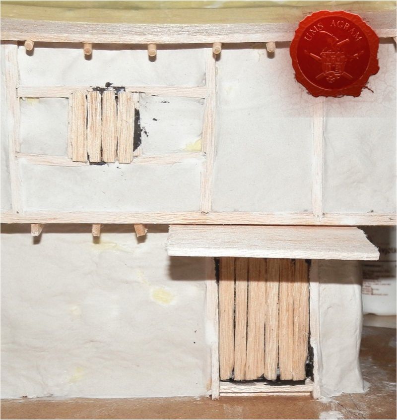
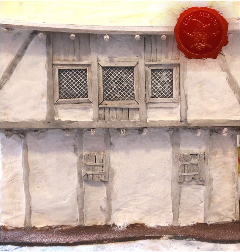
Next came the wooden framework of the walls. Also made of 2mm balsa, glued with PVA. This piece represents a house built with wattle and daub method. The framework of the walls is made of wood, and the empty spaces are filled with a woven lattice of wooden stakes and twigs called wattle, which is then daubed with a wet mix of dirt, clay, dung and straw. This is quite good quality and much more affordable than a fully wooden structure. The house can finally be whitewashed to get this neater look.
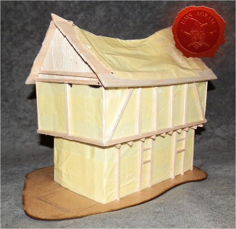
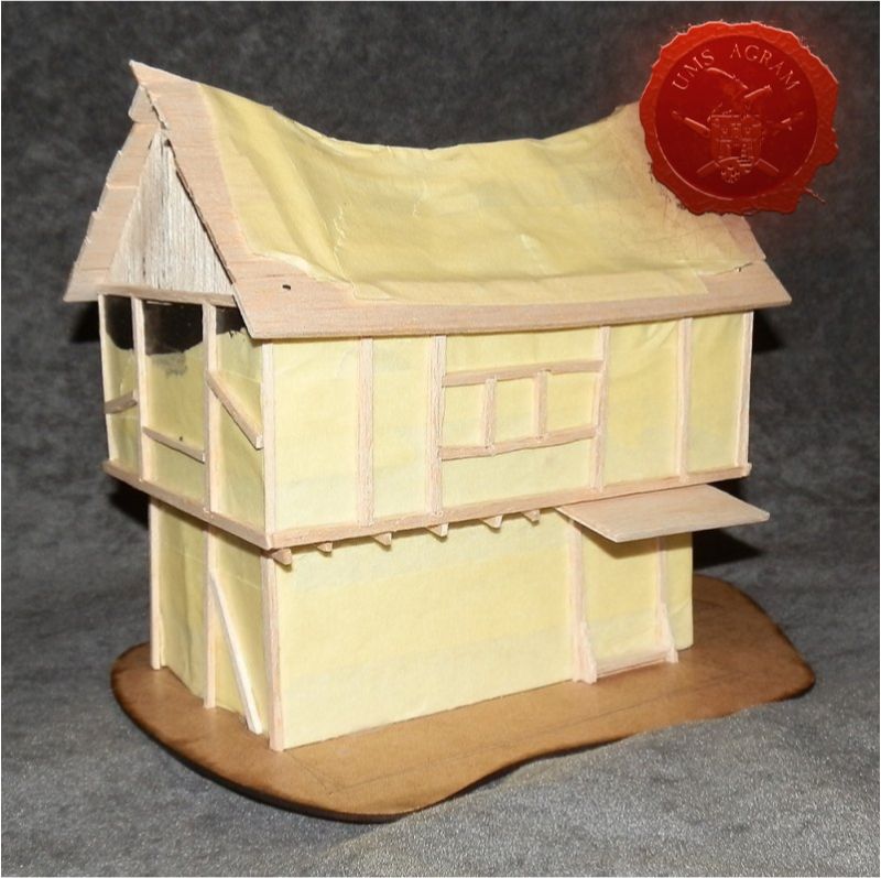
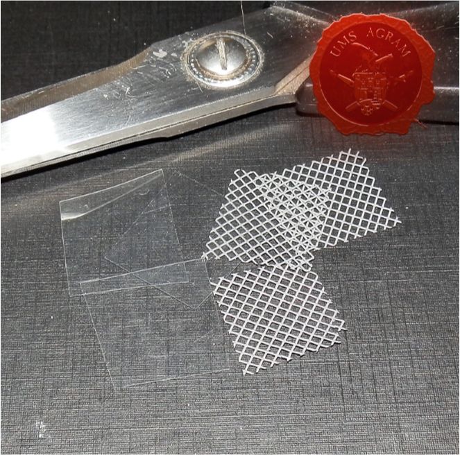
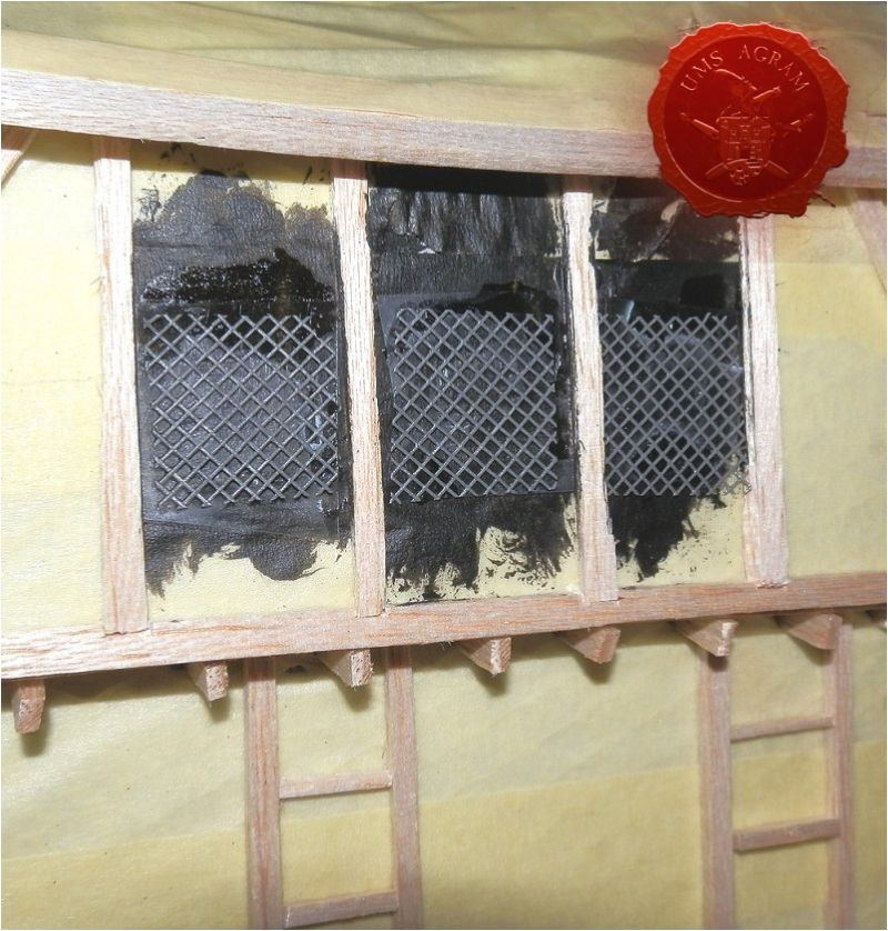
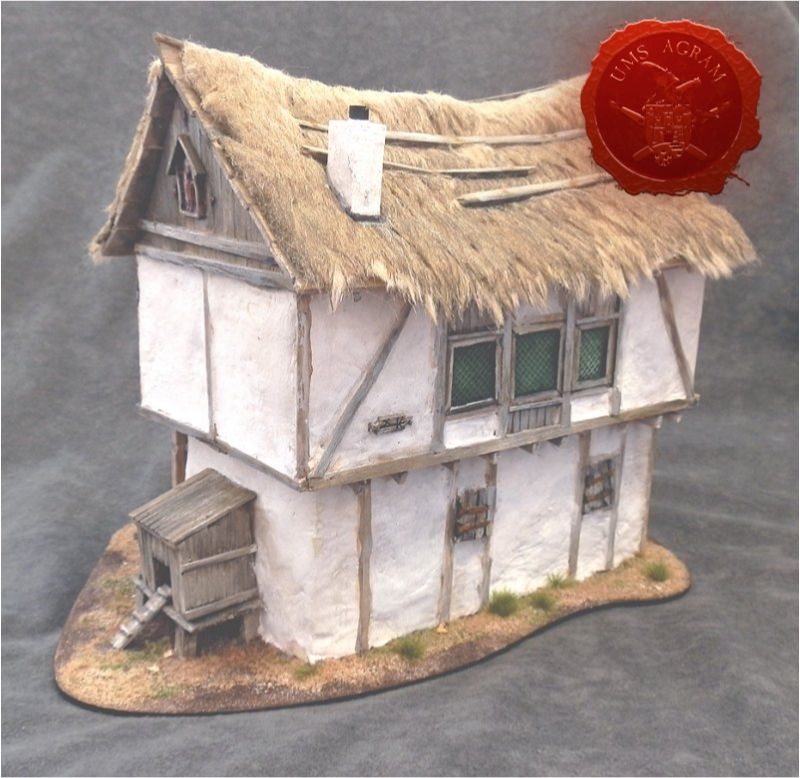
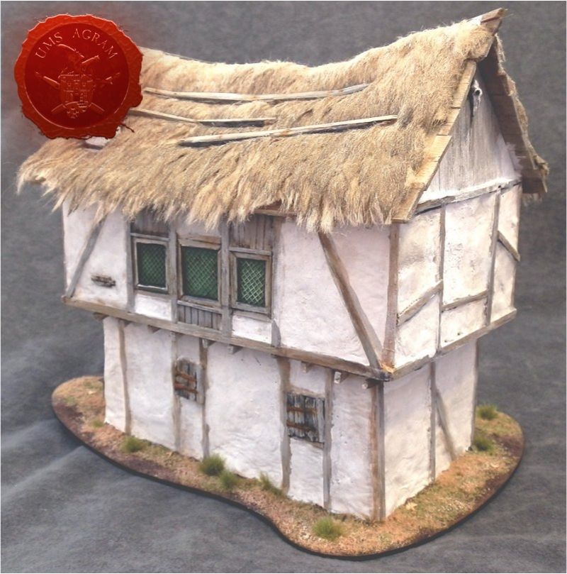
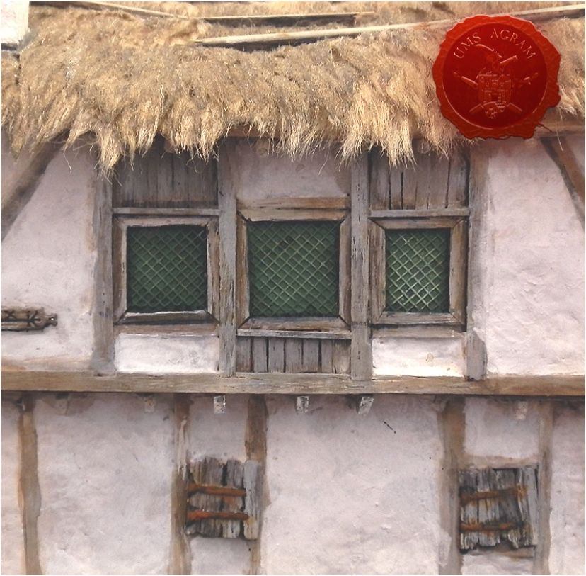
A house needs windows. These are an opportunity to add points of interest on the model. Leaded windows are commonly seen on fantasy houses, and they are really not that difficult to make. Insect net, blister pack plastic. I cut the square shapes with scissors, glued net to plastic and then the whole thing to the wall. Built the window frames around the glass because it's easier to make it fit that way. A trick for the window frame pieces to fit better is by cutting them one on top of the other. The angle will then be exactly the same without measuring. Again, to get this crooked feel avoid perfect right angles, and the windows can slightly differ in size. The building process is relaxed, without much measuring and precise cutting. This is how the finished windows look. Other windows will have shutters to add variety.
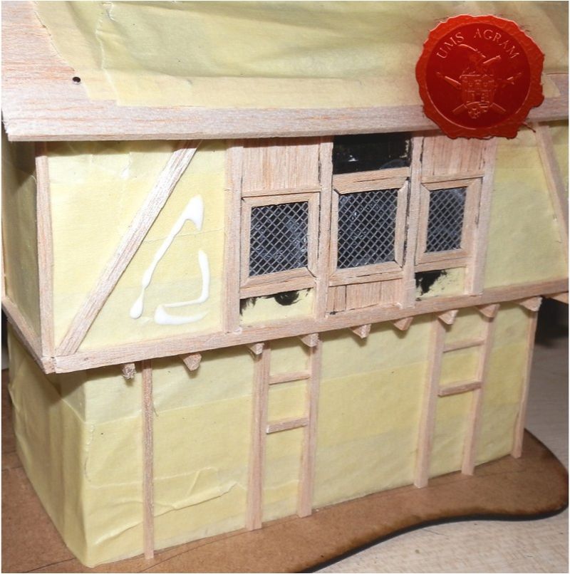
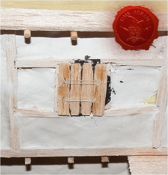
The space between the wooden beams was then filled with DAS clay to represent the wattle and daub. I normally do this with my fingers and leave it uneven and messy. Only always make sure not to leave fingerprints behind - having those showing is on the same immersion-killing level as having mould lines on a painted miniature. Simple water helps smooth things out. Before applying the clay, I smear some PVA on the surface for DAS to adhere better. I learnt early on that if your polystyrene has a textured surface, do sand it smooth first. The texture be visible in the overlaying clay after it cures because it shrinks a bit. You can still fix that with another layer of DAS on top, but it's better to prevent it from happening at all.
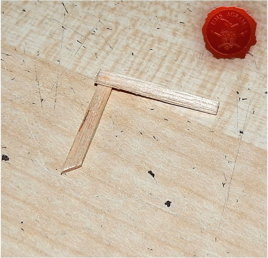
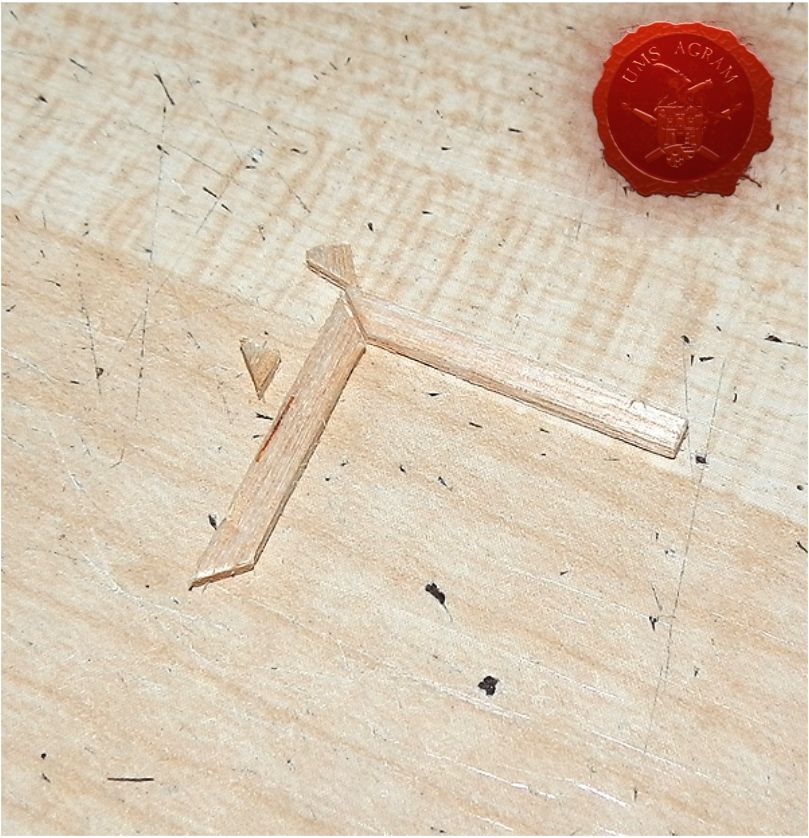
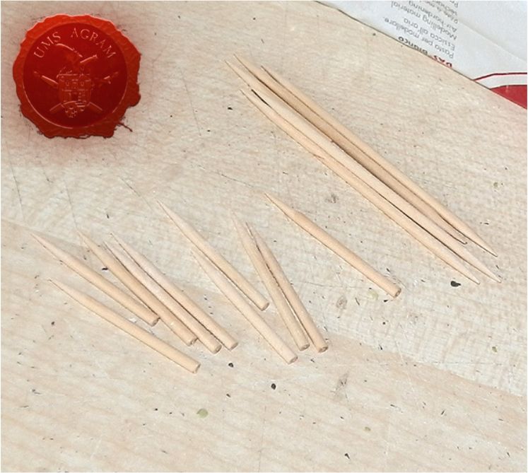
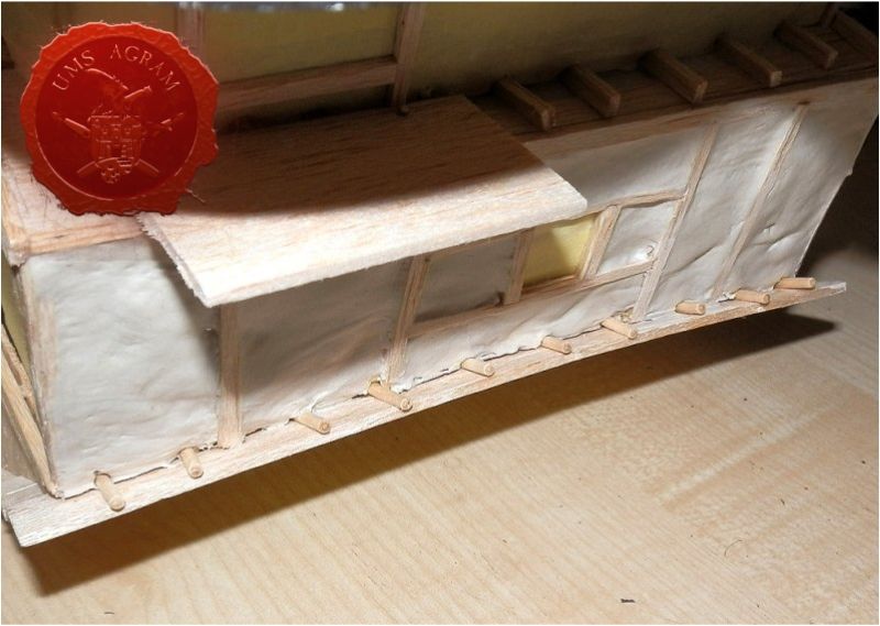
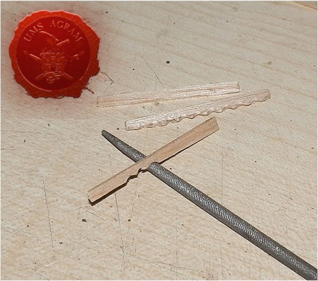
While the clay was still wet I added more detail to the overhang of the roof. It's just toothpicks, cut in half, with the pointy end dipped in PVA and pushed into the wall just where it meets the roof. This represents supporting structure.
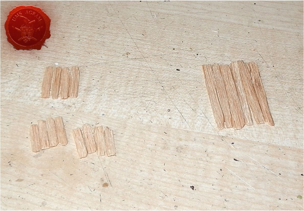
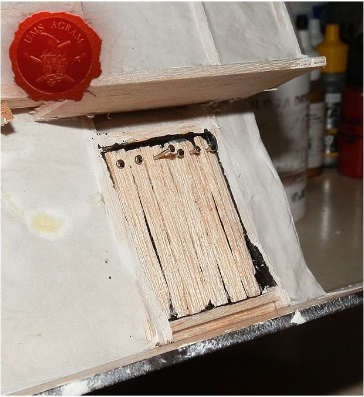
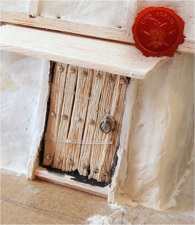
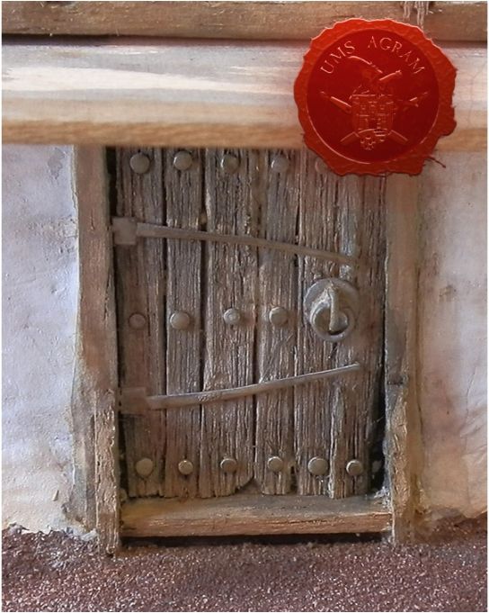
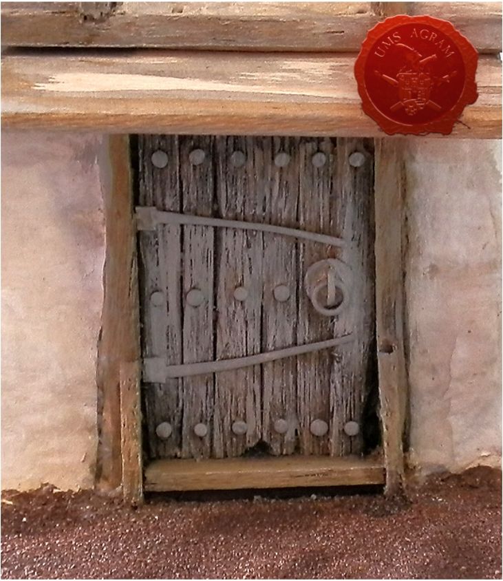
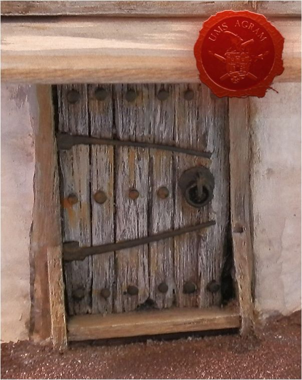
Doors and shutters are done the same way. First, basic shape and size is cut from 1mm balsa. Then it was marked and cut into vertical planks. Each plank got wood grain engraved with a pointy sculpting tool, and each was distressed around the edges with a knife. Then, the planks are glued into place in the door frame/over the window. The 'empty space' behind the door/shutter was painted black before that, since it would otherwise have been hard to reach. Thinking ahead saves you from frustration later...
Metal details give the doors and shutters character and interest. Cut up blister packaging, pins, metal rings... These are best fixed with superglue.
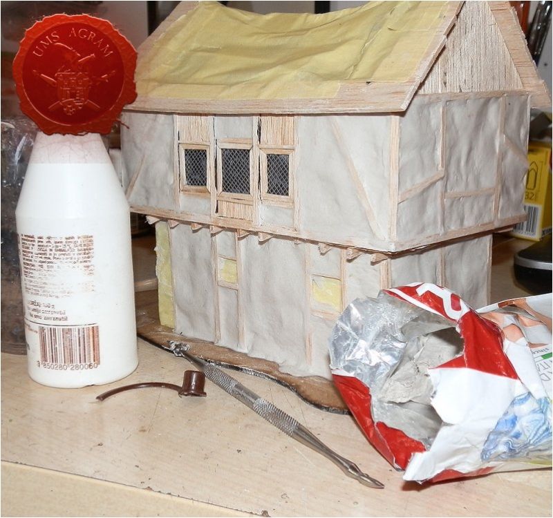
After this I just added texture on the house's base, and it was ready for painting. The whole thing can be primed white, but I did not find that necessary. The walls were already the right colour, and balsa was to be painted darker than its natural colour. I only undercoated the door and windows because they were made of a variety of different-coloured and even transparent materials. Painting it white first offers an equal base, and maybe more importantly it makes it more clearly visible what you've made. You need that when you're painting.
The painting on this was very loose and fun. A succession of grey and brown glazes on the wood and a bit of light staining on the whitewashed walls. Special attention is given to the doors and windows, as they usually attract the eye. After glazes, they got a lighter overbrush, but only in the direction of the wood grain (so, vertically). This is followed by a layer of mat black on the metal, which is finally rusted up.
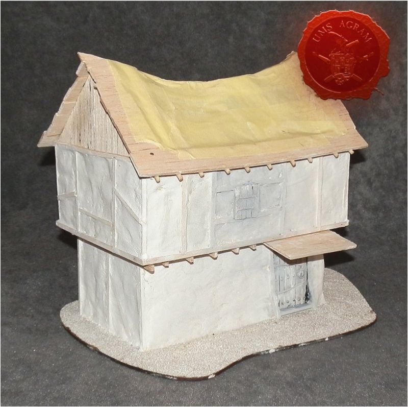
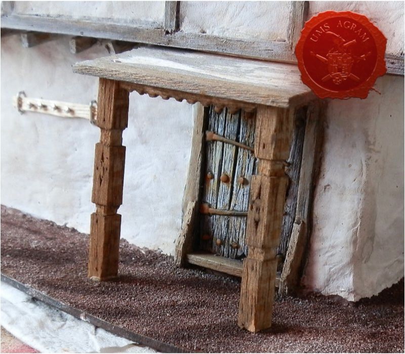
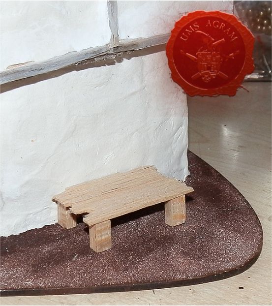
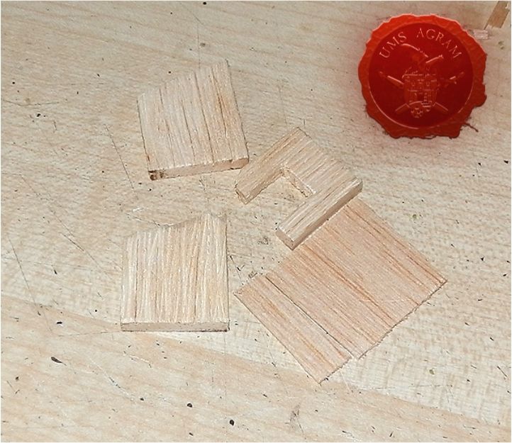
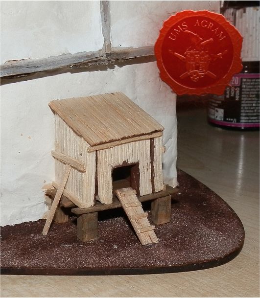
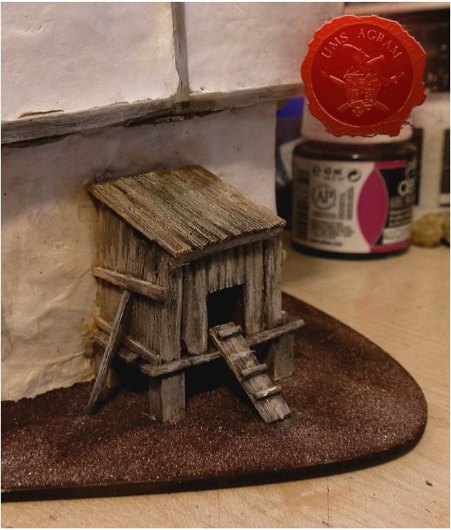
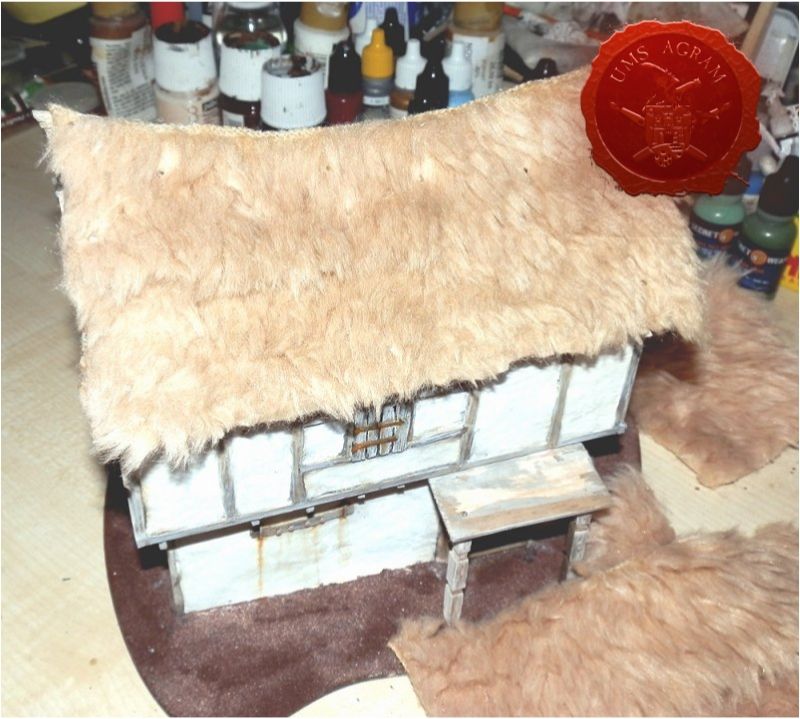
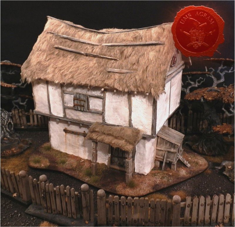
I intended from the start to include a little porch, but I left it off until the time the door was painted, since it would have been difficult to reach otherwise. Same goes for the charming henhouse that leans on the side of the house. Porch has decoratively carved pillars and roof. All this was done just with a hobby knife and a modeller's file. The henhouse was constructed fully from balsa. As visible in the pictures, some parts were partly painted while it was still being built, again to avoid leaving those difficult to reach areas unpainted.
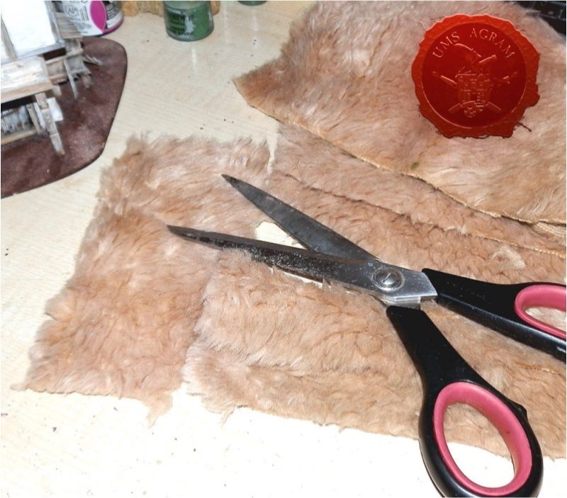
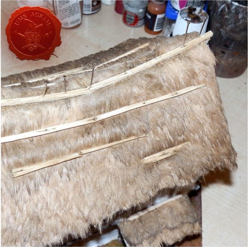
After the messiest part of painting is done, the teddy fur thatch can be glued into place. I prefer to do it in this order to avoid fur getting in the way when painting the underlying wood. The fur itself was already the right colour, so did not need to be fully repainted, just fixed a bit. You don't necessarily need to flay a teddy to get your fur; they sell fur by the yard for teddy makers. But that is a more expensive option. The fur thatch is best done by cutting horizontal strips with scissors and pasting them onto the roof, starting from the bottom and with strips slightly overlapping. I used pins to fix it all in place until the glue set. They need to be pulled out afterwards.
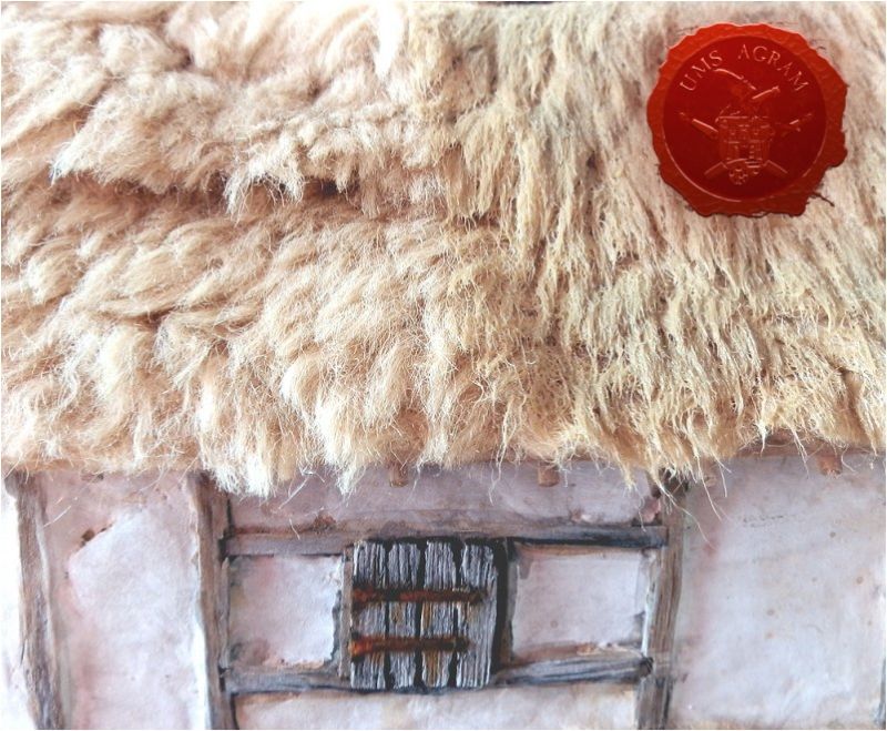
You will notice it looks very fuzzy and not exactly like thatch yet. To make it more like straw, I applied a mix of water, PVA and light brown paint. Used a large stiff brush and brushed this mix on. I only pulled my brush in the downward direction, following the flow of the hairs. This is also how water would normally go down the roof during rainfall.
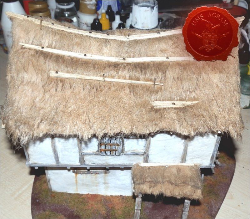
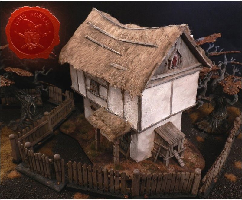
After this, the roof will be pretty drenched and it will take some time for it to dry. Best leave it overnight. When it was completely dry, I added the chimney, the wooden ridge, and some planks nailed to the roof. The latter are mostly an aesthetic choice, since they help break up the large, relatively bland surface.
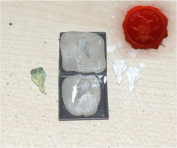
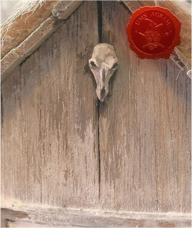
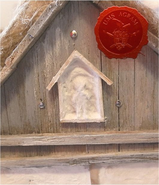
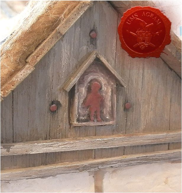
It's the little extra details that really help sell the scenery piece as a house someone inhabits. An everyday object, such as a simple, rickety ladder can be made from balsa and cut up toothpicks. Or what I put on this house: protective objects nailed to the roof. One is an animal skull, the other an effigy of the household spirit. The skull is a plaster copy of a skull I had previously sculpted in green stuff. The house patron was sculpted directly onto the house with DAS clay, a crude representation of a homunculus shape. The image is framed by a shape of a house, hinting at the spirit's function. One doesn't need to be adept at sculpting to make this happen. Bits leftover from kits, or bits designed for dioramas and basing are a good solution, too.
The final step is adding some flock and static grass to the base.
Building this kind of house is not complicated and it doesn't require expensive materials nor tools. The more time is spent on it and the more thought and attention given to details, the more spectacular it will be.
Latest articles
- We attended: Isle of Wonders 2026 Ili Said, 6th July 2026
- We attended: 13. Trofeo San Giusto 2026. Marko Paunović, 6th July 2026
- We attended: Zagreb Scale Model Show 2026 Mario Grgurev, 6th July 2026
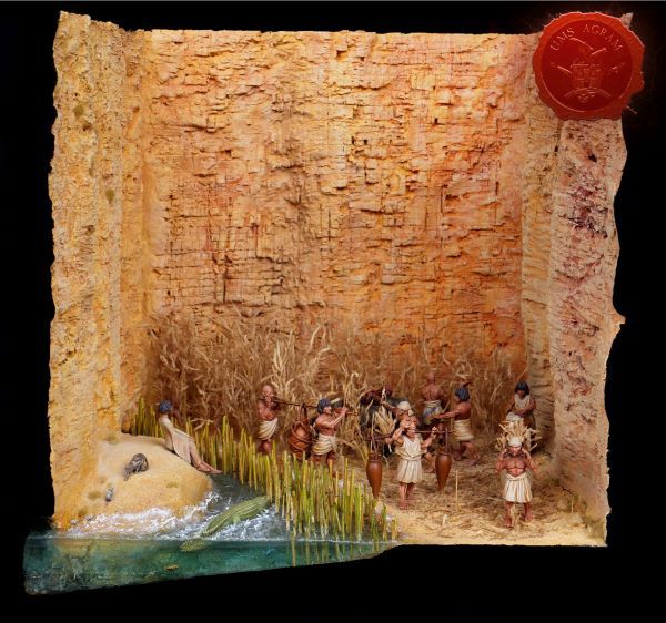
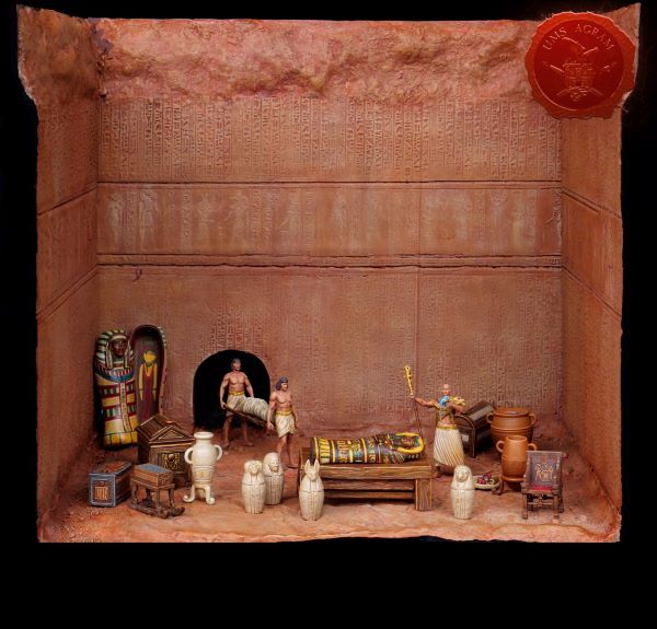
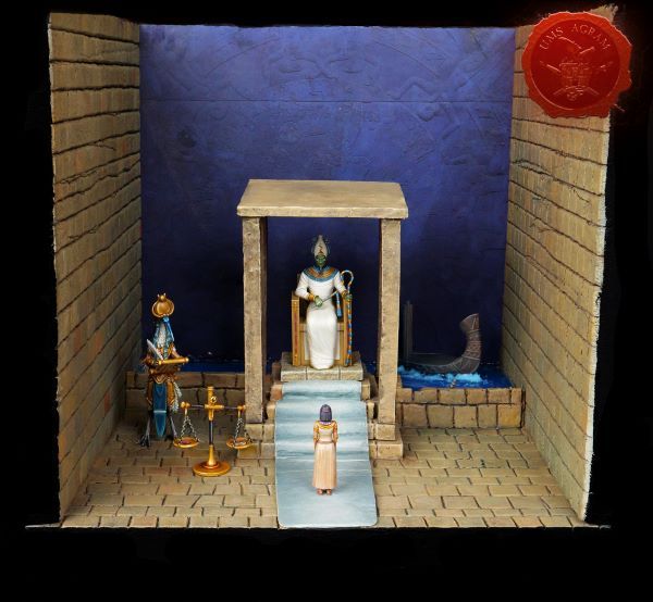
- Making of MUMMY dioramas Sebastian Søgård, 17th June 2026
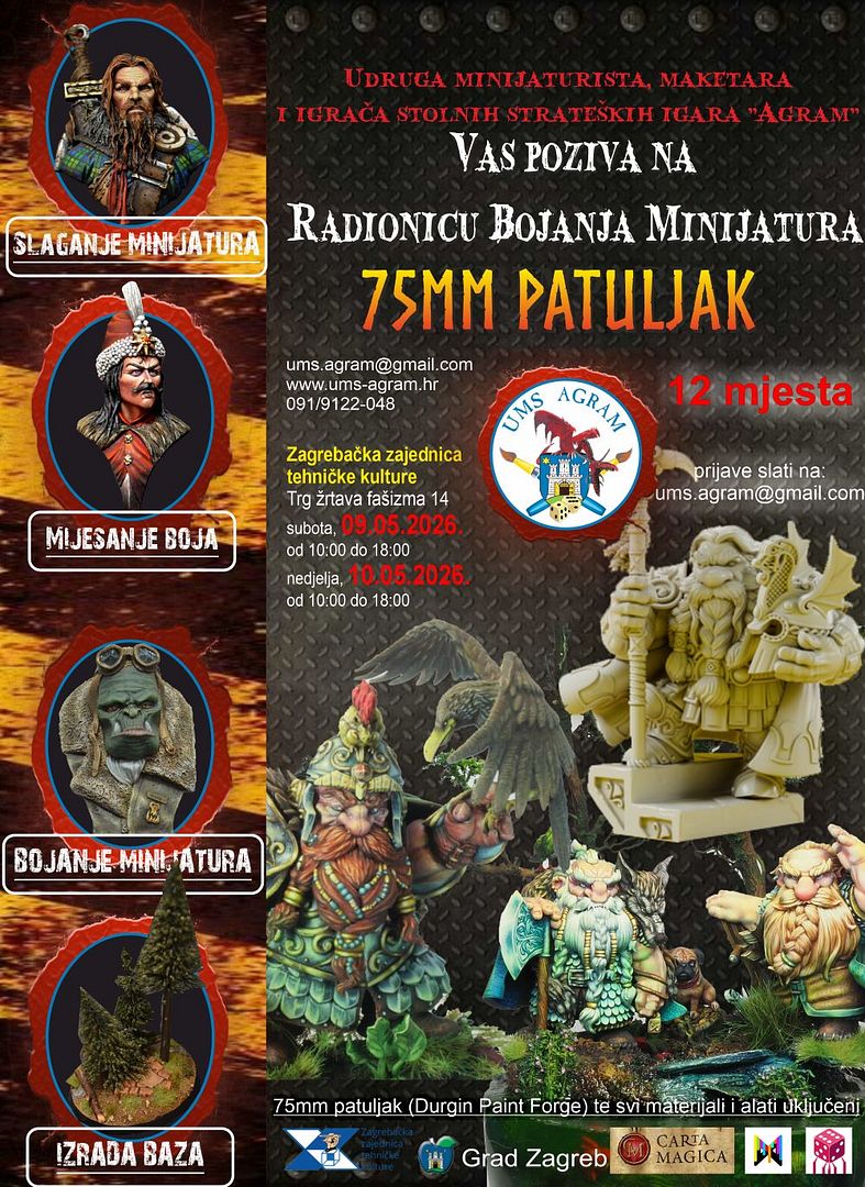
- Miniature Painting Workshop - 75mm Dwarf Ivan Knezović, 26th May 2026


Latest battle-reports
- Kill Team - Blooded vs. Vespid Stingwings 28th February 2025, GW - Warhammer 40.000, and Antoni Pastuović (Imperial Guard)
- 22nd April 2022, GW - Warhammer 40.000, Borna Pleše (Space Marines) and Kristijan Kliska (Tau Empire)
- 17th November 2021, GW - Warhammer 40.000, and Nino Marasović (Space Marines)