Agram 2022 – A Year In Review
The year 2022 has also come to an end. The year in which we celebrated our 19th birthday and were faced with various post-earthquake and pandemic challenges. The impossibility of using our main space, as well as epidemiological restrictions on the number of people in the ZZTK cinema hall, which we use on Wednesday evenings, have followed us for the third year in a row. Consequently, the gaming part suffered greatly, while the hobby part flourished.
Visit to the President of Republic Croatia
The year started fantastically. On 20 January 2022, the President of the Republic Zoran Milanović received in the Office of the President of the Republic, the winners of the "Faust Vrančić" National Award for Technical Culture and the winners of the Croatian Association of Technical Culture Award for 2020.
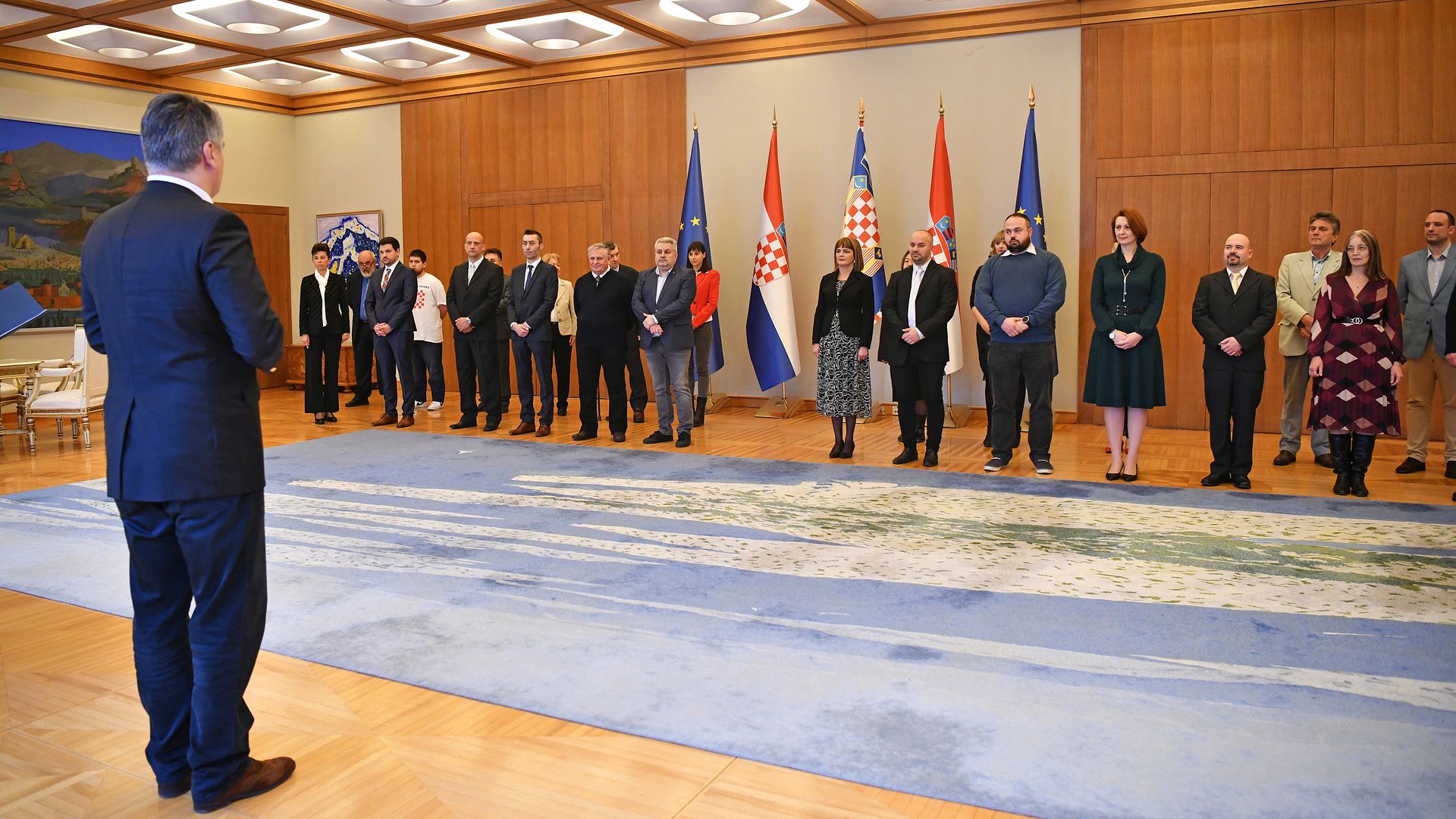
Photograph: Office of the President of Republic Croatia / Dario Andrišek
At the meeting with President Milanović, there were also winners of awards given by the Croatian Association of Technical Culture. The winner of the Lifetime Achievement Award for 2020 is Dubravko Malvić, and the winners of the Annual Awards of the Croatian Community of Technical Culture are Valentina Blašković, Ivan Kostanjski, Željka Krizmanić, Dragan Mojsilović, Milan Rendulić, Astronomical Society "Gea x" Slavonski Brod, Radio Club "Marjan" from Split, Association of miniaturists, model makers and players of strategic board games "Agram" from Zagreb, represented by our president, Marko Paunović, and the Association of Technical Culture of the Primorje-Gorski Kotar County.
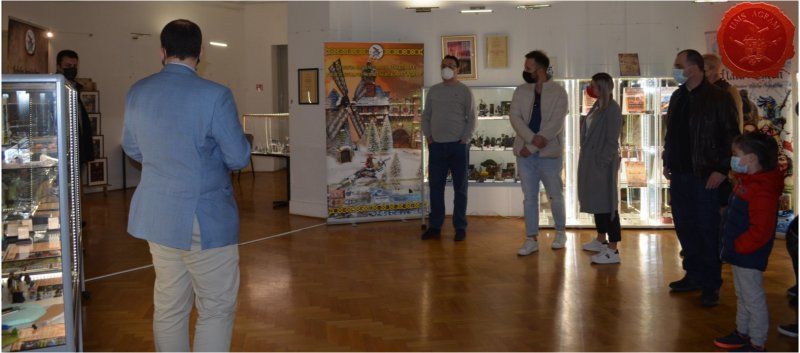
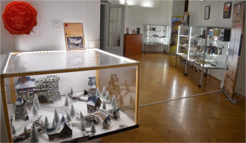
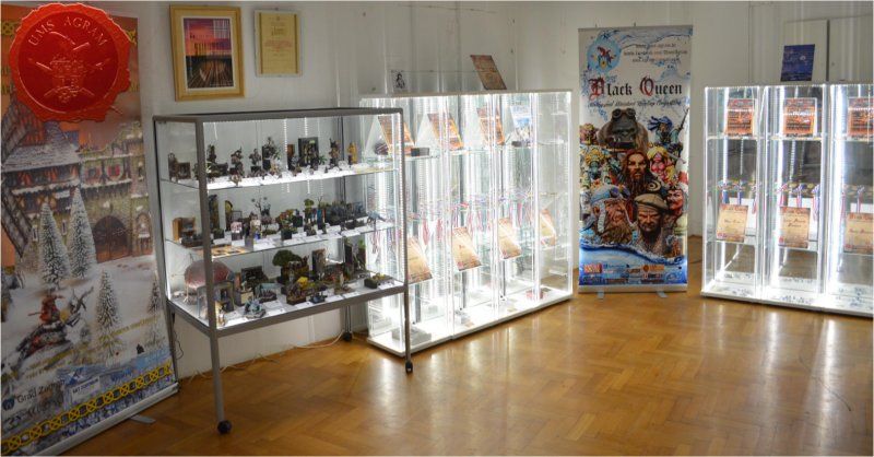
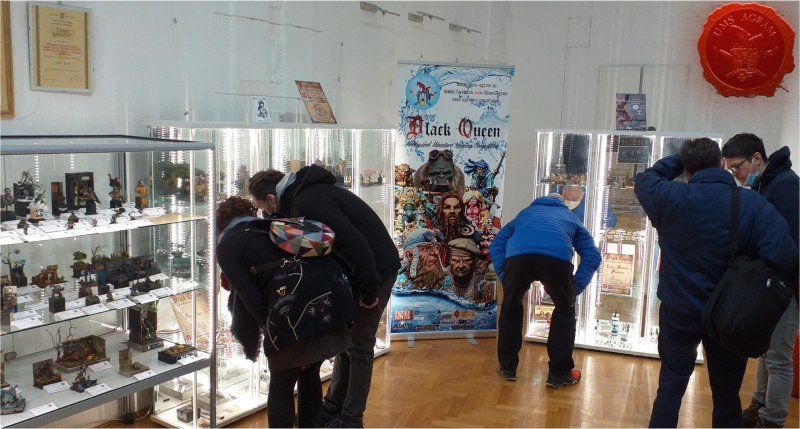
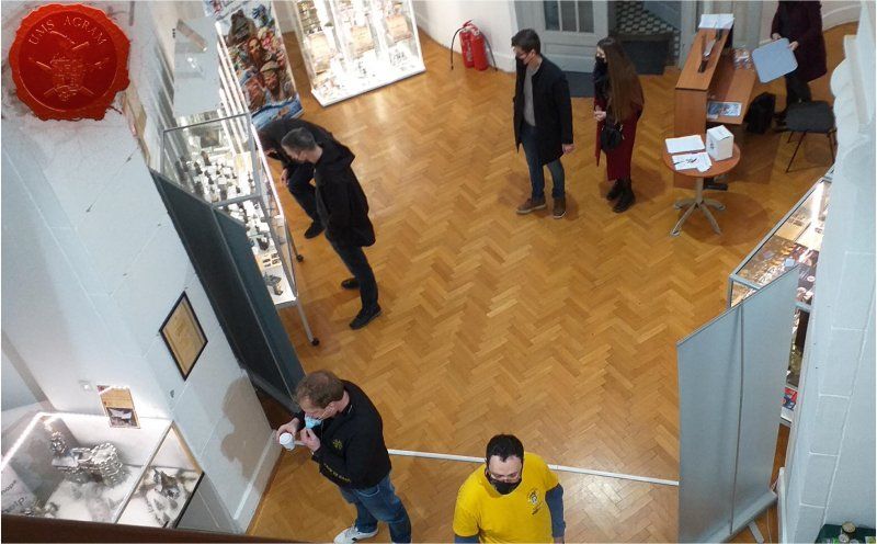
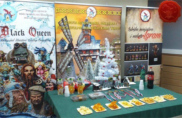
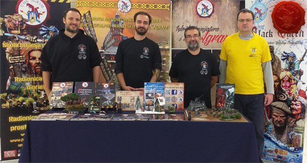
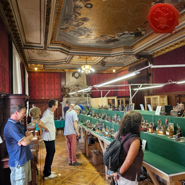
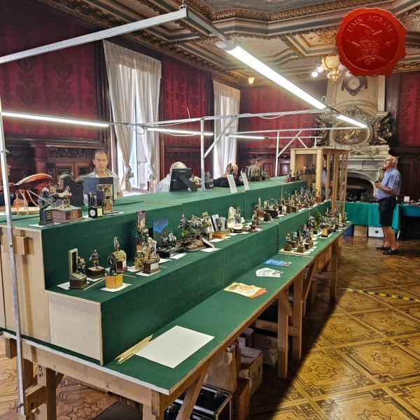
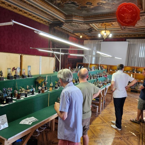
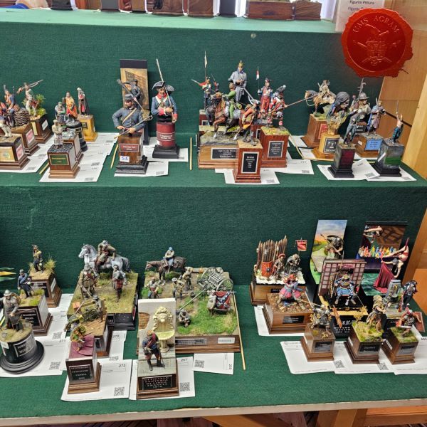
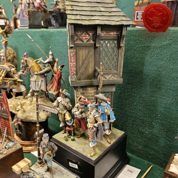
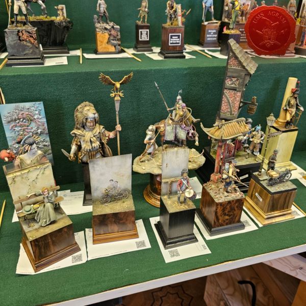
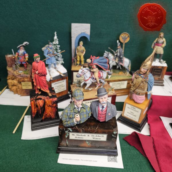
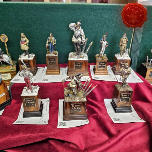
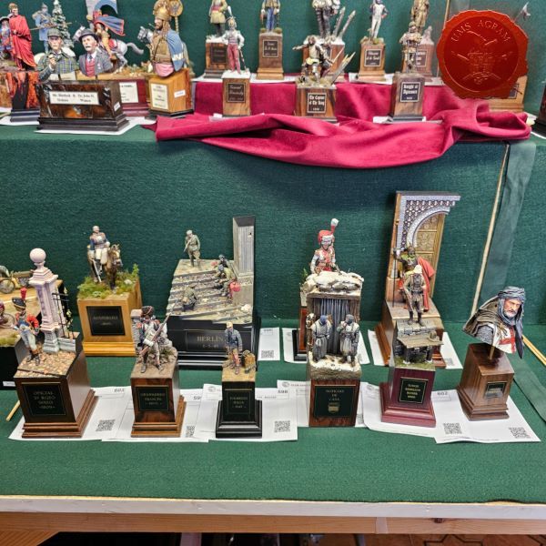
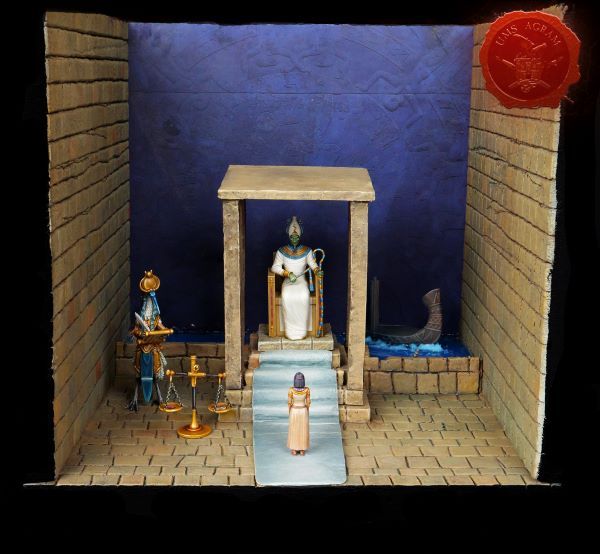
EXHIBITION OF MINIATURES AND TABLETOP SCENERY 2022
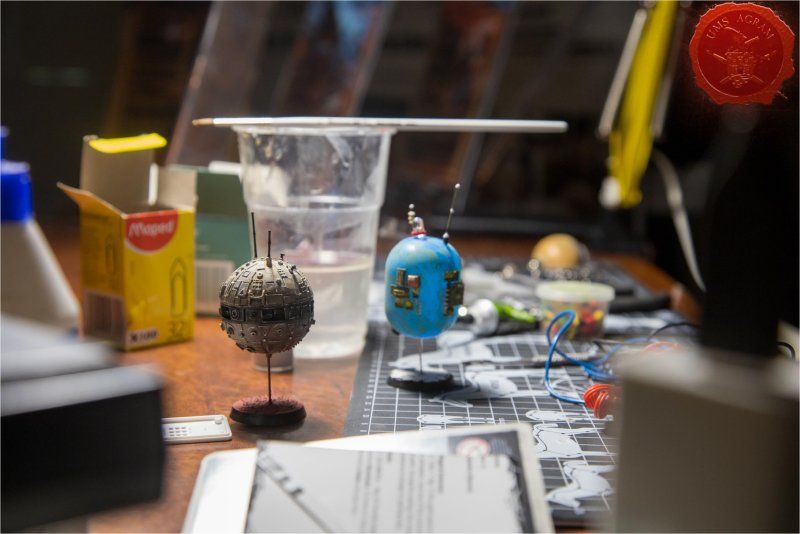
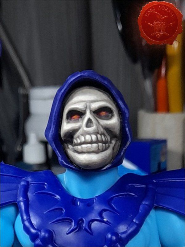
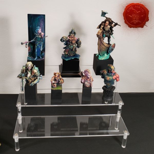
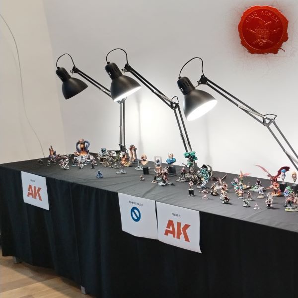
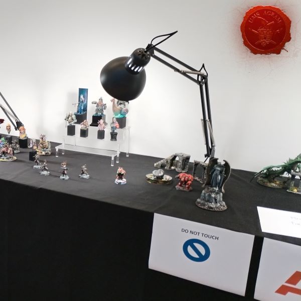
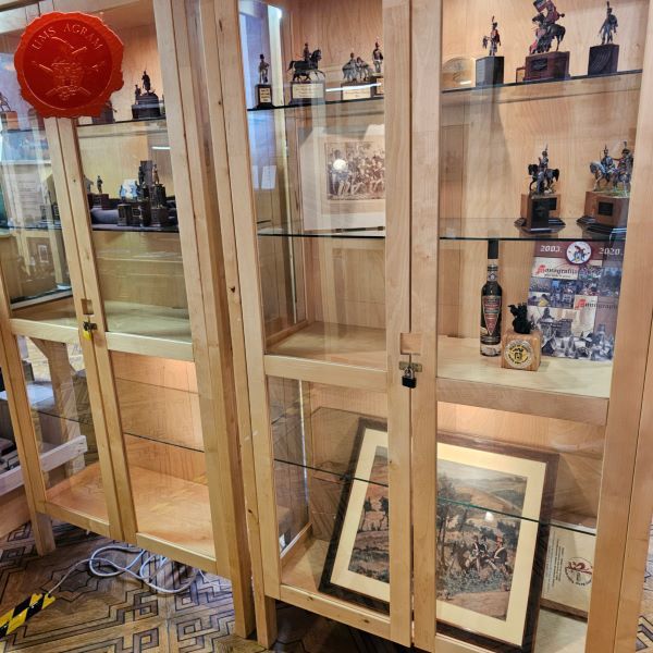
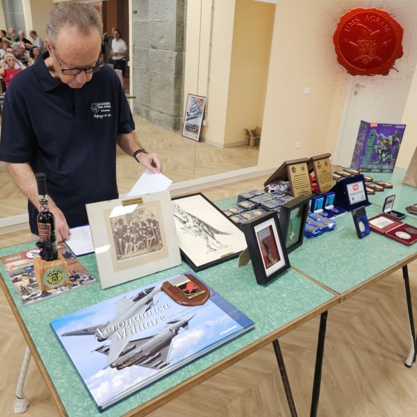
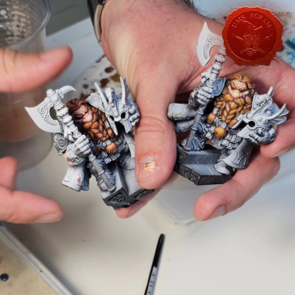
We started the year with preparations for our annual Exhibition of Miniatures and Models, during which we also organized a weekend painting workshop for miniatures and, for the third time this term, our international competition in painting miniatures, the Black Queen Hobby and Miniature Painting Competition. As always, the Exhibition presented a cross-section of the work of the Association, its members, participants of its courses and workshops, and members of the FB group Miniature Painters Croatia. In a large number of display cases, there were numerous miniatures for tabletop strategy games, board games, and an entire display case was dedicated to award-winning exhibits from previous miniature competitions. Several showcases were dedicated to projects that the Association has been implementing for 19 years, such as the UMS "Agram" Library and Reading Room, the Workshop for creating spatial models and the Miniature Painting Workshop. The works of our friends, the academic sculptor prof., had special places in the showcases. Winton Afrić and Booknooks Bookwitch.
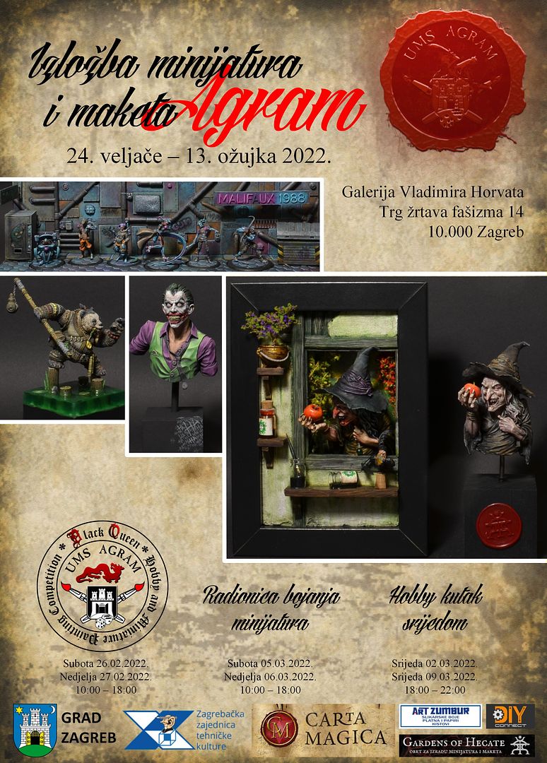
The opening of the Exhibition took place on Thursday, February 24, 2022. starting at 6 p.m.
During the duration of the Exhibition, it was possible to obtain our publications on a promotional offer.
In addition, during the Exhibition, we also held a session of the UMS "Agram" Assembly.
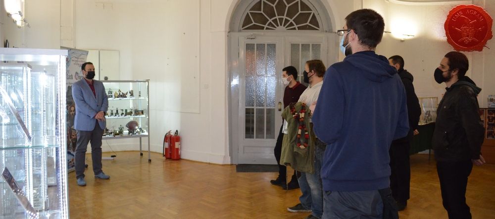
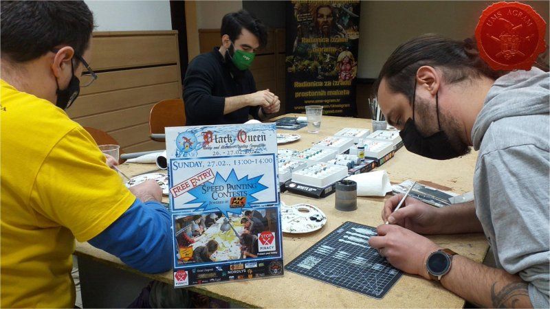
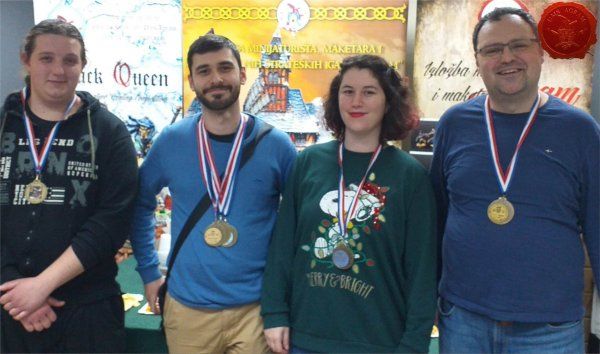
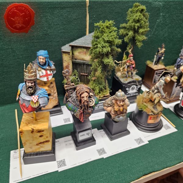
BLACK QUEEN HOBBY AND MINIATURE PAINTING COMPETITION 2022
The last weekend in February was reserved for our Black Queen Hobby and Miniature Painting Competition. And there, due to the Covid-19 epidemic, we had some changes in the format of the competition.
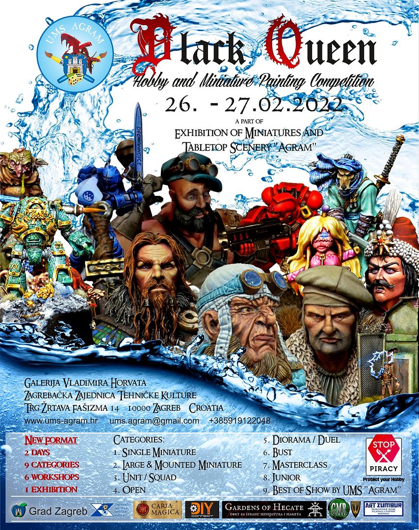
We kept the changes in the format of the registration process. Contestants had to register via email. Then they were given the exact time when they should come for registration (Saturday from 8:30 to 11:00). This limited the number of people at the scene at the same time..
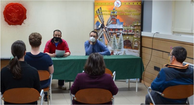
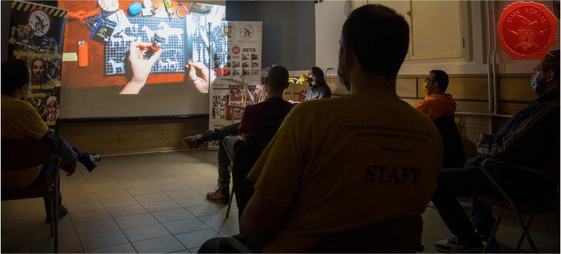
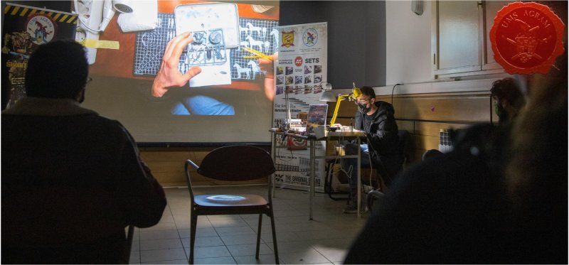
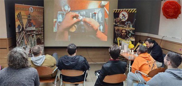
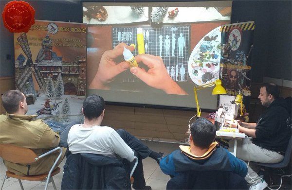
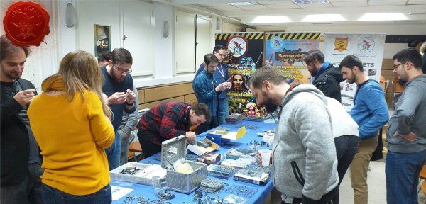
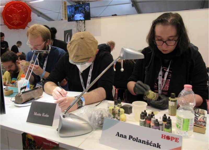
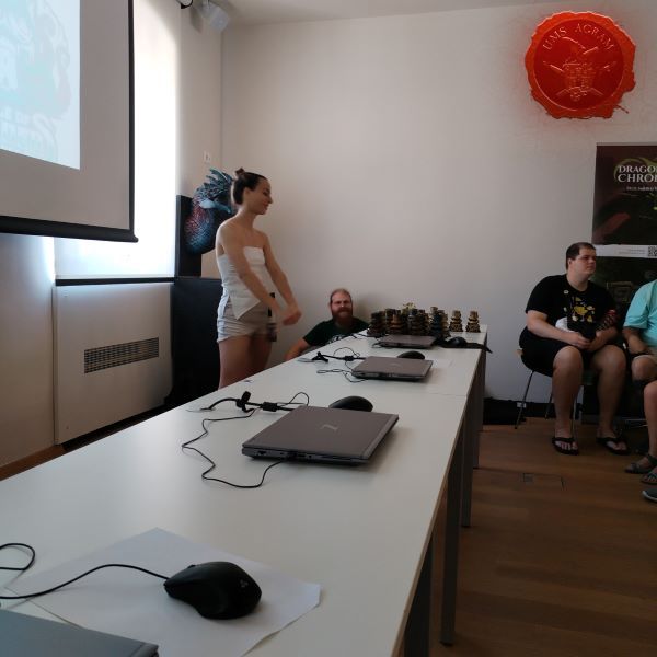
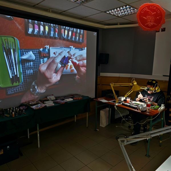
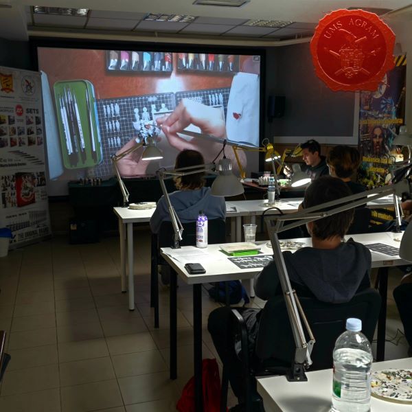
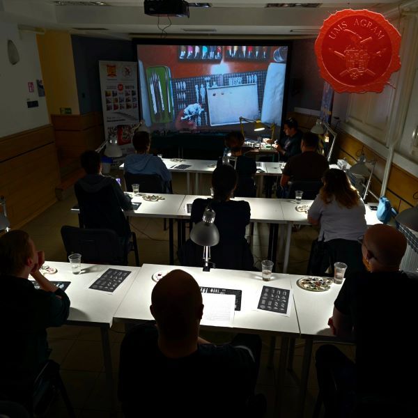
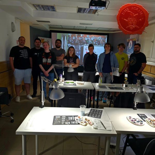
MINIATURE PAINTING DEMONSTRATION WORKSHOPS
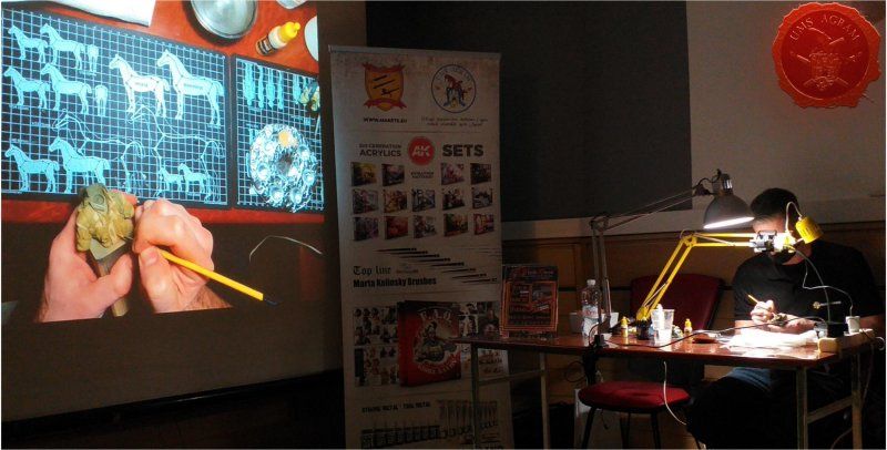
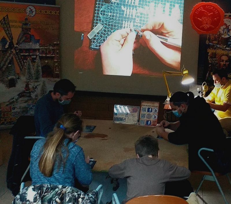
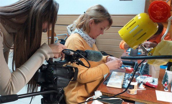
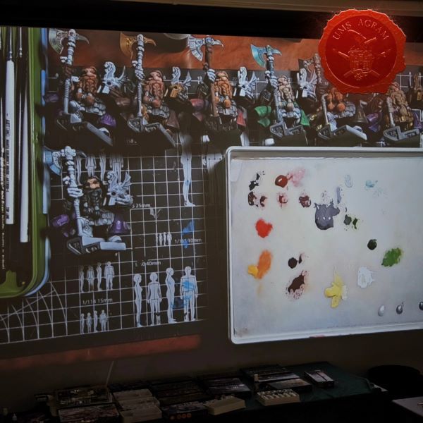
The space of Vladimir Horvat's gallery makes it possible to hold workshops during the weekend. Therefore, on Saturday after the official opening of the competition, three one-hour demonstration workshops were organized and three on Sunday before the award ceremony. This year, the workshops were held in the cinema hall. The lecturer's work was recorded with a camera and projected on the projection screen in the hall. In this way, social distancing was maintained. Also, this setting meant that the workshops were limited to 10 participants, so registration for the workshops via e-mail was also mandatory.
TRASHBASH WORKSHOP
Time: Saturday 26 February 2022, 13:00-14:00
Lecturer: Ana Polanšćak
CONTENTS:
The workshop covered building a hovering SF drone using everyday parts that you WON'T find at your local tabletop figure shop.
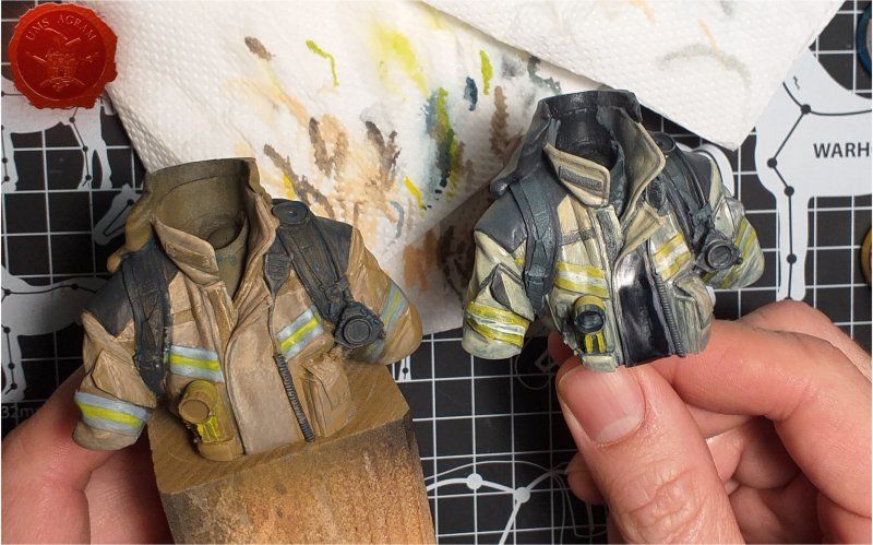
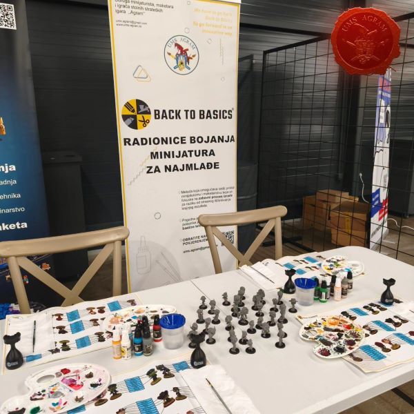
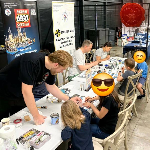
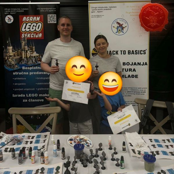
BACK TO BASICS: BUST OF THE FIREFIGHTER
Time: Saturday 26 February 2022, 14:30-15:30
LECTURER: Luka Jančič
CONTENTS:
The workshop was a presentation of the Back to Basics firefighter bust, which comes with a simple and easy-to-read video guide that will help any miniaturist take the first steps in bust painting. The Back to Basics (BTB) video explains how long it takes to build a model and breaks it down into logical steps. This sequence of steps schematically illustrates the entire process of building a model without the use of sound. The method has been thoroughly tested and fine-tuned during numerous workshops.
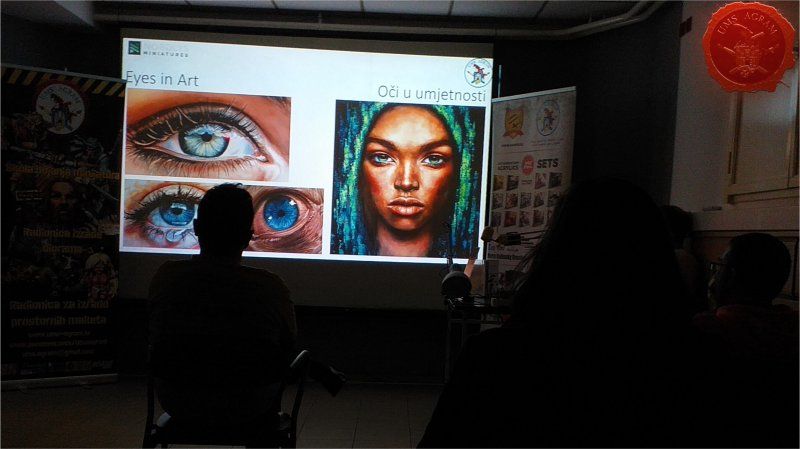
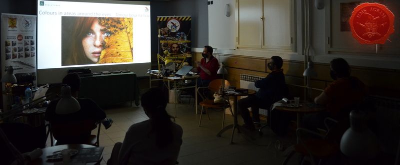
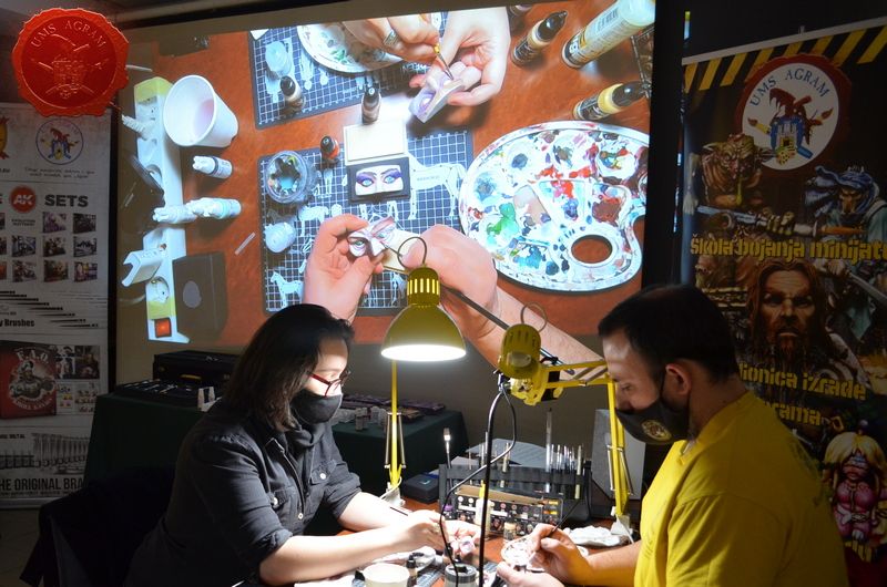
EYE ANATOMY
Time: Saturday 26 February 2022, 16:00-17:00
AUTHOR OF THE LECTURE: Jakob Skovgaard Villien
MANAGER: Marko Paunović
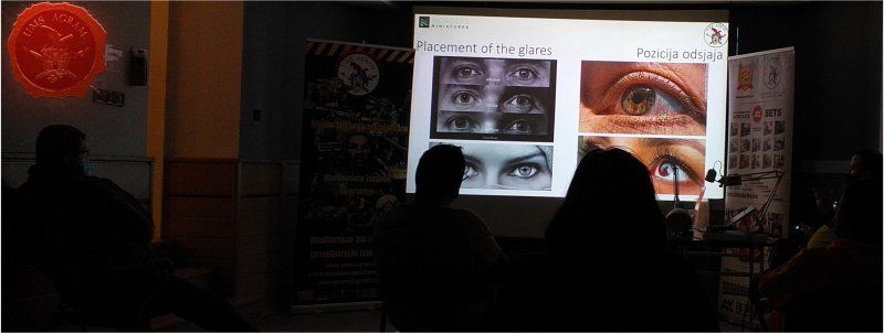
CONTENTS:
The workshop was in the form of a presentation to cover the basic anatomy of the eye as well as the use of colors, patterns and reflections to evoke emotions on both the iris and the pupil.
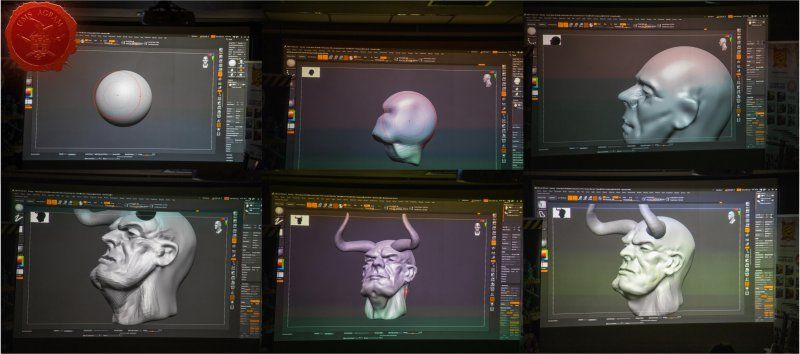
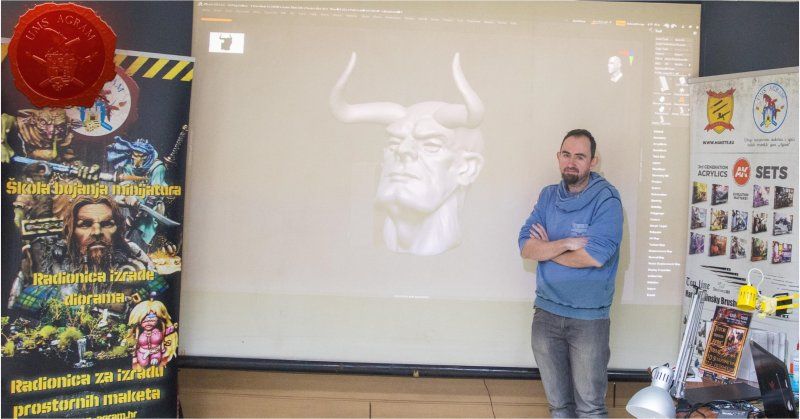
3D SCULPTING WORKSHOP
Time: Sunday, February 27, 2022, 10:00-11:00
LECTURER: Winton Afric
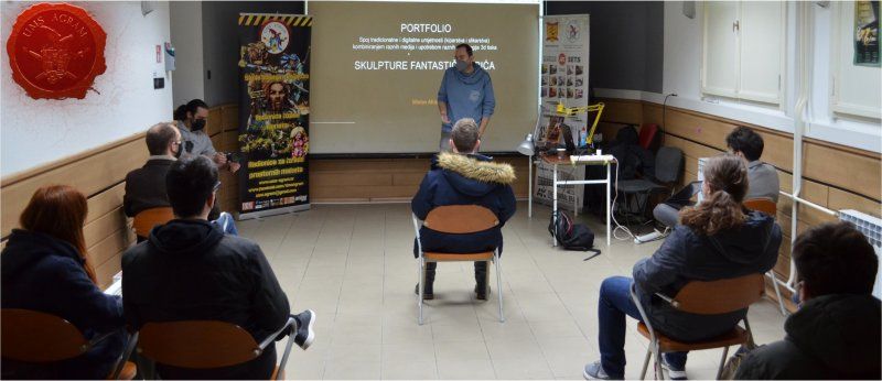
CONTENTS:
The workshop covered the process of making a 3D miniature, from idea to realization and even preparation for moulding.
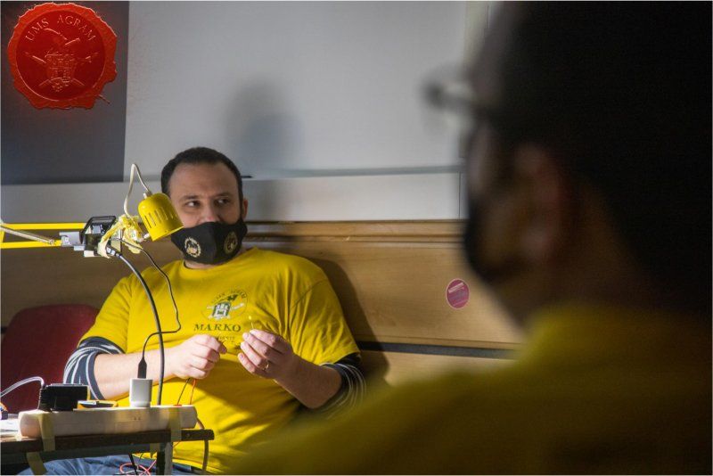
ELECTRONICS 101
Time: Sunday, February 27, 2022, 11:30-12:30
LECTURER: Marko Paunović
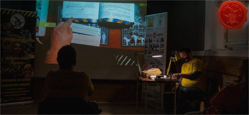
CONTENTS:
The workshop will cover the basics of electronics both in theory and in practice. Several examples of how to connect an LED to a power source will be shown, but also how to dimension a resistor and how to connect several LEDs to one power source.
ATMOSPHERIC NMM
Time: Sunday, February 27, 2022, 14:30-15:30
LECTURER: Matija Koruznjak
CONTENTS:
The workshop covered the Non-Metallic Metal (NMM) painting process with an ambient atmosphere based on the example of Sigmarinc.
SPEED PAINTING CONTEST
On Sunday afternoon, a competition in quick painting of miniatures was held. Participants had one hour to color one miniature. Previous applications were also required. Thanks to our sponsor Hobby Chest, who provided us with a large donation of coloring materials from AK Interactive, we organized a quick miniature coloring contest according to the following rules:
- contestants have 60 minutes to color the miniature
- all contestants paint the same (same type) miniature
- we provided colors from AK Interactive
- we have provided brushes from AK Interactive.
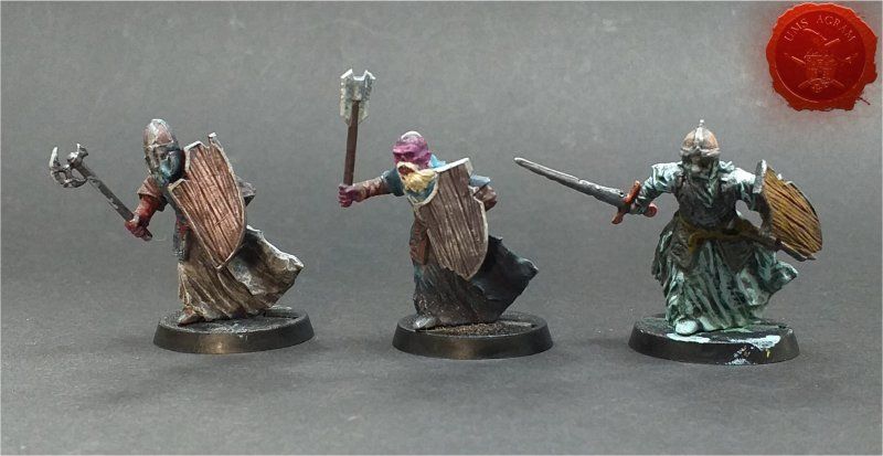
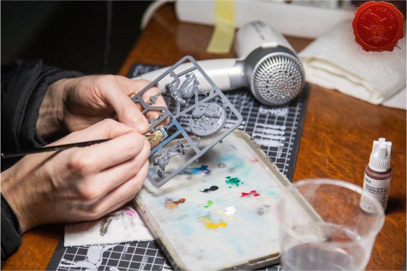
WEEKEND MINIATURE PAINTING WORKSHOPS
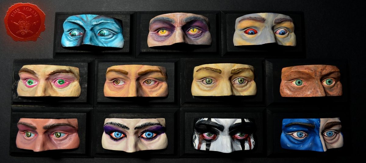
During the weekend of 03.05-03.06. MINIATURE PAINTING WORKSHOP – Eye coloring. was held.
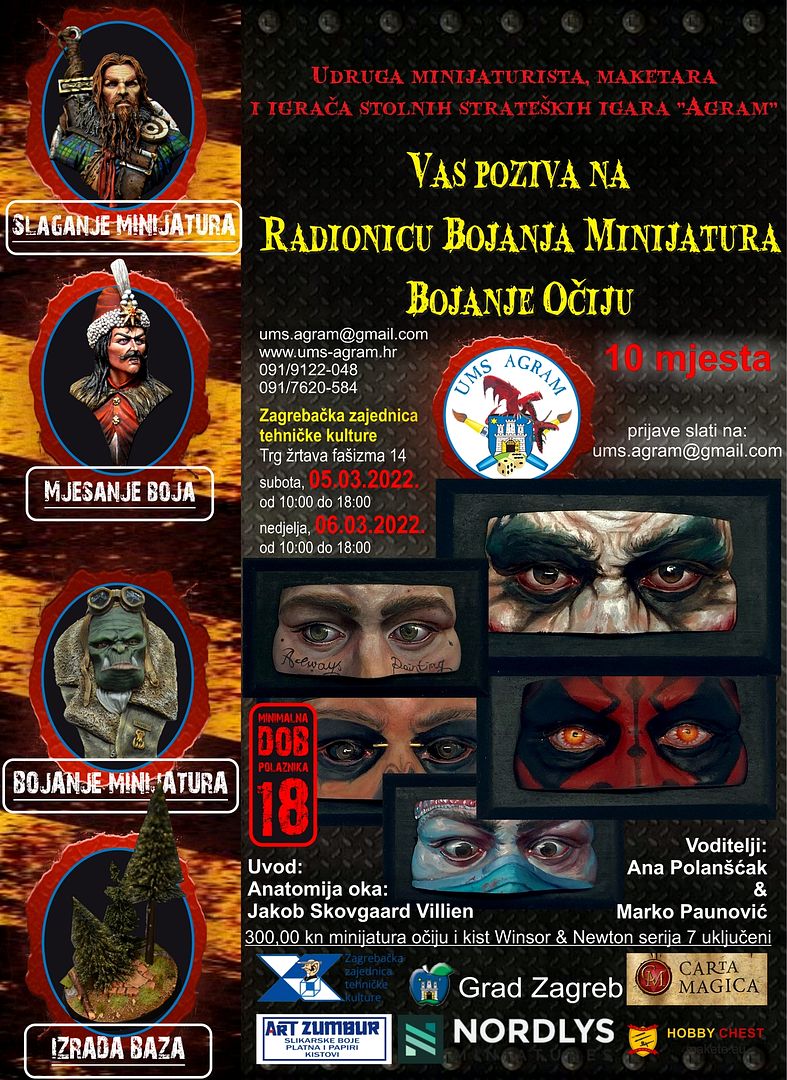
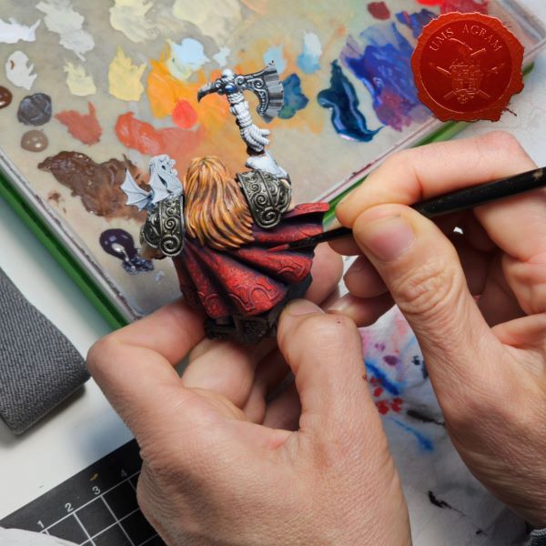
The workshop was held over two days (the whole weekend) and the participants painted a "bust" of eyes from the company Nordlys Miniatures. The main focus of these lectures was coloring the eyes, gaze and parts of the face around the eyes. Guided by this, the presenters chose a suitable miniature that all participants will color. As part of the workshop, acrylic paints and oil effects were used. The lectures were adapted so that the presenters would devote equal time to all participants. This time, each participant explored various effects at his own discretion through his coloring. Whether he wants to use the effects of OSL, tattoos, makeup or anything else is up to the participant.
First, the lecturer sits at his desk and explains and demonstrates a single "common" step in painting a miniature/model on his copy. His work is shown on a screen through a camera and projector, which the participants listen to, look at, and ask questions about. Afterwards, the participants sit at their desks and apply the acquired knowledge. When any student has a question, he asks it and the whole group together with the lecturers looks for an answer to it. The workshop will include the following thematic units:
1. Anatomy of the eye - theoretical presentation by Jakob Skovgaard Villien, author of the miniature
2. Face painting
3. Eye coloring
4. Special effects (OSL, tattoos, makeup...)
The association provided all the necessary materials and tools, lighting, scalpels, PVA and superglue, brushes of different sizes and one set of paints.
The following epidemiological measures were carried out:
Correct wearing of masks was mandatory. Disinfectant was available to everyone, and the space was ventilated. A camera and a projection screen were used to show the lecturer's work to all participants without the need for them to gather around the lecturer, which enables social distance. Each participant had his own table, which was separated by the prescribed distance.
During the weekend of May 21-22, 2022. Workshop on making vignettes and bases for dioramas was held. The participants had the opportunity to familiarize themselves with the materials and tools for making dioramas and, after acquiring the theoretical knowledge, apply the same in a practical example.
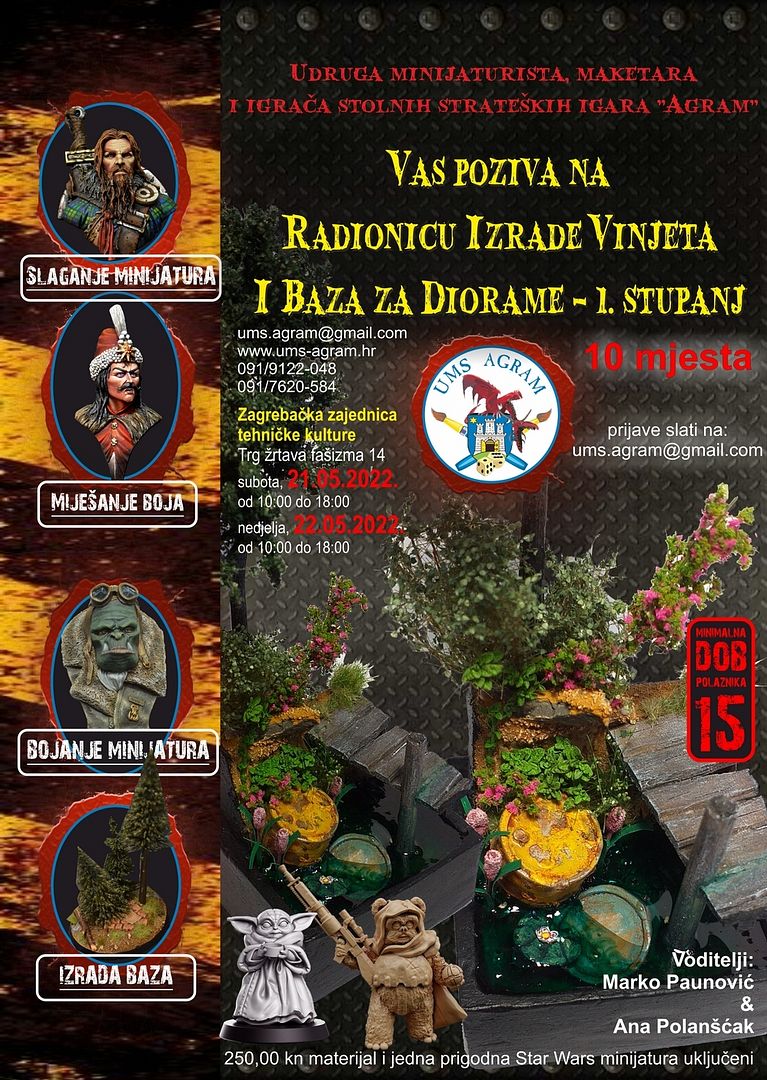
The workshop included the following techniques and ways of making scene bases:
- making a plaster diorama base
- production of disposable molds for plaster casting
- creation of the stage base of the vignette located next to the water (stand)
- painting of the metal barrel and "weathering"
- painting of wooden moth and "weathering"
- texturing
- painting the stage base
- adding vegetation
- addition of UV resin
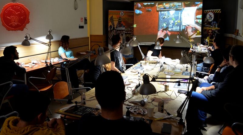
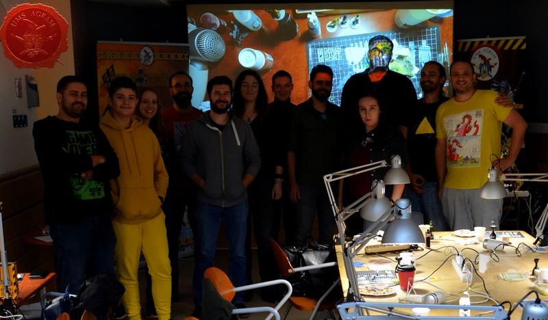
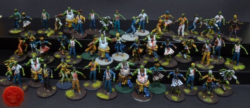
The Miniature painting workshop - ZOMBICIDE lasted two days (the whole weekend) and the participants colored zombie figures from the board game Zombicide. The focus of these lectures was coloring miniatures from boardgames, but the knowledge from the workshop is equally applicable to coloring armies for tabletop games and a collection of figures for pen&paper rpgs. The workshop presented paints and accessories, preparation of figures, several techniques for painting miniatures from basic to more advanced, and techniques and tricks for quickly and efficiently painting large quantities of figures at once. As part of the workshop, water-based acrylic paints were used. The lectures were adapted so that the leader devoted equal time to all participants and could adapt to all categories of miniaturists (from beginners to slightly advanced).
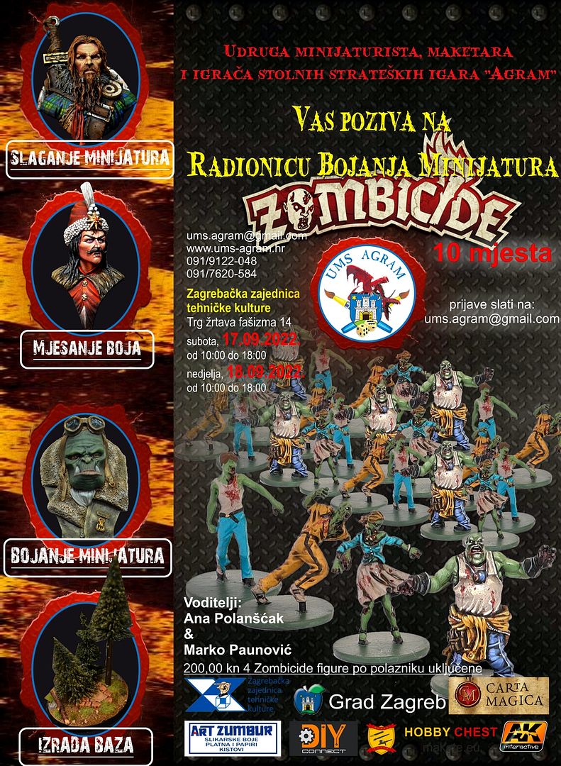
The workshop included the following thematic units:
1. Planning and preparation
2. Basic colors
3. Shading and highlighting techniques
4. Batch Painting
5. Subsequent raising of the finished paintjob to a higher level
MINIATURE PAINTERS CROATIA – FB group
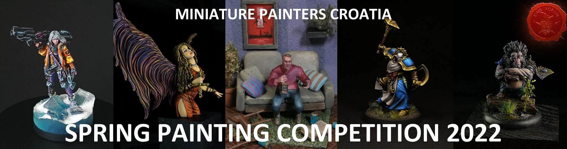
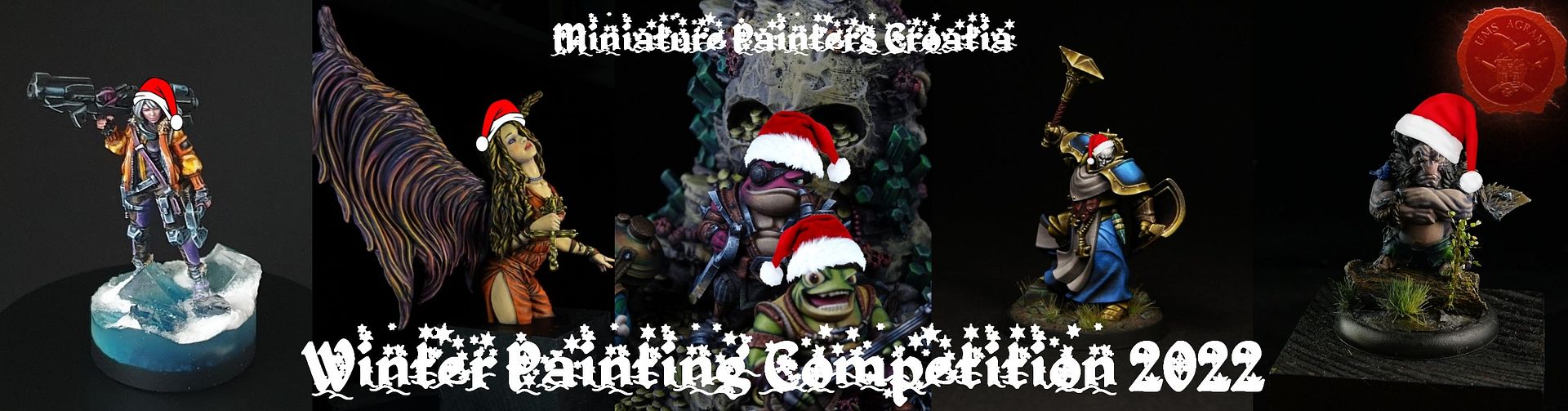
On our FB group Miniature Painters Croatia, we organized two online miniature painting competitions: Summer Painting Competition and Winter Painting Competition.
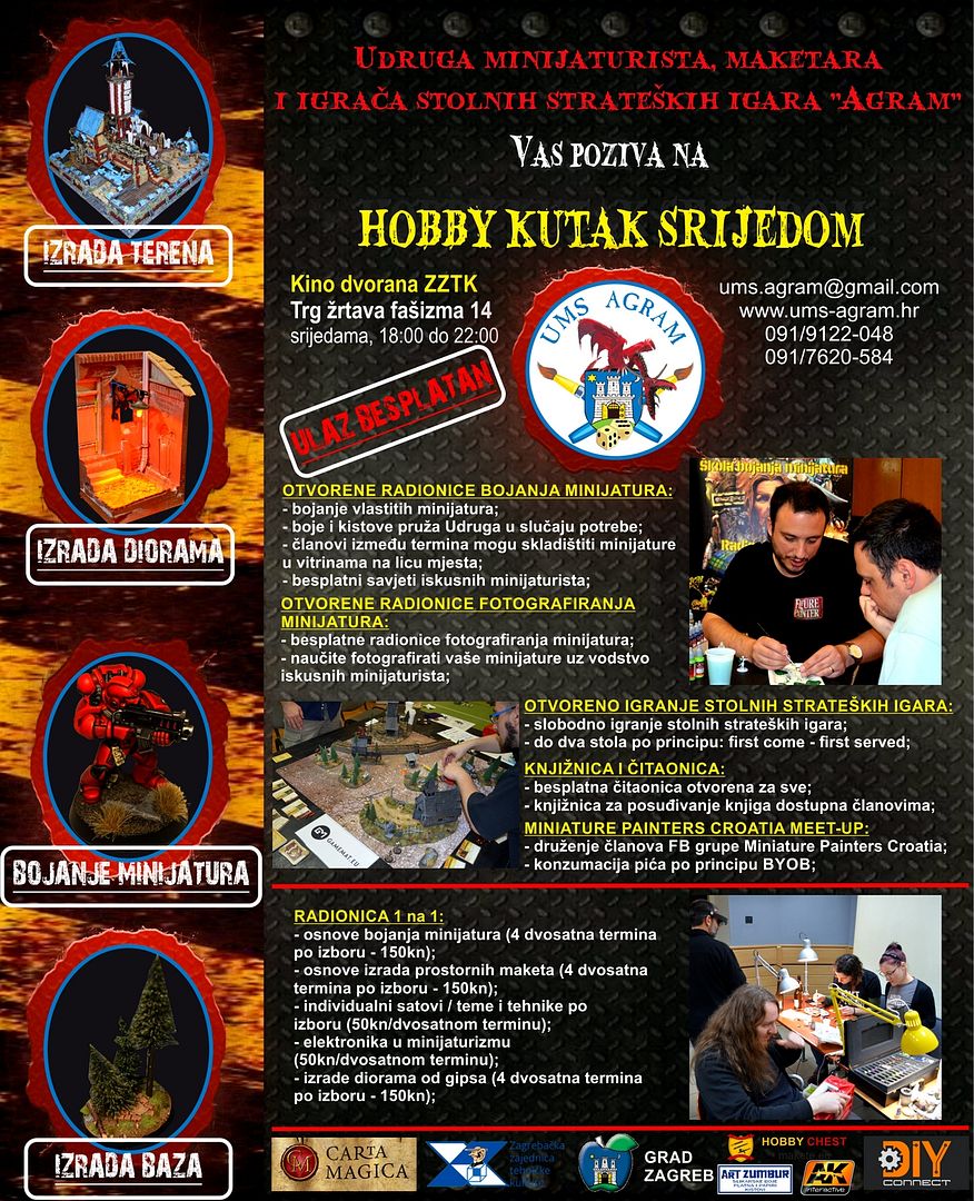
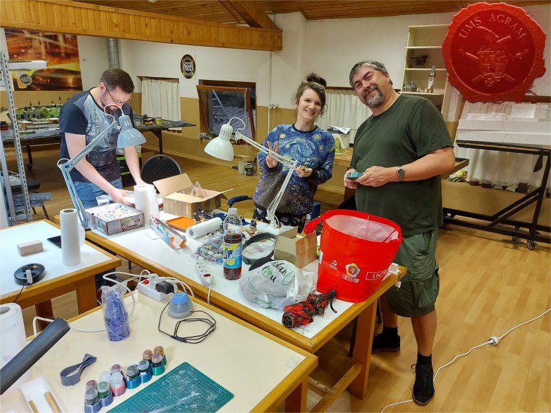
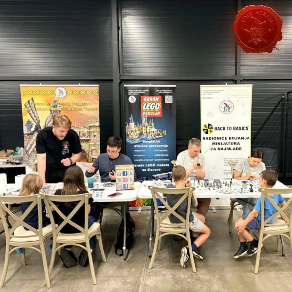
HOBBY CORNER ON WEDNESDAYS
Hobby Corner on Wednesdays is designed as a sum of free activities in the space used by UMS "Agram" on Wednesday evenings. Most activities are open to everyone, with some benefits for UMS "Agram" members, such as storing miniatures in display cases between appointments or borrowing books from our rich Library. All activities were available in each term to the extent permitted by the current epidemiological situation.
Radionica 1 na 1
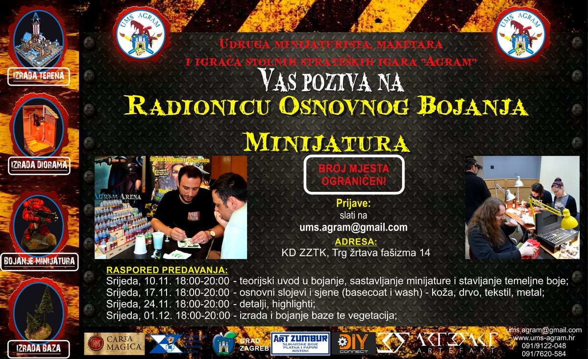
For everyone who wanted to learn how to paint miniatures in structured and carefully designed workshops, as part of the Hobby corner, we organized One-on-One Workshops. The One on One workshop has several modules designed to introduce beginners to every aspect of this hobby as soon as possible, but also to enable more experienced miniaturists to learn/practice more advanced techniques by agreement with the leaders. Work program: 1st term - introduction to paints, glues and brushes, assembling a miniature and base color 2nd term - basic layers and shadows (basecoat and wash): leather, textile, metal, wood 3rd term - details and highlights 4. term - making and painting the base and vegetation.
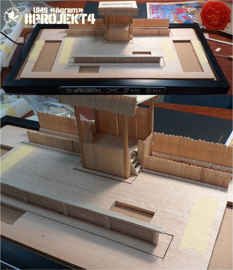
AGRAM GROUP BUILD
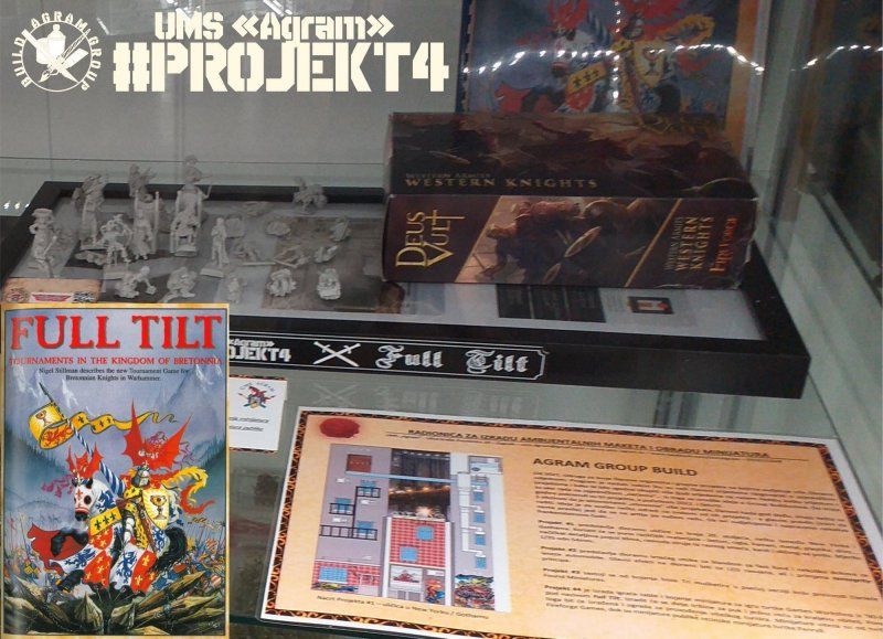
As part of this UMS "Agram" project called Agram Group Build, which was created after Goran, Kruno and Marko discussed joint projects on Wednesdays and how it would be cool to gather more people on Wednesdays to work on something together. From this, the idea of Group Builds was born. In 2022, the creation of a diorama / game board for the companion game Full Tilt from the 90s was launched.
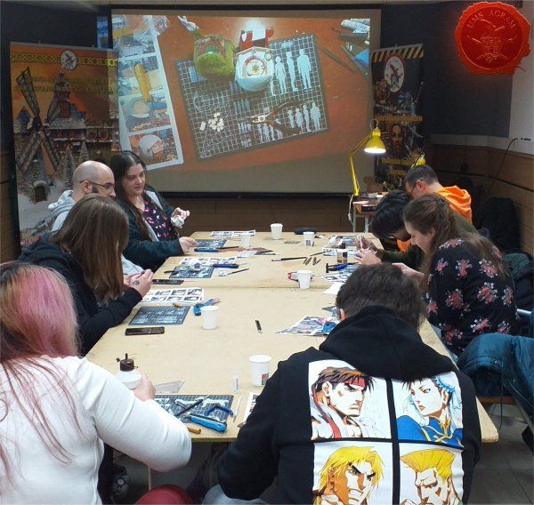
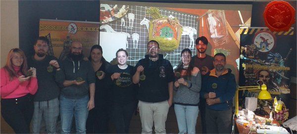
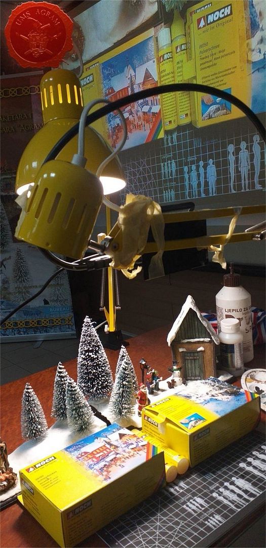
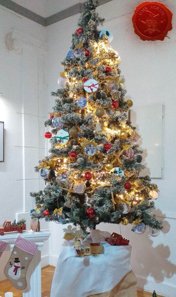
ADVENT IN AGRAM
During October, November and December, we organized a program called Advent in Agram, which consisted of two interactive workshops for making spatial models during October and November and shorter demonstration workshops during December. Interactive workshops mean that the participants make their own models according to the instructions and under the supervision of the leader. No registration is required for the sample workshops in December, and they consist of a number of separate topics that deal with modeling methods, effects and materials related to the winter period, such as making snow, ice and the like, which the lecturer demonstrates in class.
OCTOBER - Winter/nativity scene making workshop
Content: during 4 sessions, the participants were introduced to the techniques, materials and tools in model making through the creation of their own winter scene/nursery, which they kept at the end of the workshop. 1st term - construction of the house and field 2nd term - painting the house and the field 3rd term - addition of vegetation and snow cover 4th term - painting miniatures for the scene.
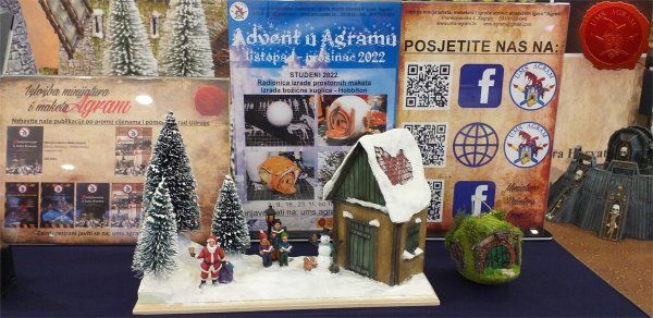
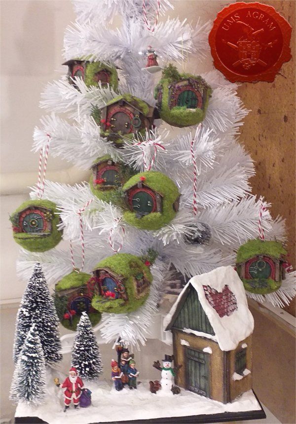
NOVEMBER - Workshop on making a christmas tree decoration in the shape of a hobbit hole
Content: during 4 sessions, the participants were introduced to the techniques, materials and tools in model making while making a pine ball in the shape of a hobbit hole, which the participants keep after finishing the workshop. 1st term - making and modeling the basic shapes of the house 2nd term - creation and addition of details 3rd term - coloring 4th term - addition of vegetation
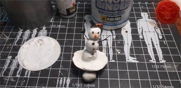
DECEMBER - sample workshops
The first sample workshop was about making snowmen.
Another sample workshop is about adding smoke and ice to miniatures and terrains.
For the end of Advent in Agram, 21.12.2022. starting at 6 p.m., we organized our FIGURES AND BITSEVA FLEA. Admission is free if you bring your own bits box. At the beginning of the Flea Market, we took the opportunity to award medals to the winners of our two online miniature painting contests.
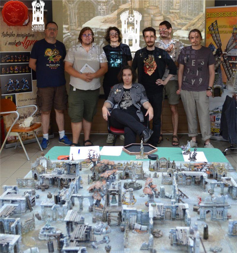
AGRAM ARENA SUMMER - SUNHOLD
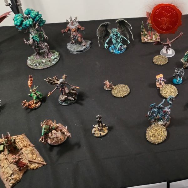
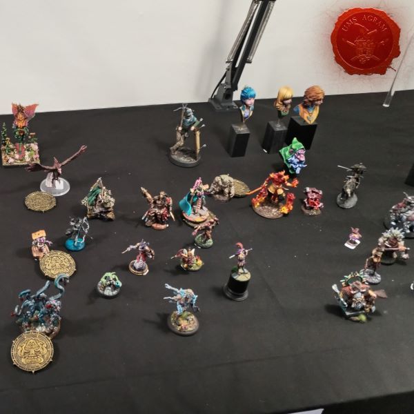
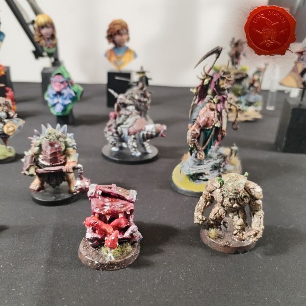
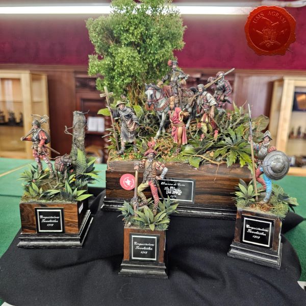
Sunhold: The First Triumvirate is an AoS28 hobbyist-tabletop-strategy event that was held on July 2, 2022 at UMS "Agram" in Zagreb. The event that was planned for the summer of 2020, after two years of postponement due to the pandemic, finally took place in our traditional Agram Arena Summer.
James (UK): “Sunhold was a fantastic experience and definitely worth the wait. Painting miniatures and seeing other people's models and terrain was a fantastic sight and made me proud to be a part of the "AoS28" community. Thanks to the organizers for an excellent series of games in a superb venue. I hope to see you again soon!”
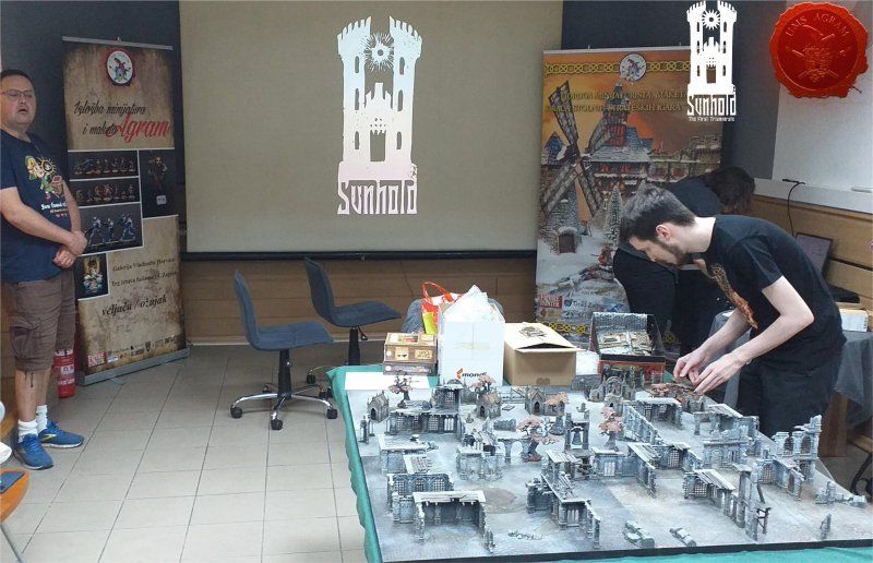
Each player took command of a small war company, which represented the groups that entered the city to fulfill their individual objectives. They can be part of a reclamation project and want to exterminate the enemies of humanity to make the city habitable again, or they can be a group of adventurers or bandits looking to loot the ruins and line their own pockets. Warbands can form alliances and cooperate, or betray and eliminate each other on their way through the ruins.
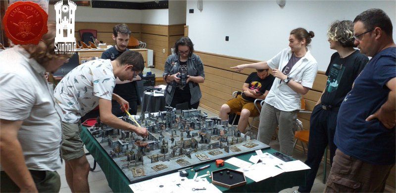
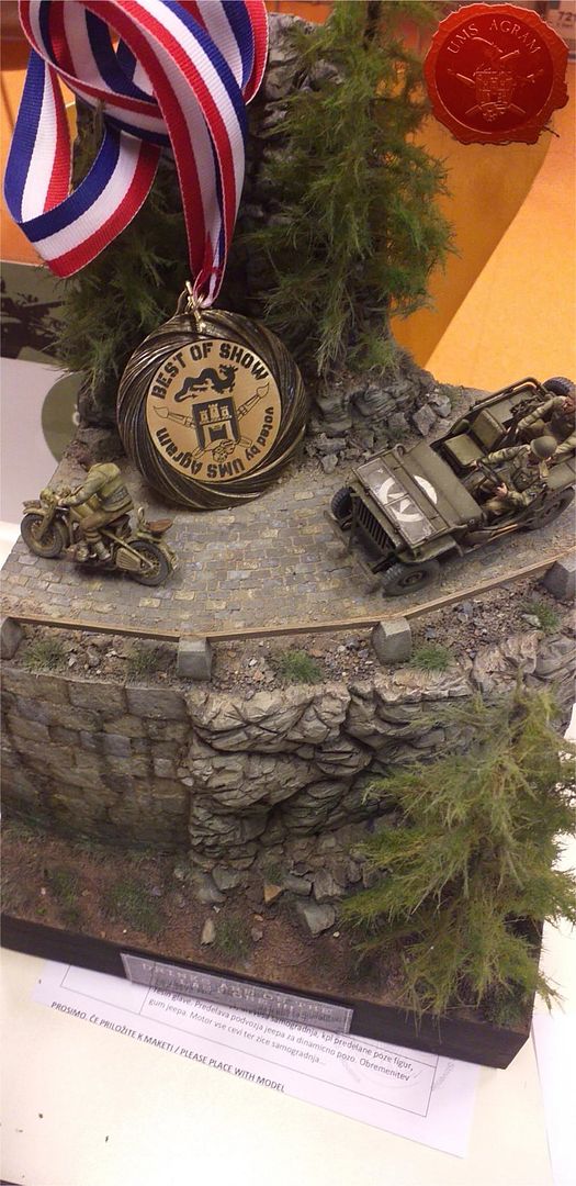
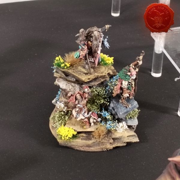
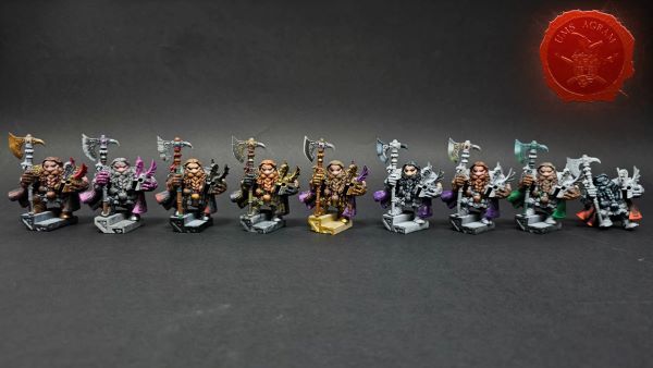
UMS “Agram” has a tradition of awarding the best painted models/armies at our events, which we couldn't miss at this visually stunning event. In the end, the prize went to Vladimir Matić-Kurijov from Serbia for his dwarfs, which he sculpted and painted himself.
VISITS TO EXHIBITIONS
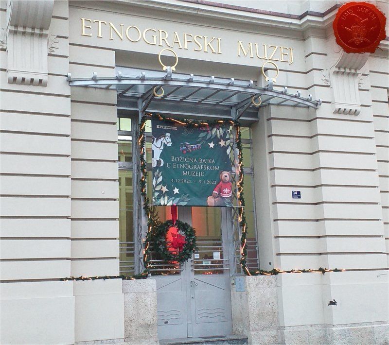
The first exhibition was A Christmas Fairy Tale in the Ethnographic Museum by Jasmine Kosanović. There we were greeted by white fairies that symbolize snowflakes and winter, little robins that represent the warmth of home on a winter's night, and a snow-covered forest with frozen animals peeking out from behind the pine branches.…
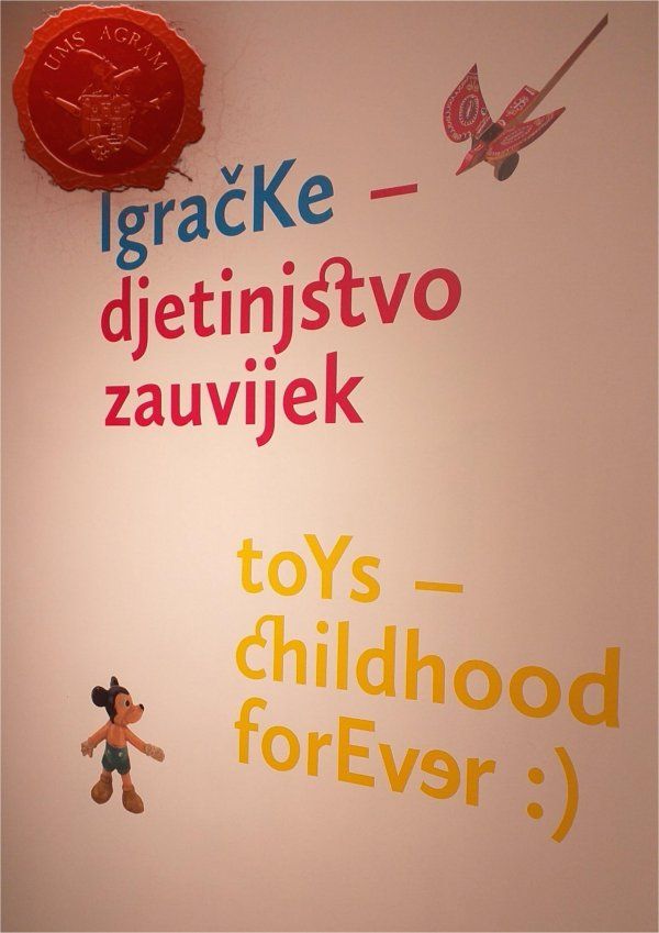
The second exhibition was also held in the Ethnographic Museum under the name Toys - childhood forever, which was conceived as a journey through the history of toys and games from the Ethnographic Museum's holdings, created in Croatia and by Croatian authors in the period from the end of the 19th century. until today. In addition to interactive content and oversized children's toys from Marija Bistrica, visitors can enjoy many favorite cartoons such as Professor Baltazar and Little Flying Bears, produced by Zagreb Film, which is also a project partner.
The Zagreb association Klub Kockice organized another in a series of interesting LEGO exhibitions. This time it was held in the Family Mall over the weekend of April 9-10, 2022.
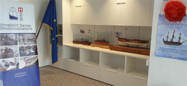
The Rijeka 2022 ship model exhibition, organized by the Croatian Association of Ship Model Makers and the Center for Technical Culture Rijeka, which was held this year from October 11 to 20 in the educational and exhibition space Kuća boati at Strossmayerova 13B in Rijeka, was also 27 the national ship model competition as well as the 14th Croatian evaluation exhibition of ship models.
Our Goran visited theExhibition of models, models and LEGO bricks, which took place in the Family Mall on November 12 and 13, 2022, organized by the Kockice Club.
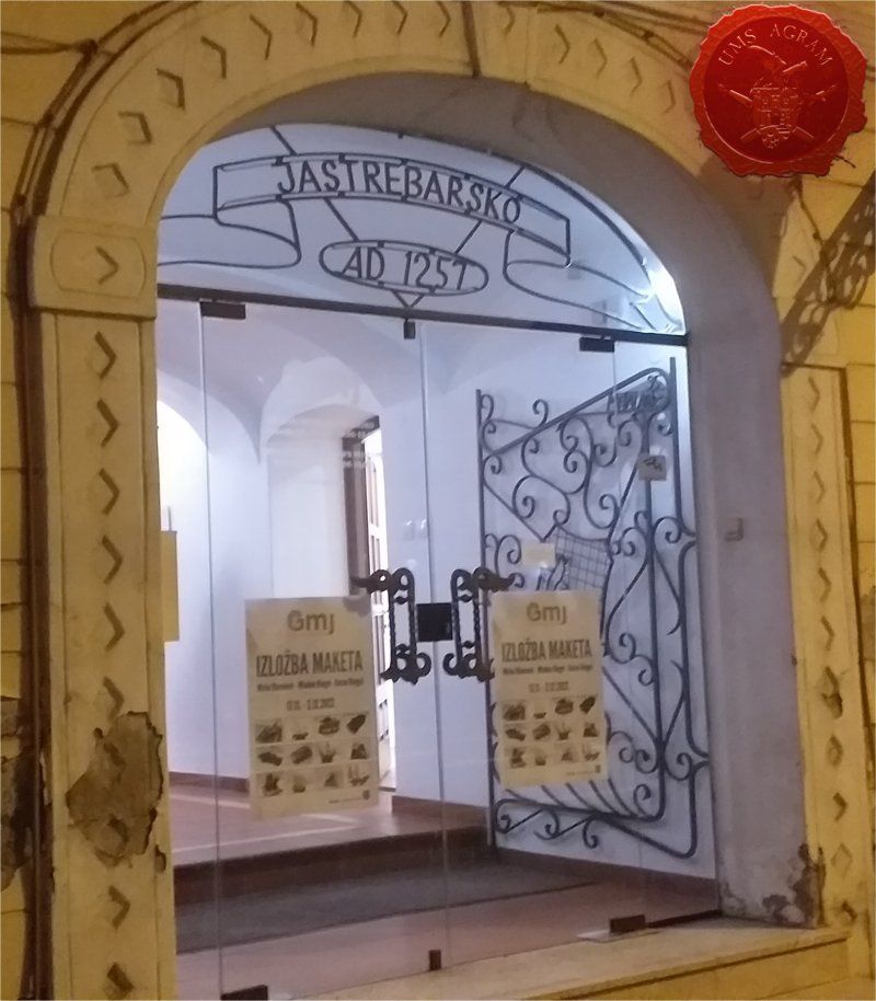
On Thursday, November 17, 2022. in the City Museum of Jastrebar, a ceremonial opening was held. Exhibition of models by Mirko Klemenić and Mladen and Goran Rengel. The exhibition was open from November 18, 2022. until 2.12.2022.
The official opening of the ZZTK Christmas exhibition took place on Tuesday, December 20, 2022. at 6:00 p.m. in the Vladimir Horvat Gallery at Trg žrtava fašizma 14. You can view the exhibition from December 20, 2022. (6:00 p.m.) until the end of the year (2022) every working day from 8:00 a.m. to 4:00 p.m.
PERFORMANCES OF OUR MEMBERS AT COMPETITIONS, CONVENTIONS, EXHIBITIONS AND OTHER EVENTS
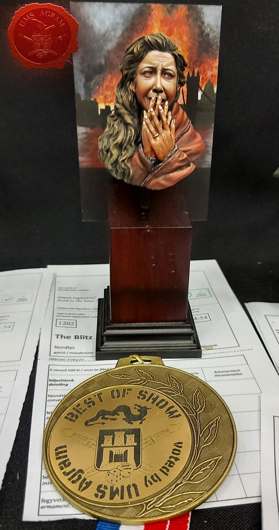
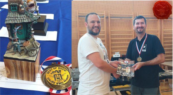
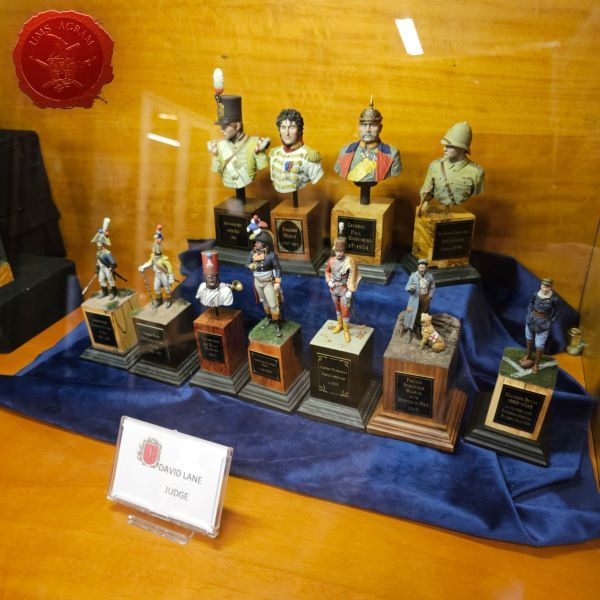
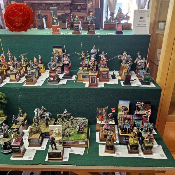
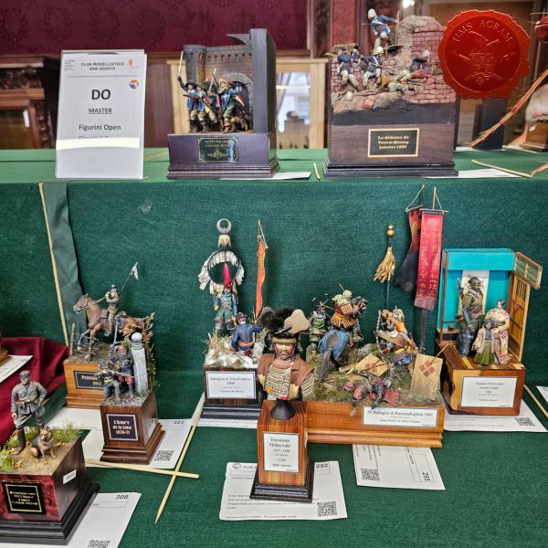
From 22.-24.4. we visited Mosonshow in Hungary, the largest model competition in the region. We awarded the Best of Show by UMS Agram award to Mr. Roberto Del Cima because of his extraordinarily devoted bust of a mother in a war environment, which at the time of the competition has great weight and meaning.
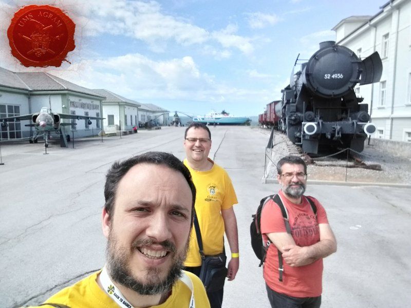
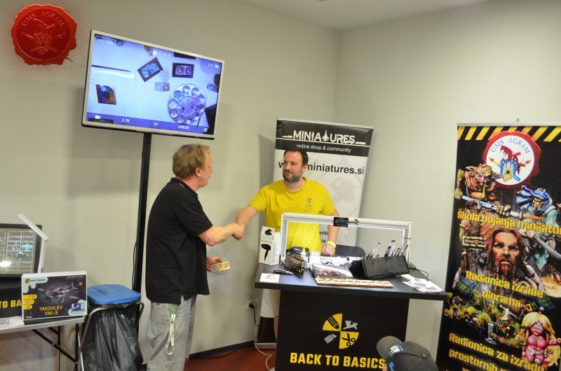
On Saturday 14.5. we visited the international model-making competition 14th Festival Svet V Malem - Pivka 2022. As part of the competition, our Marko also held a two-hour miniature painting workshop at the booth of the Slovenian company Miniatures.si. At the end of the workshop, our members chose the BEST OF SHOW by UMS AGRAM award and presented it to our Italian friend Mr. Pietro Todaro.
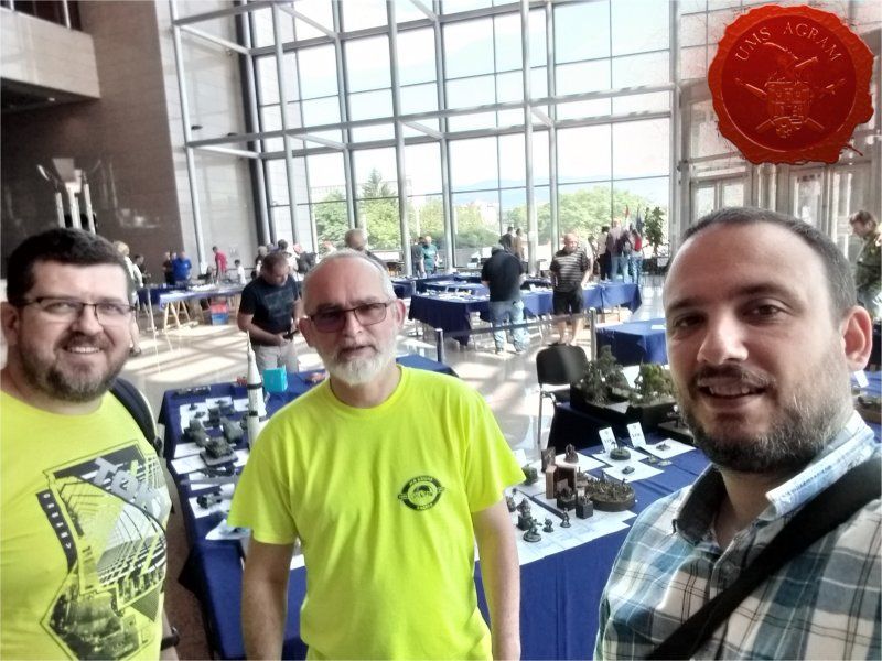
On Saturday 11.6. members of UMS "Agram" visited the mock-up competition called Cup Zagreb 2022, which this year was held in the premises of the National and University Library.
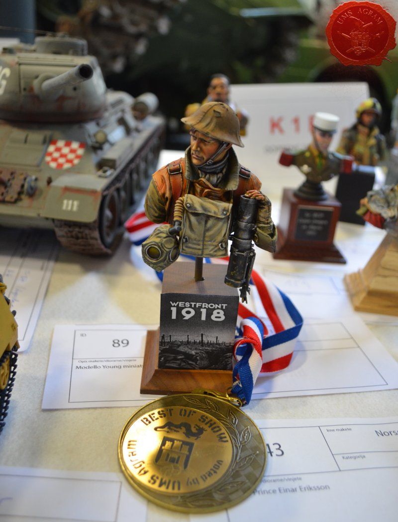
On Saturday 10.9.2022. organized by HUVM, the 17th Model Cup CK2021 was held in Oš Kajzerica in Zagreb. BEST OF SHOW selected by members of UMS Agram: Mr. Balasz Schuller.
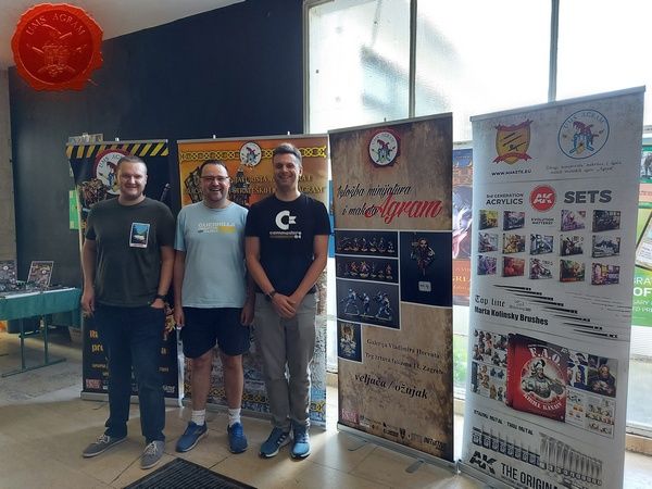
On the same Saturday, September 10, we were guests at the Zg Game Marathon 2022 , presenting the Association, future and current activities, and demonstrating Warhammer 40,000 with a series of impressive and very beautiful armies.
01.-02.10.2022. our Goran had the honor to attend and learn something in Budapest, at a miniature painting workshop with Natalia Oracz, a professional miniature painter from Poland.
Under the auspices of the City of Zagreb, organized by the Zagreb Association of Technical Culture, on October 29, 2022, the XI Days of Technical Culture were held, where we presented our programs.
Lucca Comics&Games is one of the largest comics, games and fantasy fairs in Europe. It is harvested every year at the end of October in the Tuscan town of Lucca. Our Ana visited the fair as a guest of the Italian publisher of comics and games Hollow Press, which presented several new projects there; among others the boardgame Boneforest, for which I did the coloring and photography of demonstration figures.
On Saturday, 19.11.2022. National Championship of Slovenia in Plastic Modeling was held in Ljubljana. Our delegation performed in several categories and we all returned with medals. In total, we won 2 gold, 1 silver and 2 bronze medals. As always, our members chose the best work of our choice and this time we awarded Boštjan Rener for his fantastic diorama.
ARTICLES IN MINIATURISM
And finally, our most comprehensive program should be mentioned. The online publication of articles from miniatures and model making started in 2020 and 2021 continued in 2022 with over 60 published articles this year. We would like to thank all members for their efforts and efforts in making miniatures and models, but especially for taking the time to photograph work in progress and write articles for our site.
MEDIA APPEARANCES
Our members Goran and Domagoj were interviewed in the AFK Show of Game Hub TV. What it was like, you can check out on their YT cannal:
Latest articles
- We attended: Isle of Wonders 2026 Ili Said, 6th July 2026
- We attended: 13. Trofeo San Giusto 2026. Marko Paunović, 6th July 2026
- We attended: Zagreb Scale Model Show 2026 Mario Grgurev, 6th July 2026
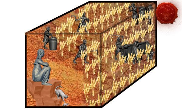
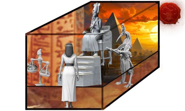
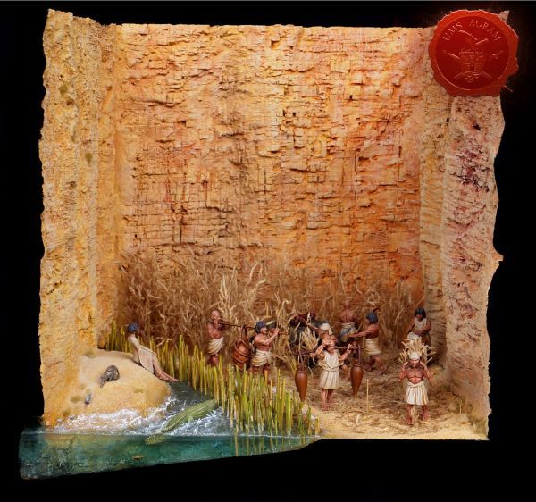
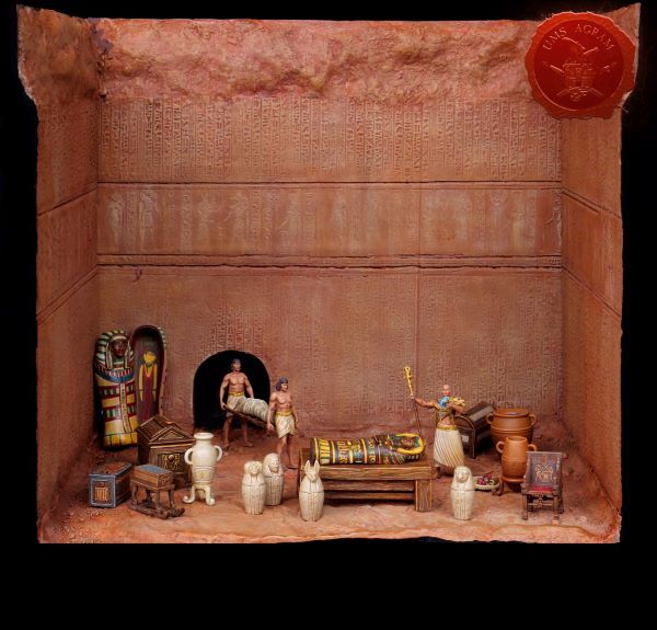
- Making of MUMMY dioramas Sebastian Søgård, 17th June 2026
- Miniature Painting Workshop - 75mm Dwarf Ivan Knezović, 26th May 2026


Latest battle-reports
- Kill Team - Blooded vs. Vespid Stingwings 28th February 2025, GW - Warhammer 40.000, and Antoni Pastuović (Imperial Guard)
- 22nd April 2022, GW - Warhammer 40.000, Borna Pleše (Space Marines) and Kristijan Kliska (Tau Empire)
- 17th November 2021, GW - Warhammer 40.000, and Nino Marasović (Space Marines)