Cities Of Death Gaming Table
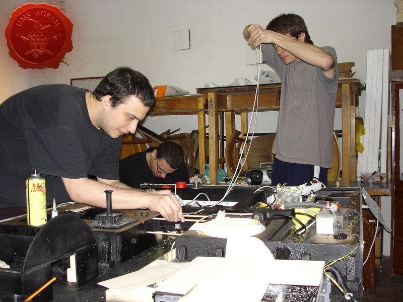
Project manager: Marko Paunović
''Special effects'' team:
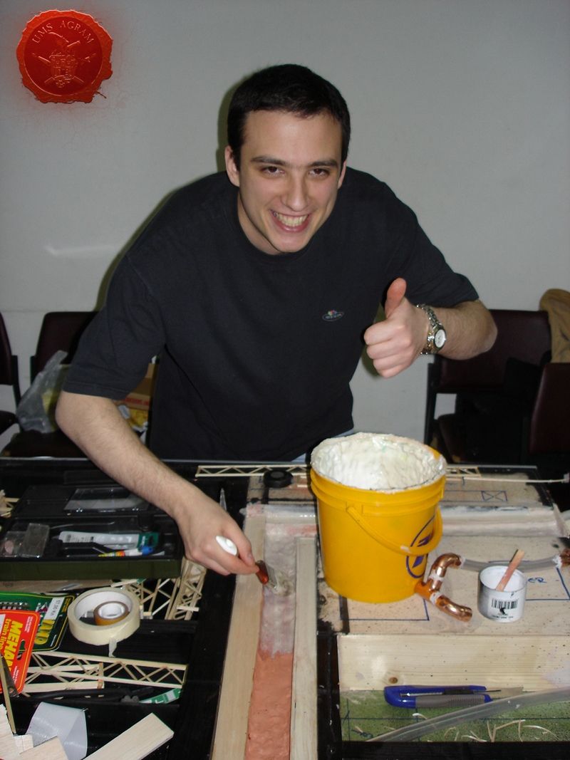
- Table design and water features (waterpump and fogger) engineered and made by: Marko Paunović (left)
- Electric/electronic components engineered and made by: Davor Bokun (right)
- Landing-pad and vents made by: Tomislav Petrović (far left)
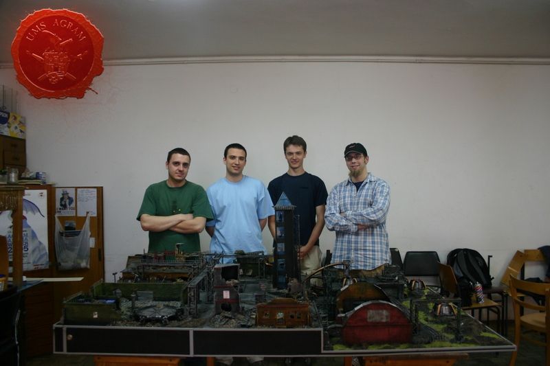
Crew: Andrija ''Walker'' Jurišić (foreman, far right in the picture) , Tomislav Rac, Ivan Kalazić, Goran Magdić, Filip ''The Dumbo'' Dumbović, Ante Majić, Domagoj Pribanić, Igor Iliovski, Ivan Kecerin
Photographs: Marko Paunović, Igor Hamzić and Borna Kržišnik
GW components used: Cities of Death sprues, Necron Destroyer, Predator, Sentinel, Shuttle from The Battle for McCragge, Steel Legion Lieutenant, Imperial Comissar, old Necromunda building parts and several left-over heavy weapons...
THE NEWS OF THE COMPETITION
A while back, in 2006 to be exact, our club recieved the news of a competition to build a gaming table for Warhammer 40.000 from our retailer Land of Magic (which was its name at that time, it's called Carta Magica these days), so we immediately started working on ideas to put on the table. First, we had a ''brainstorming'' meeting where we all suggested various ideas for items that should go onto the table. After the list of all possible ideas was made, we decided which ones to use.
These were the following: - flowing water through a canal, - a force field (made by laser pointers going through fog/mist made by a fogger), - various street lights (both blinking and normal), - a spinning radar, - a landing pad (with running lights), - some vents to be put in an industrial part of the city, - also to make this part of the city appear more industrial we decided to put in the railroad tracks
Next step was to make blueprints of the table in such a manner that no special effect interferes with another. It is of vital importance when dealing with projects of such a magnitude to delegate and divide the work apropriately. Good organisation is crucial as well as setting strict deadlines, and abiding by them.
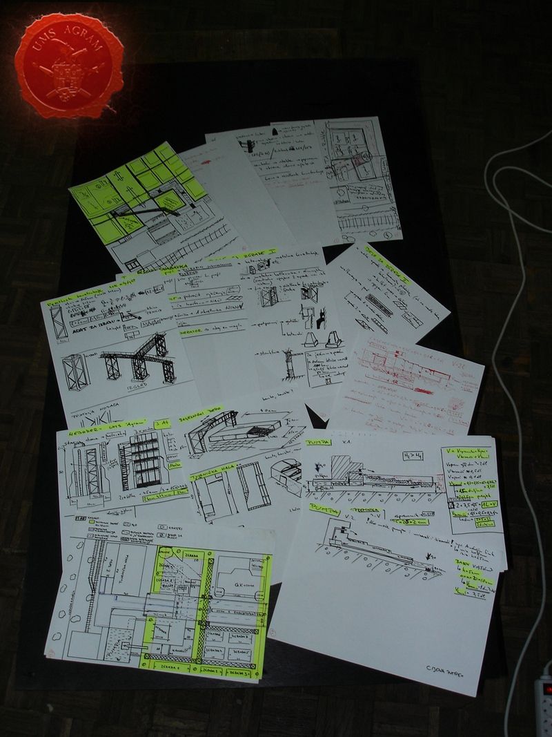
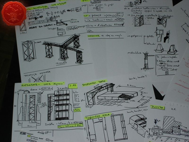
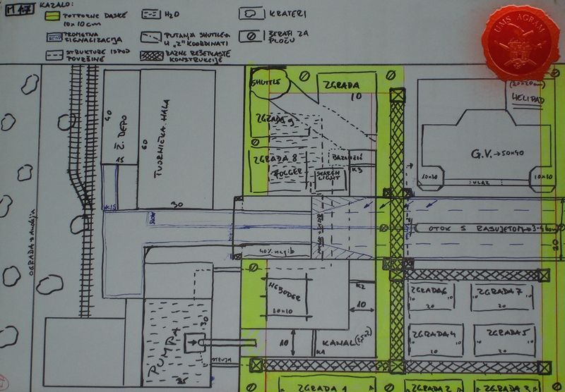
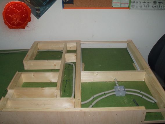
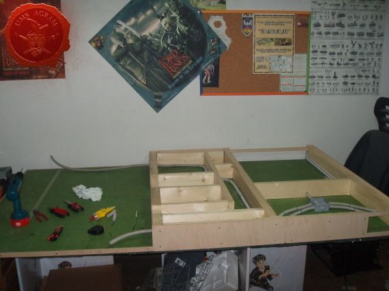
TABLE FRAME
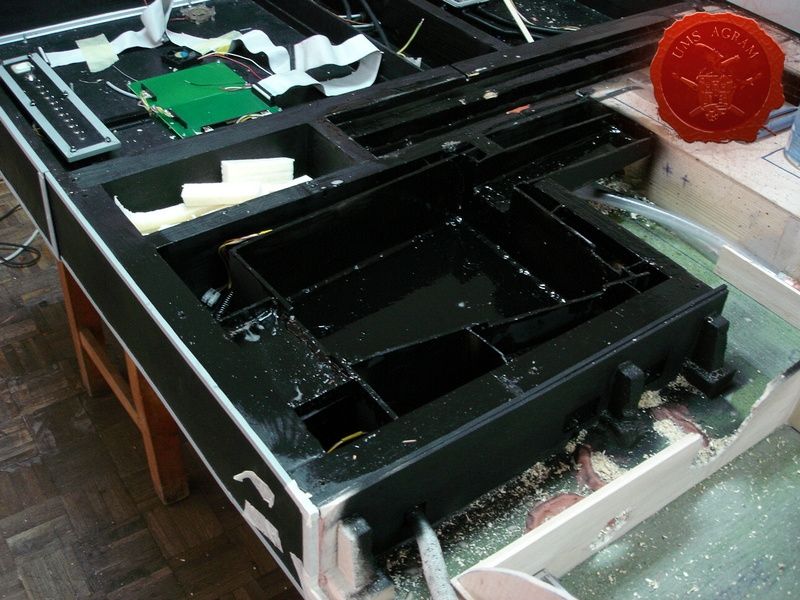
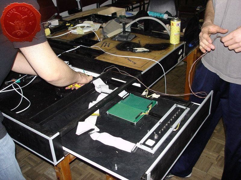
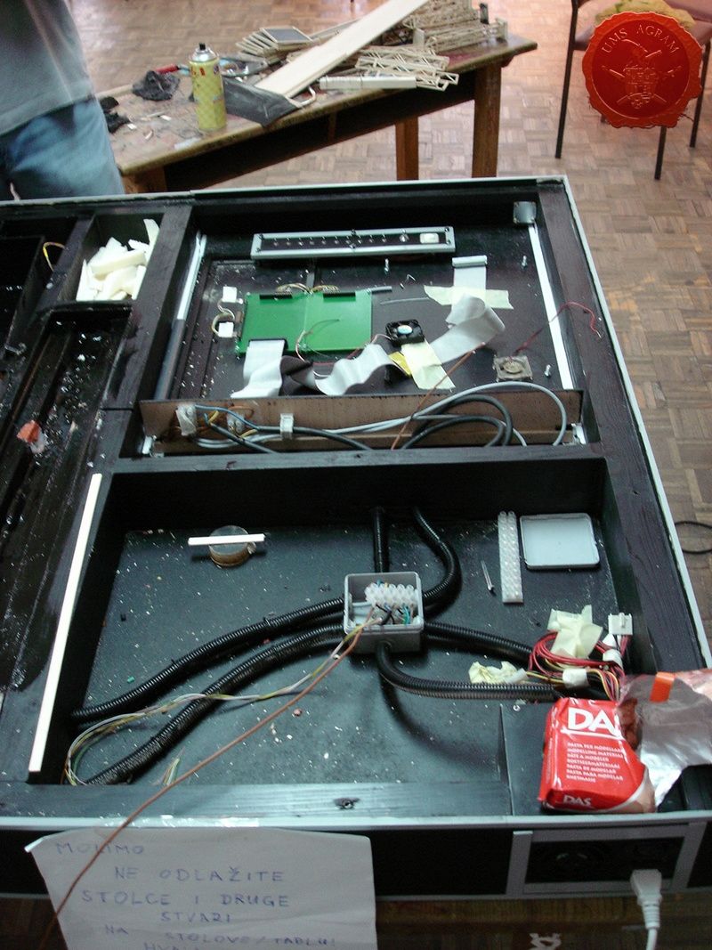
Because of all the extra features on our table we had to make at least one part of the table higher to store all the SF mumbo-jumbo inside (like the power source, electronic circuits, water pump and fogger along with two separate water tanks). To build this higher part of the frame we used 40 x 95 mm wooden planks for sturdiness and durability. The cover was made from 5 mm thick plywood that was screwed to the planks so it could be removed (if necessary). We also made a drawer where we put all the electronic circuits and switches for all of the special effects. We also left room for a canal through which the water will flow.
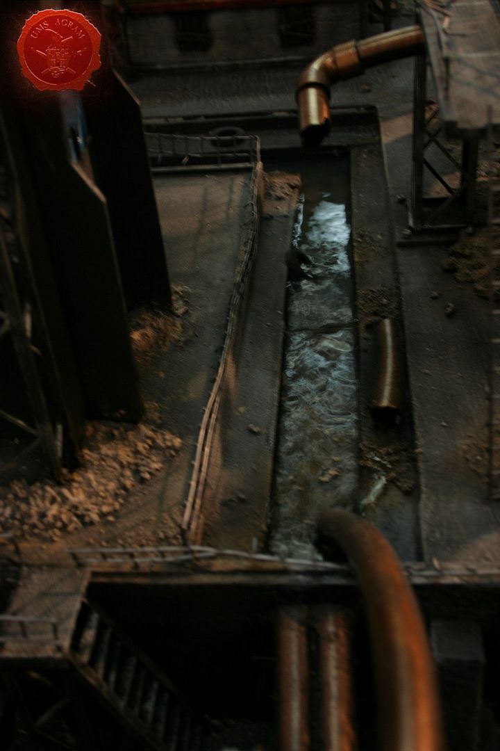
WATER FEATURES
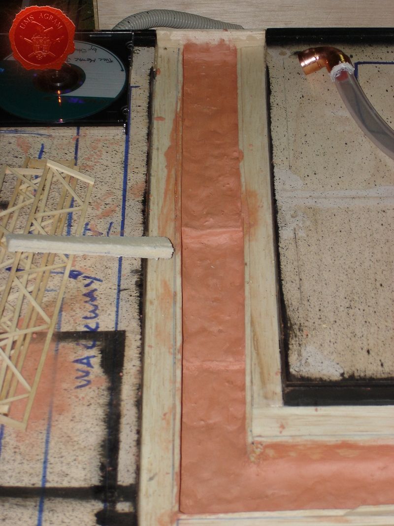
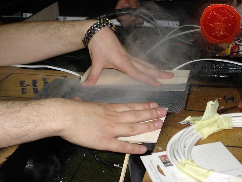
We decided to have two separate water features. One is a sewage canal coming from the factory. It consists of a water pump, hidden within the factory, a verical pipe that pumps the water into the canal. The water is dyed into green for even more repugnant effect. The other water feature is a fogger, a machine that converts water into fog and can be found in most stores dealing with lamps or garden decorations. The machine itself comes from a lamp that is made up of a bowl (that needs to be filled with water) inside which it is placed. We put the fogger underneath the city so the fog will appear to be rising from the sewers.
NOTE: When dealing with real water you must be carefull to insulate everything. Put lots of clear varnish over the terrain where the water will run. If there is even the smallest hole, water will find its way through.
IMPORTANT: It is really dangerous to put high voltage in or even near running water for obvious reasons so make sure that trained professionals do that part of the job. When you use lesser voltages (like 5V or 12V) such precautions are not necessary because of water's relatively low conductivity. This effect can be further reduced if you use distilled water whose conductivity is even lower than regular water's.
Water pump and canal
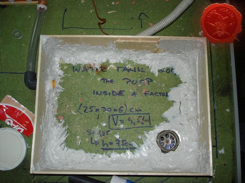
Fogger – Water tank and effect
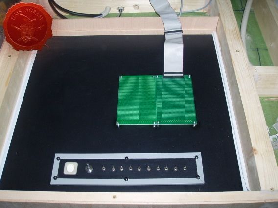
ELECTRONICS
We decided to use the AT power unit from an old PC. The output voltages from the device were everything we needed, 220V AC, 24V DC, 12V DC and 5V DC. We used 220V AC to power the waterpump, 24V DC to power the fogger, 12V DC for different vents and electronic circuits with flashing and running LEDs and 5V DC for normal LEDs and servos. When we decided to use all those special effects we didn't realise how time consumig the process would be. More than half of the time spent on this project was spent on either research or engineering of these effects. So bear that in mind. However, internet helped a lot because almost all the circuits used on this project can be easily found there. Although the process was made up of a lot of trial-and-errors to make one circuit work we never wavered and it finally payed off.
IMPORTANT: Always have the device plugged out before you start working on electrical and electronic components!
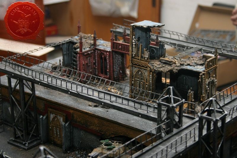
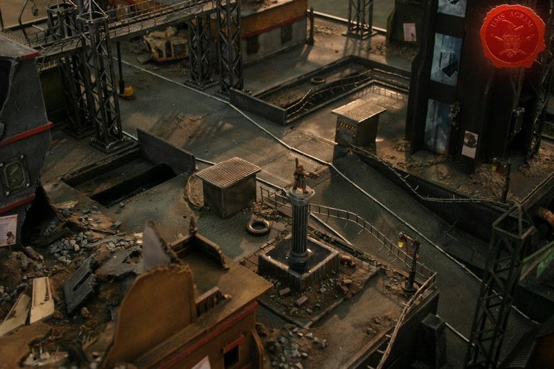
TERRAIN FEATURES
Skyscraper
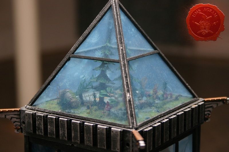
The skscraper itself is 70cm high. The base and the walls of the skyscraper were built from balsa wood while the windows were made form PVC see-through sheets cut into shape. When the inside of the tower was painted the side walls (PVC) were glued. Once everything was dry we cut holes in the windows and painted the rubble after which we added PVC bits as the broken glass. On the roof of the tower a small greenhouse was made to give a bit of life in the grim world of the City od Death...
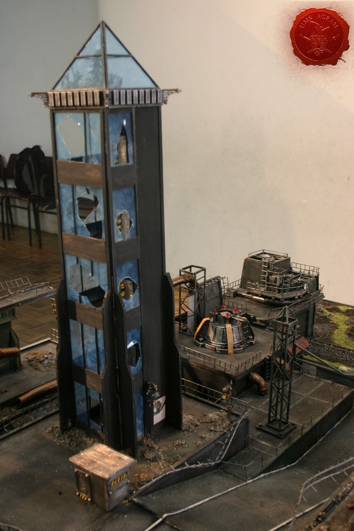
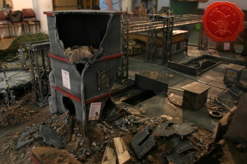
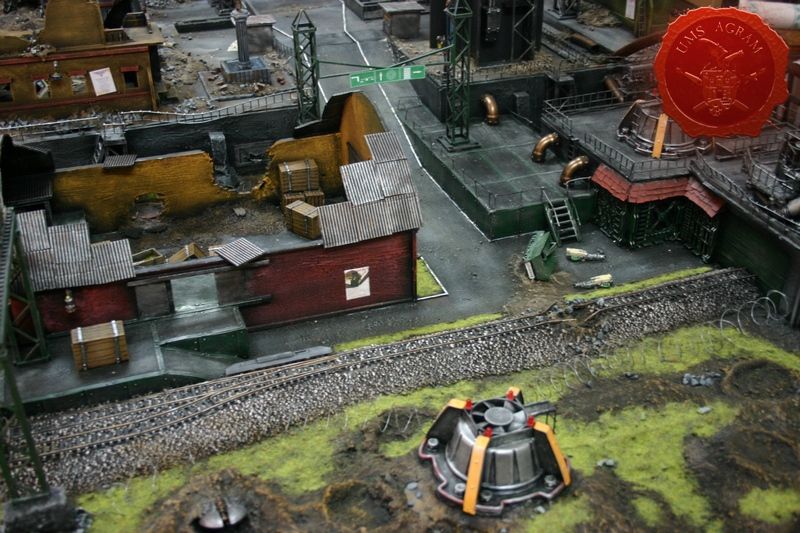
Factory
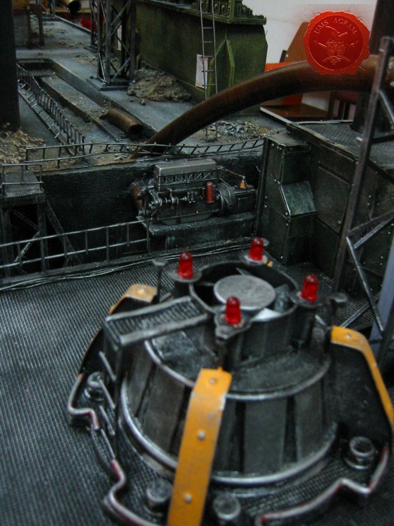
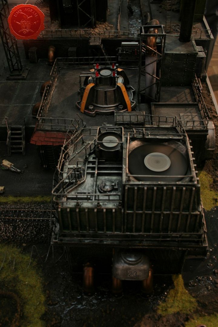
The practical purpose for factory was to house the water tank and the pump. The building itself was built around the tank with one part of the roof built in such a way so it can easily be lifted for the water to be poured inside. Note the special engine that came from an old model car in scale 1:16. After the building itself was finished, some vents (which actually rotate and the LEDs beside them light up gradually and then dim also gradually) were placed on top and around it, just to give it a more industrial feel. There is one basin filled with resin as well as a significant ''chemical'' spillage in the place where the pipelines go underground which is also made from resin.
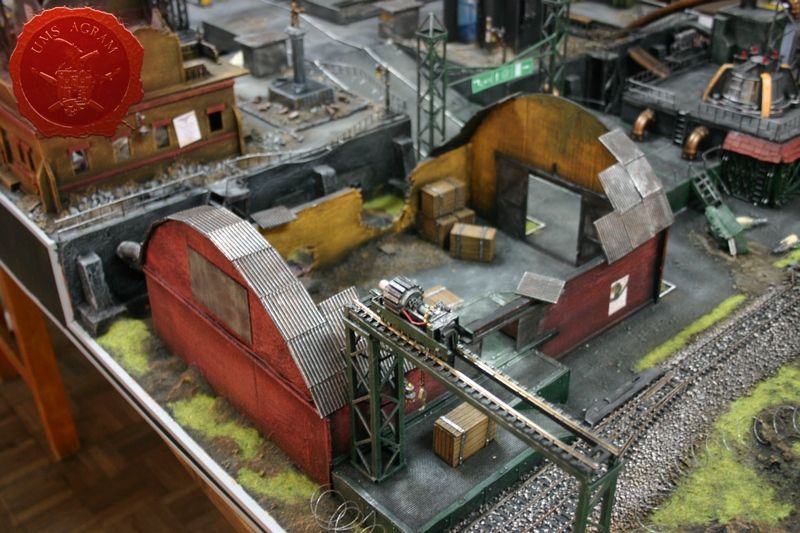
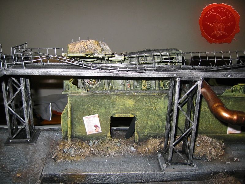
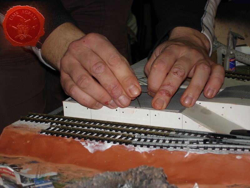
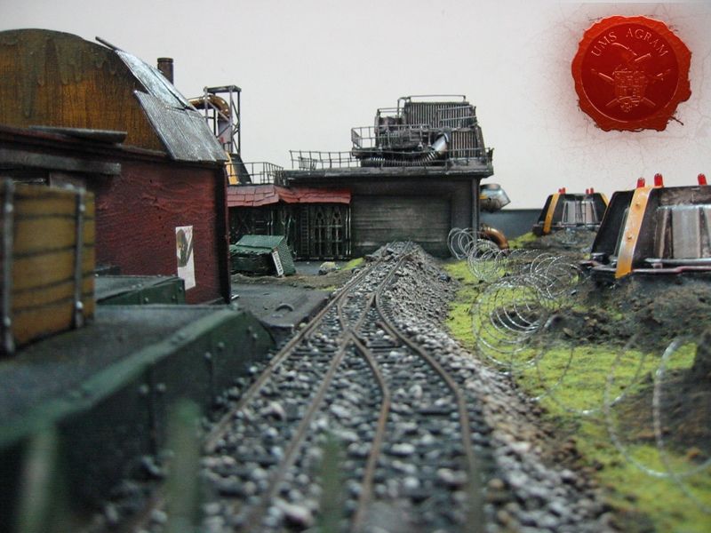
Warehouse and the railroad
To continue with the industrial feel of that part of the table we put some HO railroad tracks coming out of the factory and running all across the table. On the other side of the railroad tracks there is a loading terminal connected to a warehouse. The loads can be lifted from the carts onto the plateau with a crane which is also moveable. There is also a couple of LEDs which serve as street lights and one LED in the foreman's cabin inside the warehouse. The roof of the cabin can be lifted so you can play inside.
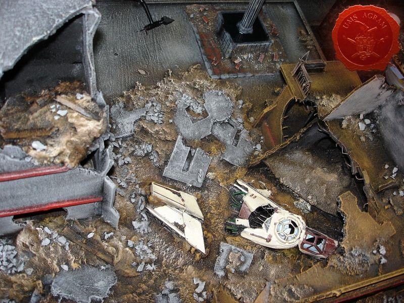
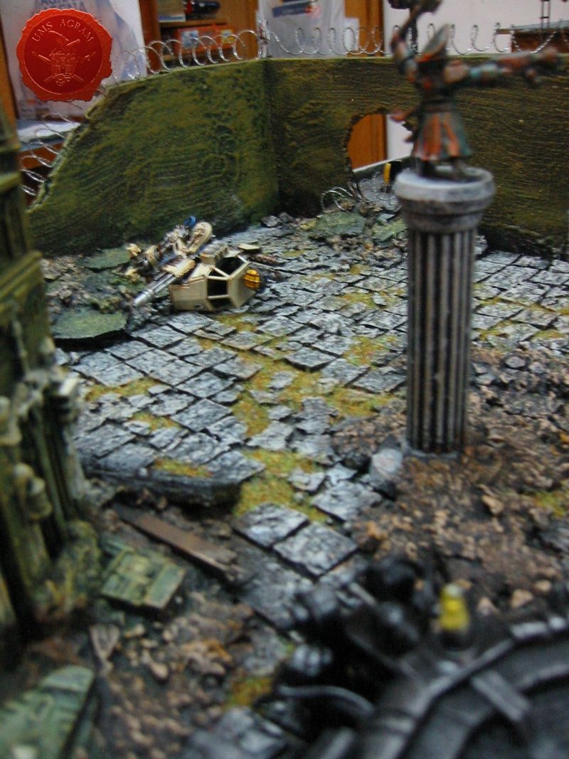
Houses with the McCragge shuttle
Moving along the table, we now come to the raised part of the table. On one side there are a couple of ruined houses and a statue. Houses were made from balsa wood and decorated by some bits from the Cities of Death sprues. The great thing about those bits is that they can be easily interchanged and also added to other materials used to build structures like balsa wood. Among the houses we placed the shot down shuttle from the Battle for McCragge box set. We made sure that the flight path goes through at least one building where it hits and deflects from the path to the left. Underneath those houses the before mentioned water tank with the fogger is concealed. We left holes under the shuttle for the fog to pass so it appears as if the shuttle just crashed.
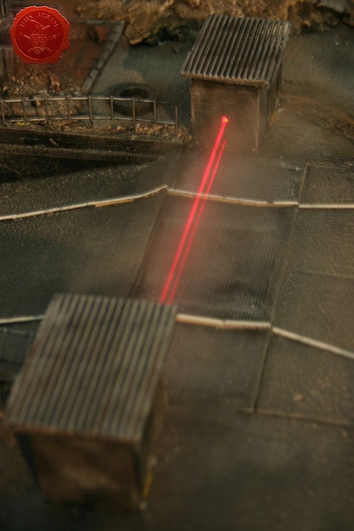
Turrets
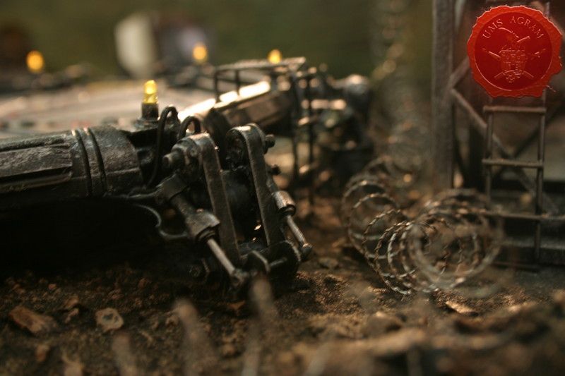
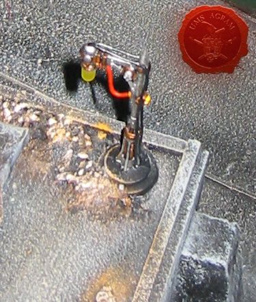
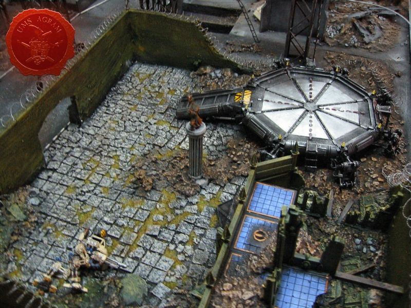
The design of the turrets was taken from Forge World. They are octagonal, two-storey concrete buildings with three firing slots per storey built exclusively from balsa wood. One of them also houses a servo motor which operates the searchlight on top of the turret. In it there are also three laser diodes which point across the street to the other turret creating a force field. Of course, untill you put your model in front of the laser beam you can not see it. And that is where the fogger comes into play! We built a small canal underneath the street where the fogger makes the fog. The fog is then lifted by a small concealed vent into the air right into the path of the laser beams, making them visible!
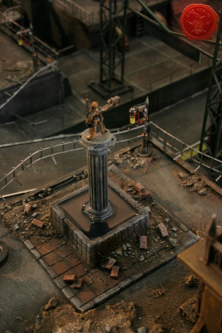
Statues and posters
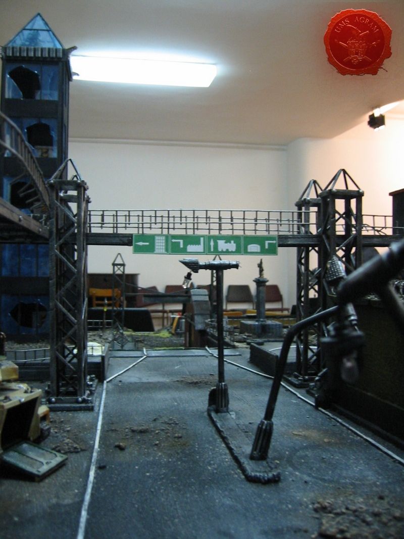
To add a bit of personal touch and to make the city seem more ''Imperial'' we added some statues, namely one of a Steel Legion Lieutenant and one of a Comissar. Those really lift the entire table. What we also added to the buildings is some posters. But that was not enough for us. We asked ourselves what else do you find in a city? The answer was so obvious that we didn't see it for quite a while... Road signs! So we drew them on a PC, printed and glued them in logical places (on a walkway above the road).
Sentinel and the Predator
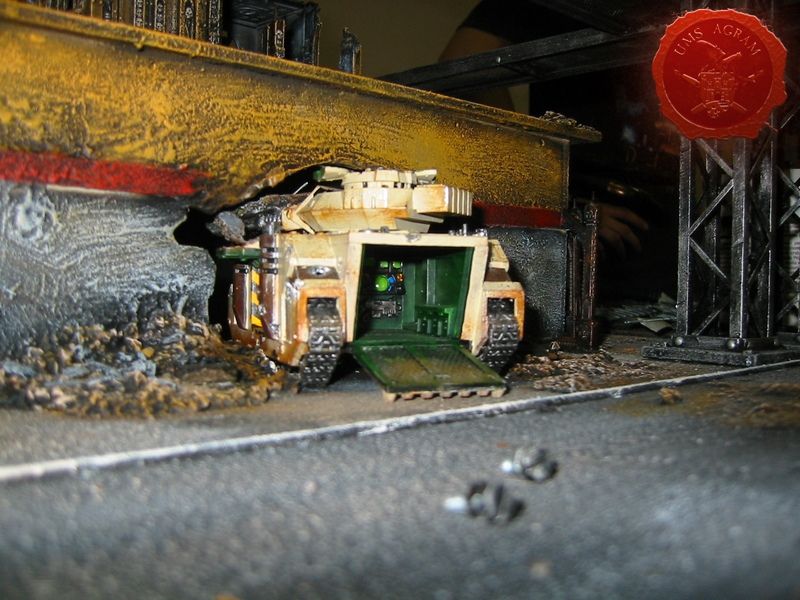
What kind of a battle torn city this would be if it didn't have any casualties? Therefore we sacrifised one Imperial Sentinel (slightly converted) and a Predator. The Predator was placed partly inside a building which collapsed around it. Extra care was taken in painting the interior of the Predator, and the back hatch is left moveable so you can actually hide your models inside!
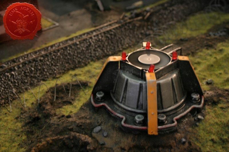
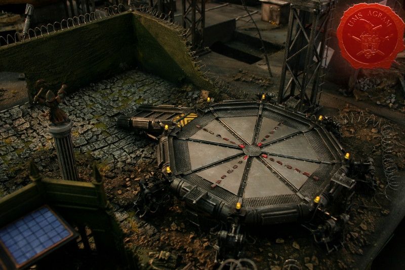
Landing pad
Our landing pad also draws its idea from Forge World's one with the octagonal design. It was hand-made from scratch. Each of the six legs has 51 separate parts! It has 8 yellow LEDs and 4 times 7 red LEDs that have their own circuit which makes them apear as if running to the middle of the pad.
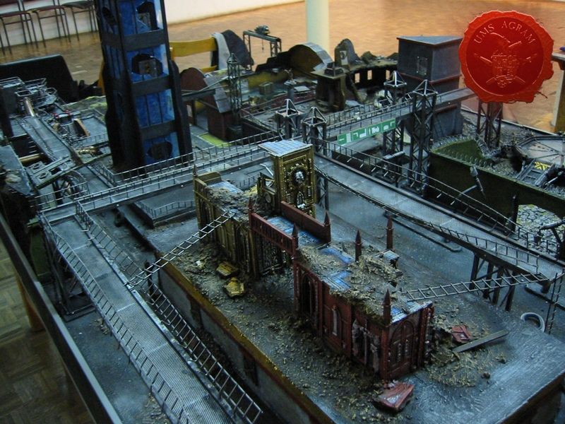
Cities of Death buildings
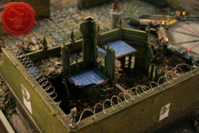
And finally we come to the Cities of Death buildings. We made three large buildings. One is a part of the factory exclusively made up of parts on the Manufactorium sprue. The other is a large complex that once served as a courthouse but is now a pile of rubble where the army moved in and made its HQ with a specially built landing pad and radar. This remnants of the courthouse were made of Sanctum Imperialis sprues. The third building was built from the Basilica Administratum sprues.
The great thing about Cities of Death sprues is its multiplicity. You can build as many different buildings as you like (or can afford). The painting is easy, even the beginners can paint it masterfully, just by using drybrush techniques in several shades. But the buildings really come alive if you add just a couple of details in another colour. Of course the parts are so intricate that you can easily spend a couple of hours painting and perfecting just one part of the building. It all depends on how much time and effort you are willing to put in.
EXTRA DETAILS
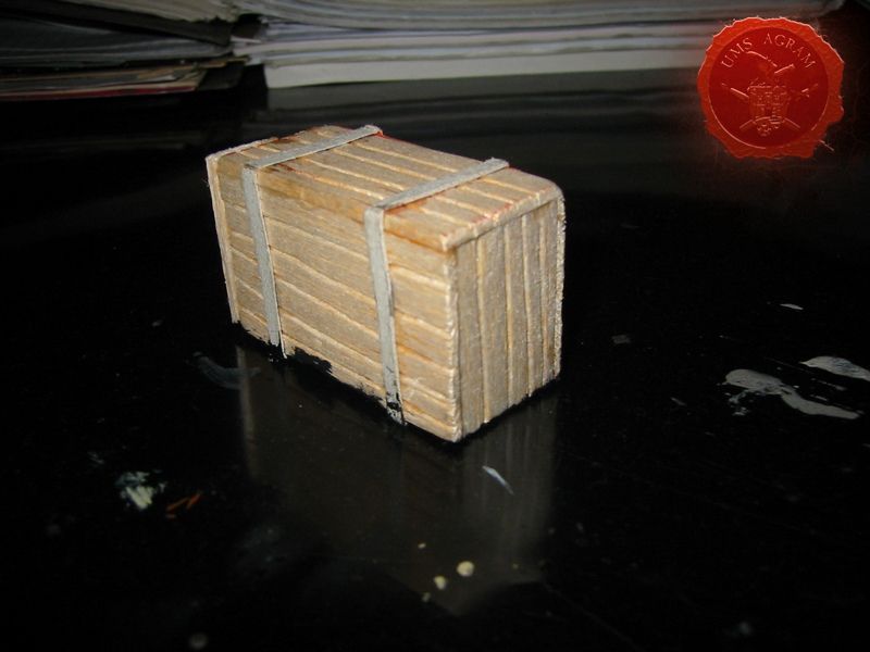
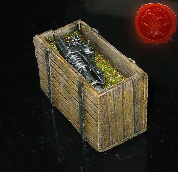
Wooden Boxes
These are easily made from 2 mm thin balsa wood sheets. Just cut the sides of the boxes (ours were 2x5cm, 2x3cm and 2,5x3cm), glue them together, draw lines into the balse to represent the planks and glue thin strips of card as metal reinforcements. You may even add small dressmaker's pins as rivets.
Lamp conversions
It is easy to convert the Cities of Death lamp posts with LEDs so that they actualy give light. Just remove the bottom part of the lamp, drill a hole through the lamp for the wires and attach the LEDs.
You must watch out not to connect the + and the – wires because you will short circuit the LED.
Metal plates, hatches and mesh
Metal plates can be easily made by using card cut into squares and glued onto the base repetively one beside another. When finished, just add dressmaker's pins as rivets. Hatches are also done with card. Just cut the hatch frame and both sides of the doors and glue together. You can also add pins as rivets. Mesh is done with plastic anti-mosquito nets found in most stores. It is easy to cut, form and glue and yet it gives excellent results.
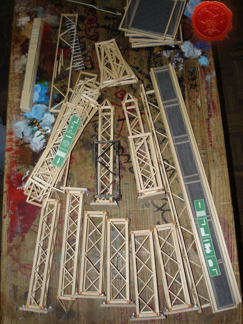
Trussed metal constructions
Trussed constructions are a bit fidly to make but once finished they will be worth while. They are made from two strips of wood, one 2x2mm and the other 5x5mm while the length is up to you. You use the thicker ones for the frame and you put the smaller ones in between at a 45 degree angle to the frame. The finished product not only looks great but is also very sturdy and can withstand suprisingly big loads.
CONCLUSSION
To sum it all, this table contains over 15l of water, over 100m of cables and wires, weighs around 75kg (without the water), has 2,5m of walkways, over 10m of handmade trussed structures, a dozen various electronic circuits, 63 LEDs, 3 laser diodes, 6 working vents, 2 servo motors, a waterpump, a fogger, one factory, one skyscraper, one warehouse, a railroad terminal, 3 small buildings, 2 large buildings, 2 statues, 3 wrecks (tenk, sentinel and a shuttle), 2 turrets...
As you can see it is much more than the mere sum of its parts because over 1000 working hours after the initial sketches, the final product was before us.
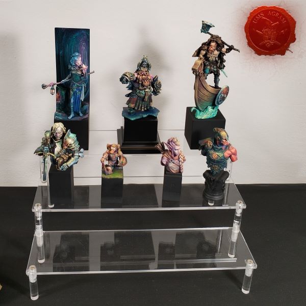
Latest articles
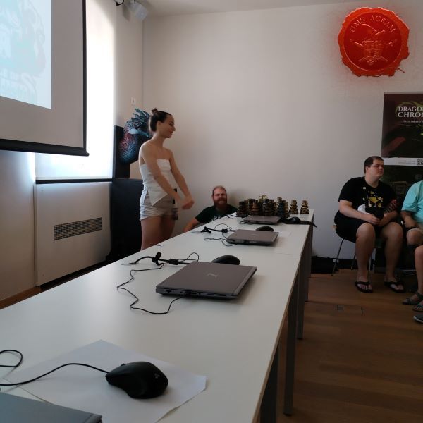
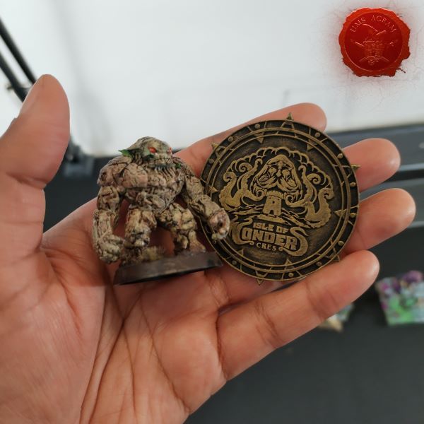
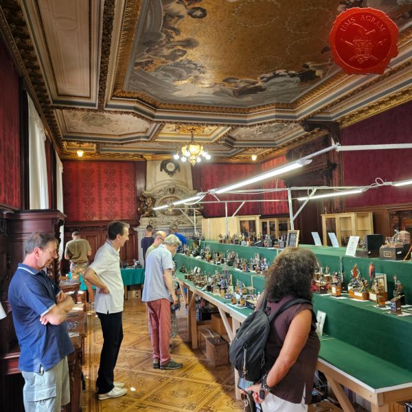
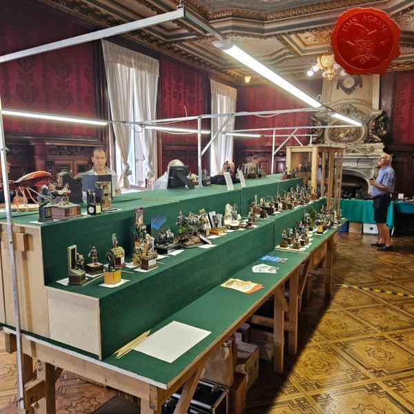
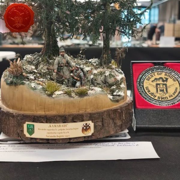
- We attended: Isle of Wonders 2026 Ili Said, 6th July 2026
- We attended: 13. Trofeo San Giusto 2026. Marko Paunović, 6th July 2026
- We attended: Zagreb Scale Model Show 2026 Mario Grgurev, 6th July 2026
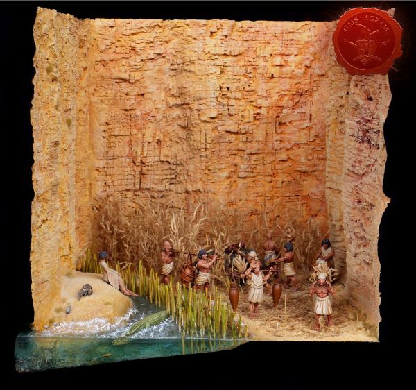
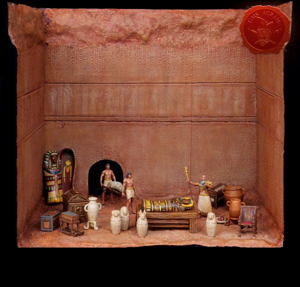
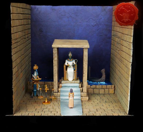
- Making of MUMMY dioramas Sebastian Søgård, 17th June 2026
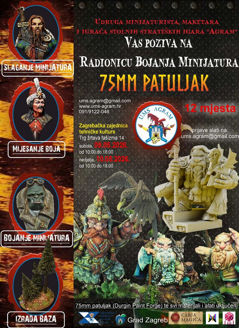
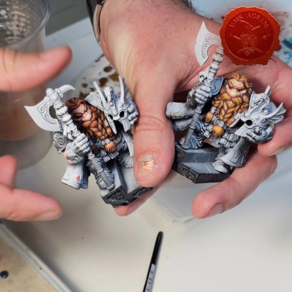
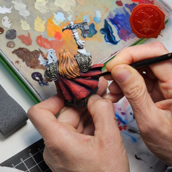
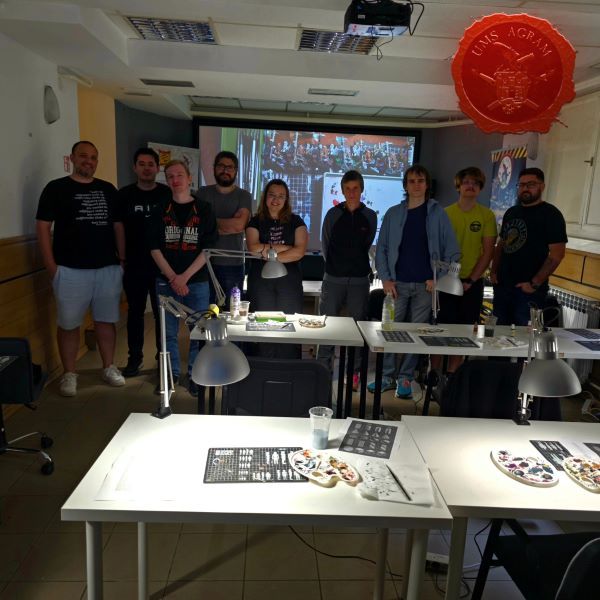
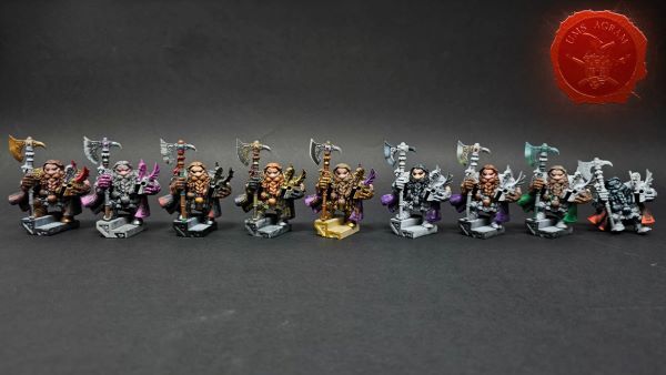
- Miniature Painting Workshop - 75mm Dwarf Ivan Knezović, 26th May 2026


Latest battle-reports
- Kill Team - Blooded vs. Vespid Stingwings 28th February 2025, GW - Warhammer 40.000, and Antoni Pastuović (Imperial Guard)
- 22nd April 2022, GW - Warhammer 40.000, Borna Pleše (Space Marines) and Kristijan Kliska (Tau Empire)
- 17th November 2021, GW - Warhammer 40.000, and Nino Marasović (Space Marines)