
Making PIETY HILL
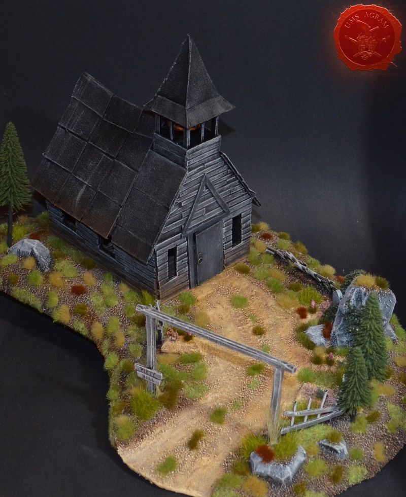
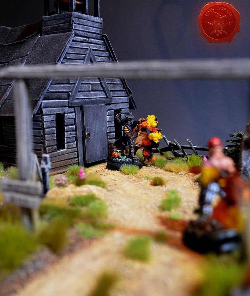
In this article, I'll be doing a centerpiece terrain for an old west type table. For a while now I've had an idea of doing a hilltop church with a small cemetary for my games of Malifaux and writing this article presented a perfect excuse for such a project.
Idea and planning
I always say when you start any larger project you should plan ahead first. Take your time and explore your options, design the terrain (in this case), decide what materials would be best, see if you have all the tools at hand and most important check if you have enough glue. There is no worse thing than running out of superglue on a saturday evening when you have a sunday's worth of working planned out.
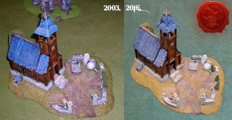
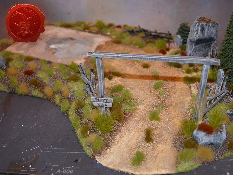
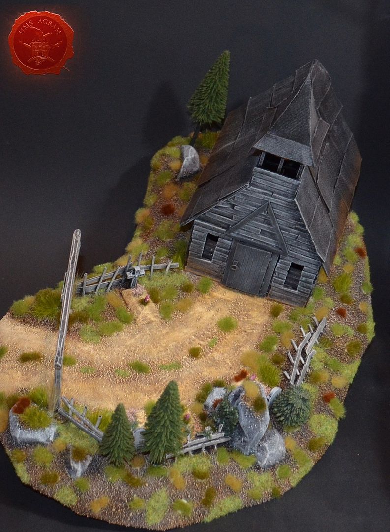
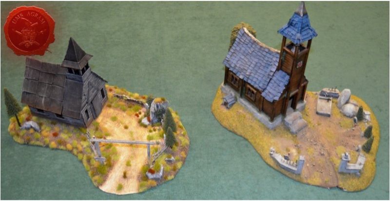
The idea behind this terrain comes from a terrain I did for my gaming club in 2003. mainly for Mordheim and WHFB. It was done in the usual Vampire Counts style. The terrain exists to this day and has only minor damage and some small pieces missing as can be seen in the picture. However, as much as I love this terrain, it doesn't quite fit in the Malifaux world. And besides I wanted to see how differently I'd make this (more or less) same terrain 13 years later.
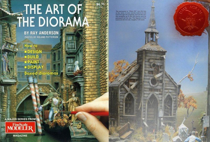
With the theme of the project decided, I know started to explore my design options. First thing I usually do is go for my home diorama/hobby library. Usually the first books I leaf through are from old masters Ray Anderson and late Sheperd Paine. The former has done some great Old west dioramas and his book The Art of the Diorama is a source of endless inspiration for me, the latter has done mostly military dioramas and his book How To Build Dioramas offers great advice and tips on building scenery and composition. For this project I decided to refer to Ray Anderson's diorama Piety Hill and thus have decided to name my project equally in hommage to this great artist.
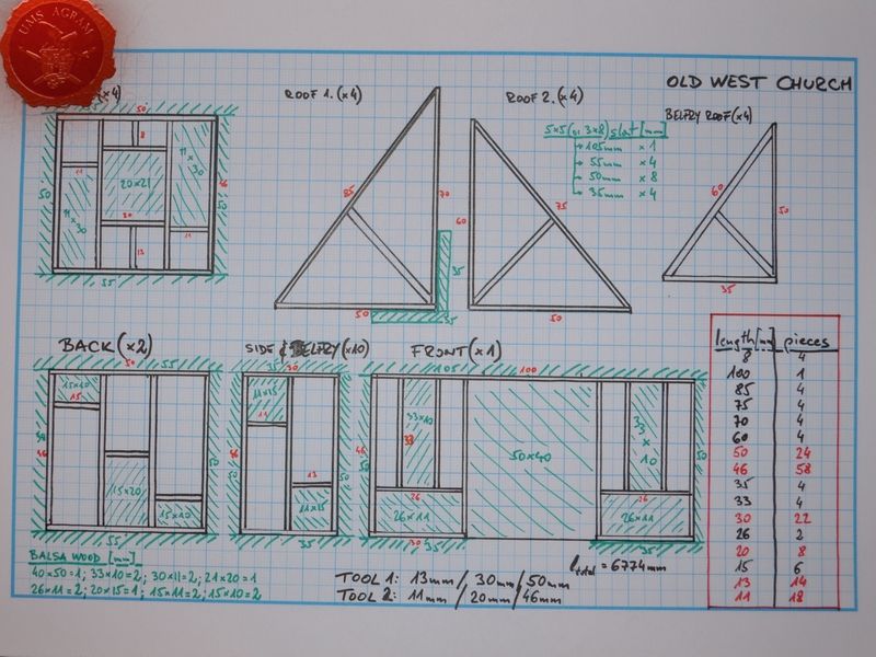
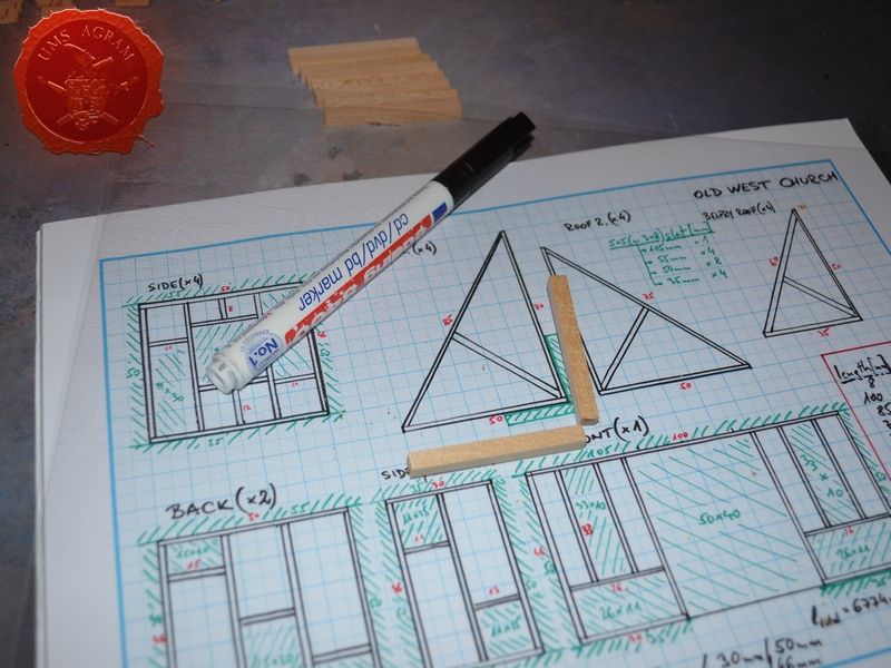
So, with the style and theme decided upon, I began designing the outline of the terrain. It became apparent that the size of the terrain would greatly depend on the size of the church. Since I had an already existing terrain with church as a template I roughly copied the dimensions of the church. With the rough dimensions determined (13x10cm with 5cm high walls), I went ahead and started to draw the design of the wall elements. I wanted to build the model of this church as close to how a real wooden churches were built – by using wooden beams to construct the wall frame segments. Connect those segments and after they are errect, use wooden planks to make the walls. The design of the wall frame segments showed four different setups. One for the front side of the building (10x5cm) with holes for two narrow windows and a door, one for the back side of the building (two such frames would be needed as they are 5x5cm), one for the sides of the building with holes for the windows (four such frames needed as they are 5x5cm) and one for the side of the building and for the church belfry (8 needed – 2 for the sides and 6 for belfry, as they are 3x5cm). I would also need several wooden beam constructions/horns for the roof. When I had all this drawn in 1:1 scale on graph paper, I used a different paint marker (green) to mark how the moulding tool should look.
This sketch provided me with the lengths and ammount of material (tables in the drawing sketch) I'd need for the construction work.
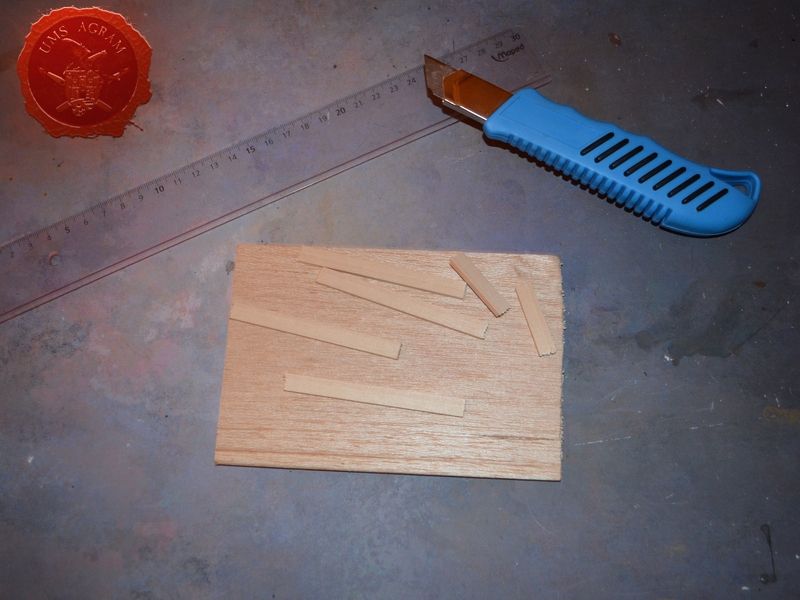
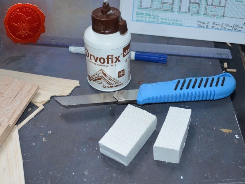
For this project I will need the following materials:
- roughly 7 meters of 2x2mm linden slat
- roughly 1 meter of 5x5mm linden slat
- roughly half of a meterlong plank of 2mm balsa wood (they come in 10x100cm planks)
- 40x40cm of HD styrofoam
- superglue
- PVA glue
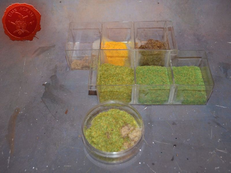
- gravel (three sizes)
- static grass
- pine trees (several)
- other vegetation
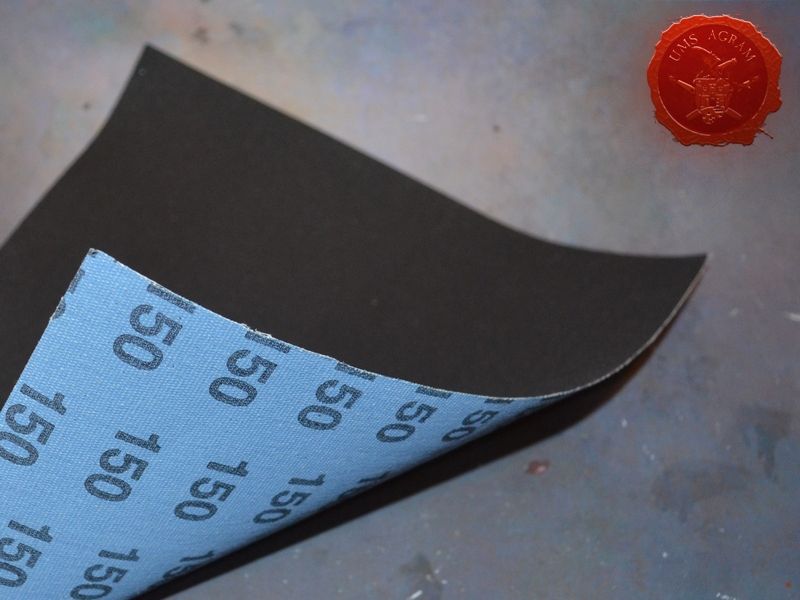
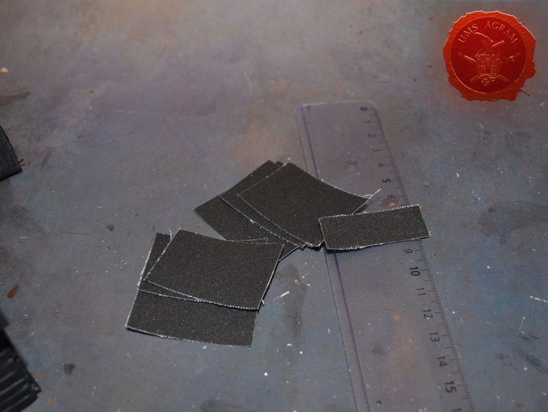
- sanding paper (2 sheets)
- foil for overhead projector
- thin card
- toothpicks
- one chain ring and two small hinges for jewlery boxes
- one bell from a Christmas decoration
- several tombstones
The tools needed are:
- scalpel blade
- scissors
- modelling saw
- pin vice (or an electric mini drill)
- brushes
– various sizes
– for painting/washing and for drybrushing
- pliers and pincers - icepick
Building the church
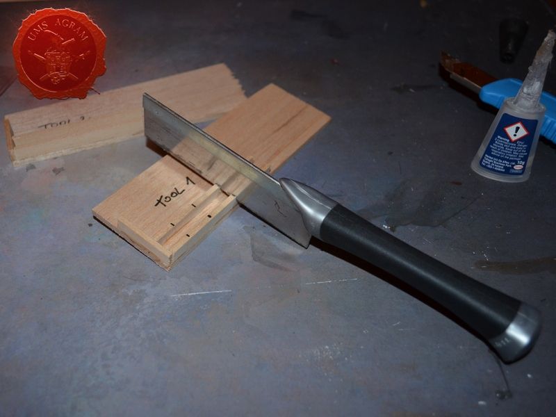
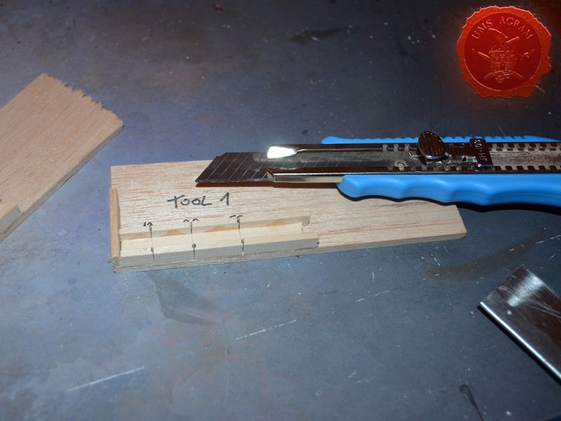
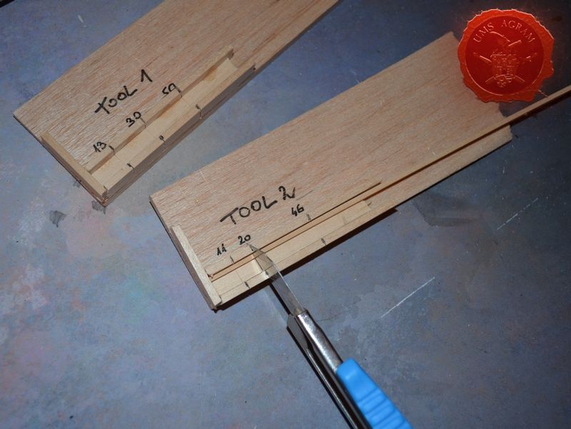
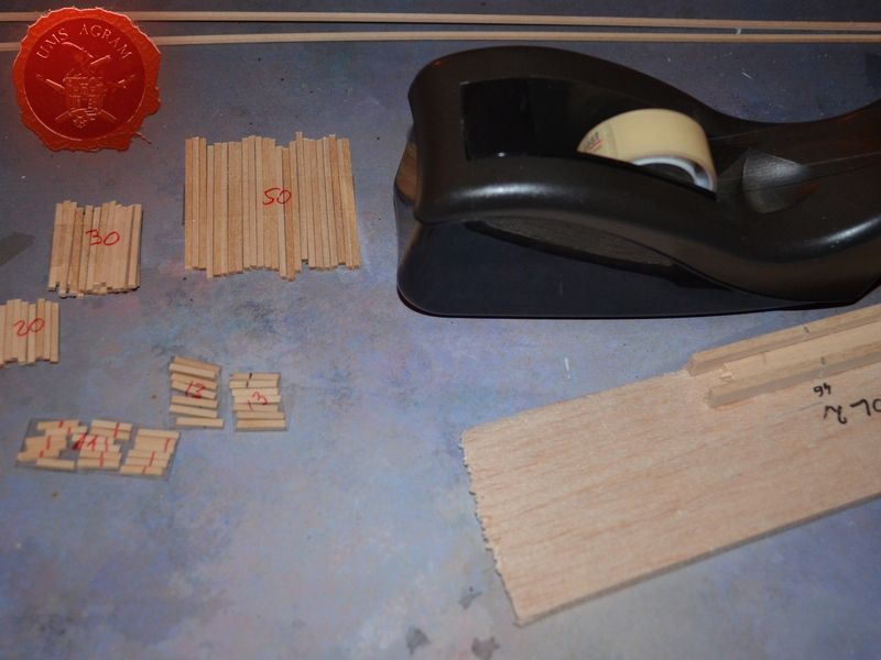
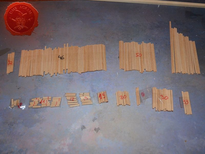
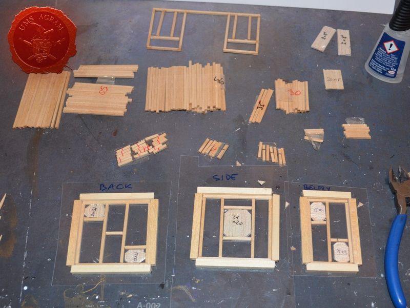
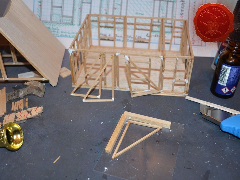
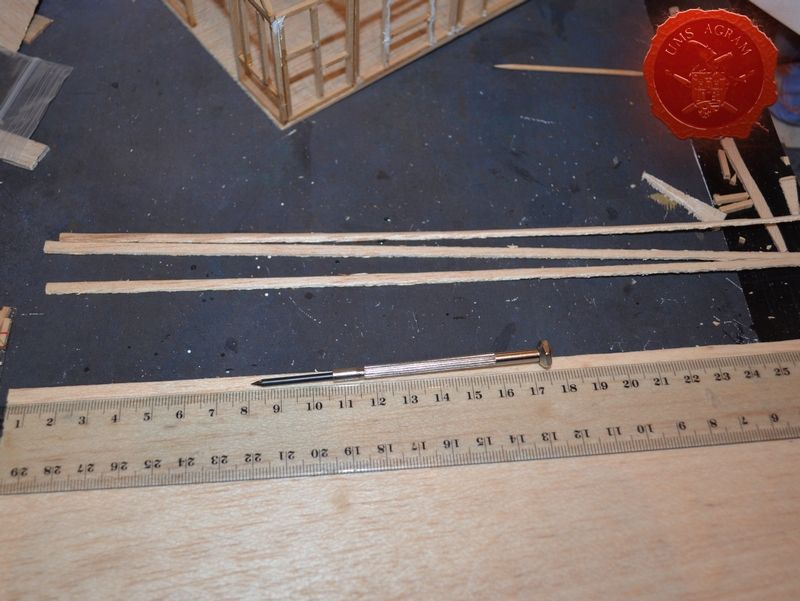
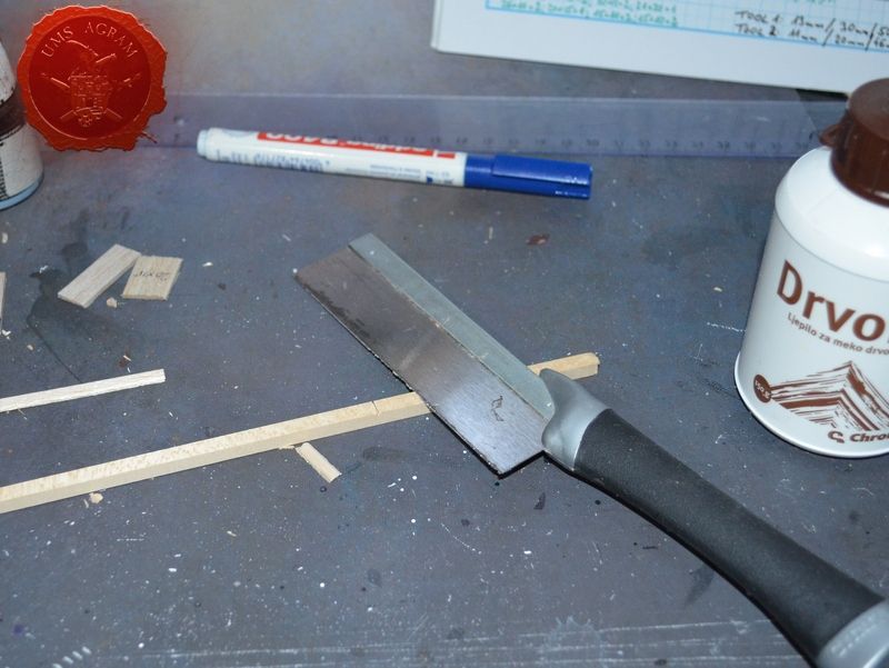
As I mentioned earlier, the size of the terrain and the layout of various elements greatly depends on the size of the church so it was only natural to start with the construction of the church first. Since I would need a lot of slats of various sizes which would require a lot of precise and repeated measuring, I decided to help myself and construct two tools that would be used to cut the slats into several desired lengths. Tool 1 would be used to cut planks 13, 30 and 50 mm long, whereas Tool 2 would cut planks 11, 20 and 46 mm long. The geometry of these simple tools would allow fast and precise cutting of the linden slats and true enough after only an hour I had cut almost 7 meters of linden slats into 181 differently sized would-be wooden beams. Using scotch tape I glued them all into groups so they wouldn't get mixed up.
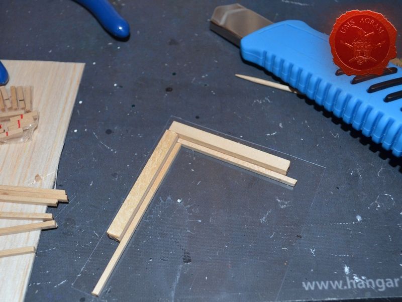
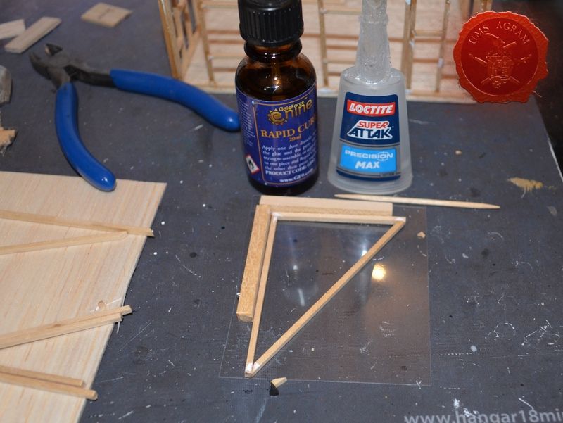
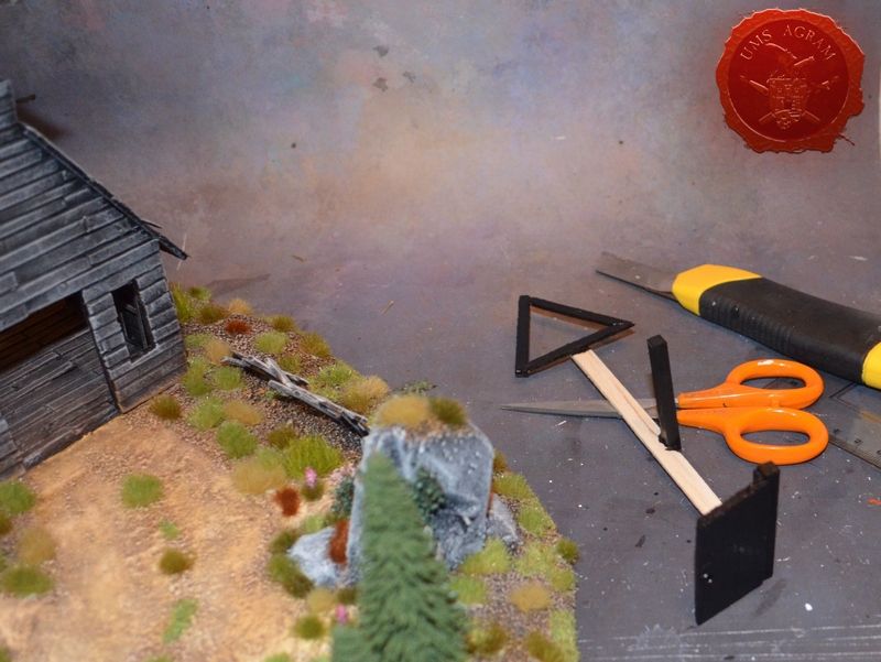
Next up, it was time to construct the moulding tools to simplify the production of wooden frames and ensure the right angles of the beam connections (as much as possible). For this, I used one sheet of transparent plastic foil. I simply placed it over the sketch and glued the 5x5mm linden slats over the green marked areas on the sketch. Inside I put the linden slats of according sizes (I had previously written the sizes in red on the sketch for easier assembly) and put just a dab of superglue making sure it didn't run onto the plastic foil or the thicker linden slats of the moulding tool. A great advice is to use Rapid Cure. This is a chemical of sorts that instantly cures the superglue the moment it comes into contact with it. However it leaves some white marks which in this case won't matter as everything will get painted in the end.
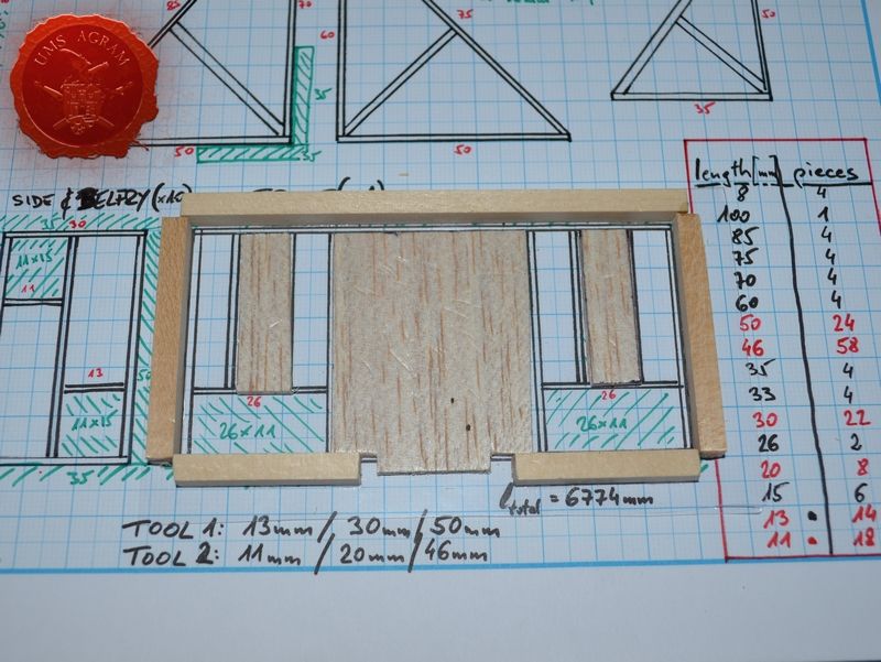
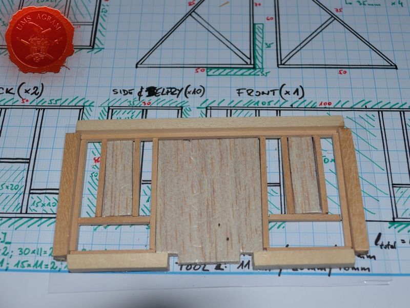
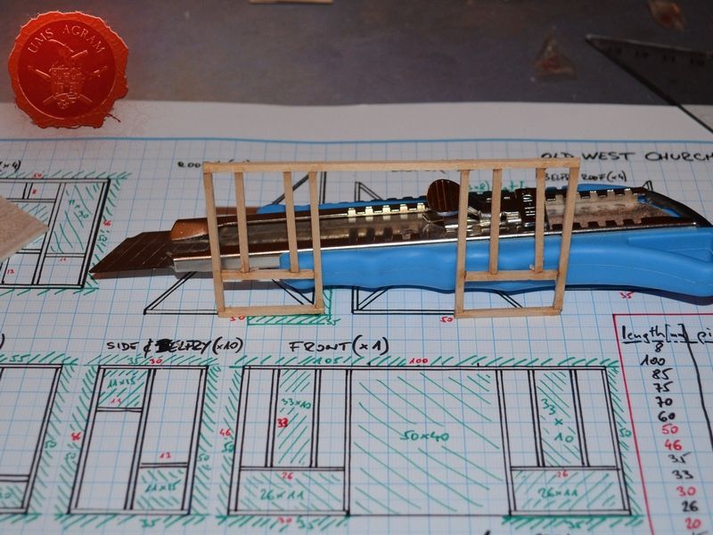
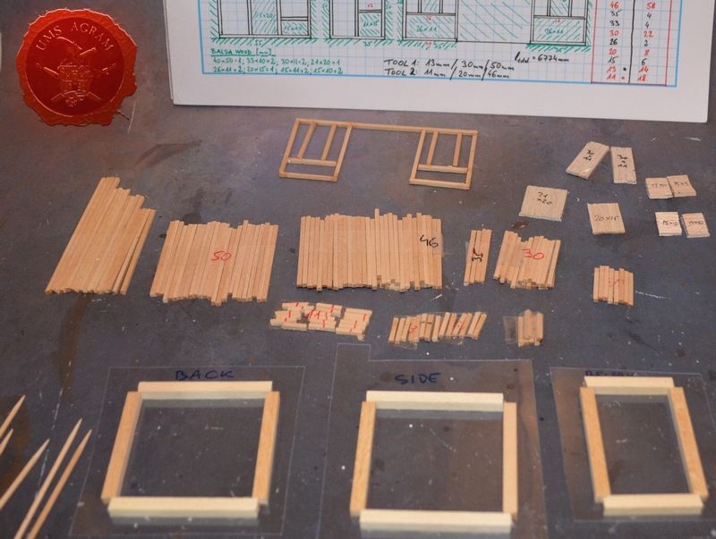
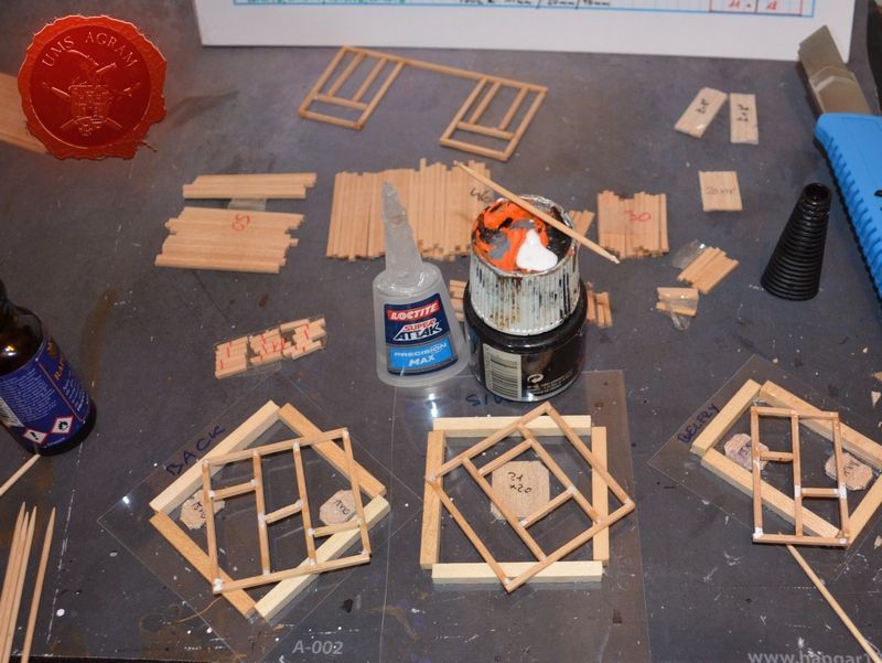
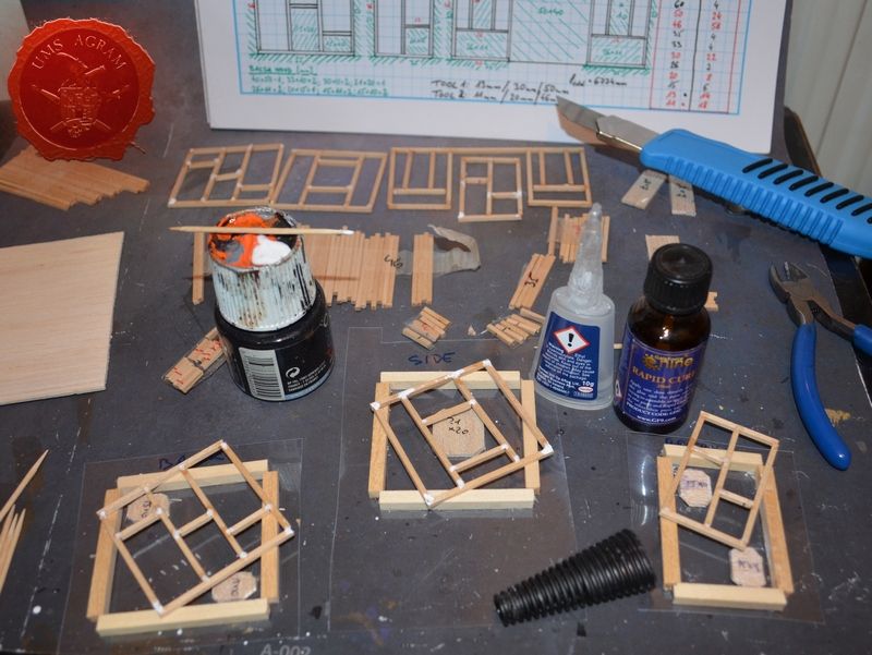
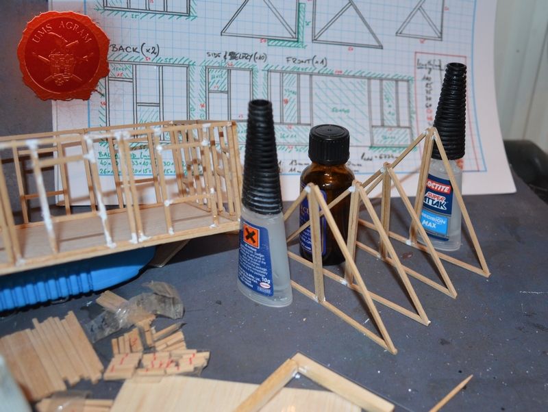
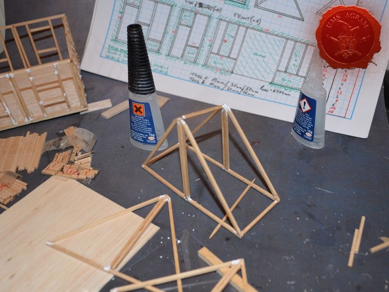
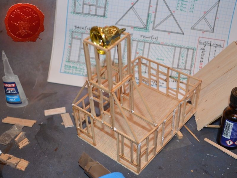
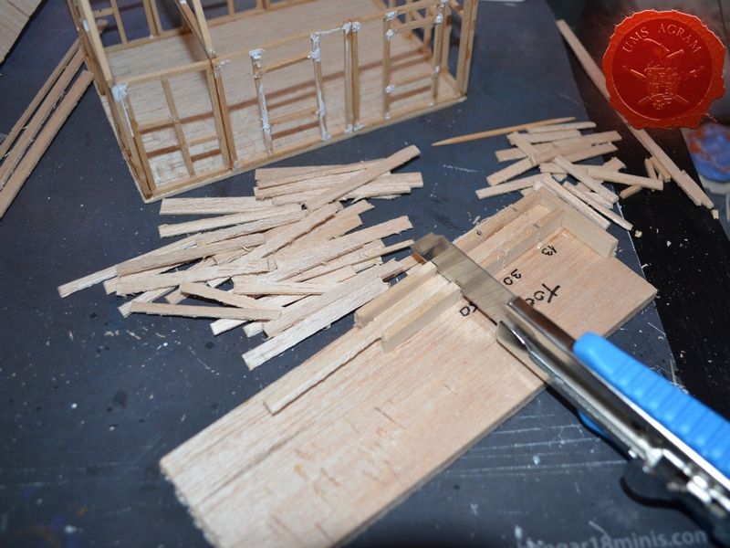
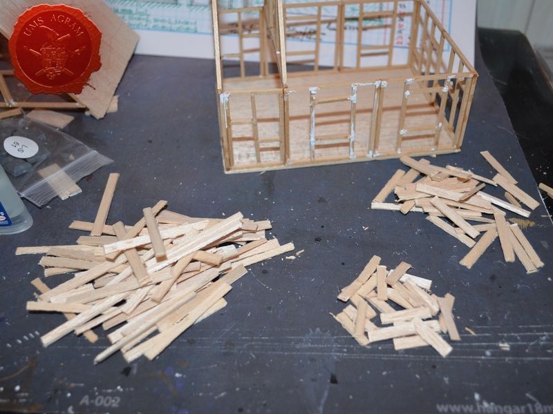
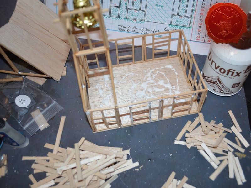
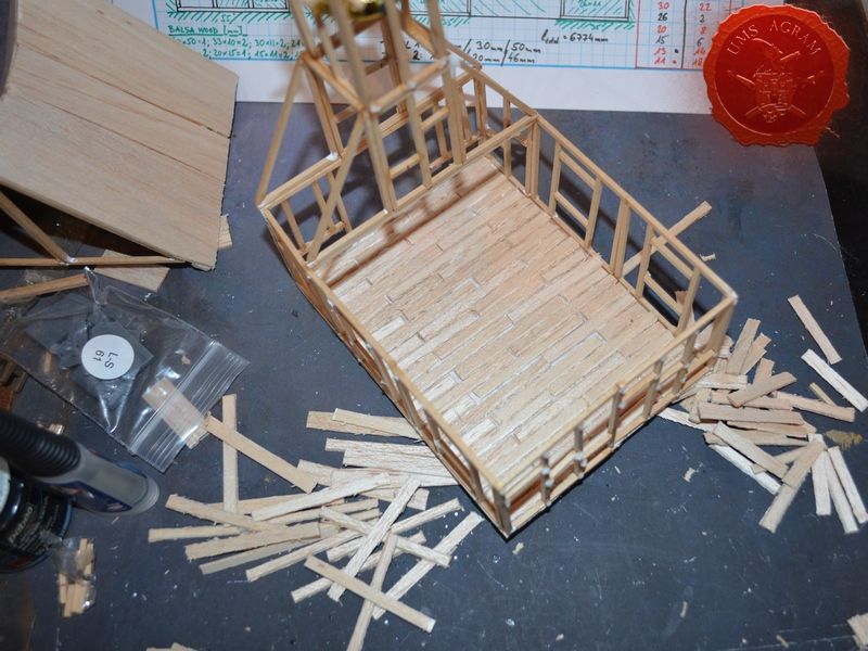
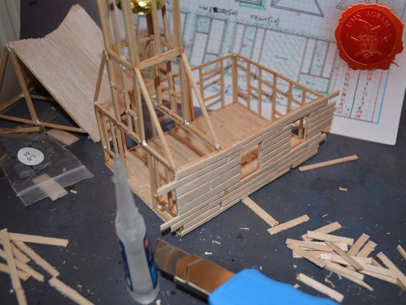
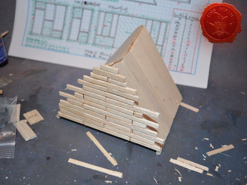
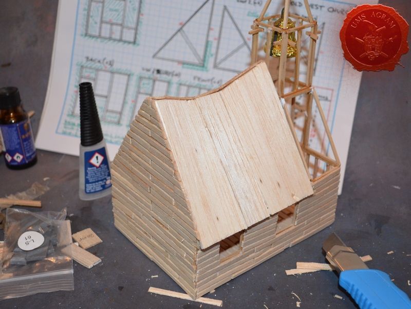
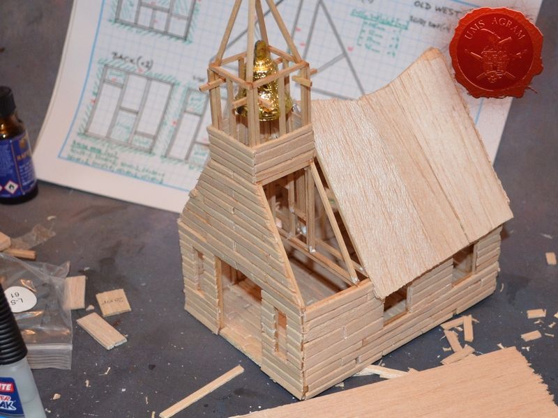
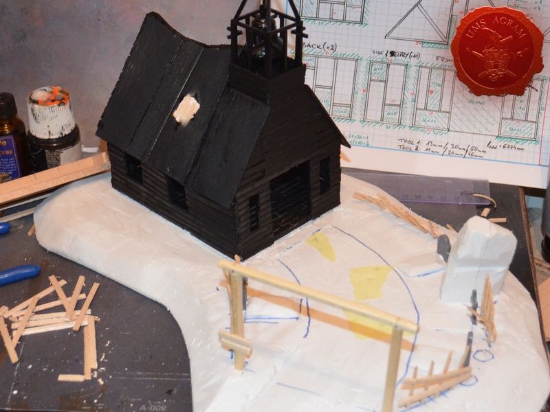
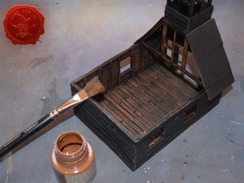
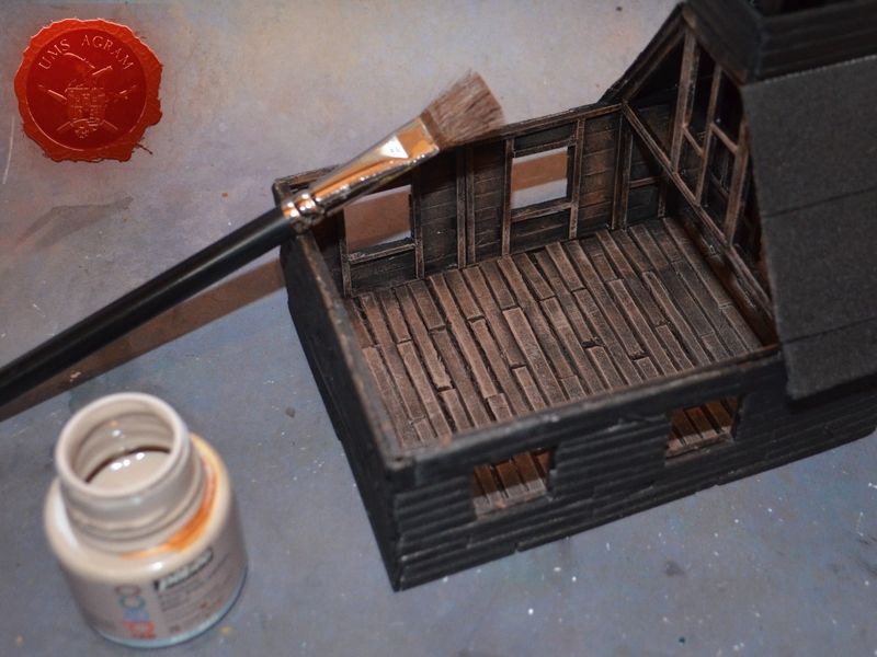
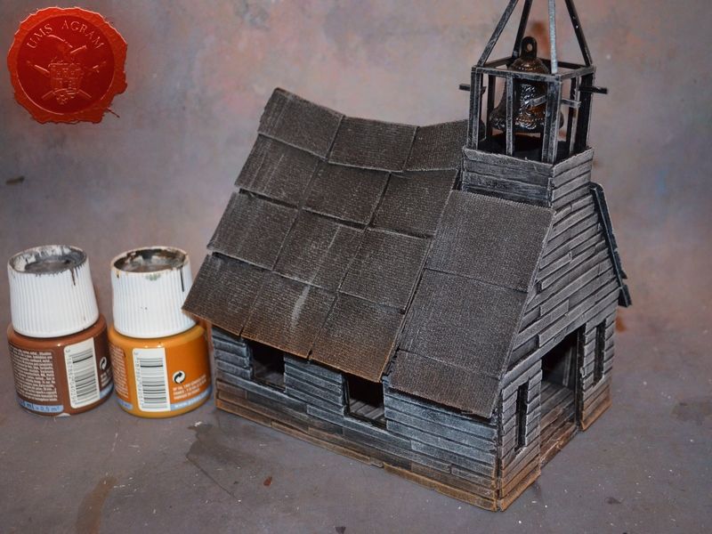
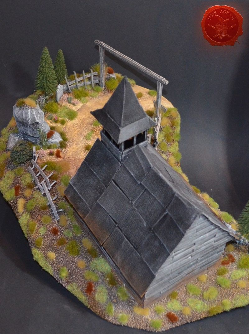
Once I had all the wooden frames for the bottom part of the church I glued them onto a balsa wood base. I now had the outline of my would-be church. It was time to construct the belfry and the roof. Using the same method, I made the roof horns – basicly a set of triangles glued to gether. To make those, I used only one mould tool as all I really needed was to construct the right angle between the horizontal and perpendicular beams. Once they are fixed, I just connected the hypothenuse of the triangle that would hold the roof. I made several sizes of the roof horn in order to have an appearance of a wobbly roof. When the roof construction was done, I glued 2mm balsa wood over it that would hold the roof tiles. (Note: I didn't glue the roof construction to the wall frames so the roof will be removable) With the roof construction done, I proceeded to make the belfry using 6 smaller wall frames and some roof triangles.
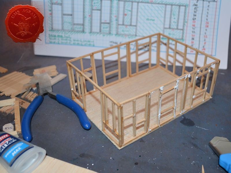
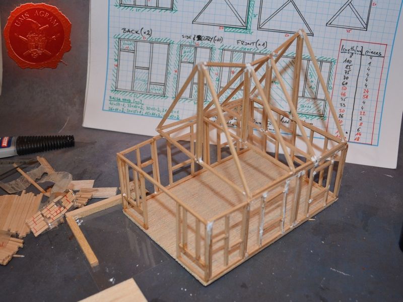
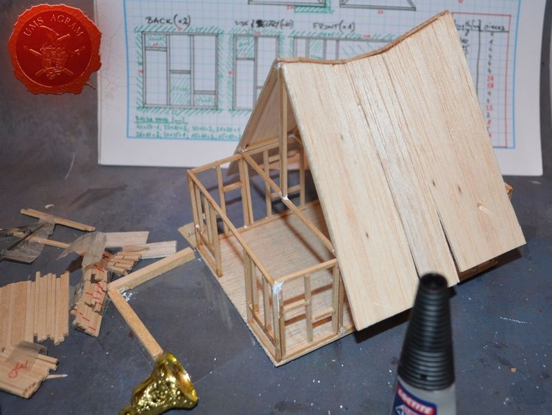
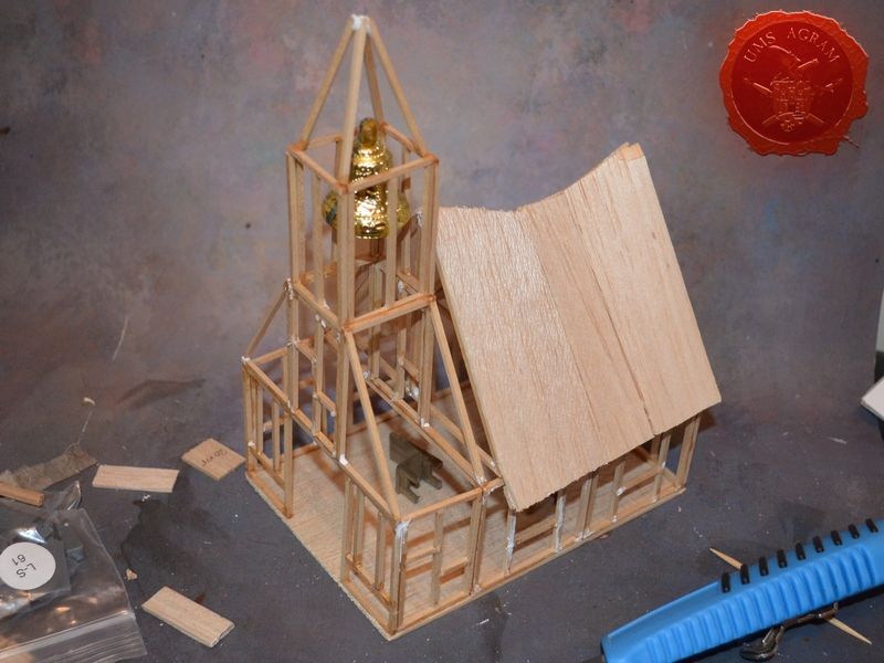
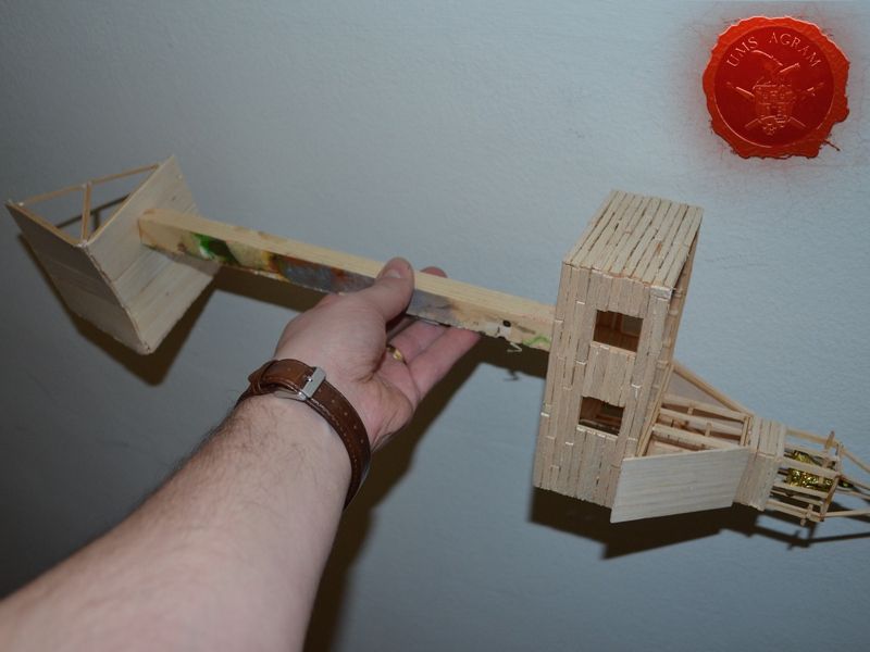
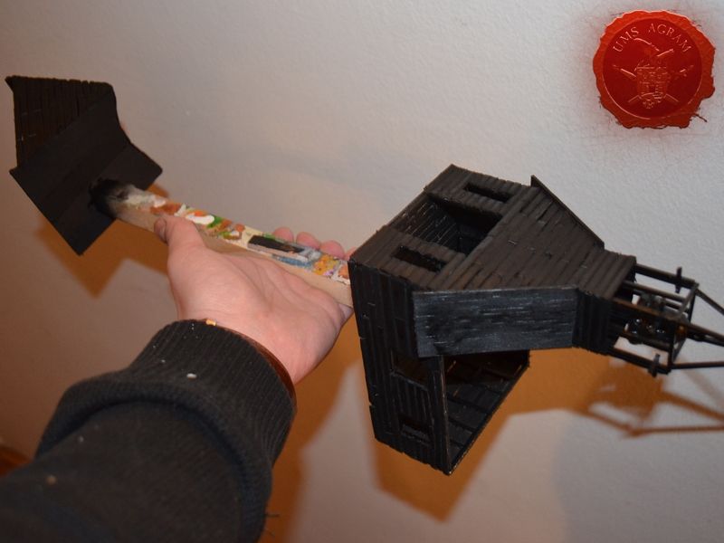
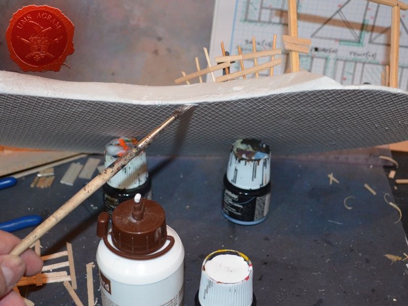
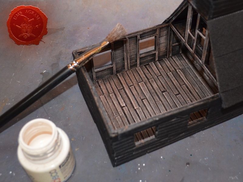
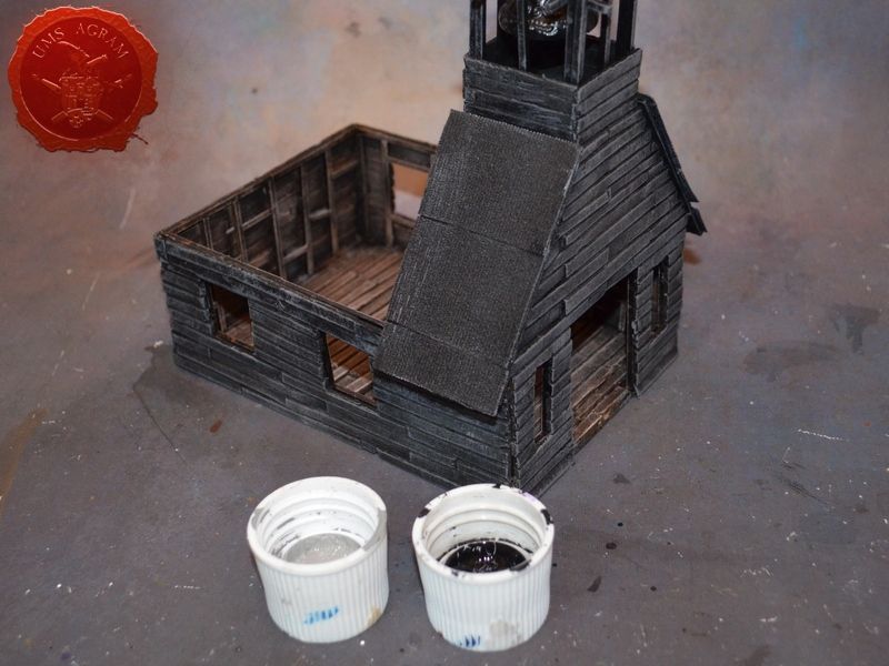
It was time to fill the walls with planks. Using 2mm thick balsa wood I cut strips about 30cm long and 5mm wide using an icepick. The shape of the icepick enables the bevelled look of the plank in one stroke (both cutting and bevelling at the same time). If I had used the scalpel blade, I would have to chamfer the sides which would prolong the process. Afterwards, I again resorted to my makeshift tools for cutting planks and made a bunch of 20, 30 and 50mm planks out of the balsa strips. These I then glued to the floor, making sure I followed a certain pattern. It does not matter which pattern you use, but you need to follow it to the end. In the case of my floor, I used the following pattern: 40mm-50mm; 20mm-50mm-20mm; 50mm-40mm; 20mm-50mm-20mm and repeat. I used a similar method for all the walls. Where the length of the plank protruded from the wall frame, I had cut the excess material only after the glue had set (which is best seen on the roof part). Once both parts of the church were done (roof and building) I glued them on a stick to make the undercoating with a black sprey easier and to prevent spreying over my hands.
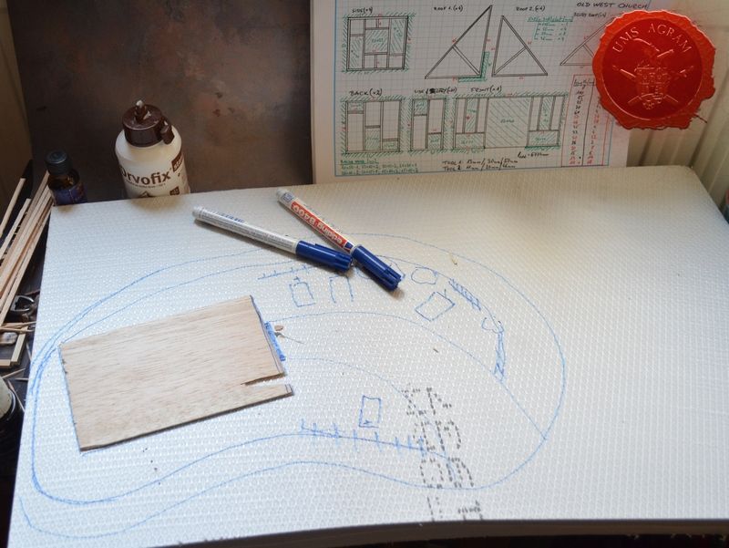
Making the base
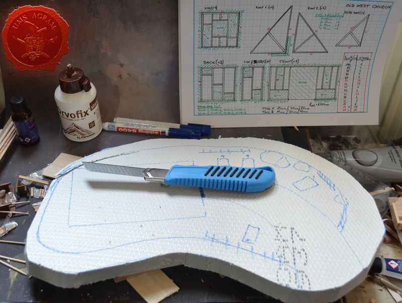
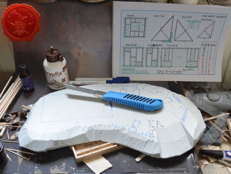
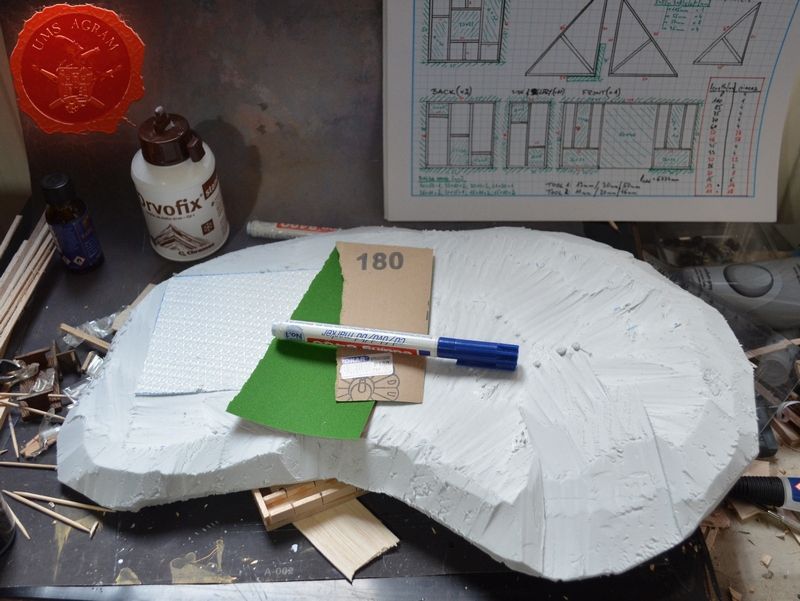
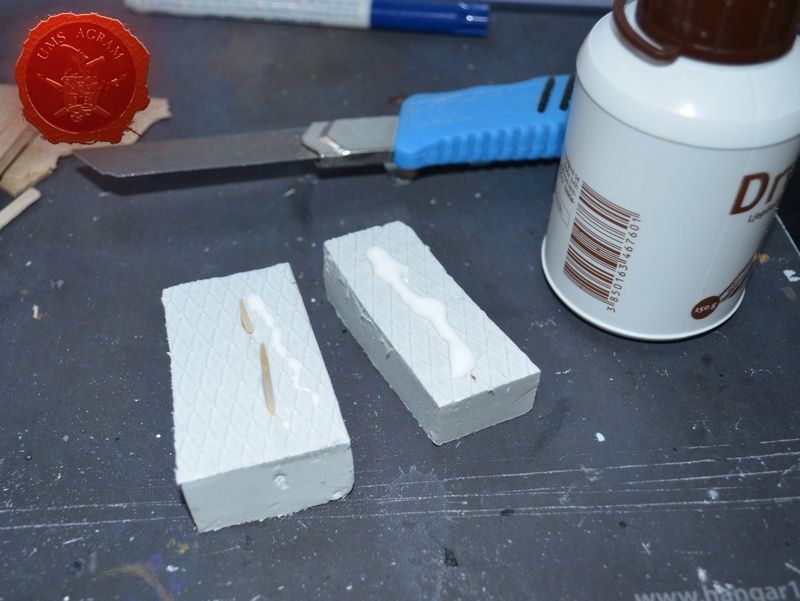
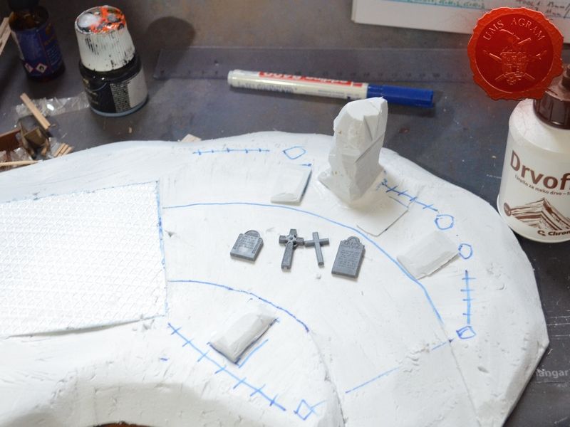
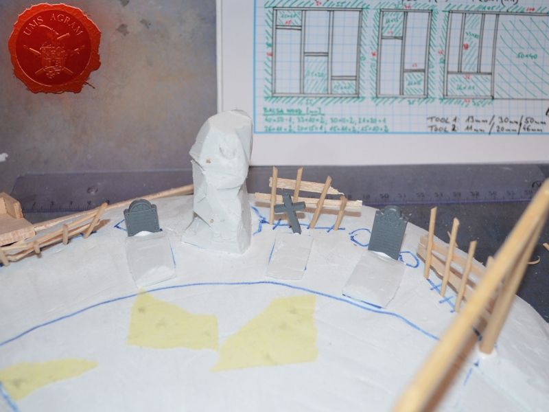
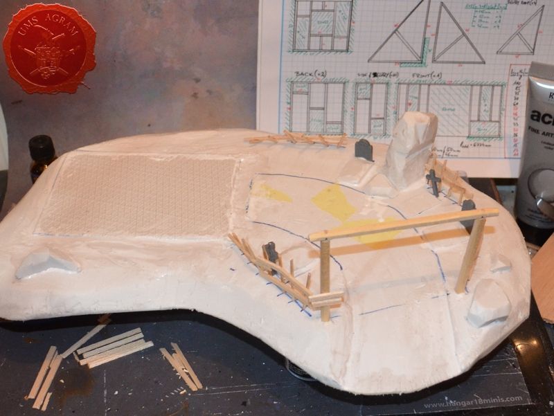
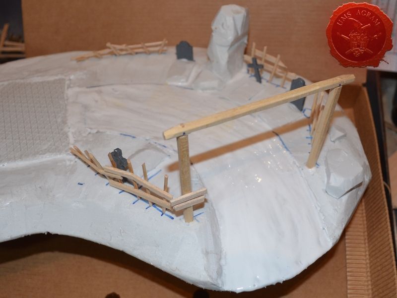
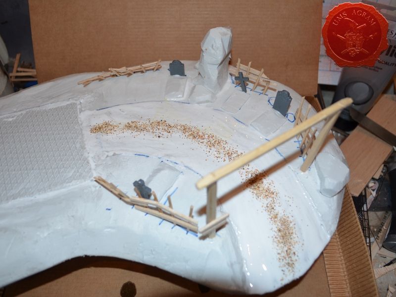
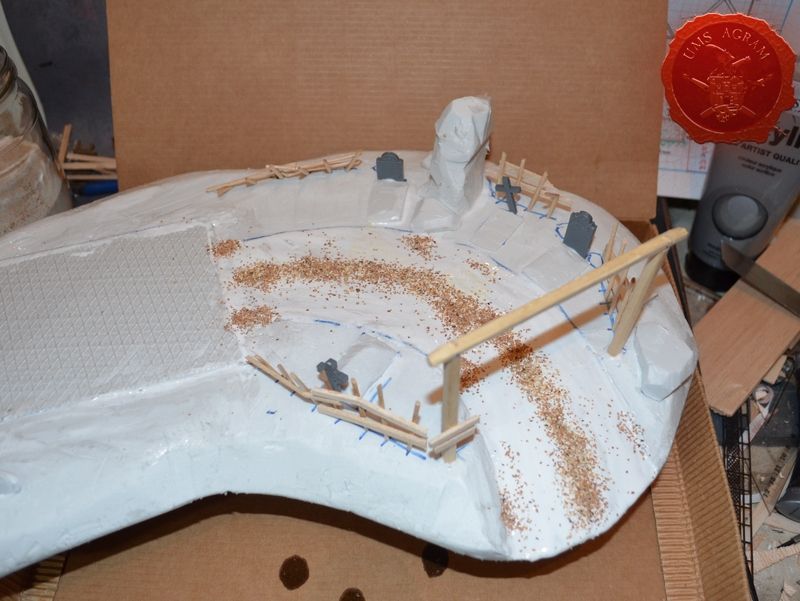
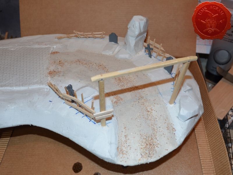
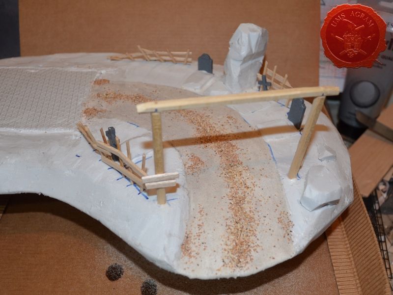
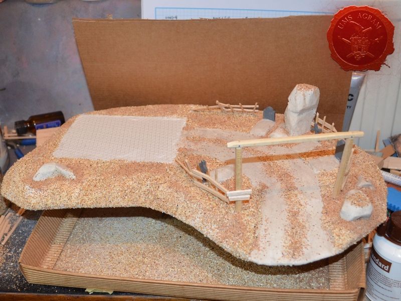
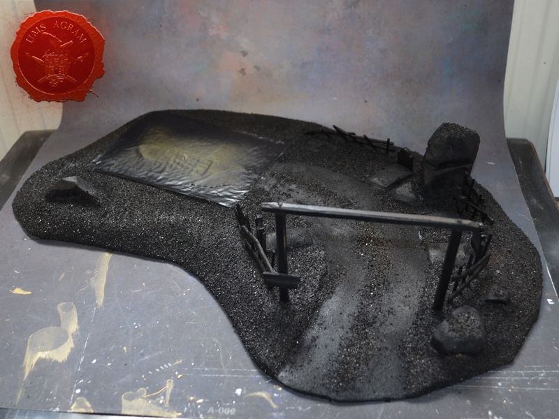
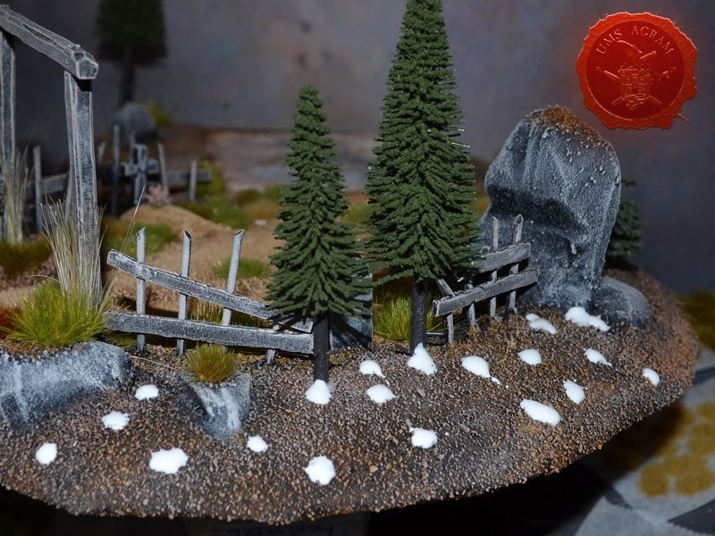
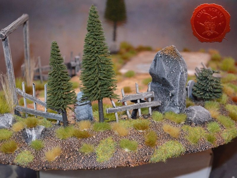
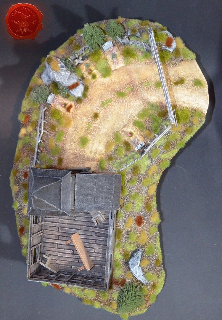
With the church done, I could now make the base for the terrain. Same as in the original from 2003, I opted to make it from HD Styrofoam. Although these days I opt for the more sturdier materials for the base (like MDF), I went for the styrofoam because I wanted the extra height that 3cm thick styrofoam provides. First, I drew the church outline with a marker and then arranged all the elements according to their position to the church. Once I had all the elements in place, I drew the outline of the top side of the base and around it the bottom side. Using a scalpel blade I cut the base along the outmost line. In several steps I cut the base until I reached the inner outline of the base adding more angle to the blade with each step. Once the cutting part was done, I sanded everything using sanding paper. I also made a couple of stone boulders from leftover pieces of styrofoam and glued them to the base using PVA glue and toothpicks as pins.
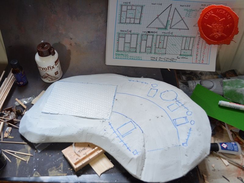
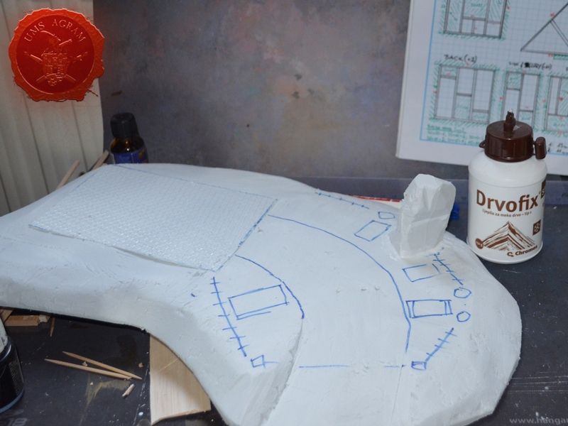
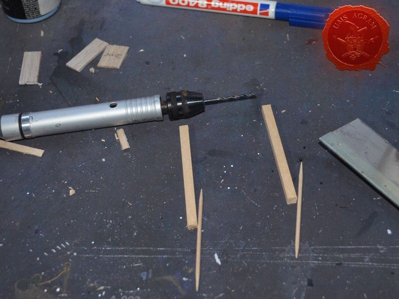
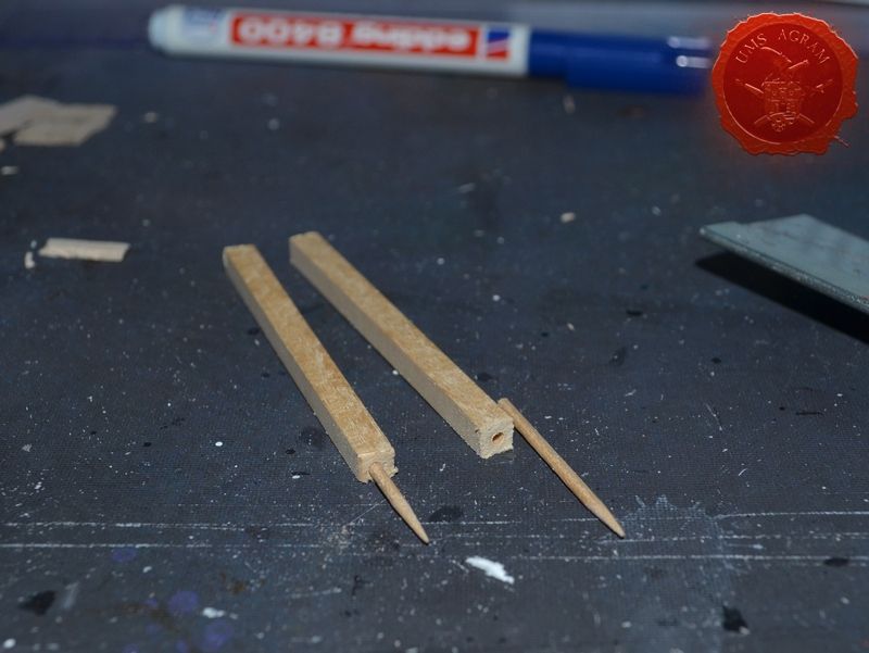
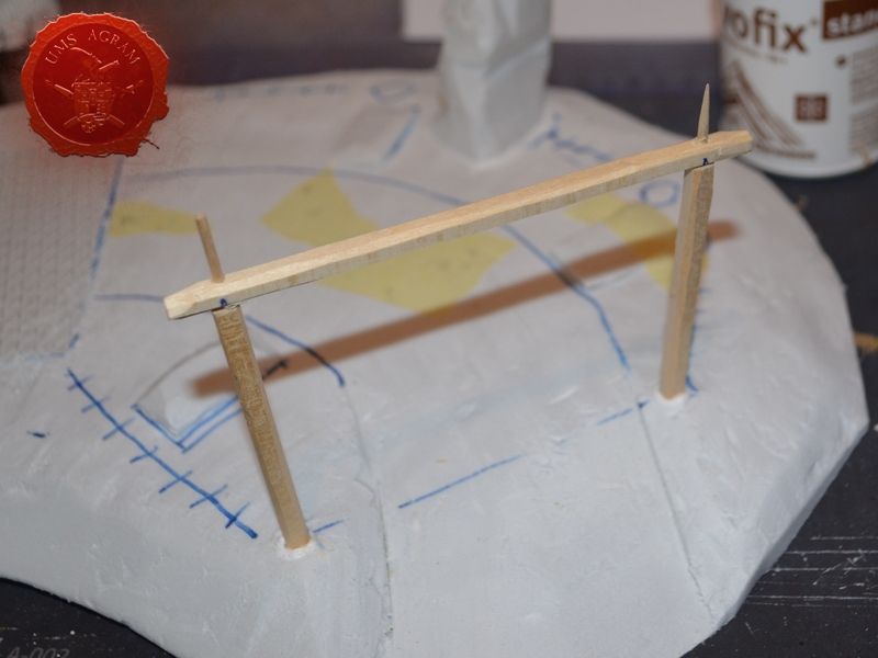
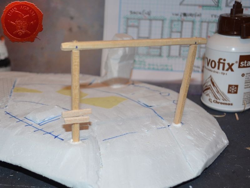
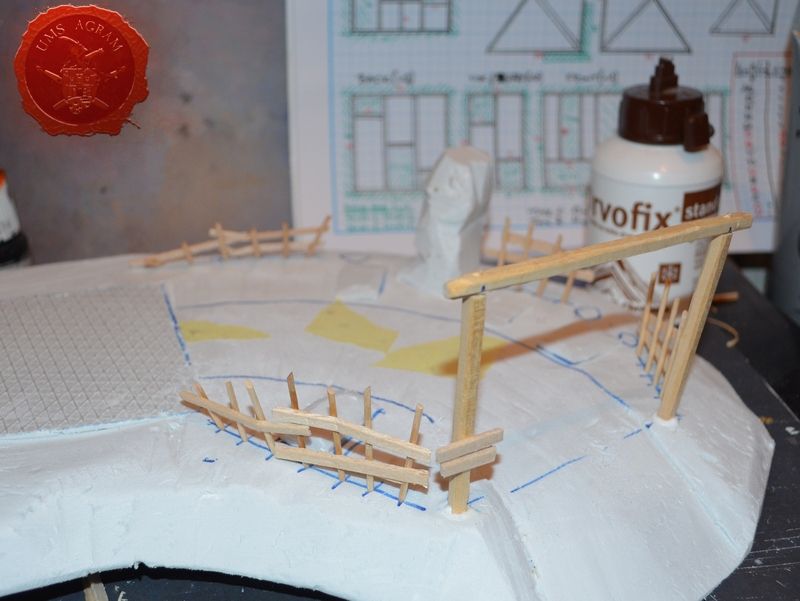
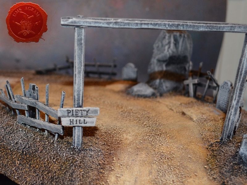
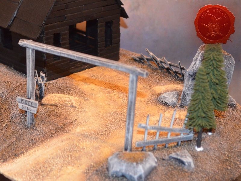
5x5mm linden slat was used to make the gate to the church graveyard. Using my electric mini drill (which can be replaced by a hand-held pin vice) I pinned all the pieces together and to the base again using toothpicks as pins. Once the gate was done, I made the wobbly wooden fence from toothpicks and balsa wood planks left over from church construction. Before adding texture it was time to dryfit the two pieces together. Upon inspection I discovered several damaged places on the styrofoam that needed fixing. Had I more time, I would probably have filled those with DAS airdrying clay. However, several strips of masking tape provided a perfect quick fix.
Texturing
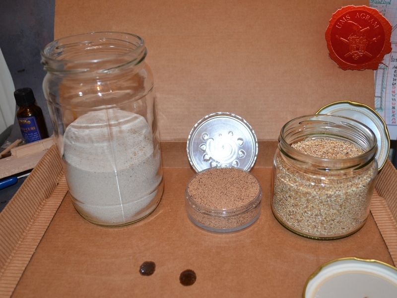
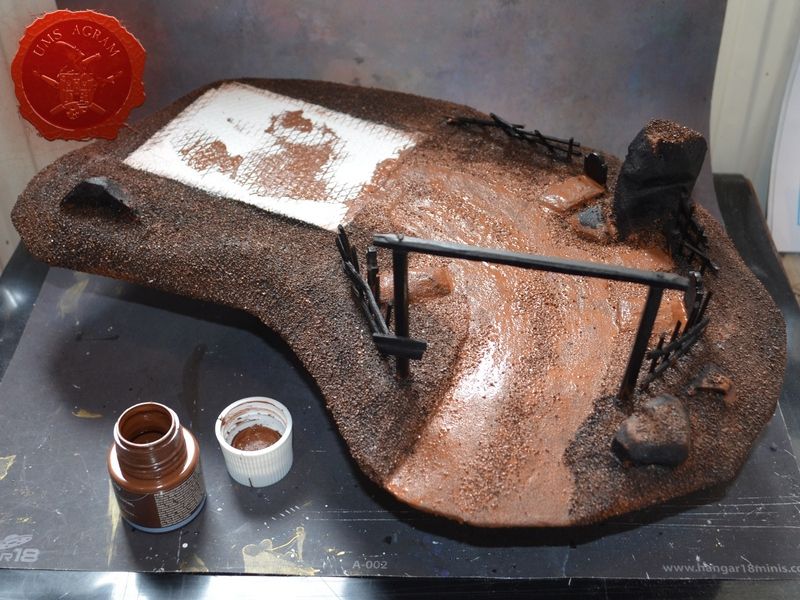
At this point, I was nearing the end of the construction and all that had to be done before the painting was to add texture to the base. Before doing this, take a look at the picture of the old piece taken in 2016. You will see that there is a damage to the road just on the rim of the base. I'm not sure what happened or how it got torn off, but my best guess is that the styrofoam base was not fully protected before undercoating with a sprey so it damaged the undersurface of the base and during time the stress broke off this piece. In order to prevent this (as much as possible) I decided to cover about 5mm around the edge of the underside with PVA and thus protect it from damage. While it was drying, I took out all the gravel I was to use on this project:
- chinchilla sand – smallest grain
- GF9 medium basing grit
- chinchilla sand – largest grain
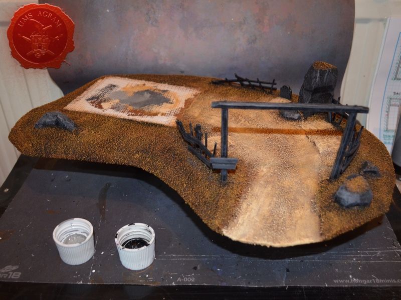
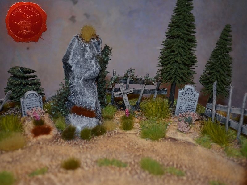
Once the PVA protection was dry, I smeared more wattered-down PVA on the surface that would become the road/yard. I first sprinkled over some largest grain gravel, next I sprinkeld some GF9 Medium Basing Grit and to finish I poured over the smallest grain chinchilla sand. If you sprinkle gently and with care you can end up with nice variations in texture – for instance the middle of the dirt road usually has some larger stones as opposed to the sides of it. When the road was dry, I repeated the process with the rest of the base, sprinkling the two largest grains over the ground part and smallest grain over the boulders and graves.
Preparation while waiting
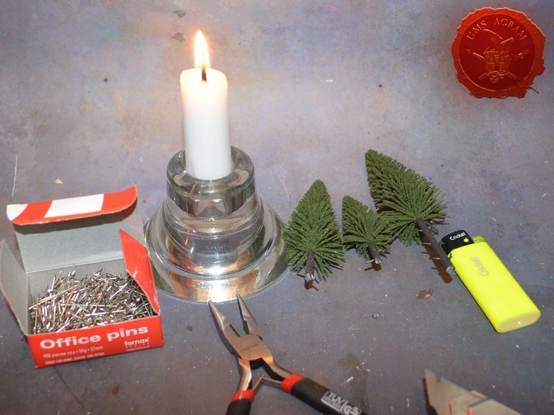
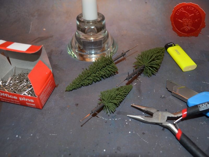
While I was waiting for the texture to dry, I made the roof tiles from finest grain sanding paper. It has nice texture when painted. I also put metal pins to the pine trees I was going to use on this terrain. The easies method of pinning metal pins to the plastic trunks of the trees is to heat the metal pin using a candle and just stick it into the trunk. The heat will melt the plastic locally. As the pin goes into the trunk it gives over heat (to the trunk that melts) and once the pin is cool it will become lodged into the trunk without any need to glue it.
Painting the base
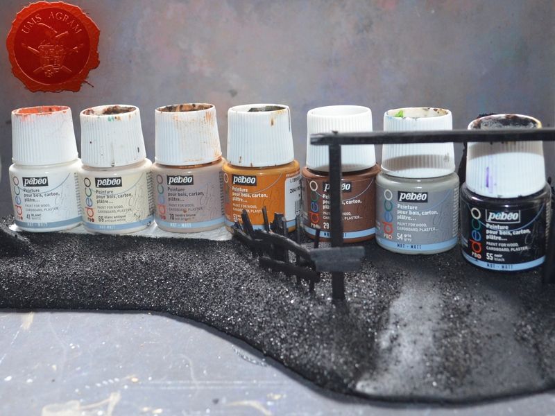
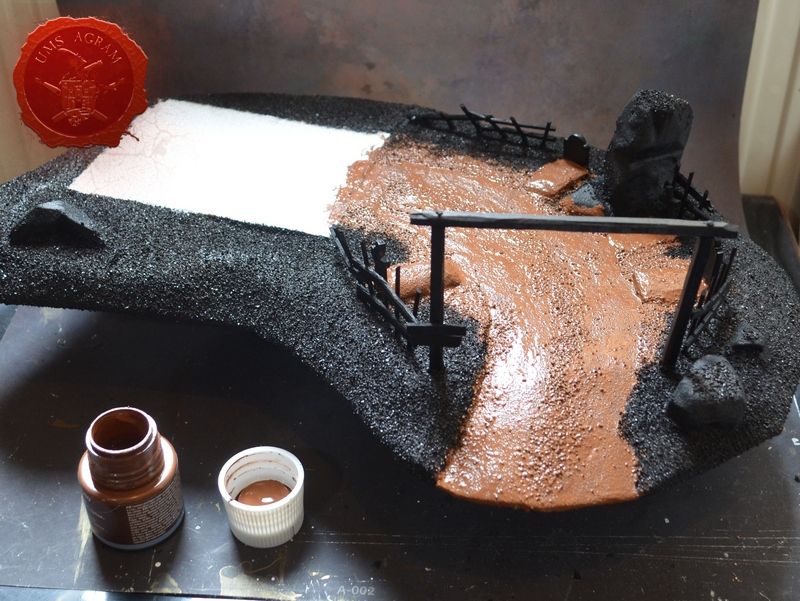
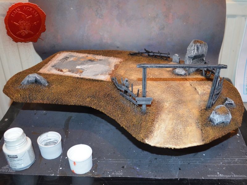
After the texture had set, I undercoated the base using black sprey and it was time to paint the terrain. Unlike my minis, I like to use minimal/limited pallette when painting my scenery. These are the paints used during this whole project (manufacturer: Pebeo Deco):
- White (41)
- Antique White (69)
- Ash (70)
- Ochre (51)
- Brown (29)
- Grey (54)
- Black (55)
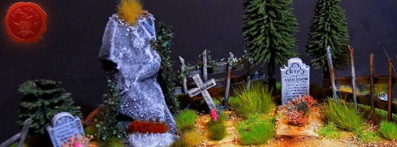
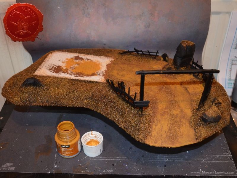
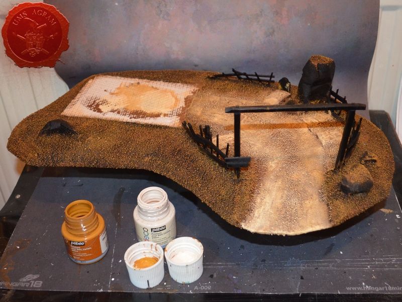
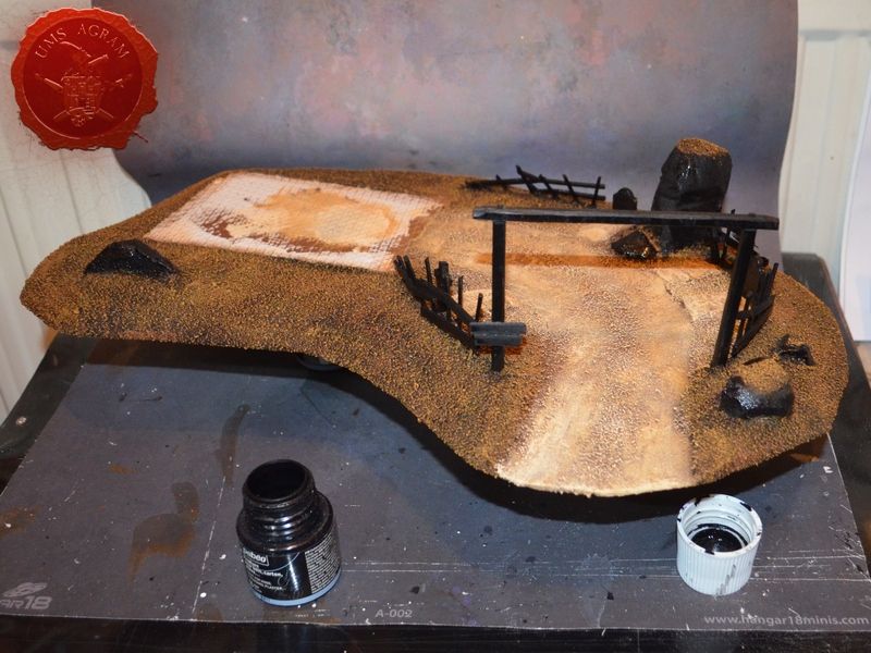
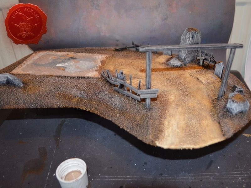
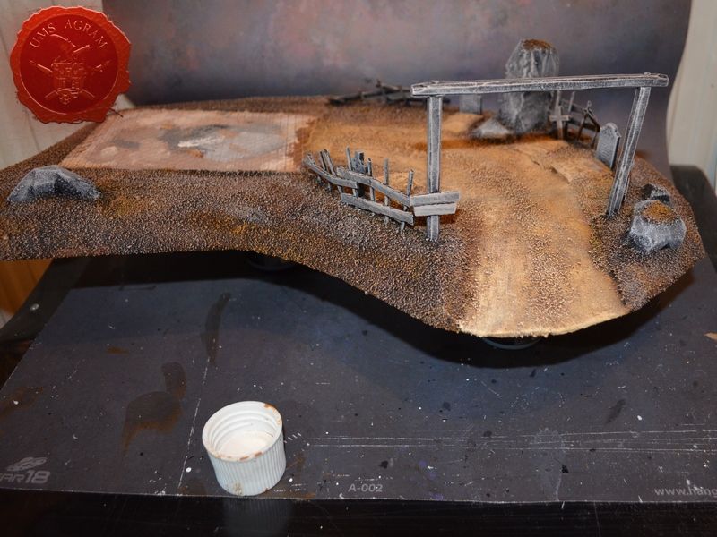
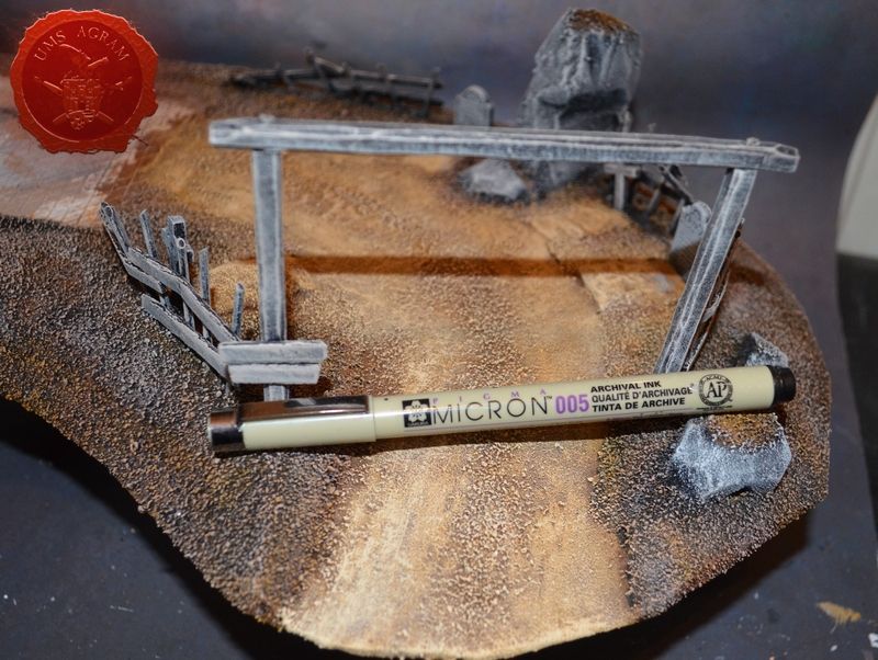
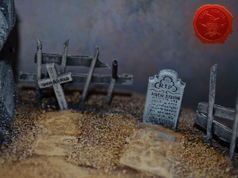
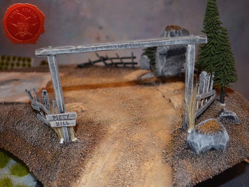
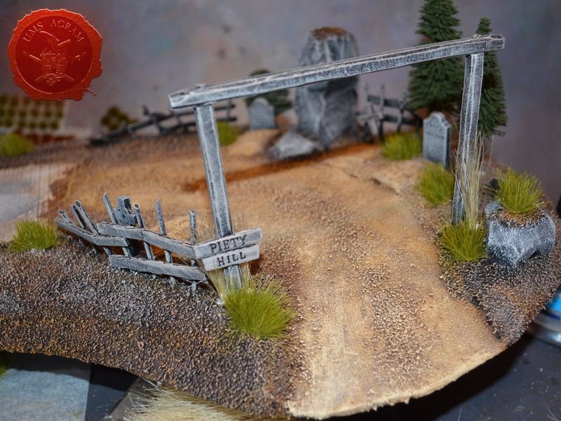
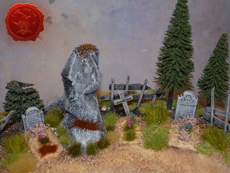
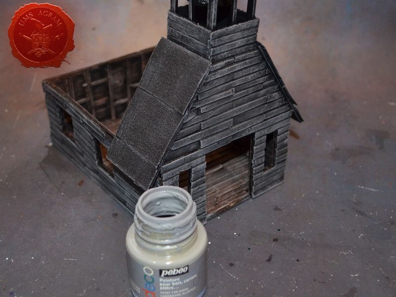
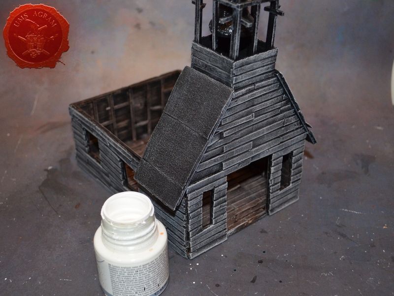
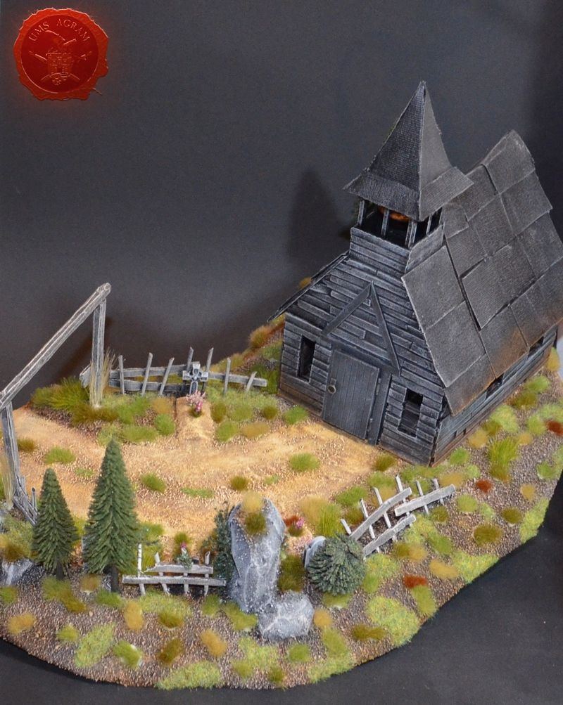
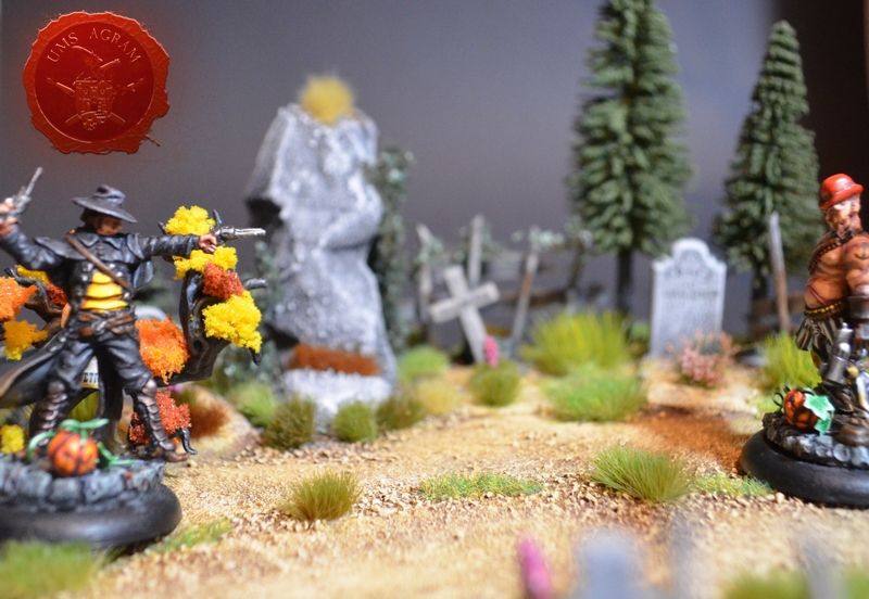
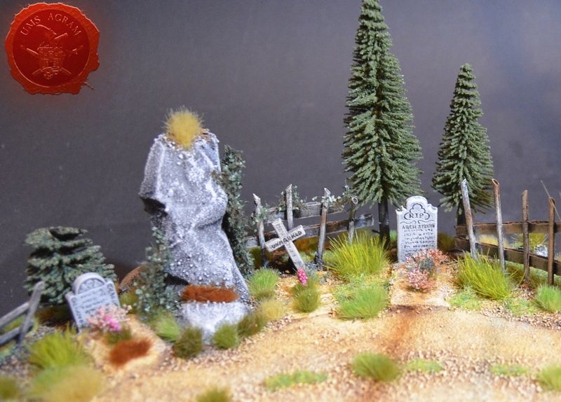
On all my scenery I use Pebeo Deco colours as I find they have just the consistency needed for quickly painting the terrain. They are quite rubbish for painting minis, mind you, as they are too thick. For terrain, however, they are perfect and their price of 3USD per 45ml bottle is well worth it. When the undercoat was dry, I painted brown all over the yard/road/graves area and just drybrushed the rest of the base. Using drybrush method (without cleaning my brush from previous paint) I applied ochre over the entire base. On the road part I added a final highlight of a mixture of ochre and antique white. Once that was done, I used black paint to pick out all the details – fence, stones, gate and when this layer was dry, I drybrushed them all with a mixture of black and grey. I highlighted it with pure grey. Now all my grey surfaces were the same, both wooden and stone. To make variation to them, I put a final highlight of pure white on the stone surfaces (stones and gravestones). I also added a highlight of ash to both the ground part of the base (without the road/yard) and the wooden parts. To end this part of painting process I decided to make hommages to two works of art very dear to me. First is the sign on the church gate that says Piety Hill in reference to Ray Anderson's work and the other is the two tombstones – one marked Arch Stanton the other marked Unmarked in reference to one of my favourite movies of all time. This being a terrain for Malifaux, I figured a reference to The Good, the Bad and the Ugly couldn't miss. All three signs I wrote using my 0,05mm micron marker (you can get those from Ebay for quite a reasonable price, and they come in several colours if you need them).
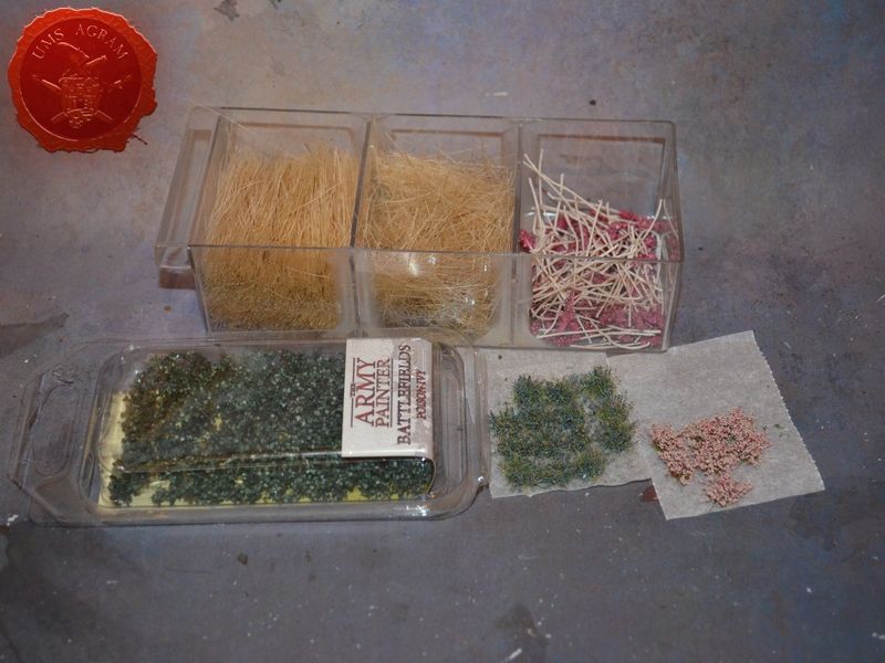
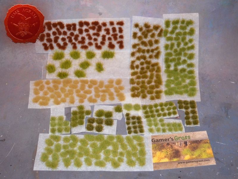
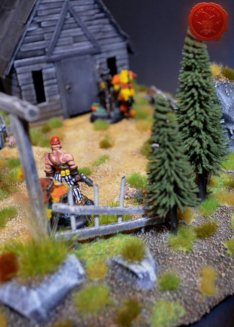
Vegetation
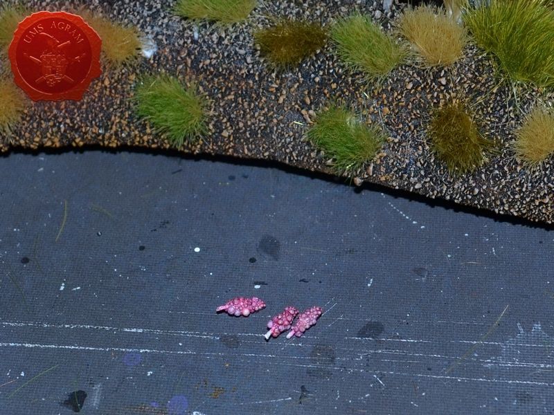
When I was done with painting, I glued the four pine trees to the base using PVA glue and assmbled all the vegetation I would use: tufts of flowers (found on Ebay), extra long static grass/fibres (Noch), Poison Ivy (ArmyPainter), and a wide assortment of tufts of various colours, sizes and lengths (Gamer's Grass). All these I would use on the base to hopefully get that prairie feel to the piece. Starting with the longest fibres and going to the shortest length tufts I glued each using PVA glue. In the end I added some flowers to the graves. With all the tufts glued, I still had some awkward empty places on the base so I decided to mix some static grass and glue it. I used green, pure yellow, ash and almost black green stuff to get the mixture of the right colour. When I was happy with the shade, I glued it using PVA glue once again.
Painting the church
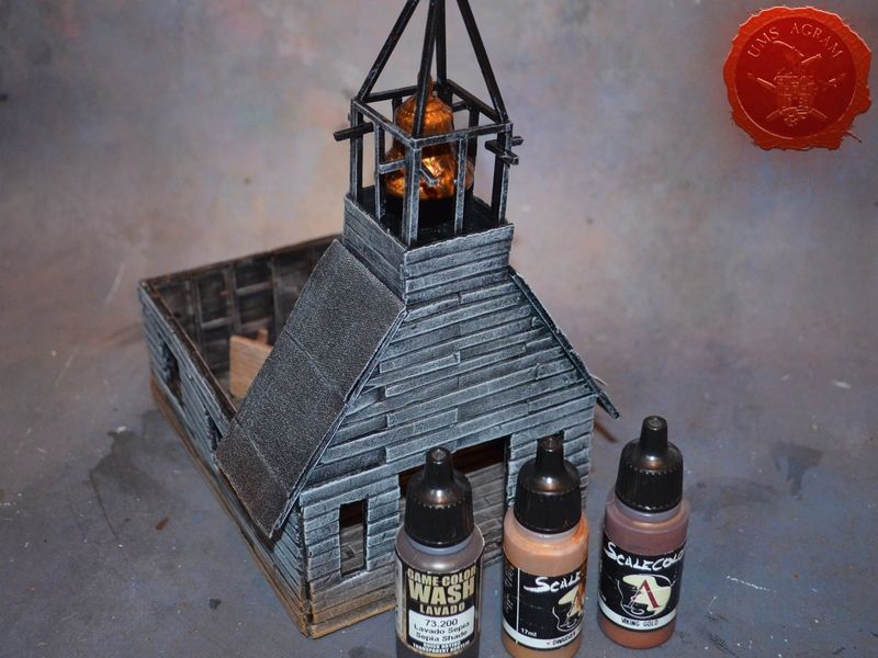
While the flock was drying, I painted the church. I decided to go for the brownish interior and grey exterior. Inside was painted using brown, ash and antique white. Outside was painted using a mixture of black and grey, then grey and pure white as the final highlight. While this was drying I added some poison ivy to the base and proceeded to paint the bell. This element was the only one painted with paints I normally use for painting minis. Scalecolor Dwarven and Viking Gold and Vallejo Sepia Shade. When everything was painted, I added the roof to the belfry and glued the church to the base.
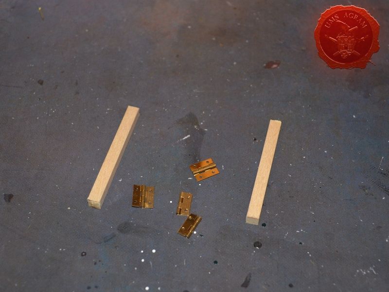
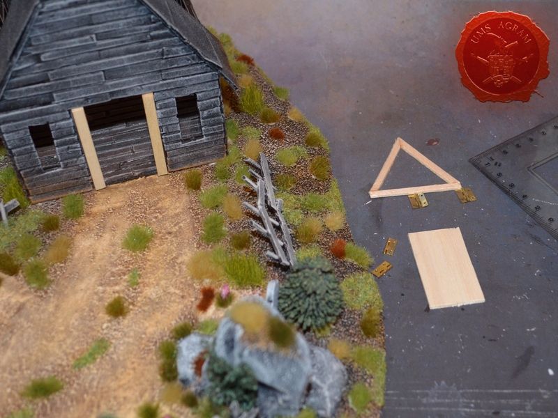
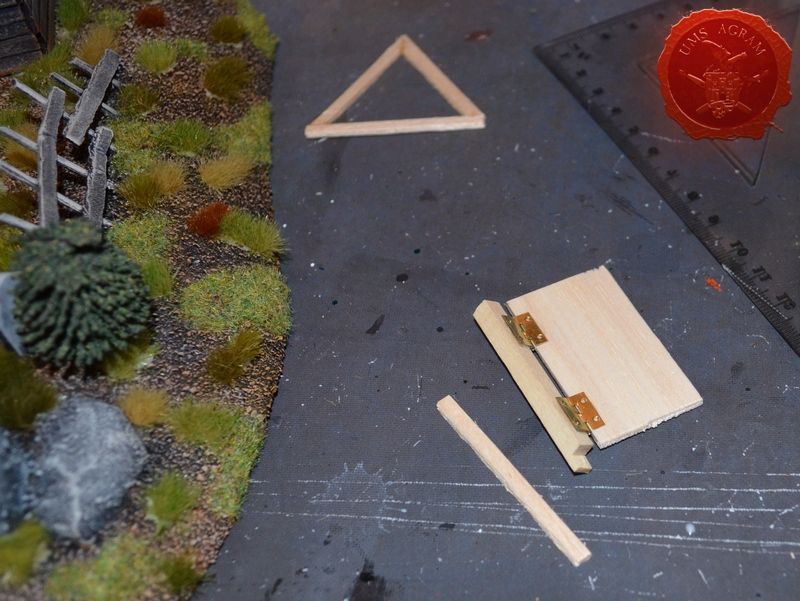
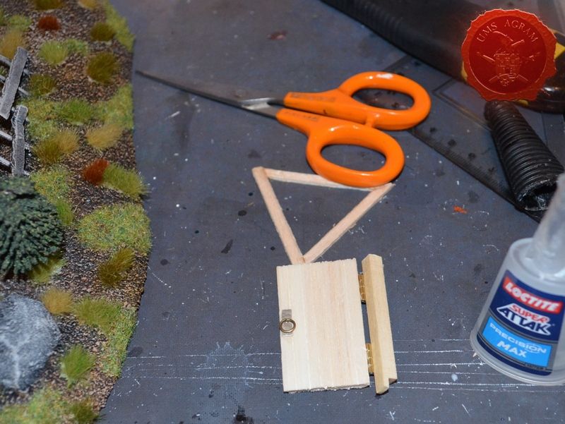
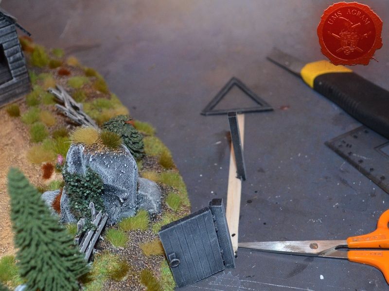
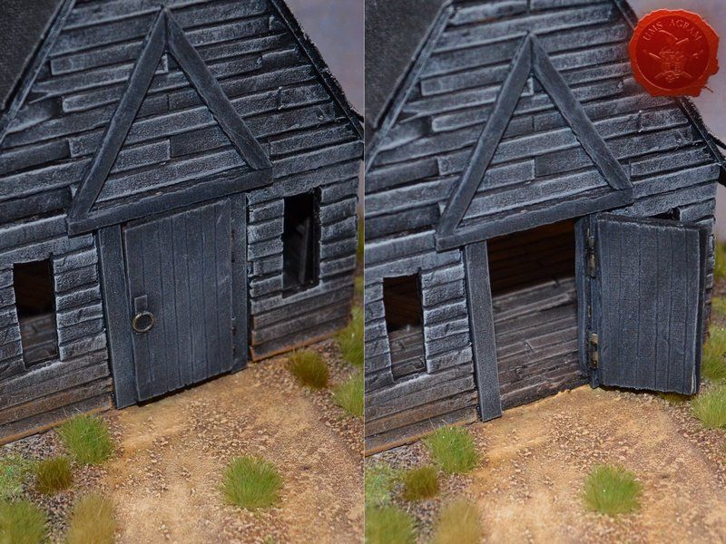
Adding the door that can be opened
During my build of the Malifaux modular gaming board for Figure Painter Magazine, I discovered a nifty little way to make doors that can open. Apart from a couple of linden slats and some balsa, it requires smallest (that you can find) hinges for jewlery boxes. The process of making is really easy, but you need to make sure the hinge is fixed between two plates both on the door side and on the frame side. This way, there is no (or little) chance of the door falling off during opening. Once it was done, I painted it following the process described above and when the paint was dry, I glued the whole thing to the church and the base.
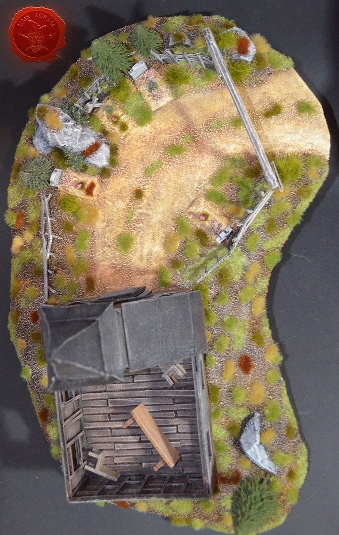
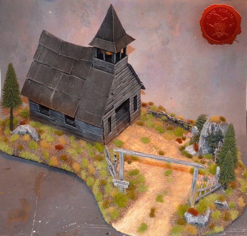
Final product
The fitting of the door marked the end of the project and all that was left was for me to take it to the club to take a picture of it with it's older brother.
Latest articles
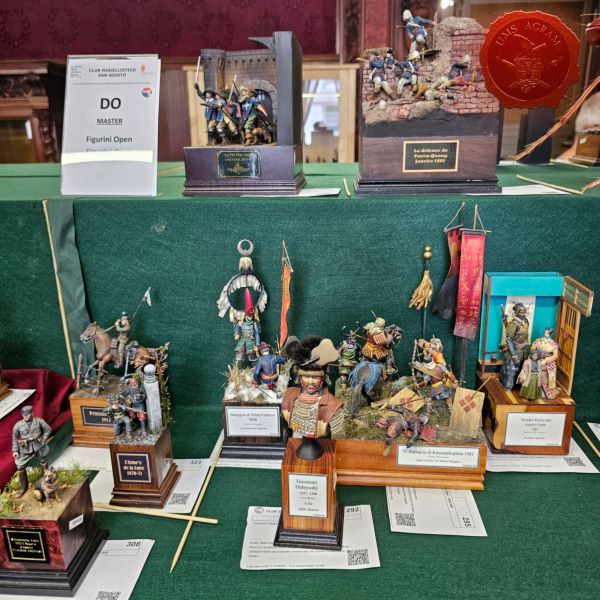
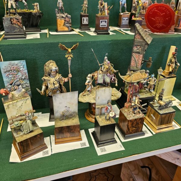
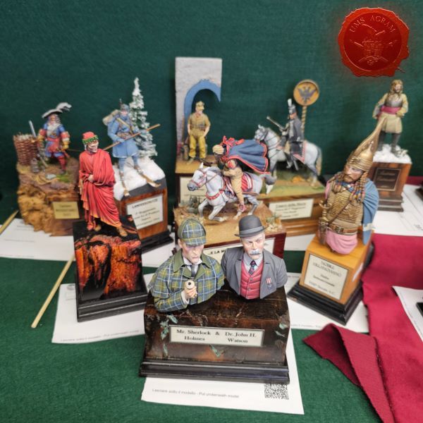
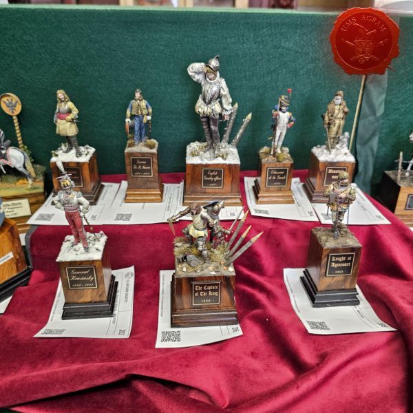
- We attended: Isle of Wonders 2026 Ili Said, 6th July 2026
- We attended: 13. Trofeo San Giusto 2026. Marko Paunović, 6th July 2026
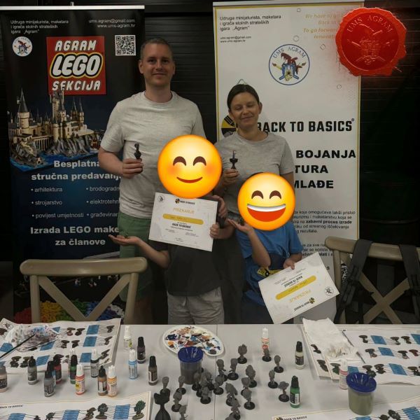
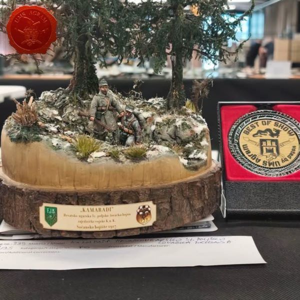
- We attended: Zagreb Scale Model Show 2026 Mario Grgurev, 6th July 2026
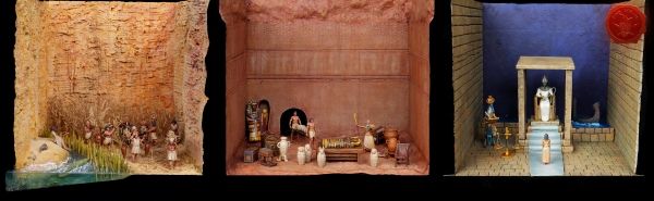
- Making of MUMMY dioramas Sebastian Søgård, 17th June 2026
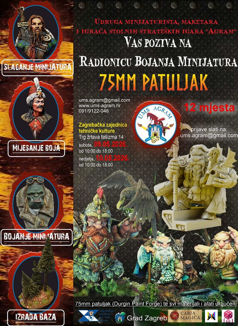
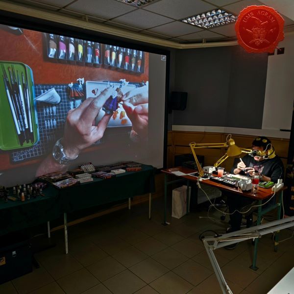
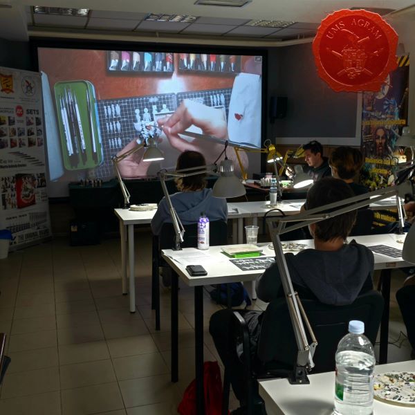
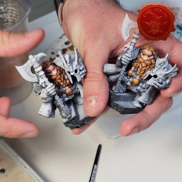
- Miniature Painting Workshop - 75mm Dwarf Ivan Knezović, 26th May 2026


Latest battle-reports
- Kill Team - Blooded vs. Vespid Stingwings 28th February 2025, GW - Warhammer 40.000, and Antoni Pastuović (Imperial Guard)
- 22nd April 2022, GW - Warhammer 40.000, Borna Pleše (Space Marines) and Kristijan Kliska (Tau Empire)
- 17th November 2021, GW - Warhammer 40.000, and Nino Marasović (Space Marines)