Building a modular river

Marko Paunović, 11th September 2020

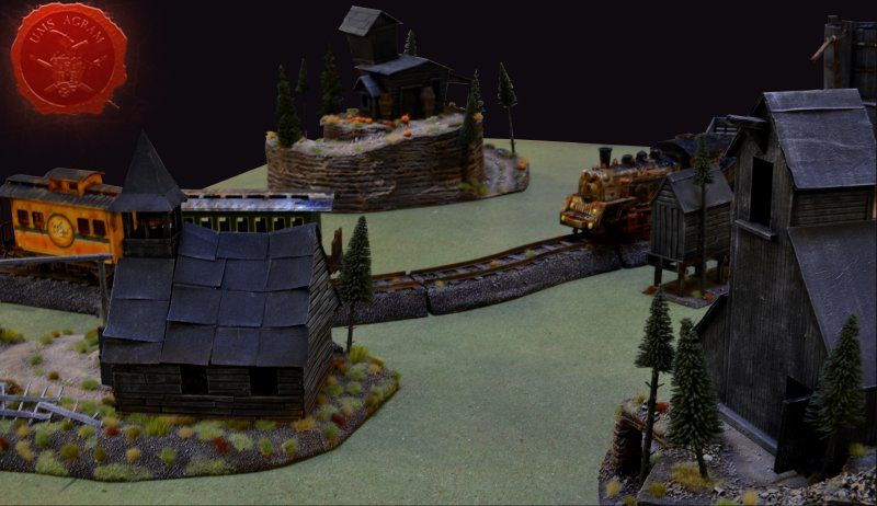
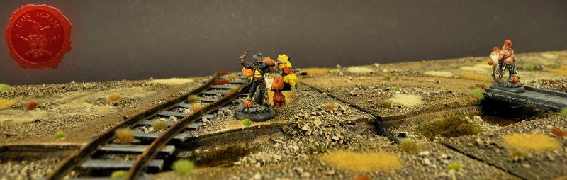
If you've been following my articles about building terrain in previous articles on this site, you'll know that I've slowly been making terrain for my Wild West table for Malifaux. I've already built a church with a graveyard, an undertaker's on a hilltop, a minehead entrance, a watertower and in the last issue I've covered the building process of modular railroad tracks. This time, I decided to do a modular river to span the length of the standard Malifaux table.

Click for enlarged picture

Idea and planning

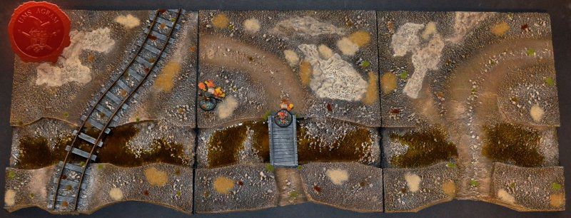
As always, planning is important, in some cases even vital part of the design process so it's always good to prepare yourself for the build. Good preparation not only saves money, but it also saves time. As I mentioned above, in this issue I'll be discussing how to build a modular river. Most of the rivers for tabletop look fake because people tend to make two banks with the river in the middle. This in itself is not bad, however, when placed on a flat tabletop, it will look more like a man made canal than a proper river. This had me thinking and I've come up with a simple solution. I decided to make the river modules about 30 x 30 cm (12'' x 12'') out of 2 cm thick HD styrofoam. This way, I'll have a part of the table at an elevated level with enough space to place some of the already built terrain. But most importantly the river won't look so much like a man made canal placed on top of the tabletop.

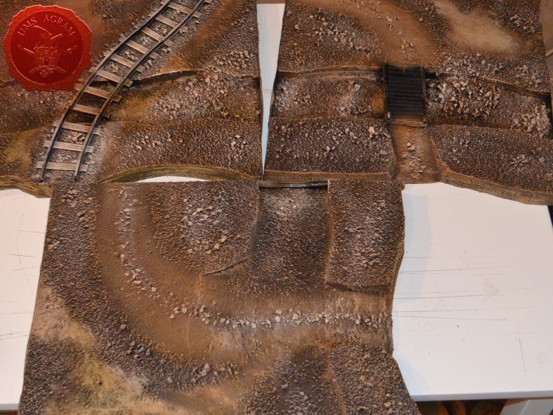
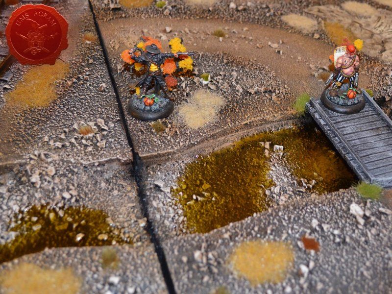
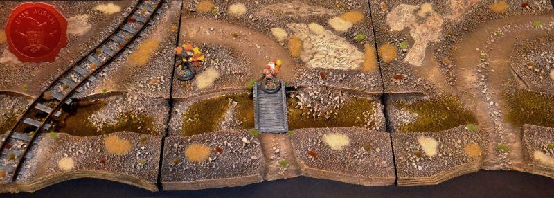
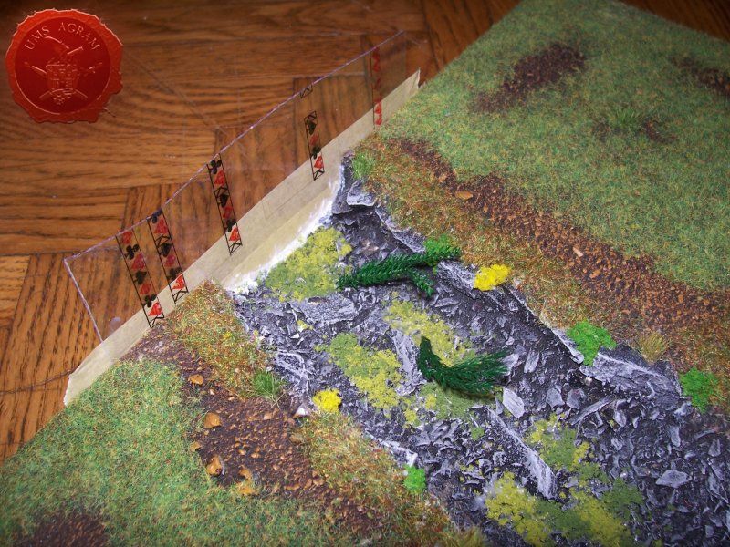
This in turn presented additional problems. Having such a river might provide some difficulties during gaming. How to get across to the other side, lots of free space with long lines of sight. Therefore, I decided that each of the three modules would have a river crossing. In order to make it as diverse as possible, I've decided to make one wooden pedestrian bridge, one railroad bridge (as I had some tracks left over) and one river crossing over shallows.

In fact, when I thought of the shallow crossing, it dawned on me that the overall setting on my table isn't what you normally see with lots of green colours and vegetation. It's almost desert like. That's the reason I decided to make the river almost dried up. (I will however, explain how to make the modules if you wish to have a full body of water inside your riverbed).

Materials and tools

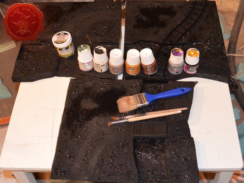
After the rough sketch, I could make a definite list of materials and tools needed for this project. Those are as follows:
- roughly 10cm 2 mm balsa wood plank (they come in 10 x 100 cm planks)
- roughly 10cm of 5mm balsa wood plank (they also come in 10 x 100 cm planks)
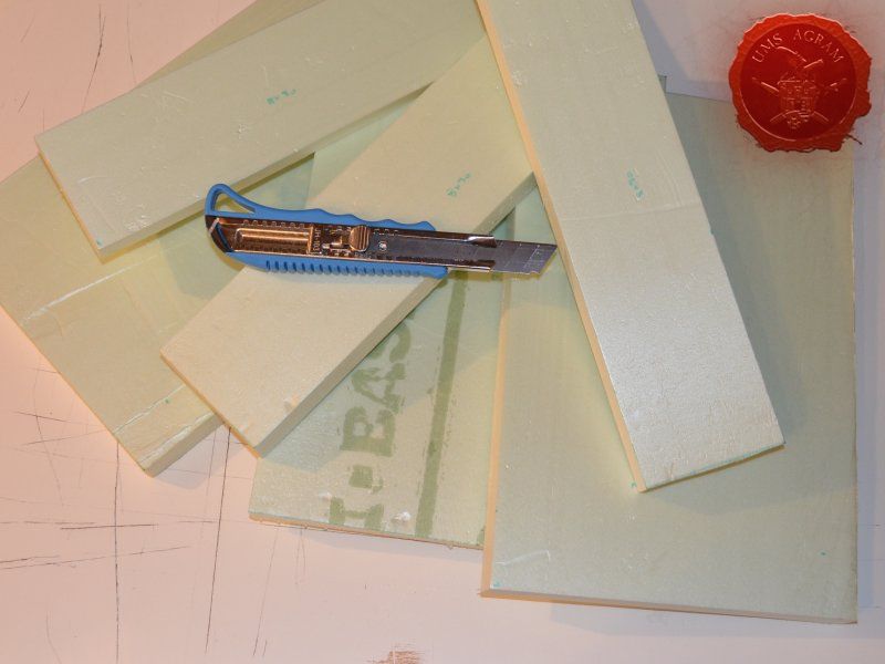
- about half a sheet of 2cm thick HD styrofoam (50x100cm)
- about 30 x 30 cm of 5mm thick MDF
- superglue
- PVA glue
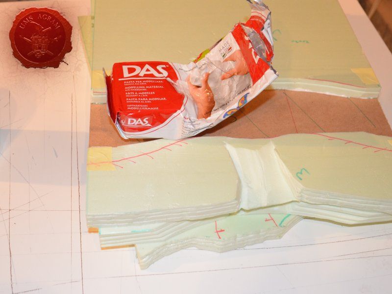
- 0,5 kg of DAS air drying clay
- gravel (four sizes)
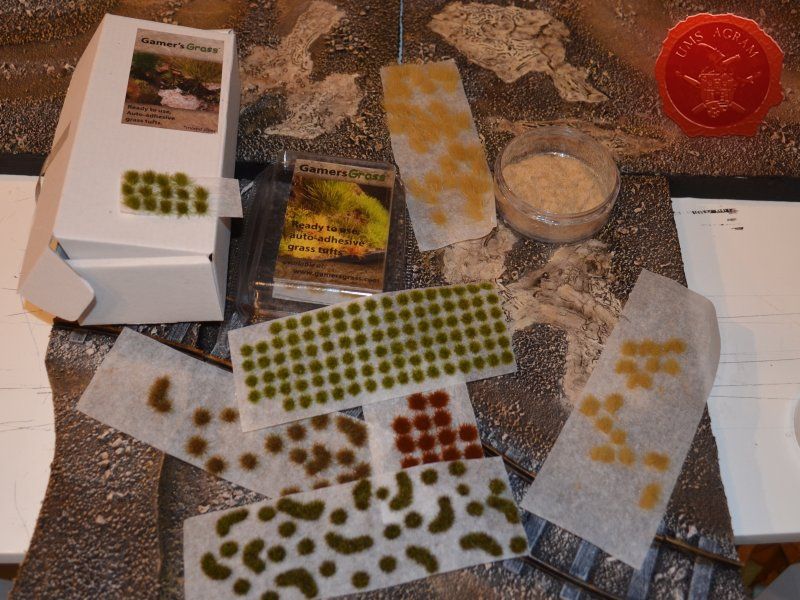
- static grass / tufts
- AK Interactive Light and Dry Crackle Effect
- sanding paper (1 sheet)
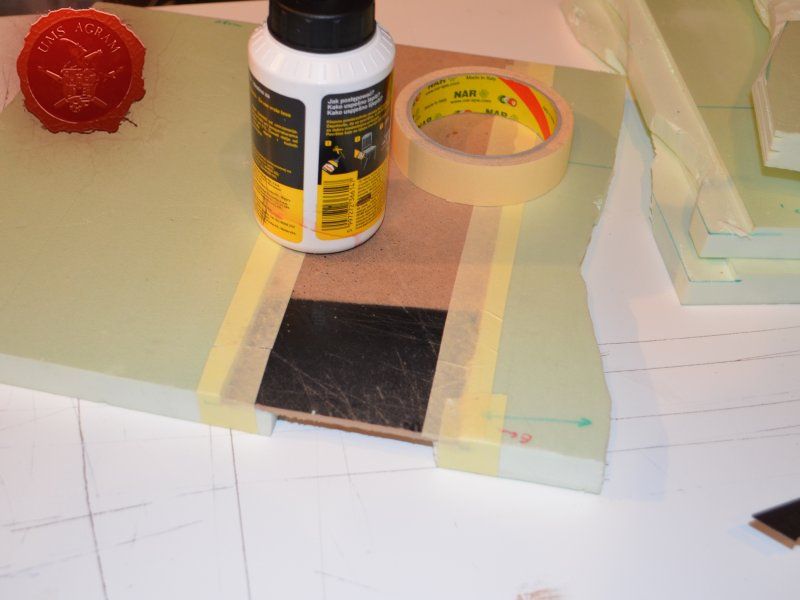
- masking tape
- Gedeo Crystal Resin
- Pebeo Vitrail Colour – Greengold
- railroad tracks (toy)

The tools needed are:
- scalpel blade
- marker pen
- scissors
- modelling saw
- brushes – various sizes – for painting/washing and for drybrushing
- hot wire cutter

* Like in previous issues, I used my Proxxon table mounted circular saw, jigsaw on the MDF to cut the river base and cut the tracks to size.

Building the base

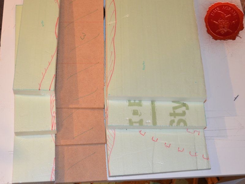
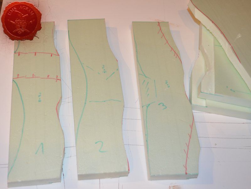
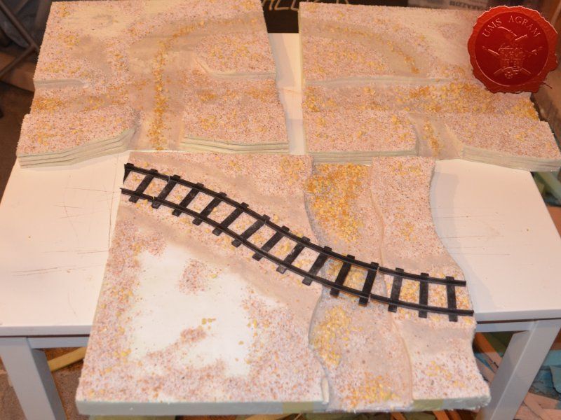
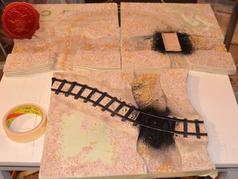
Having aquired all of the materials, using my scalpel blade, I first cut the three 30 x 30 cm modules from HD styrofoam. I then cut them in half with one side being about 20 cm wide and the other 10 cm. It was then time to draw the shape of the base of the riverbed on a piece of 5 mm thick MDF. If you have an irregularly shaped piece (like I had) it's wise to try different ways of placing your 10 x 30 cm riverbed modules to find the easiest way to cut the MDF. If you look carefull, you'll notice both red and green lines on my piece of MDF. In the end I cut the MDF along the green lines as it saved me a couple of passes with my jigsaw.

Click for enlarged picture

Click for enlarged picture

Click for enlarged picture

Click for enlarged picture

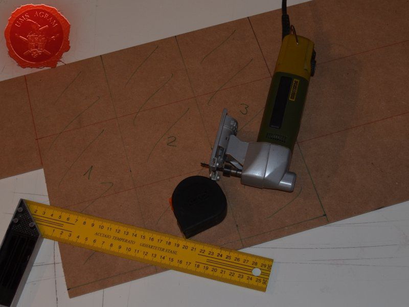
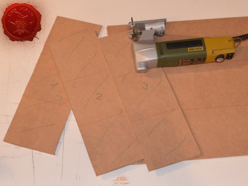
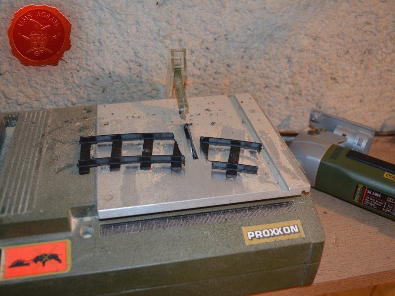
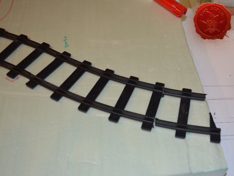
When both the HD styrofoam and MDF parts were cut, I made a mock assembly to find a suitable place to put my railroad tracks (as I had no straight lines, only curved). When I was satisfied with the layout, I cut the last piece of the track using my table mounted circular saw. If you don't own one, same can be done with either a scalpel blade or a modeller's saw.

Click for enlarged picture

Click for enlarged picture

Click for enlarged picture

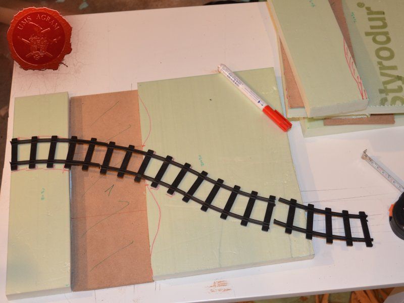
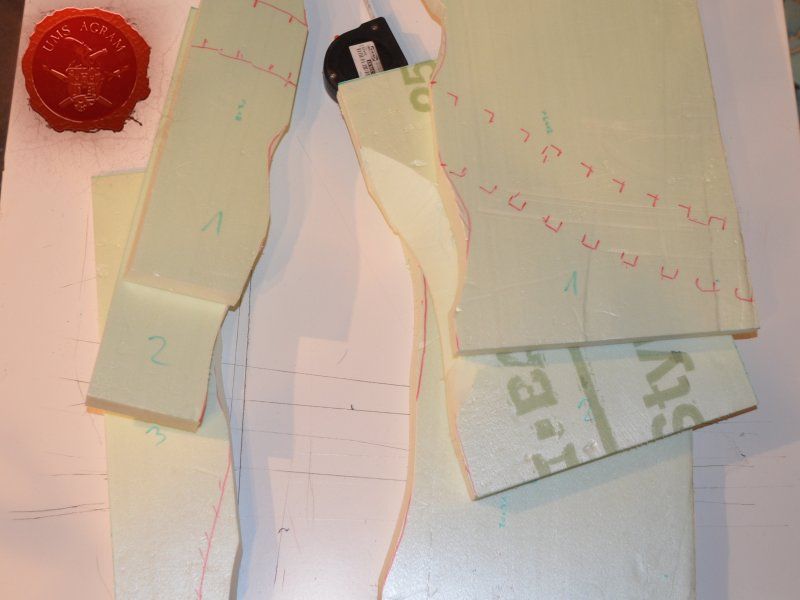
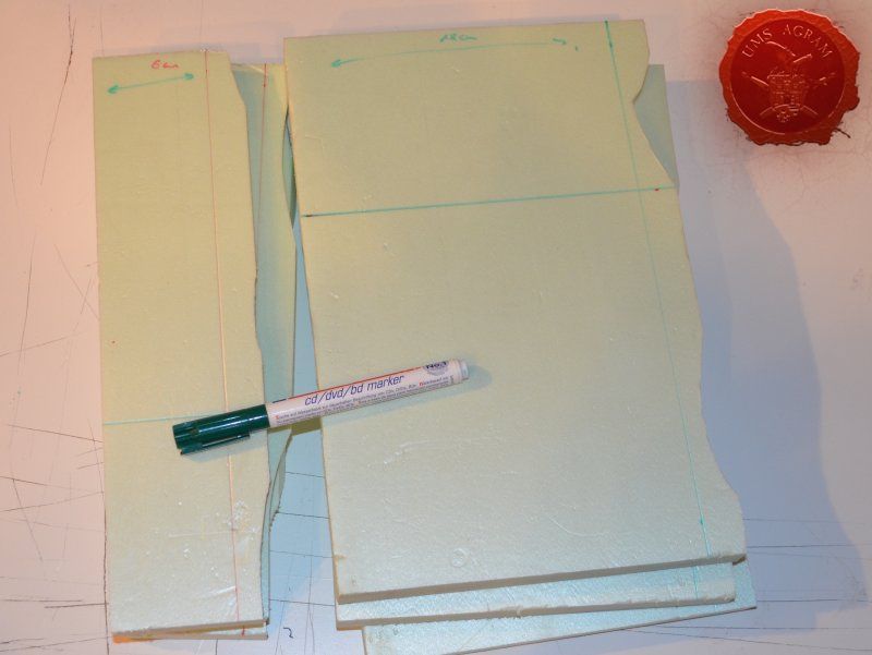
When the railroad was cut, it was time to design the river banks. Placing the three pieces that make one module (small and large HD styrofoam part with MDF river bed in the middle), I drew the outline of the river bank using my marker pen. I made sure that the edges of the modules on both sides were exactly the same dimension. This would ensure that the modules can be placed in any formation. Following the drawn lines as closely as possible with my sclapel blade, I cut the embankments. It was now time to try to fit the MDF river bed to the remaining two parts. Again, using my marker pen, I marked 5mm from the bottom side of the styrofoam board and exactly 18 cm from the back of the larger and 6 cm from the smaller styrofoam piece. I cut along the lines and removed the excess material. This would ensure that my MDF riverbed would snuggly fit the HD styrofoam parts of each module.

Click for enlarged picture

Click for enlarged picture

Click for enlarged picture

Click for enlarged picture

Click for enlarged picture

Click for enlarged picture

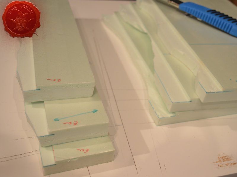
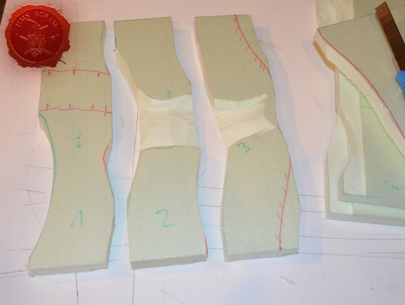
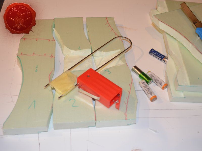
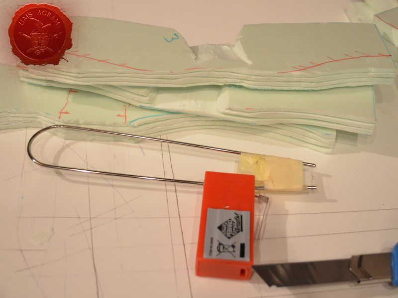
Before assembly, I had to cut the surfaces of the embankments. I used my electric hot wire cutter. Hot wire cutter can come in several forms and power outputs. The one I have is the cheapest out there, powered by two AA batteries. How it works? The electricity from the batteries heats up the wire that then melts the styrofoam performing a perfect straight cut. However, as it heats the wire elongates so you should take into account that fact when fixing the wire to the cutter. It is quite cumbersome to operate in small, confined places which is the reason I used it before assembling the river modules.

Click for enlarged picture

Click for enlarged picture

When the embankments were formed, I turned the two HD styrofoam pieced over, generously poured some PVA glue and placed the MDF river bed in its place. Using my finger, I removed the excess PVA glue and with some 2 cm thick masking tape, I covered the joints between HD styrofoam and the MDF ensuring I had a really hard bond. Also, covering the joints with tape, enables you to procede with the build as it prevents the PVA glue from leaking. PVA glue normally takes up to 6 hours to fully cure.

Click for enlarged picture

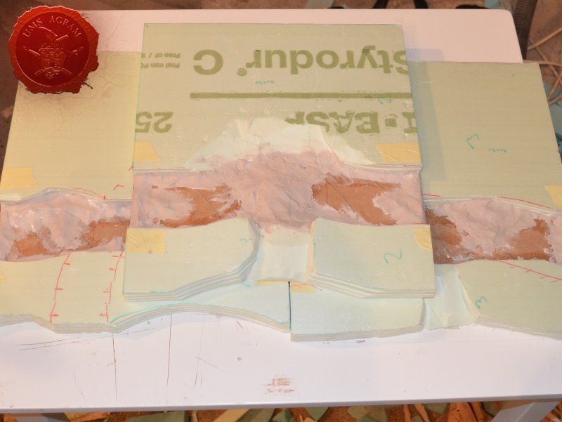
With the tape in place, I turned over the tree modules and I built up some volume using DAS air drying clay. I made sure I had some clay on every edge of the module. When I add texture, this will ensure that the resin remain inside my module. I've already mentioned that I want the river to be half dried-up so this will actually help with the build as well as look good.

Click for enlarged picture

Click for enlarged picture

Texturing

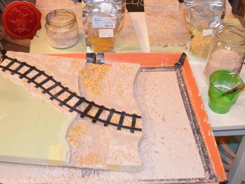
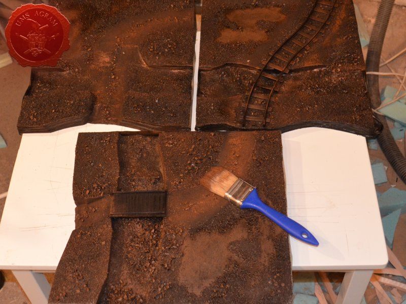
At this point, I was nearing the end of the construction and all that had to be done before the painting was to add texture to the base. In order for the grooves that were cut with the hot wire cutter remain undamaged after undercoating (undercoat sprey burns styrofoam so it needs to be protected), I decided to cover those surfaces with a cote of pure PVA first. While it was drying, I took out all the gravel I was to use on this project: - chinchilla sand – smallest grain - basing grit in two sizes - chinchilla sand – largest grain

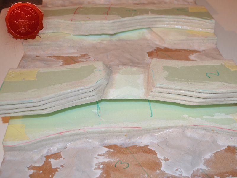
Once the PVA protection was dry, I smeared more wattered-down PVA on the vertical surfaces and sprinkled some smallest grain chinchilla sand. I then repeated the PVA smearing process on the roads and river shallows. Here, however, I first sprinkled over some largest grain gravel, next I sprinkeld some Basing Grit and to finish I poured over the smallest grain chinchilla sand. If you sprinkle gently and with care you can end up with nice variations in texture – for instance the middle of the dirt road usually has some larger stones as opposed to the sides of it. When the road was dry, I repeated the process with the rest of the base, sprinkling the two largest grains over the ground part. Inisde the riverbed, I carefully placed the largest gravel where the riverbed would be dry, and intentionally left the smaller grain where the water effect would be placed.

Click for enlarged picture

Click for enlarged picture

When I tackled the module with the railroad tracks, I first covered the route of the tracks with pure PVA glue to make sure the railorad tracks would stick. Then I sprinkled some roughest grain gravel along the route and in between the tracks.

Click for enlarged picture

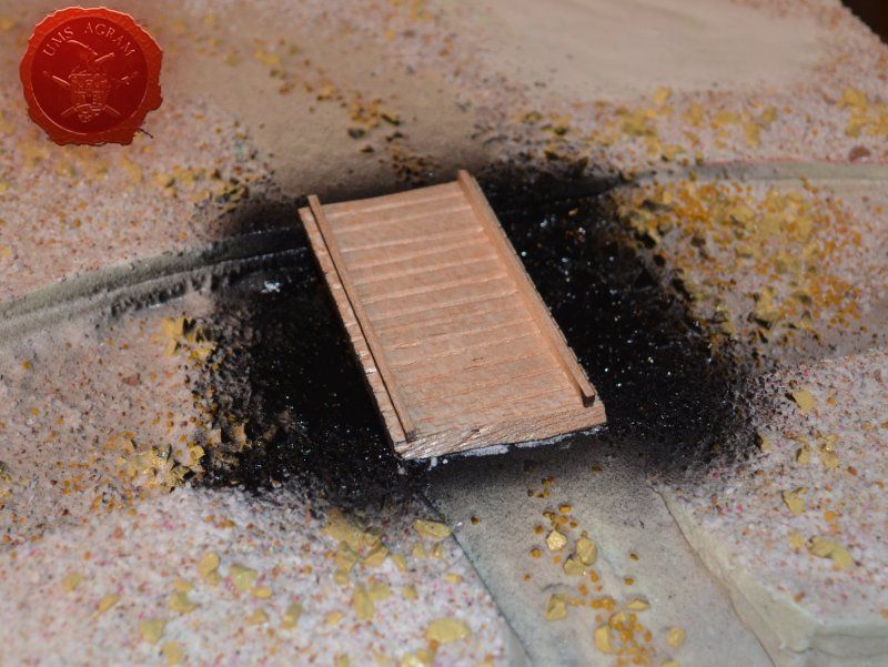
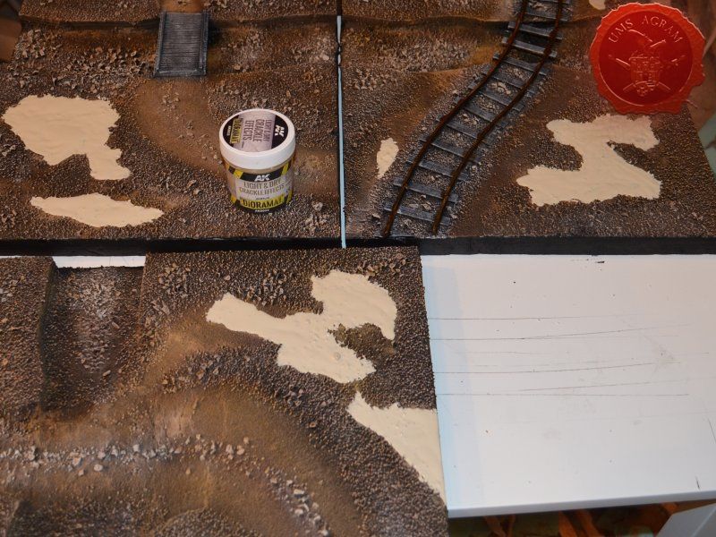
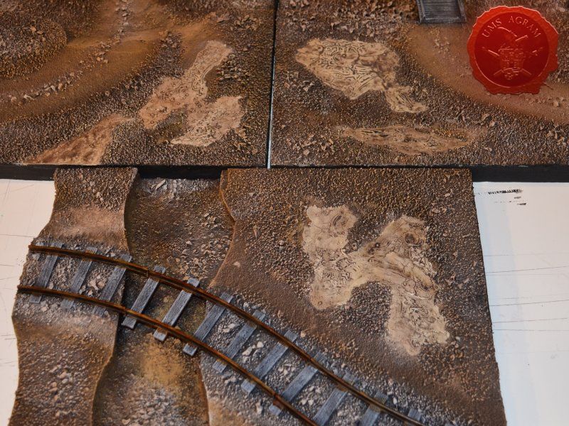
You will notice that all of the modules have some parts of the modules without sand (with only PVA over them). This part of the modules would be covered with AK Interactive Light and Dry Crackle Effect paste to create the image of a dried up desert. But more about that a bit later on in this article.

Click for enlarged picture

Click for enlarged picture

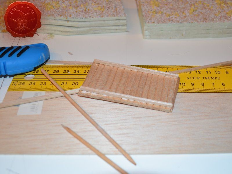
Making the bridge structure

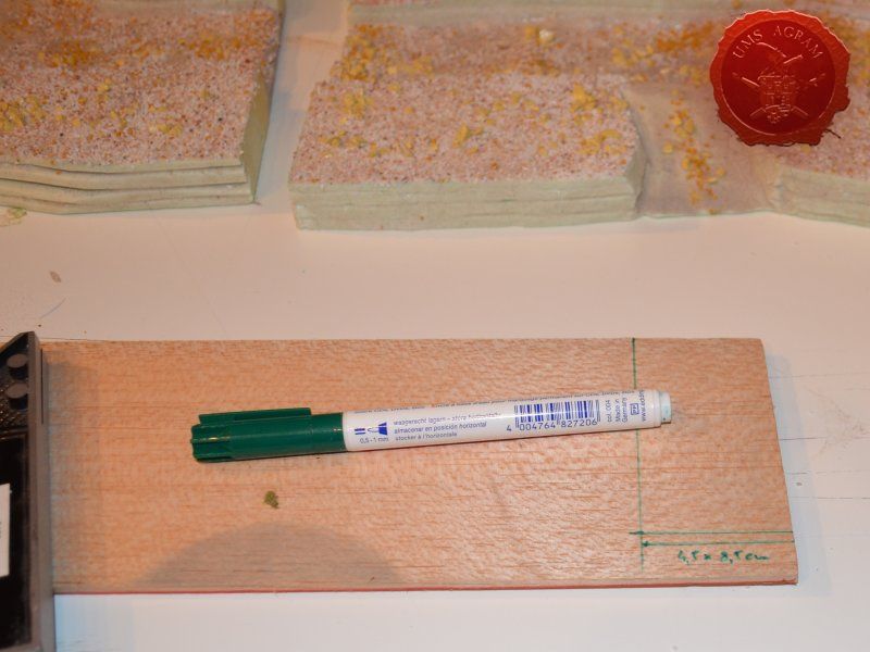
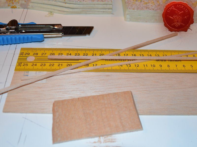
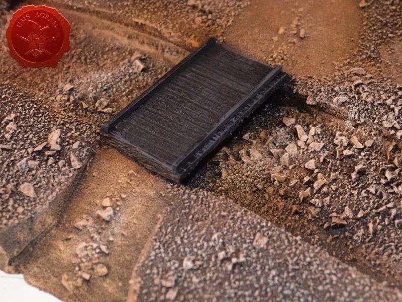
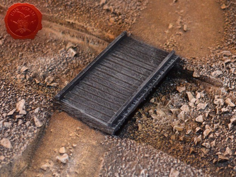
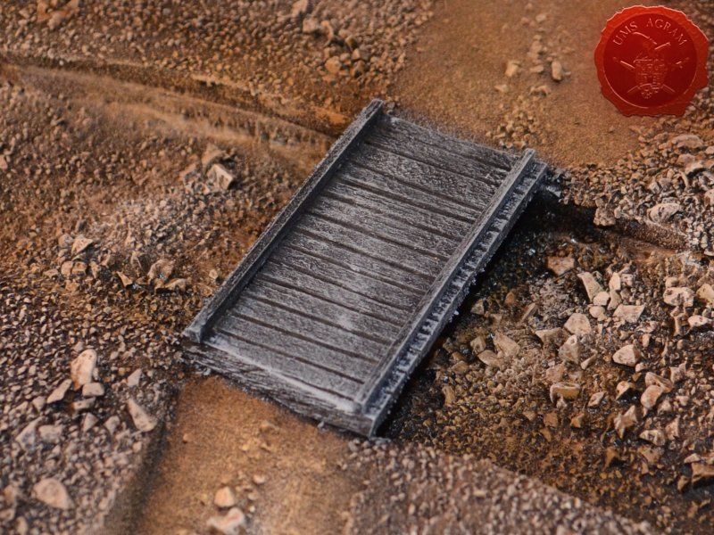
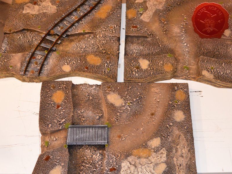
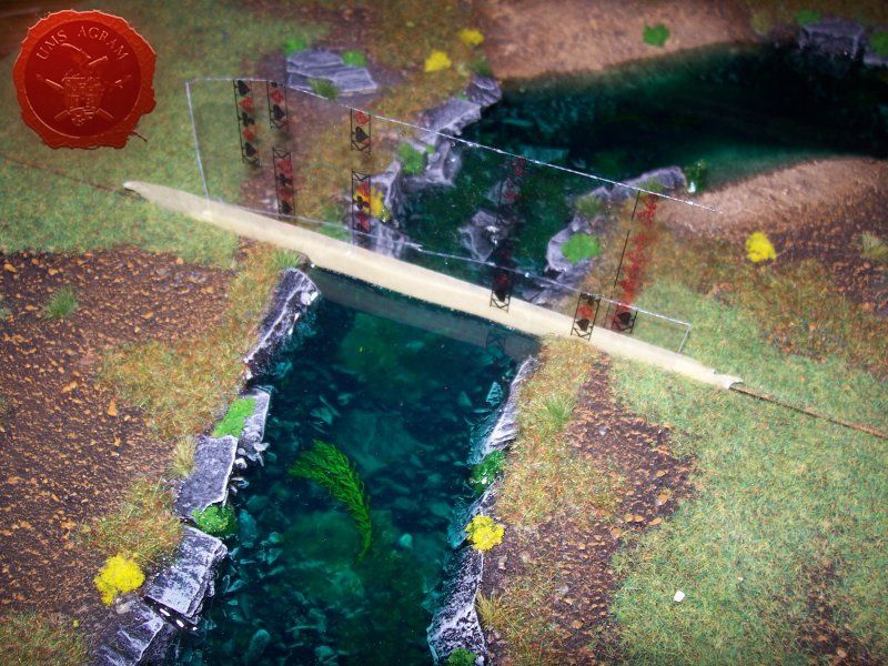
Before undercoating, there was only one more thing to do – the wooden pedestrian bridge. Using a 4,5 x 8,5 cm piece of 5mm thick balsa wood I made the body of the bridge. The dimensions I used are a bit odd, but it's only because the bridge was made to measure. I measured the width of the road and the span of the river and came up with those numbers. The 4,5 cm wide bridge would however accommodate every miniature base for Malifaux. When the body was cut, using a wooden stick, I made grooves across the bridge that would make up planking. Then, using 2 mm thick balsa wood, I made several supports for the bridge and glued them using super glue. Before gluing the bridge to the base, I undercoated the underside of the bridge as well as the river bank and river bed under the bridge to make my job easier later on.

Click for enlarged picture

Click for enlarged picture

Click for enlarged picture

Click for enlarged picture

Painting

First job when painting is to undecoat everything. This will help with the shading and the overall 3D effect of the entire terrain piece. Wanting all my terrain to fit one theme (and consequently one tabletop) it was only natural I use the same colours and colour scheme as on the earlier terrain. Therefore once again I used Pebeo Deco color range. I used Brown (29) for the basecoat and continued drybrushing with Ocre (51). Lighter shades were done with a 50:50 mixture of Ocre (51) and White (41). The final highlight was done with Antique White (69). The road and the river shallows were first basecoated with Brown (29) then heavily drybrushed with Ocre (51) and a 50:50 mixture of Ocre (51) and White (41). The last two highlights were Antique White (69) and pure White (41). This way, I had a visual difference between the normal groundwork and the worn out road.

Click for enlarged picture

Click for enlarged picture

Click for enlarged picture

Click for enlarged picture

Click for enlarged picture

Click for enlarged picture

Click for enlarged picture

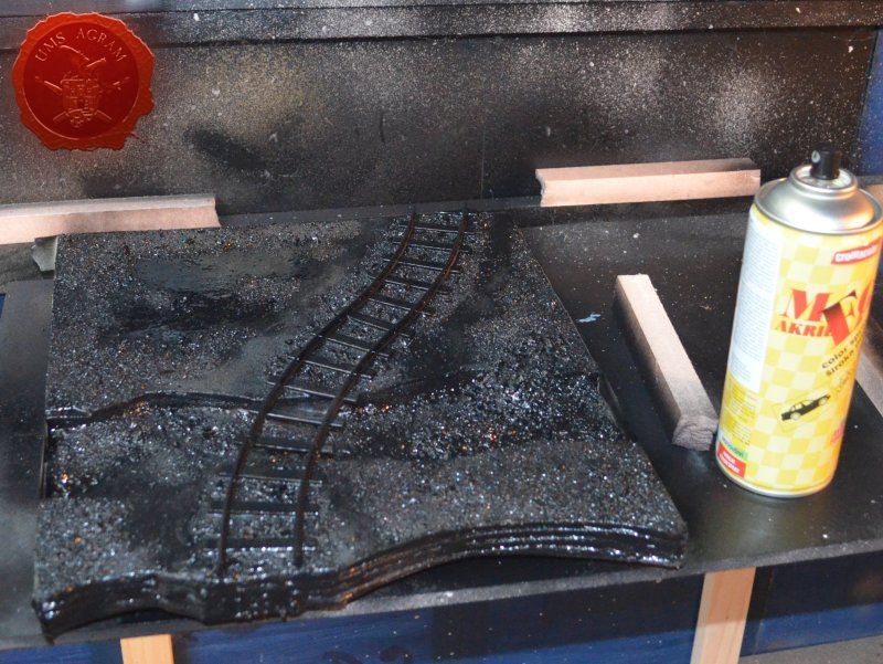
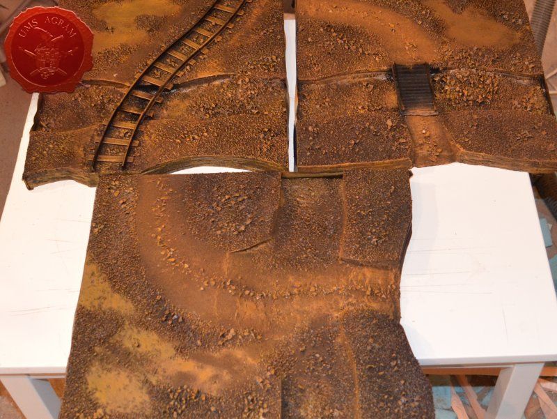
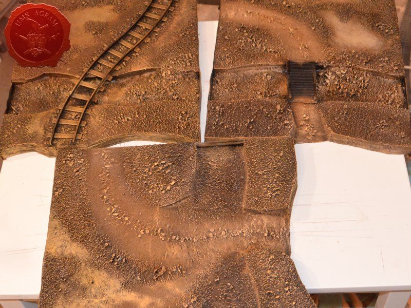
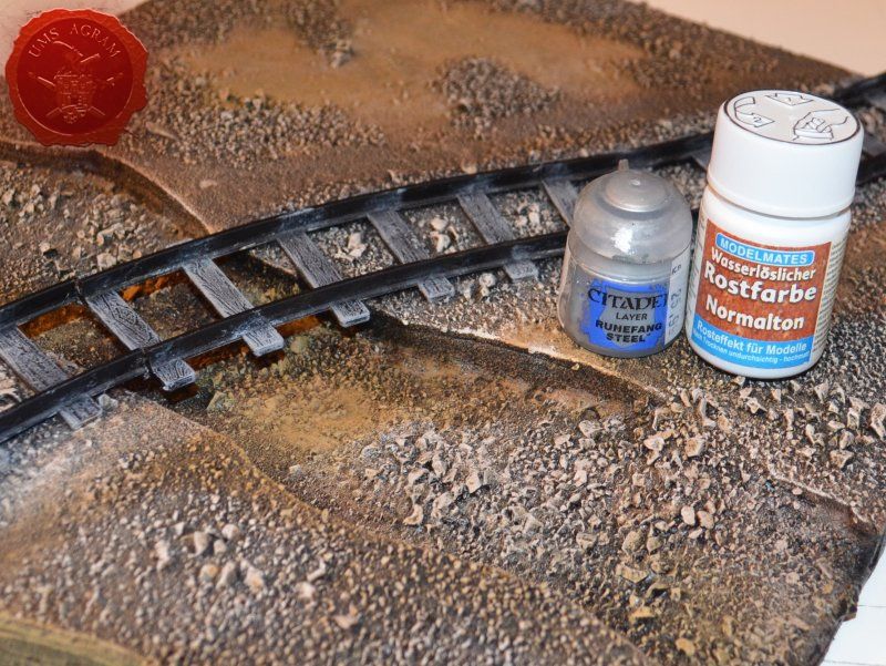
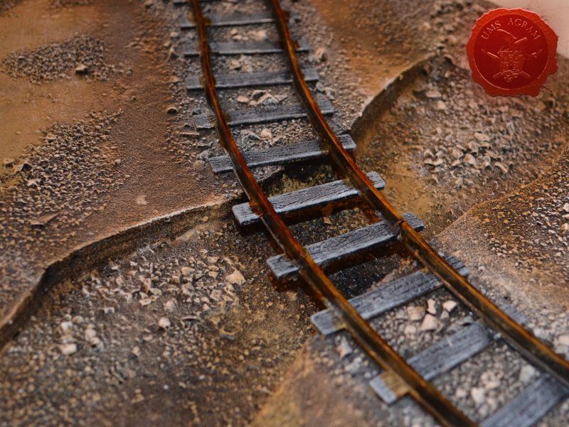
The bridge and the wooden parts of the railorad tracks were painted by drybrushing first using a 50:50 mixture of Black (55) and Grey (54). Next layer was pure Grey (54) and the finishing highlight was Ash Brown (70). I was not quite satisfied with the result, so I added another highlight of pure White (41). The metal tracks were then painted pure metal (I used Citadel's Runefang Steel). When it was dry, as was the case in the last issue, I covered the metal bits with Model Mates' Rust Effect.

Click for enlarged picture

Click for enlarged picture

Click for enlarged picture

Click for enlarged picture

Click for enlarged picture

With the basic painting done, you'll have noticed the large patches without texture where pure PVA was placed in the texturing phase. As I promised before, I covered this parts using AK Interactive Light and Dry Crackle Effect. In some places I left only a thin layer, while in some I put it on generously and left it to dry. When it was dry, the effect of dried earth was created.

Click for enlarged picture

Click for enlarged picture

Vegetation

After the painting, it was time to add the vegetation to the base. Normaly, at this point, I'd add some trees (in the case of this Malifaux build, pine trees to be more exact). However, here I decided not to plant them as this way, the storage would be much, much simpler. And anyway, my intention is to make a lot of smaller terrain pieces (like small pine forest patches, some crates and other debris later on – maybe even in the next issue). With the trees out of the way, I added some static grass. I made a mixture using several green, brown, yellow and black shades of static grass and when I was satisfied with the end product, I glued it in random patches throughout the modules. One thing I made sure of is that I put static grass over any and all of the remaining holes where the black undercoat melted the HD styrofoam in order to hide the unintentional mistake. Once the static grass was in place, I applied several shades of different tufts. Again, as in the former articles, I used tufts made by a company called Gamer's Grass.

Click for enlarged picture

Click for enlarged picture

Working with resin

The water on the tabletop terrain can be simulated in many ways. Some are better and more realistic, while some are simpler but less believable. In my experience, I've come across six ways of reproducing water. In the end I'll focus on one method that in my opinion gives the most faithful reproduction of water.

First method is to texture the surface using PVA glue and sand (which is an especially good method for streams) and then paint it using long strokes of greenish brownish tint. After the paint dries coat it with a thick layer of marine varnish or some other form of gloss cote.

The most primitive method is using water itself. Leaking and not having depth in artificial light are the biggest drawbacks apart from evaporation and tendecy to grow life.

The third option is using glass. Make a riverbed like I explained earlier and put a glass surface over it. For extra effect you can tint it on the bottom. However, it is difficult to shape, so that it is not worth the effort.

The fourth method is using plexiglas. Same principles apply here as in the previous method. It is relatively easy to cut and is good for flat and calm water. I've seen it used in railroad models extensively and while both of these methods can look good on static displays such as railroad model tables and such, on smaller pieces of terrain (like used on tabletop) it is better to avoid these two methods.

The fifth method to recreate water is using marine varnish. Pouring in numerous layers means it takes a lot of time to finish. And still you will not get much depth in your river/body of water. It is therefore suitable for small wetlands or small ponds and puddles on various terrains. As with the first method, work in well-ventilated preferably open areas.

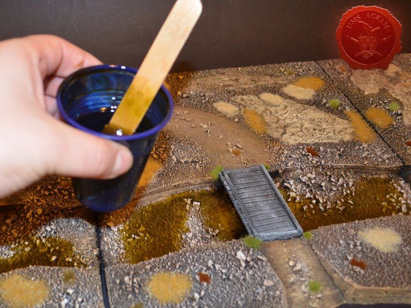
The final method, and also the most realistic, is the usage of resins. Are usually two-component mixtures (one is resin, the other a hardener). They are a really good way of creating water, both still and running. Good depth can be achieved and they can be tinted with special colors so that you can get the shade of water you need. A few tips for working with resin: - Protect your hands - wear gloves - Work in well ventilated areas - Have thinner handy to clean up if your pours outside the wanted space - Stir in plastic cups - When it is poured, drill the bottom of the glass so that Resin can slowly leak to avoid creating air bubbles

There are numerous versions of resin available at the market today but I’ll name a few products I use.

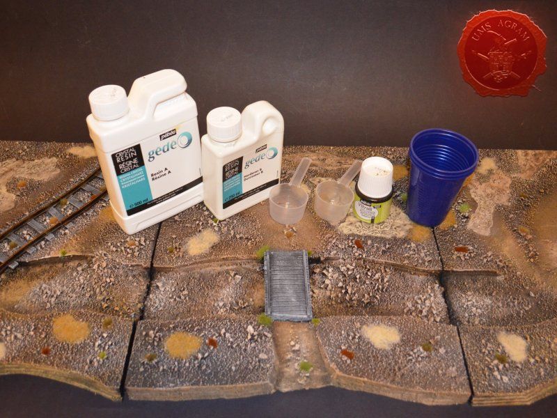
First, two part resin called Crystal Resin which is made by a company called Gedeo. It comes in two various sizes (300 ml and 750 ml), and can also be bought predyed. It’s main advantage over other products out there is that it is mixed in 2:1 ratio (resin : hardener), unlike most products who mix in 97:3 (or similar) ratio. Because of the easy way to calculate the ratio, this enables me to use quantities I need and does not force me to use the whole package at once. It has a drying time of 24 hours.

Second, Vallejo Still Water which is an awesome one part resin. It does not require mixing and can be dyed using Vallejo colours. It comes in a 200 ml bottle and is great for small ponds on your bases.

The third kind I use is Vallejo Water Effects (Extra Heavy Gel). It comes in various colours, but I use the transparent one. It is a white paste with the consistency similar to that of a tooth paste that dries clear. It is great for modeling ripple effects or waves on your water surfaces.

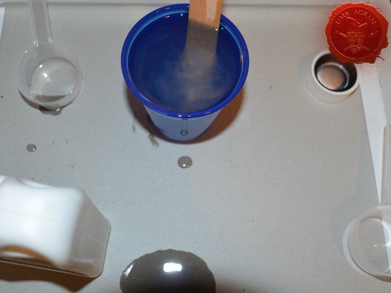
Back to the practical application. For this build, I chose Gedeo Crystal Resin. I first mixed a batch of resin and hardener (2:1 ratio as per instructions). Once I got a murky consistency, I poured in some Pebeo Vitrail Greengold Colour. Using a stirrer, I mixed it evenly throughout the resin. When I was satisfied with the colour, I carefully poured the resin inside the modules making sure I do not drip where I'm not supposed to. I left it to dry for 24 hours and my modular river was done!

Click for enlarged picture

Click for enlarged picture

Click for enlarged picture

Click for enlarged picture

Click for enlarged picture

Click for enlarged picture

Click for enlarged picture

How to make full-bodied river modules?

Simple. Follow the steps described earlier up to the point of pouring in the resin. Before I could add resin into the riverbed, you need to make dams to prevent the resin from leaking. Easiest way is to use strips of plastic foil gently glued to the sides of each module using superglue. Then use Vallejo Extra Heavy Gel to seal the joints between the modules and the plastic foils on the inside of the riverbed. Leave it to dry thoroughly, day or two if neccesary. Once dry, covered the plastic foil on the inside with some cooking oil to prevent it from sticking to the resin. Then place all the modules next to each other and pour in the coloured resin of your choice into each of the modules making sure that the level of the river in each module was the same. Leave it to dry for 24 hours, at least. Also, if you want to have a gradual transition of the colour in your river (pure resin on top with the darkest colour in the bottom), use several layers starting, obviously with the darkest colour allowing each layer to fully cure. Once the resin is dry, remove the plastic foil dams and there you have it – river done. To add some ripples and waves, you can use Vallejo Extra Heavy Gel when the resin is dry.

Click for enlarged picture

Click for enlarged picture

Latest articles

  • Painting Faces at Tabletop Level
              array(2) {
      ["Article"]=>
      array(10) {
        ["id"]=>
        string(3) "510"
        ["member_id"]=>
        string(2) "35"
        ["title_eng"]=>
        string(32) "Painting Faces at Tabletop Level"
        ["title_hrv"]=>
        string(35) "Bojanje lica standardom za tabletop"
        ["mask_eng"]=>
        string(32) "painting_faces_at_tabletop_level"
        ["mask_hrv"]=>
        string(35) "bojanje_lica_standardom_za_tabletop"
        ["content_eng"]=>
        string(4367) "

    In this short article, I will describe two ways to paint faces on a so-called tabletop standard. The text follows two versions of the painting. One will use a store-bought wash, and in the second, slightly less contrasting one, I will use a wash that I got from regular paint. This way, the reader can choose which method suits them better.

    Click for enlarged picture

    The first step is to dye the base color.

    Left: Since I'm going to use a store-bought wash in this example, I decided to go for a darker shade of skin tone.

    Right: In this example, I'm going to use the color as a base for the wash, so I decided to go for a slightly lighter skin tone - and therefore a lighter base color.

    Click for enlarged picture

    The next step is to apply the wash.

    Left: I use a regular, store-bought Reikkland Fleshshade wash.

    Right: On a drop of the darker skin tone, I add two drops of Lahmian Medium and a drop or two of water. This creates my own wash, which I apply similarly to the example on the left.

    Click for enlarged picture

    Then comes the first highlight.

    Left: I apply the base color to the raised parts of the face and thus get the first highlight.

    Right: Just like in the example on the left, I use the base color as the first highlight.

    Click for enlarged picture

    Then the second highlight.

    Left: I get the second highlight by mixing the base color with a lighter shade.

    Right: I follow the same process as on the left, with the caveat that I never use pure white to mix the highlight, it's always an off white – with a minimal amount of some pigment.

    Click for enlarged picture

    The penultimate step is to outline the eyes.

    Left: This step is identical in both cases.

    Right: I outline the eyes with some off-white paint (to make my life easier, it's usually two lines).

    Click for enlarged picture

    The last step is to add shadows around the mouth and eyes.

    Left: In this case, you can use a darker wash like Nuln Oil or Druchi Purple.

    Right: I mixed black and purple and added two drops of Lahmian Medium and a drop or two of water to create a darker wash, then applied the mixture to the eye sockets, making sure not to get the wash on the previously drawn eyes.

    And the last thing is drawing the pupils – just vertical lines of dark/black color against the horizontal light lines for the eyes.

    " ["content_hrv"]=> string(4347) "

    U ovom kratkom članku, opisat ću dva načina za bojanje lica na takozvanom tabletop standardu. Tekst prati dvije verzije bojanja. Jedna će koristiti kupovni wash, a u drugoj, malo manje kontrastnoj koristit ću wash kojeg sam dobio iz obične boje. Na taj način, čitatelj može izabrati koji način mu više odgovara.

    Click for enlarged picture

    Prvi korak je bojanje u osnovnu boju.

    Lijevo: s obzirom da ću na ovom primjeru koristiti kupovni wash, odlučio sam se za tamniju nijansu boje kože.

    Desno: u ovom primjeru koristit ću boju kao osnovu za wash, tako da sam se odlučio za malo svjetliju nijansu kože – a samim time i svjetliju osnovnu boju.

    Click for enlarged picture

    Sljedeći korak je stavljanje wash-a.

    Lijevo: Koristim običan, kupovni Reikkland Fleshshade wash.

    Desno: Na kap tamnije nijanse boje kože stavljam dvije kapljice Lahmian Mediuma i kap do dvije vode. Na taj način dobivam vlastiti wash kojeg nanosim slično kao i na lijevom primjeru.

    Click for enlarged picture

    Zatim ide prvi highlight.

    Lijevo: Nanosim na izdignute dijelove lica osnovnu boju i na taj način dobivam prvi highlight.

    Desno: Jednako kao i u lijevom primjeru, kao prvi highlight koristim osnovnu boju.

    Click for enlarged picture

    Potom drugi highlight.

    Lijevo: Drugi highlight dobivam mješajući osnovnu boju s nekom svjetlijom nijansom.

    Desno: Pratim isti proces kao i lijevo, uz napomenu da nikada ne koristim čistu bijelu boju za miješanje highlighta, uvijek je to neki off white – s minimalnom količinom nekog pigmenta.

    Click for enlarged picture

    Predzadnji korak je iscrtavanje obrisa očiju.

    Lijevo: Ovaj korak je identičan u oba slučaja.

    Desno: Nekom off white bojom iscrtam obrise očiju (da si olakšam život, to su najčešće dvije crtice).

    Click for enlarged picture

    Zadnji korak je dodavanje sjena oko ustiju i očiju.

    Lijevo: U ovom slučaju, možete koristiti tamniji wash poput Nuln Oil ili Druchi Purple.

    Desno: Pomiješao sam crnu i ljubičastu boju te dodao kap dvije Lahmian Mediuma i kad do dvije vode da dobijem tamniji wash te smjesu nanio u očne šupljine pazeći da wash ne dođe na prethodno iscrtane oči.

    I zadnja stvar je ucrtavanje zjenica – samo okomite crtice tamne/crne boje u odnosu na horizontalne svijetle crte za oči.

    " ["created"]=> string(19) "2026-05-20 10:46:57" ["modified"]=> string(19) "2026-05-20 10:46:57" } ["Member"]=> array(10) { ["id"]=> string(2) "35" ["group_id"]=> string(1) "1" ["first_name"]=> string(5) "Marko" ["last_name"]=> string(9) "Paunović" ["first_name_mask"]=> string(5) "marko" ["last_name_mask"]=> string(8) "paunovic" ["username"]=> string(5) "marko" ["password"]=> string(40) "3bd37b326d19d1880d3b93a4b32e8fb3a90fa122" ["born"]=> string(19) "2033-03-07 20:35:00" ["created"]=> string(19) "2009-06-02 20:37:03" } }
    Marko Paunović, 20th May 2026
  • Pigmentation principles: why do the colors look the way they do?
              array(2) {
      ["Article"]=>
      array(10) {
        ["id"]=>
        string(3) "509"
        ["member_id"]=>
        string(3) "108"
        ["title_eng"]=>
        string(64) "Pigmentation principles: why do the colors look the way they do?"
        ["title_hrv"]=>
        string(60) "Principi pigmentacije: zašto boje izgledaju kako izgledaju?"
        ["mask_eng"]=>
        string(62) "pigmentation_principles_why_do_the_colors_look_the_way_they_do"
        ["mask_hrv"]=>
        string(57) "principi_pigmentacije_zasto_boje_izgledaju_kako_izgledaju"
        ["content_eng"]=>
        string(9492) "

    In the previous article, we talked about pigment dispersion. This article takes a step back and addresses the fundamental question: what exactly is a pigment, why do we see color, and what determines whether a pigment will cover a substrate well or not.

    Click for enlarged picture

    1. Why do we see color?

    Visible light is part of the electromagnetic spectrum, with wavelengths between approximately 380 nm (violet) and 700 nm (red). When light strikes a substance, three things can happen: reflection (bounce), transmission (passage through the substance), and absorption (absorption).

    The color we see is the result of the portion of light that is reflected back to our eye. A pigment that absorbs blue and green light and reflects red will appear red. A pigment that absorbs all wavelengths almost equally will appear black. A pigment that reflects all wavelengths almost equally will appear white.

    What determines which wavelengths will be absorbed and which will be reflected is the chemical structure of the pigment—specifically, the arrangement of electrons in the molecule or crystal lattice. This is why chemically different pigments are different colors, and why changing the chemical structure (e.g., by oxidation or photodegradation) changes the color.

    Click for enlarged picture

    2. What determines the coverage of the pigment?

    As described in the first article in this series, opacity depends primarily on the index of refraction — a physical property that describes how much light is refracted and scattered when passing through a particular substance or encountering its surface.

    The greater the difference between the refractive index of a pigment and the binder it is in, the more the pigment scatters light and thus has a more opaque effect. Titanium dioxide (TiO₂) has a refractive index of around 2.7 — far higher than most binders (around 1.4–1.6) — making it the strongest white pigment known.

    In addition to the refractive index, particle size also affects coverage. The optimal particle size for maximum light scattering lies around half the wavelength of visible light — that is, between 200 and 400 nm. Particles that are significantly smaller or larger than this range scatter light less efficiently.

    Many pigments — especially organic ones — have a relatively low refractive index and are not opaque by themselves. That doesn't mean you can't achieve coverage with them, but more on that in Chapter 6.

    The lack of opacity of a pigment is not always a defect—sometimes it is the desired property. Contrasts, washes, glazes, and inks intentionally use pigments with low opacity: light passes through the paint layer, reflects off the substrate, and returns through the paint, giving a visual depth and shine that an opaque pigment cannot reproduce. This is why organic pigments with a low refractive index are ideal for these applications.

    Interestingly, the opacity of a pigment can be intentionally reduced by special processing. Pigments that are semi-opaque or opaque in their standard form — such as ochre — can be made transparent by micronization (crushing the particles below the optimal size for scattering light) or by surface chemical treatment. Transparent ochre is the same pigment as standard, but treated so that it transmits more light to the substrate than before processing. Such pigments are used, for example, in wood stains where we want the natural grain of the wood to remain visible after painting and wherever we want to change the color of the surface without losing transparency.

    Click for enlarged picture

    3. Organic pigments

    Organic pigments are carbon-based compounds that derive their color from specific chemical structures—most often conjugated double bond systems—that absorb certain wavelengths of visible light.

    Characteristics of organic pigments:

    • Extremely intense, pure and saturated colors

    • Low refractive index — not inherently opaque

    • Lower density — easier to achieve high particle concentrations in the formulation

    • Variable lightfastness — from excellent (e.g. phthalocyanines) to poor (e.g. some azo pigments)

    • Variable thermal stability — many organic pigments degrade at higher temperatures

    Typical examples: phthalocyanine blue and green (e.g. PB15, PG7), quinacridones (e.g. magenta PR122), azo pigments (e.g. yellow PY74, orange PO34, red PR112), carbazole purple (PV23), pyrrole red (PR254).

    4. Inorganic pigments

    Inorganic pigments are mineral compounds — oxides, sulfides, salts, etc. They most often obtain their color through electronic transitions in transition metal ions (iron, chromium, manganese, cobalt, etc.) or through structural effects.

    Characteristics of inorganic pigments:

    • Higher refractive index — better hiding potential (especially white pigments such as TiO₂ and ZnO)

    • Excellent lightfastness — inorganic pigments are generally more stable to UV radiation

    • Excellent thermal stability — suitable for high temperature applications

    • Less intense, often muted colors — palette is more limited than organic pigments

    • Some contain heavy metals — lead, cadmium, chromium(VI) — which are toxic and regulated

    Typical examples: titanium dioxide (white, PW6), iron oxides (yellow PY42, red PR101, black PBK11), ultramarine blue (PB29), cobalt blue (PB28), zinc oxide (white, PW4).

    5. Organic vs. inorganic — a brief comparison

    It is not true that one group is better than the other — each has advantages and disadvantages, and in practice they are often combined in the same formulation. Organic pigments provide intense, saturated color and a wide palette, but are inherently less opaque and may be less stable. Inorganic ones provide coverage, durability, and thermal stability, but with a more limited palette and less saturated shades. Paint formulations rarely work with a single type of pigment — the finished paint most often contains a combination of multiple pigments, each with its own role.

    Click for enlarged picture

    6. Coverage with opaque pigments

    Organic pigments do not cover well on their own — but that does not mean that they cannot be used to achieve a covering color. The covering in such formulations is achieved by mixing. The most common approach is to combine an organic pigment with TiO₂. Titanium dioxide takes on the role of an “opacity carrier”: it scatters light and makes the color opaque, while the organic pigment provides color and saturation. Without TiO₂, the same amount of organic pigment would give an intense but non-covering color. Formulating a color with an organic pigment and TiO₂ gives an intense and more covering shade. It is very difficult, in some cases impossible, to achieve a completely covering and intense shade because TiO₂ desaturates the shade.

    This principle also applies in reverse: TiO₂ itself provides a white covering paint. Adding a small percentage of organic pigment produces a covering colored paint, but these shades are pastel, i.e. mild. This is exactly how the tinting of white paints in stores works — a small proportion of organic or inorganic colorant is added to a white TiO₂ base.

    Conclusion

    The color of a pigment is a consequence of its chemical structure, which determines which wavelengths will be absorbed. Opacity depends on the refractive index and particle size — and not all pigments are the same. Organic pigments provide intense colors, inorganic ones provide coverage and durability. In practice, they are combined, and coverage with non-opaque pigments is achieved by mixing with TiO₂.

    " ["content_hrv"]=> string(9543) "

    U prethodnom tekstu govorili smo o disperziji pigmenta. Ovaj tekst ide korak unatrag i bavi se temeljnim pitanjem: što je zapravo pigment, zašto vidimo boju i što određuje hoće li pigment dobro pokriti podlogu ili ne.

    Click for enlarged picture

    1. Zašto vidimo boju

    Vidljiva svjetlost dio je elektromagnetskog spektra, s valnim duljinama između otprilike 380 nm (ljubičasta) i 700 nm (crvena). Kad svjetlost padne na neku tvar, mogu se dogoditi tri stvari: refleksija (odbijanje), transmisija (prolaz kroz tvar) i apsorpcija (upijanje).

    Boju koju vidimo rezultat je onog dijela svjetlosti koji se reflektira natrag prema našem oku. Pigment koji apsorbira plavu i zelenu svjetlost, a reflektira crvenu — vidjet ćemo kao crveni. Pigment koji apsorbira sve valne duljine gotovo podjednako vidjet ćemo kao crni. Pigment koji reflektira sve valne duljine gotovo podjednako vidjet ćemo kao bijeli.

    Ono što određuje koje će valne duljine biti apsorbirane, a koje reflektirane, jest kemijska struktura pigmenta — konkretno, raspored elektrona u molekuli ili kristalnoj rešetki. Zato su kemijski različiti pigmenti različitih boja, i zato promjena kemijske strukture (npr. oksidacijom ili fotodegradacijom) mijenja boju.

    Click for enlarged picture

    2. Što određuje pokrivnost pigmenta

    Kao što je opisano u prvom tekstu ove serije, pokrivnost ovisi primarno o indeksu refrakcije — fizikalnom svojstvu koje opisuje koliko se svjetlost lomi i raspršuje prolazeći kroz određenu tvar ili nailazeći na njezinu površinu.

    Što je razlika između indeksa refrakcije pigmenta i veziva u kojemu se nalazi veća, to pigment jače raspršuje svjetlost i time djeluje pokrivnije. Titanijev dioksid (TiO₂) ima indeks refrakcije oko 2,7 — daleko viši od većine veziva (oko 1,4–1,6) — što ga čini najjačim bijelim pigmentom koji poznajemo.

    Osim indeksa refrakcije, na pokrivnost utječe i veličina čestica. Optimalna veličina čestice za maksimalno raspršivanje svjetlosti leži oko pola valne duljine vidljive svjetlosti — dakle između 200 i 400 nm. Čestice koje su znatno manje ili veće od tog raspona raspršuju svjetlost manje efikasno.

    Mnogi pigmenti — posebno organski — imaju relativno nizak indeks refrakcije i sami po sebi nisu pokrivni. To ne znači da se s njima ne može postići pokrivna boja, ali o tome više u poglavlju 6.

    Nepokrivnost pigmenta nije uvijek mana — ponekad je upravo to željeno svojstvo. Kontrastice, washevi, glazure i tinte namjerno koriste pigmente niske pokrivnosti: svjetlost prolazi kroz sloj boje, reflektira se od podloge i vraća kroz boju, što daje vizualnu dubinu i sjaj koji pokrivni pigment ne može reproducirati. Upravo zato su organski pigmenti s niskim indeksom refrakcije idealni za ove primjene.

    Zanimljivo je da se pokrivnost pigmenta može namjerno smanjiti posebnom obradom. Pigmenti koji su u standardnoj formi polupokrivni ili pokrivni — poput okera — mogu se mikronizacijom (usitnjavanje čestica ispod optimalne veličine za raspršivanje svjetlosti) ili površinskom kemijskom obradom učiniti transparentnima. Transparentni oker isti je pigment kao standardni, ali obrađen tako da propušta više svjetlosti do podloge nego prije obrade. Takvi pigmenti koriste se npr u lazurama za drvo gdje želimo da prirodne šare drveta ostanu vidljive nakon bojanja i svuda gdje želimo promijeniti boju površine bez gubitka prozirnosti.

    Click for enlarged picture

    3. Organski pigmenti

    Organski pigmenti su spojevi na bazi ugljika. Boju dobivaju zahvaljujući specifičnim kemijskim strukturama — najčešće konjugiranim sustavima dvostrukih veza — koje apsorbiraju određene valne duljine vidljive svjetlosti.

    Karakteristike organskih pigmenata:

    • Iznimno intenzivne, čiste i zasićene boje

    • Nizak indeks refrakcije — same po sebi nisu pokrivne

    • Manja gustoća — lakše je postići visoku koncentraciju čestica u formulaciji

    • Varijabilna svjetlostalnost — od izvrsne (npr. ftalocijanini) do loše (npr. neki azo pigmenti)

    • Varijabilna toplinska stabilnost — mnogi organski pigmenti degradiraju na višim temperaturama

    Tipični primjeri: ftalocijanin plavi i zeleni (npr. PB15, PG7), kinakridoni (npr. magenta PR122), azo pigmenti (npr. žuti PY74, narančasti PO34, crveni PR112), karbazol ljubičasti (PV23), pyroll crveni (PR254).

    4. Anorganski pigmenti

    Anorganski pigmenti su mineralni spojevi — oksidi, sulfidi, soli i slični. Boju najčešće dobivaju elektronskim prijelazima u ionima prijelaznih metala (željeza, kroma, mangana, kobalta i dr.) ili strukturnim efektima.

    Karakteristike anorganskih pigmenata:

    • Viši indeks refrakcije — bolji potencijal pokrivnosti (posebno bijeli pigmenti poput TiO₂ i ZnO)

    • Izvrsna svjetlostalnost — anorganski pigmenti su generalno stabilniji prema UV zračenju

    • Izvrsna toplinska stabilnost — pogodni za primjene na visokim temperaturama

    • Manje intenzivne, često prigušene boje — paleta je ograničenija nego kod organskih pigmenata

    • Neki sadrže teške metale — olovo, kadmij, krom(VI) — koji su toksični i regulirani

    Tipični primjeri: titanijev dioksid (bijeli, PW6), željezni oksidi (žuti PY42, crveni PR101, crni PBK11), ultramarin plava (PB29), kobalt plava (PB28), cinkov oksid (bijeli, PW4).

    5. Organski vs. anorganski — kratka usporedba

    Nije točno da je jedna skupina bolja od druge — svaka ima prednosti i mane, i u praksi se često kombiniraju u istoj formulaciji. Organski pigmenti donose intenzivnu, zasićenu boju i široku paletu, ali su sami po sebi manje pokrivni i mogu biti manje stabilni. Anorganski donose pokrivnost, trajnost i toplinsku stabilnost, ali s ograničenijom paletom i manje zasićenim nijansama. U formulacijama boja rijetko se radi s jednom vrstom pigmenta — gotova boja najčešće sadrži kombinaciju više pigmenata, svaki sa svojom ulogom.

    Click for enlarged picture

    6. Pokrivnost s nepokrivnim pigmentima

    Organski pigmenti sami po sebi ne pokrivaju dobro — ali to ne znači da se s njima ne može postići pokrivna boja. Pokrivnost se u takvim formulacijama postiže miješanjem. Najčešći pristup je kombinacija organskog pigmenta s TiO₂. Titanijev dioksid preuzima ulogu “nosača pokrivnosti”: on raspršuje svjetlost i čini boju neprozirnom, dok organski pigment daje boju i zasićenost. Bez TiO₂, ista količina organskog pigmenta bi dala intenzivnu ali nepokrivnu boju. Formuliranje boje s organskim pigmentom i TiO₂ daje intenzivnu i pokrivniju nijansu. Vrlo teško, u nekim slučajem i nemoguće je postići potpuno pokrivnu a intenzivnu nijansu jer TiO₂ desaturira nijansu.

    Ovaj princip vrijedi i u obrnutom smjeru: TiO₂ sam po sebi daje bijelu pokrivnu boju. Dodavanjem malog postotka organskog pigmenta dobiva se pokrivna obojena boja, no te nijanse su pastelne, tj blage. Upravo tako funkcionira nijansiranje bijelih boja u prodavaonicama — u bijelu bazu na bazi TiO₂ dodaje se mali udio organskog ili anorganskog koloranta.

    Zaključak

    Boja pigmenta posljedica je kemijske strukture koja određuje koje će valne duljine biti apsorbirane. Pokrivnost ovisi o indeksu refrakcije i veličini čestica — i nije svojstvo svih pigmenata jednako. Organski pigmenti donose intenzivne boje, anorganski donose pokrivnost i trajnost. U praksi se kombiniraju, a pokrivnost s nepokrivnim pigmentima postiže se miješanjem s TiO₂.

    " ["created"]=> string(19) "2026-05-20 10:20:12" ["modified"]=> string(19) "2026-05-20 10:20:12" } ["Member"]=> array(10) { ["id"]=> string(3) "108" ["group_id"]=> string(1) "2" ["first_name"]=> string(5) "Dunja" ["last_name"]=> string(6) "Singer" ["first_name_mask"]=> string(5) "dunja" ["last_name_mask"]=> string(6) "singer" ["username"]=> string(5) "Dunja" ["password"]=> string(40) "772414a5d6b32309f32f46e9009f1e550809c62d" ["born"]=> string(19) "2006-01-01 00:00:00" ["created"]=> NULL } }
    Dunja Singer, 20th May 2026
  • Painting a Floral Kimono
              array(2) {
      ["Article"]=>
      array(10) {
        ["id"]=>
        string(3) "508"
        ["member_id"]=>
        string(3) "107"
        ["title_eng"]=>
        string(24) "Painting a Floral Kimono"
        ["title_hrv"]=>
        string(23) "Bojanje cvjetnog kimona"
        ["mask_eng"]=>
        string(24) "painting_a_floral_kimono"
        ["mask_hrv"]=>
        string(23) "bojanje_cvjetnog_kimona"
        ["content_eng"]=>
        string(8912) "

    In the next article, my brother, Petar, will explain how he painted the kimono on the Tetsuha & Wakaba miniature sculpted by CobraMode. If you're interested, follow him on PlaySupport

    PROBLEM

    Everyone knows that contrast is key when painting miniatures. This doesn't just apply to values and colors, but also to the level of detail that the model has. If you have an incredibly painted or sculpted model that is completely covered in various details and textures, all your hard work is for naught. The brain simply can't absorb all that overwhelming visual information and the model turns into a blurry mass - it's unpleasant to look at.

    The solution is to have areas that are almost completely devoid of detail, so that the observer's eye can "rest" in those places and better perceive the richness of detail in the neighboring areas. To me, however, this is unacceptable. Usually my strategy for creating great models is to simply paint them very quickly, so at least one will win a medal. Lately, however, I have been wanting to invest an unreasonable amount of time in a single model, and to do that I need a way to get as much detail in as possible without the model becoming that aforementioned mass.

    IDEA

    As with many of my miniature problems, the solution came from a product specifically designed for women and has nothing to do with this hobby – wedding dresses.

    Click for enlarged picture

    Wedding dresses are often completely covered in intricate embroidery, yet they don’t appear overly saturated. This is because both the embroidery and its background are the same color, so all of these details blend into the background and become very subtle. In this project, I wanted to see if I could achieve something similar – painting white embroidery on a white surface. If I could, I could use this effect to create a model that at first glance gives a balanced impression of detail, but upon closer inspection reveals that it is even more impressive than it first appeared. In short, I want people to react with: “This looks even better than I thought!”

    PROCESS

    I chose a model that was covered in clothing without any unnecessary details. I started with a base of “white” that was very subtly shaded, because I knew I would add more highlights and shadows later after I finished the embroidery. I played it safe – better to have to highlight more than have the details become invisible.

    Click for enlarged picture

    The model is very small, so I had to choose a simple enough pattern to draw. After a few hours of looking at references of embroidered kimonos, I decided on a floral pattern. I decided that three different repeating flowers would be enough for an interesting pattern.

    I tried a few variations on the pattern before finding three that looked good and were simple enough. I wanted to keep the flowers as small as possible, so simple shapes were the best choice. I settled on:

    - Four simple dots that make up a flower

    Click for enlarged picture

    - X shape (at first I tried to sharpen the ends, but quickly gave up - it's more important to keep it small than realistic)

    Click for enlarged picture

    - A star (in my head it's a dandelion)

    Click for enlarged picture

    Once the shapes were selected, all that was left was to repeat them. To do this, I mixed a little bit of the shadow color with white, because I wanted to highlight them later. Of course, none of the shapes turned out perfectly symmetrical, but that's not a problem because we're talking about fabric that stretches and deforms.

    Click for enlarged picture

    The most important thing in this process is to get the paint to the right consistency. If you thin it too much, it will start to run all over the model and stain it instead of painting it. If it's too thick, it won't come off the brush. Note: I used oil paints. It's probably possible with acrylics, but the paint would probably dry on the tip of the brush a lot.

    Click for enlarged picture

    After many hours, the sample was ready.

    Click for enlarged picture

    During the process I realized that the initial layer should have been lighter, because although this looks good, it doesn't feel like "white on white" to me. The next step was to add additional shading and highlighting to the kimono to make everything look whiter. For this I used semi-transparent oil paints, applied and then feathered with a dry brush.

    Click for enlarged picture

    Once that layer dried, I added the reflected colors from the surrounding surfaces. With that, the floral kimono was complete!

    Click for enlarged picture

    CONCLUSSION

    While I think I learned a lot from this project and the initial idea had great potential, in the end I didn't quite get it right. I don't think the kimono looks completely white. If I were to do this again, I would start with an even lighter base and actually paint all the patterns in a darker color first. Then I would go over them with a lighter tone to create more depth to the embroidery.

    Nevertheless, the result is quite nice, and I promise the next one will be even better! Here is the model when the rest is finished and placed on a cute base.

    Click for enlarged picture

    " ["content_hrv"]=> string(8839) "

    U sljedećem članku moj brat, Petar, će objasniti kako je obojao kimono na minijaturi Tetsuha & Wakaba koju je sculptao CobraMode. Ako ste zainteresirani, zapratite ga na PlaySupport

    PROBLEM

    Svi znaju da je pri bojanju minijatura kontrast ključan. To se ne odnosi samo na vrijednosti i boje, već i na razinu detalja koju model ima. Ako imate nevjerojatno obojen ili skulpturiran model koji je potpuno prekriven raznim detaljima i teksturama, sav vaš trud je uzaludan. Mozak jednostavno ne može upiti sve te silne vizualne informacije i model se pretvara u nejasnu masu – neugodno ga je gledati.

    Rješenje je imati područja koja su gotovo potpuno lišena detalja, kako bi se oko promatrača moglo „odmoriti“ na tim mjestima i bolje percipirati bogatstvo detalja u susjednim dijelovima. Meni je to, međutim, neprihvatljivo. Obično mi je strategija za stvaranje odličnih modela da ih jednostavno vrlo brzo naslikam, pa će barem jedan osvojiti medalju. U zadnje vrijeme, ipak, imam želju uložiti nerazumno puno vremena u jedan jedini model, i za to mi treba način kako ubaciti što više detalja bez da model postane ta spomenuta masa.

    IDEJA

    Kao i kod mnogih mojih problema s minijaturama, rješenje je došlo iz proizvoda koji je posebno dizajniran za žene i nema nikakve veze s ovim hobijem – vjenčanice.

    Click for enlarged picture

    Vjenčanice su često potpuno prekrivene složenim vezom, a ipak ne djeluju kao prezasićena masa. To je zato što su i vez i njegova podloga iste boje, pa se svi ti detalji stapaju s pozadinom i postaju vrlo suptilni. U ovom projektu htio sam vidjeti mogu li postići nešto slično – naslikati bijeli vez na bijeloj površini. Ako uspije, mogao bih koristiti taj efekt za stvaranje modela koji na prvi pogled daje uravnotežen dojam detalja, a pri bližem promatranju otkriva da je još impresivniji nego što se činilo. Ukratko, želim da ljudi reagiraju s: „Ovo izgleda još bolje nego što sam mislio!“

    PROCES

    Odabrao sam model koji je prekriven odjećom bez suvišnih detalja. Počeo sam s bazom „bijele“ koja je vrlo suptilno sjenčana, jer sam znao da ću kasnije dodati još svjetla i sjena nakon što završim vez. Igrao sam na sigurno – bolje da moram dodatno highlightati nego da detalji postanu nevidljivi.

    Click for enlarged picture

    Model je vrlo malen, pa sam morao odabrati dovoljno jednostavan uzorak za crtanje. Nakon nekoliko sati gledanja referenci vezenih kimona, odlučio sam se za cvjetni uzorak. Zaključio sam da će tri različita ponavljajuća cvijeta biti dovoljna za zanimljiv uzorak.

    Isprobao sam nekoliko varijacija na modelu prije nego što sam pronašao tri koje izgledaju dobro i dovoljno su jednostavne. Htio sam da cvjetovi budu što manji, pa su jednostavni oblici bili najbolji izbor. Odlučio sam se za:

    - Četiri jednostavne točkice koje čine cvijet

    Click for enlarged picture

    - X oblik (isprva sam pokušao zaoštriti krajeve, ali sam brzo odustao – važnije je da bude malen nego realističan)

    Click for enlarged picture

    - Zvjezdicu (u mojoj glavi to je maslačak)

    Click for enlarged picture

    Kad su oblici bili odabrani, preostalo je samo njihovo ponavljanje. Za to sam pomiješao malo boje sjene s bijelom, jer sam ih kasnije želio dodatno highlightati. Naravno, nijedan oblik nije ispao savršeno simetričan, ali to nije problem jer govorimo o tkanini koja se rasteže i deformira.

    Click for enlarged picture

    Najvažnije u ovom procesu je postići pravu konzistenciju boje. Ako je previše razrijedite, počet će se razlijevati po modelu i mrljati ga umjesto bojanja. Ako je pregusta, neće sići s kista. Napomena: koristio sam uljane boje. Vjerojatno je moguće i s akrilima, ali boja bi se vjerojatno često sušila na vrhu kista.

    Click for enlarged picture

    Nakon mnogo sati, uzorak je bio gotov.

    Click for enlarged picture

    Tijekom procesa shvatio sam da je početni sloj trebao biti svjetliji, jer iako ovo izgleda dobro, meni ne djeluje kao „bijelo na bijelo“. Sljedeći korak bio je dodatno sjenčanje i highlightanje kimona kako bi sve izgledalo bjelje. I za to sam koristio poluprozirne uljane boje, nanesene i zatim featherane suhim kistom.

    Click for enlarged picture

    Nakon što se taj sloj osušio, dodao sam reflektirane boje iz okolnih površina. Time je cvjetni kimono bio završen!

    Click for enlarged picture

    ZAKLJUČAK

    Iako mislim da sam puno naučio iz ovog projekta i da početna ideja ima velik potencijal, na kraju ipak nisam u potpunosti uspio. Ne mislim da kimono u potpunosti djeluje bijelo. Da radim ovo ponovno, počeo bih s još svjetlijom bazom i zapravo bih sve uzorke prvo naslikao tamnijom bojom. Zatim bih ih prešao svjetlijim tonom kako bih stvorio vez s više dubine.

    Unatoč tome, rezultat je prilično lijep, i obećavam da će sljedeći biti još bolji! Evo modela kada je ostatak dovršen i postavljen na simpatičnu bazu.

    Click for enlarged picture

    " ["created"]=> string(19) "2026-05-05 07:54:11" ["modified"]=> string(19) "2026-05-05 07:54:11" } ["Member"]=> array(10) { ["id"]=> string(3) "107" ["group_id"]=> string(1) "2" ["first_name"]=> string(5) "Ivan " ["last_name"]=> string(9) "Knezović" ["first_name_mask"]=> string(4) "ivan" ["last_name_mask"]=> string(8) "knezovic" ["username"]=> string(8) "IvanKlan" ["password"]=> string(40) "94527877845e989fe51bd34849504967876063aa" ["born"]=> string(19) "2006-01-01 00:00:00" ["created"]=> NULL } }
    Ivan Knezović, 5th May 2026
  • Pigmentation principles: why powdered pigment doesn't work
              array(2) {
      ["Article"]=>
      array(10) {
        ["id"]=>
        string(3) "506"
        ["member_id"]=>
        string(3) "108"
        ["title_eng"]=>
        string(58) "Pigmentation principles: why powdered pigment doesn't work"
        ["title_hrv"]=>
        string(60) "Principi pigmentacije: zašto pigment u prahu ne funkcionira"
        ["mask_eng"]=>
        string(56) "pigmentation_principles_why_powdered_pigment_doesnt_work"
        ["mask_hrv"]=>
        string(58) "principi_pigmentacije_zasto_pigment_u_prahu_ne_funkcionira"
        ["content_eng"]=>
        string(9550) "

    This text was written after a Wednesday get-together where a discussion about the pigmentation of plaster developed. Since I wasn't able to explain everything on the spot, I decided to put it all down on paper — and the principles in question apply more broadly than plaster itself anyway.

    1. What is a pigment — and what is not

    Click for enlarged picture

    A pigment is a substance that imparts color by selectively absorbing certain wavelengths of visible light and reflecting others. A black pigment absorbs almost all wavelengths; a red pigment absorbs blue and green and reflects red. It is important to distinguish a pigment from a filler. Fillers are white or neutral substances that are added to paints, coatings, and masses to increase volume, improve texture, or reduce cost—but do not provide strong color or good hiding power on their own. Typical fillers include calcium carbonate (chalk, CaCO₃), calcium sulfate (gypsum, CaSO₄), barium sulfate, and similar materials. The difference between a true pigment and a filler is not just in color—it lies in a physical property called the index of refraction.

    2. Refractive index and opacity

    Click for enlarged picture

    The refractive index (IR) describes how much light is refracted and scattered when it passes through a substance or encounters its surface. The higher it is, the more the particle scatters light — and thus appears more opaque, "opaque". A few comparative values:

    • • Titanium dioxide (TiO₂) — IR around 2.7 → excellent coverage, strongest white pigment
    • • Zinc oxide (ZnO) — IR around 2.0 → good coverage
    • • Calcium carbonate (CaCO₃) — IR around 1.59 → poor coverage, filler
    • • Calcium sulfate / gypsum (CaSO₄) — IR around 1.52 → almost transparent in a binder, filler

    This means that gypsum and chalk, although white as a powder, become almost transparent in the formulation of a coating or mass. They do not compete with the pigment — they are subordinate to it. That's why a small amount of pigment easily and evenly colors a gypsum or chalk-based mass, while the same amount of pigment in a mass containing TiO₂ would be barely visible.

    3. Agglomeration — the enemy of even color

    Click for enlarged picture

    Pigment powders do not exist as perfectly separate particles. Due to electrostatic attractive forces and surface tension, the particles spontaneously group into clusters called agglomerates or aggregates. Agglomeration is particularly pronounced in: fine particles (the smaller the particle, the higher the surface area to volume ratio, so the attractive forces are relatively stronger) pigments with a high specific surface area, such as carbon black high temperature or humidity conditions When pigment powder is mixed with filler or binder powder, the agglomerates do not break down—they remain as compact clusters. The visual result is an uneven color: dark spots where pigment particles have accumulated, and pale areas where they are absent. The user then concludes that "more pigment is needed"—but this is not true. The problem is not a lack of pigment, but its poor distribution.

    4. Dispersion — meaning properly dispersed pigment

    Click for enlarged picture

    Dispersion is the process of breaking up agglomerates and evenly distributing individual pigment particles throughout a medium (water, oil, binder). A well-dispersed pigment means that the particles are as evenly distributed as possible — each filler or binder particle "sees" the pigment, not just the neighborhood of the agglomerate. Dispersion is achieved by mechanical and chemical means:

    • • Mechanical: mixing with high shear forces (mixers, mill aggregates, ultrasound). Mixing with a spoon or spatula is not sufficient to break up agglomerates.
    • • Chemical: the use of dispersants and surfactants that adsorb to the surface of the particle and prevent it from re-adhering to neighboring particles.

    5. Why liquid colorant works better than powdered pigment

    Click for enlarged picture

    Liquid colorants are not just pigment dissolved in water. They are ready-made systems that contain: Pigment — already dispersed to the level of individual particles or very small clusters Dispersants and surfactants — which keep the particles separated and prevent re-agglomeration Liquid medium — which allows the pigment to be evenly distributed throughout the material being colored before that material begins to set or dry When a liquid colorant is added to the mixing water (e.g. in gypsum, concrete, mortar), the pigment is already in an ideal state of dispersion. The same amount of pigment is evenly delivered to each part of the mixture. The color effect is therefore much more intense than with dry-mixed pigment — with a significantly lower total amount of pigment. The same logic applies to paints and varnishes: pigment pastes and dispersed pigments provide better coverage and color uniformity than pigments that have not undergone the dispersion process.

    6. Practical application — gypsum example

    Gypsum is a good example because it illustrates all the above principles at once. Because it has a low refractive index (~1.52), it is not a true white pigment — it does not resist staining when mixed with a binder. This means that a small amount of black pigment can easily and evenly color the gypsum mass. Why then does it happen to many people that they have to add a large proportion of pigment in relation to the mass of plaster? Because they mix the pigment in powder form directly into the gypsum powder. Pigment agglomerates (especially Fe₃O₄ or carbon black) remain intact, the distribution is uneven, and the result is disappointing. The conclusion "we need more" is wrong — we need better.

    Correct procedure:

    Click for enlarged picture

    Add the colorant (or pigment dispersed in water) to the mixing water Mix the water with the colorant well Only then add the gypsum and mix until a homogeneous mixture This way, the pigment is distributed throughout the entire mass before the gypsum begins to set. The result is an even, intense color with a much smaller amount of pigment than with dry mixing. For those who do not have access to professional colorants, a good alternative are liquid pigment additives available in building paint stores — usually in the form of small bottles intended for tinting wall paints. It is the same principle: the pigment is already dispersed in a liquid medium with additives that prevent agglomeration. Added to the mixing water, they give a more even result than powdered pigment with a significantly smaller amount.

    Conclusion

    The intensity and uniformity of color in a mass depend not only on the amount of pigment — they depend on how well the pigment is dispersed. A pigment powder mixed with a powder of another material almost always gives worse results than a pigment that has been previously dispersed in a liquid medium, in the presence of dispersants. When you encounter the problem of "the pigment does not color enough," it is worth asking yourself: is the problem not in the way it was added — and not in the amount.

    " ["content_hrv"]=> string(9431) "

    Ovaj tekst nastao je nakon druženja srijedom na kojem se razvila rasprava o pigmentaciji gipsa. Kako nisam uspjela sve objasniti na licu mjesta, odlučila sam to složiti na papir — a principi o kojima je riječ ionako vrijede šire od samog gipsa.

    1. Što je pigment — i što nije

    Click for enlarged picture

    Pigment je tvar koja daje boju tako što selektivno apsorbira određene valne duljine vidljivog svjetla i reflektira ostale. Crni pigment apsorbira gotovo sve valne duljine; crveni apsorbira plavu i zelenu, a reflektira crvenu. Važno je razlikovati pigment od punila. Punila su bijele ili neutralne tvari koje se dodaju u boje, premaze i mase kako bi povećala volumen, poboljšala teksturu ili snizila cijenu — ali same po sebi ne daju snažnu boju ni dobru pokrivnost. Tipična punila su kalcijev karbonat (kreda, CaCO₃), kalcijev sulfat (gips, CaSO₄), barijev sulfat i slični materijali. Razlika između pravog pigmenta i punila nije samo u boji — leži u fizikalnom svojstvu koje se zove indeks refrakcije.

    2. Indeks refrakcije i pokrivnost

    Click for enlarged picture

    Indeks refrakcije (IR) opisuje koliko se svjetlost lomi i raspršuje kada prolazi kroz neku tvar ili nailazi na njezinu površinu. Što je veći, to čestica jače raspršuje svjetlost — i time djeluje neprozirnije, "pokrivnije". Nekoliko usporednih vrijednosti:

    • • Titanijev dioksid (TiO₂) — IR oko 2,7 → izvanredna pokrivnost, najjači bijeli pigment
    • • Cinkov oksid (ZnO) — IR oko 2,0 → dobra pokrivnost
    • • Kalcijev karbonat (CaCO₃) — IR oko 1,59 → slaba pokrivnost, punilo
    • • Kalcijev sulfat / gips (CaSO₄) — IR oko 1,52 → gotovo transparentno u vezivu, punilo

    Ovo znači da gips i kreda, premda su bijeli kao prah, u formulaciji premaza ili mase postaju gotovo prozirni. Ne natječu se s pigmentom — podređuju mu se. Zato mala količina pigmenta lako i ravnomjerno oboji masu na bazi gipsa ili krede, dok bi ista količina pigmenta u masi koja sadrži TiO₂ jedva bila vidljiva.

    3. Aglomeracija — neprijatelj ravnomjerne boje

    Click for enlarged picture

    Pigmenti u prahu ne postoje kao savršeno odvojene čestice. Zbog elektrostatičkih privlačnih sila i površinske napetosti, čestice se spontano grupiraju u nakupine koje se zovu aglomerati ili agregati. Aglomeracija je posebno izražena kod: sitnih čestica (što je čestica manja, veći je omjer površine i volumena, pa su privlačne sile relativno jače) pigmenata visoke specifične površine, poput carbon blacka (čađe) uvjeta visokih temperatura ili vlage Kada se prah pigmenta umiješa u prah punila ili veziva, aglomerati se ne raspadaju — ostaju kao kompaktne nakupine. Vizualni rezultat je neujednačena boja: tamne mrlje tamo gdje su se nakupile čestice pigmenta, i blijeda područja tamo gdje ih nema. Korisnik tada zaključuje da "treba više pigmenta" — ali to nije točno. Problem nije nedostatak pigmenta, nego njegova loša raspodjela.

    4. Disperzija — što znači pravilno dispergiran pigment

    Click for enlarged picture

    Disperzija je proces razbijanja aglomerata i ravnomjernog raspoređivanja pojedinačnih čestica pigmenta kroz medij (vodu, ulje, vezivo). Dobro dispergiran pigment znači da su čestice što ravnomjernije raspoređene — svaka čestica punila ili veziva "vidi" pigment, a ne samo susjedstvo aglomerata. Disperzija se postiže mehaničkim i kemijskim putem:

    • • Mehanički: miješanje s visokim smičnim silama (mikseri, mlinski agregati, ultrazuk). Miješanje žlicom ili lopaticom nije dovoljno za razbijanje aglomerata.
    • • Kemijski: upotreba dispergirnih sredstava (dispergatora) i surfaktanata koji se adsorbiraju na površinu čestice i sprječavaju njezino ponovno lijepljenje za susjedne čestice.

    5. Zašto tekući kolorant radi bolje od pigmenta u prahu

    Click for enlarged picture

    Tekući koloranti nisu samo pigment otopljen u vodi. To su gotovi sustavi koji sadrže: Pigment — već dispergiran do razine pojedinačnih čestica ili vrlo malih klastera Dispergatore i surfaktante — koji drže čestice razdvojenima i sprječavaju ponovnu aglomeraciju Tekući medij — koji omogućuje da se pigment ravnomjerno rasporedi kroz materijal koji se boji još prije nego što taj materijal počne vezati ili sušiti Kada se tekući kolorant doda u vodu za miješanje (npr. kod gipsa, betona, žbuke), pigment je već u idealnom stanju disperzije. Svakom dijelu smjese ravnomjerno se isporučuje ista količina pigmenta. Efekt boje je stoga mnogo intenzivniji nego kod suho miješanog pigmenta — uz znatno manju ukupnu količinu pigmenta. Ista logika vrijedi za boje i lakove: pigmentne paste i disperzirani pigmenti daju bolju pokrivnost i ravnomjernost boje od pigmenata koji nisu prošli proces disperzije.

    6. Praktična primjena — primjer gipsa

    Gips je zahvalan primjer jer ilustrira sve navedene principe odjednom. Budući da ima nizak indeks refrakcije (~1,52), nije pravi bijeli pigment — u smjesi s vezivom ne pruža otpor bojanju. To znači da mala količina crnog pigmenta može lako i ravnomjerno obojiti gipsanu masu. Zašto se onda mnogima događa da moraju dodati veliki udio pigmenta u odnosu na masu gipsa? Jer pigment miješaju u obliku praha direktno u prah gipsa. Aglomerati pigmenta (posebno Fe₃O₄ ili carbon black) ostaju netaknuti, raspodjela je neujednačena, i rezultat je razočaravajući. Zaključak "treba više" je pogrešan — treba bolje.

    Ispravni postupak:

    Click for enlarged picture

    Kolorant (ili pigment dispergiran u vodi) dodati u vodu za miješanje Dobro promiješati vodu s kolorantom Tek tada dodati gips i miješati do homogene smjese Na taj način pigment bude raspoređen kroz cijelu masu još prije nego gips počne vezati. Rezultat je ravnomjerna, intenzivna boja uz višestruko manju količinu pigmenta nego pri suhom miješanju. Za one koji nemaju pristup profesionalnim kolorantima, dobra alternativa su tekući pigmentni dodaci dostupni u trgovinama građevinskih boja — najčešće u obliku malih bočica namijenjenih nijansiranju zidnih boja. Radi se o istom principu: pigment je već dispergiran u tekućem mediju s aditivima koji sprječavaju aglomeraciju. Dodani u vodu za miješanje, daju ravnomjerniji rezultat od pigmenta u prahu uz znatno manju količinu.

    Zaključak

    Intenzitet i ravnomjernost boje u nekoj masi ne ovise samo o količini pigmenta — ovise o tome koliko je taj pigment dobro dispergiran. Prah pigmenta miješan u prah drugog materijala gotovo uvijek daje lošije rezultate od pigmenta koji je prethodno dispergiran u tekućem mediju, uz prisustvo dispergirnih sredstava. Kada se susretnete s problemom "pigment ne boji dovoljno", vrijedi si postaviti pitanje: nije li problem u načinu na koji je dodan — a ne u količini.

    " ["created"]=> string(19) "2026-05-04 12:54:47" ["modified"]=> string(19) "2026-05-04 20:10:17" } ["Member"]=> array(10) { ["id"]=> string(3) "108" ["group_id"]=> string(1) "2" ["first_name"]=> string(5) "Dunja" ["last_name"]=> string(6) "Singer" ["first_name_mask"]=> string(5) "dunja" ["last_name_mask"]=> string(6) "singer" ["username"]=> string(5) "Dunja" ["password"]=> string(40) "772414a5d6b32309f32f46e9009f1e550809c62d" ["born"]=> string(19) "2006-01-01 00:00:00" ["created"]=> NULL } }
    Dunja Singer, 4th May 2026
  • We visited: Warhammer World – pt.3
              array(2) {
      ["Article"]=>
      array(10) {
        ["id"]=>
        string(3) "505"
        ["member_id"]=>
        string(3) "106"
        ["title_eng"]=>
        string(36) "We visited: Warhammer World – pt.3"
        ["title_hrv"]=>
        string(40) "Posjetili smo: Warhammer World – dio 3"
        ["mask_eng"]=>
        string(30) "we_visited_warhammer_world_pt3"
        ["mask_hrv"]=>
        string(35) "posjetili_smo_warhammer_world_dio_3"
        ["content_eng"]=>
        string(10061) "

    Click for enlarged picture

    For any Warhammer hobbyist, a visit to Warhammer World in Nottingham is a pilgrimage of sorts. It is the epicenter of the entire Games Workshop culture - a combination of global corporate headquarters, visitor center, exhibition space, gaming hall, specialty store and themed bar, all gathered in one location. It should also be taken into account that the large gaming hall hosts Grand Tournaments for all games published by Games Workshop, and since our Ivan found himself in WHW on 18.4.2026. there was a WH40k tournament on the schedule, so the experience of the exhibition, Bugman Bar, WHW store, workshops, and gaming hall was also enhanced by the grand tournament that took place that day. This series follows his adventures…

    2.5. Exhibition Centre

    The Exhibition Centre is the central attraction of Warhammer World and the only part of the complex that requires an entrance fee. It consists of four main areas, which together represent the largest collection of painted Warhammer miniatures in the world.

    Click for enlarged picture

    Click for enlarged picture

    Click for enlarged picture

    Click for enlarged picture

    Click for enlarged picture

    The lineup includes: • Classic figurines, books and dioramas from the past thirty years of the hobby, in regularly rotating exhibitions.

    • Thousands of expertly painted figurines, the work of the renowned 'Eavy Metal team and Army/Battlefield Painter, as seen on codex covers and in White Dwarf.

    • Over 25 purpose-built dioramas with more than 20,000 models, plus numerous smaller vignettes.

    • "The Battle for Angelus Prime" - the largest exhibition board that Games Workshop has ever created, on which, according to information from the exhibition, an assassin is hidden that visitors can try to find.

    • Regularly changing Guest Displays - works by talented painters from the wider Warhammer community.

    Click for enlarged picture

    Click for enlarged picture

    Click for enlarged picture

    Click for enlarged picture

    Click for enlarged picture

    The 'Eavy Metal team consists of 6 members who paint figures and dioramas full time, and the whole exhibition is terribly fascinating because the figures are painted to the highest standard, and they are quite large.

    Click for enlarged picture

    Click for enlarged picture

    Click for enlarged picture

    3. General Impressions and Recommendations

    It is recommended that you set aside a whole day for the trip because visiting the WHW itself takes 4-5 hours with activities. If you are flying from Zagreb, RyanAir has cheap tickets, but it flies to Stansted so you need to go from London, a direct line is not a good idea. RyanAir is quite cheap, 20 to 30 GBP per person per way. From London, there are two options that are the fastest, and that is FlixBus for 5 GBP per person per way, and the national rail which is about 50 GBP per person per way. The bus from London stops at the first station in the south of Nottingham, from which there are a couple of stops by tram to WHW. From the center, there are several ways to get to the WHW itself, from walking along the canal for 20 minutes, to the bus and tram. If you want to play, you have to book a table, and if the tournament is in progress, you also have to pay an entry fee to play in the tournament.

    Click for enlarged picture

    Click for enlarged picture

    Click for enlarged picture

    All in all, a great recommendation for a visit to Warhammer World itself, which is a kind of pilgrimage for every miniaturist. The employees are extremely friendly and informative, there is a lot of content, there is something to see. With the note that in WHW itself you can buy explosives, but also do activities like in other official Warhammer stores, such as the first figures, assembling and painting, collecting figures of the month, buying White Dwarf, Combat Patrol, or starting the Battle Honors program. Definitely a warm recommendation.

    Click for enlarged picture

    Click for enlarged picture

    You can find more photos on our social networks.

    " ["content_hrv"]=> string(9998) "

    Click for enlarged picture

    Za svakog hobista koji se bavi Warhammerom, posjet Warhammer Worldu u Nottinghamu predstavlja svojevrsno hodočašće. Riječ je o središnjem mjestu cjelokupne Games Workshop kulture - kombinaciji globalnog korporativnog sjedišta, posjetiteljskog centra, izložbenog prostora, igračke dvorane, specijalizirane trgovine i tematskog bara, sve okupljeno na jednoj lokaciji. Također treba uzeti u obzir da se u velikoj igraćoj dvorani održavaju Grand Turniri za sve igre koje izdaje Games Workshop, a budući da se naš Ivan našao u WHW 18.4.2026. na rasporedu je bio WH40k turnir, pa je samom doživljaju izložbe, Bugman Bara, WHW dućana, radionica, i igraće hale doprinio i veliki turnir koji se odvijao taj dan. Ovaj serijal prati njegove dogodovštine…

    2.5. Exhibition Centre (Izložbeni centar)

    Exhibition Centre je središnja atrakcija Warhammer Worlda i jedini dio kompleksa za koji se plaća ulaznica. Sastoji se od četiri glavna područja, koja zajedno predstavljaju najveću zbirku oslikanih Warhammer figurica na svijetu.

    Click for enlarged picture

    Click for enlarged picture

    Click for enlarged picture

    Click for enlarged picture

    Click for enlarged picture

    Postav uključuje: • Klasične figurice, knjige i diorame iz posljednjih trideset godina hobbyja, u redovno rotirajućim izložbama.

    • Tisuće ekspertno oslikanih figurica, rad renomiranog 'Eavy Metal tima i Army/Battlefield Paintera, kakve se viđaju na koricama codexa i u White Dwarfu.

    • Preko 25 namjenski izrađenih diorama s više od 20.000 modela, plus brojne manje vinjete.

    • "The Battle for Angelus Prime" - najveću izložbenu ploču koju je Games Workshop ikada izradio, na kojoj je, prema podatku iz izložbe, skriven jedan attentat (assassin) kojeg posjetitelji mogu pokušati pronaći.

    • Redovito izmjenjive Guest Displays - radove talentiranih slikara iz šire Warhammer zajednice.

    Click for enlarged picture

    Click for enlarged picture

    Click for enlarged picture

    Click for enlarged picture

    Click for enlarged picture

    'Eavy Metal tim se sastoji od 6 članova koji full time farbaju figure i diorame, i cijela izložba je užasno fascinantna jer su figure obojane na najvišem standardu, a i poprilično su velike.

    Click for enlarged picture

    Click for enlarged picture

    Click for enlarged picture

    3. Opći dojmovi i preporuke

    Preprouka je da za izlet izdvojite cijeli dan jer je z posjet samom WHW potrebno sigurno 4-5 sati sa aktivnostima. Ukoliko letite iz Zagreba RyanAir ima jeftine karte, ali leti na Stantsted pa je potrebno ići iz Londona, direktna linija nije neka sreća. RyanAir je poprilično jeftin, 20 do 30 GBP po osobi po smjeru. Iz Londona postoje dvije opcije koje su najbrže, a to je FlixBus za 5 GBP po osobi po smjeru, i nacionalna željeznica koja je cca 50 GBP po osobi po smjeru. Bus iz Londona staje na prvoj stanici na jugu Nottinghama, s koje ima par stanica tramvajem do WHW. Iz centra ima više načina da doći do samog WHW, pješke uz kanal 20 minuta hoda, pa do autobusa i tramvaja. Ukoliko želite igrati morate rezervirati stol, a ako je turnir u tijeku i platiti upad za igranje na turniru.

    Click for enlarged picture

    Click for enlarged picture

    Click for enlarged picture

    Sve u svemu velika preporuka za posjet samom Warhammer Worldu, koji je za svakog minijaturista određena vrsta hodočašća. Djelatnici su izrazito ljubazni i informativni, sadržaja je izuzetno puno, ima se kaj vidjeti. Uz napomenu da je u samom WHW-u mogu kupiti ekspluzive, ali i odraditi aktivnosti kao i u ostalim službenim Warhammer trgovinama, poput prvih figura, slaganja i farbanja, skupljanja figura mjeseca, kupnje Wite Dwarfa, Combat patrolea, ili početak Battle Honors programa. Svakako topla preporuka.

    Click for enlarged picture

    Click for enlarged picture

    Više fotografija možete naći na našim socijalnim mrežama.

    " ["created"]=> string(19) "2026-05-04 12:34:13" ["modified"]=> string(19) "2026-05-04 12:34:13" } ["Member"]=> array(10) { ["id"]=> string(3) "106" ["group_id"]=> string(1) "2" ["first_name"]=> string(4) "Ivan" ["last_name"]=> string(5) "Vedak" ["first_name_mask"]=> string(4) "ivan" ["last_name_mask"]=> string(5) "vedak" ["username"]=> string(10) "djrofellos" ["password"]=> string(40) "da5a4d9105d666439cd393d7a22997badd8203f8" ["born"]=> string(19) "2006-01-01 00:00:00" ["created"]=> NULL } }
    Ivan Vedak, 4th May 2026

All articles

Latest battle-reports

All battle-reports