
SCATTER TERRAIN FOR A WILD WEST GAMING BOARD
Having built a decent number of bigger, „feature“ gaming terrain for my Wild West gaming board for Malifaux, I've decided I now need a lot of smaller terrain that will add some fun to the games. Bigger terrain will create the atmosphere, while the smaller ones will provide many gaming options, such as hard and soft cover, rough terrain, woods and provide additional challenges and opportunities to any player to further enhance the gaming experience.
Idea and planning
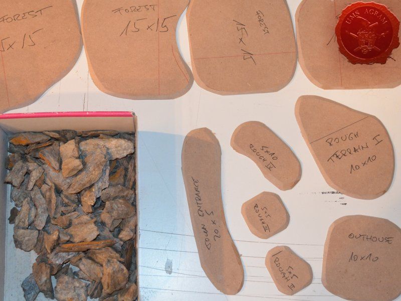
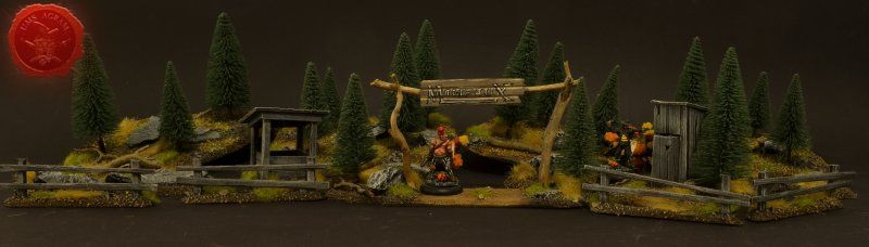
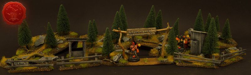
The basic outline of each of these terrain is pretty straightforward and simple. After a couple of days planning, I've decided what terrain I'll need to have a complete and versatile board that will provide gamers with plenty of atmosphere and challenge during their games. In this article, I'll cover the following subjects: forests, outhouse, well, town entrance, fences, rough terrain, a wooden crate and a metal coal container.
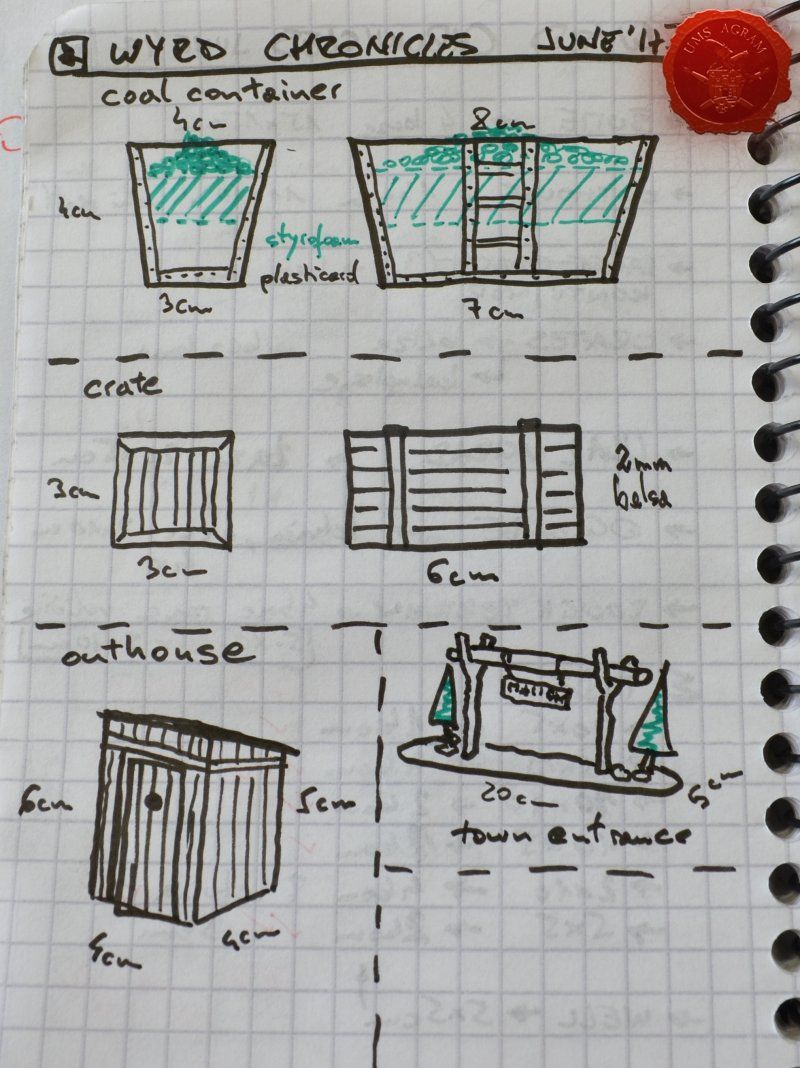
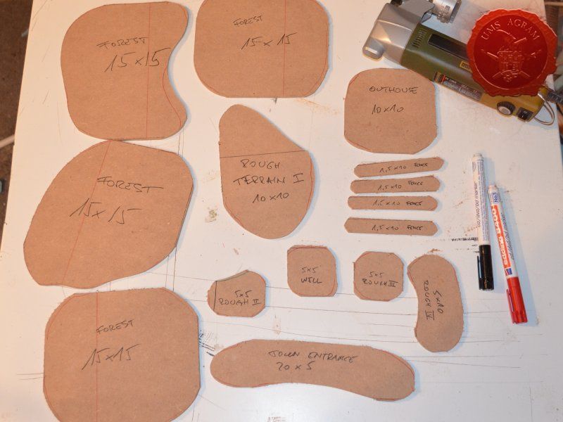
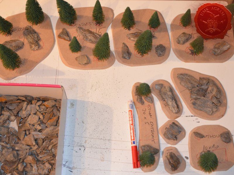
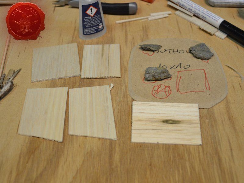
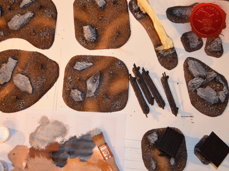
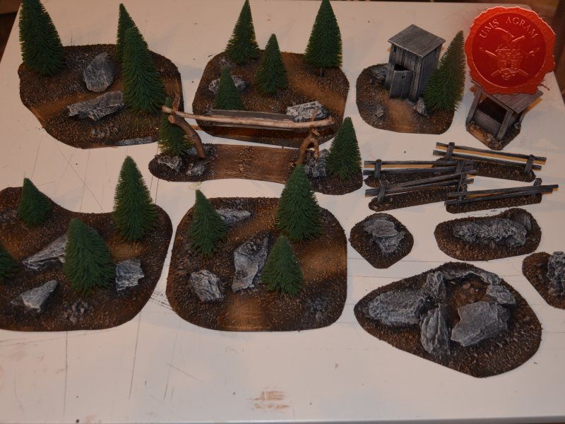
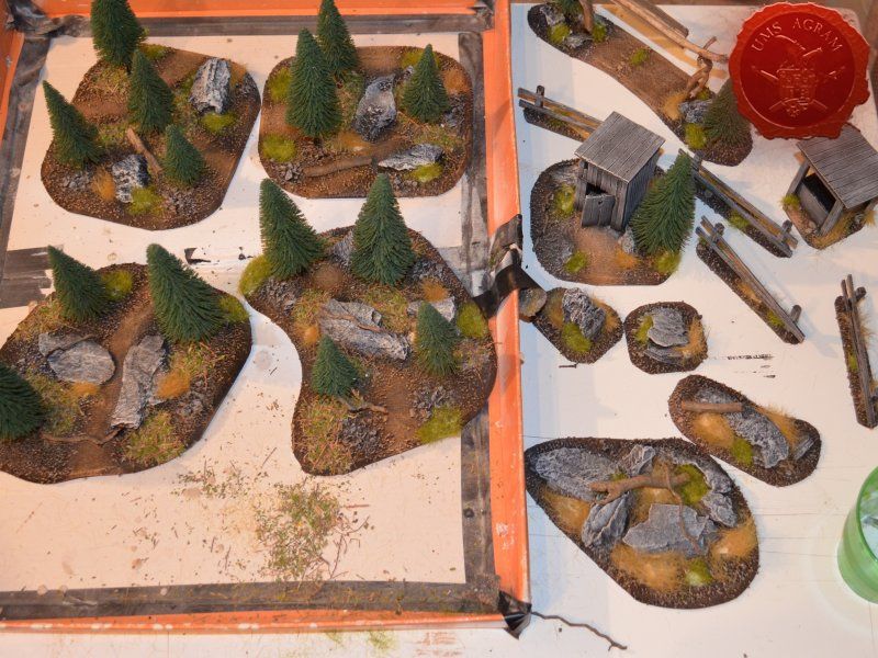
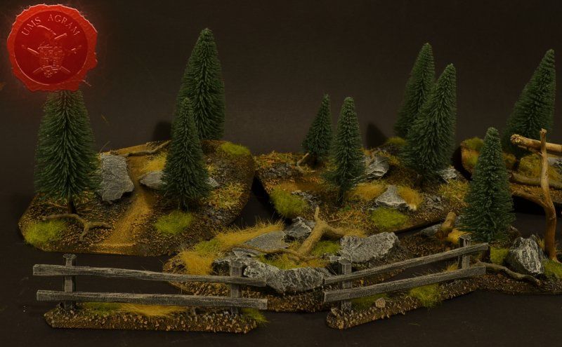
I'll build four forests roughly 15 x 15 cm in size. To tie them in with the rest of the scenery I've already built, they'll be pine forests. I'll also build four pieces of rough terrain varying in size from really small ones 5 x 5 cm to a slightly larger one 10 x 15 cm. The idea behind these is that, although they hinder movement, they do not allow any cover. A nuisance on the battlefield, really.
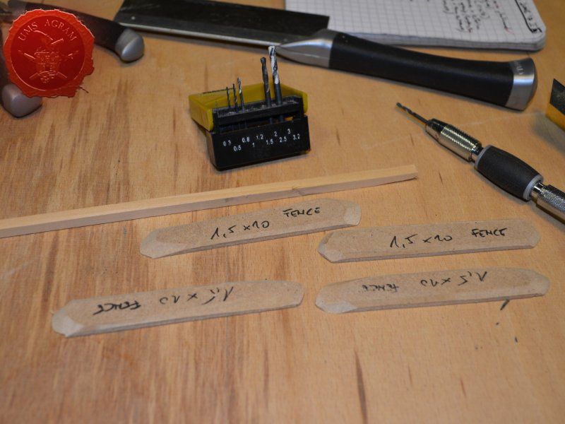
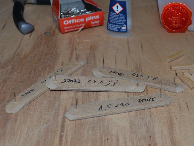
I'll also be making four 1,5 x 10 cm fences and a 20 x 5 cm western town entrance. Fences will provide soft cover in my Malifaux games as well as impede movement a bit.
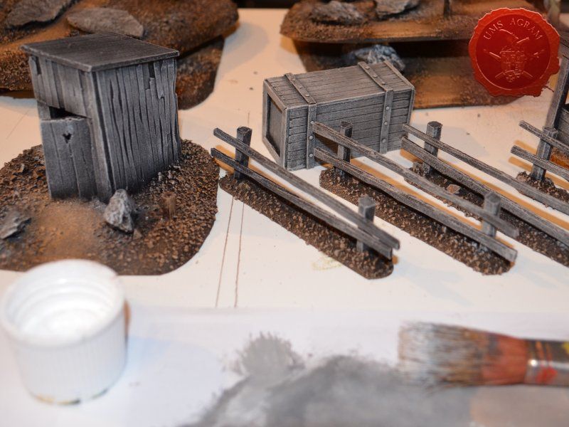
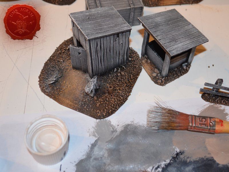
Next, I'll be building several smaller pieces of terrain: an outhouse (because what is a western town without at least one outhouse) and a wooden well. These smaller pieces would provide hard cover and provide hinderance in movement and in line of sight. To finish this issue's build, I'll be adding some containers. One will be a metal container for coal and the other will be simple wooden crate. Both will be slightly bigger than one would expect, but I've decided to go down that road because I want these to provide enough space for the models to be placed on top of them should the player wish to.
Materials and tools
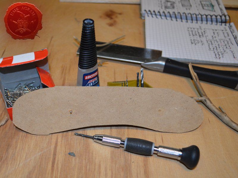
Once I've had most of the design ready, I could finally make a list of tools and materials needed. For this project I will need the following materials:
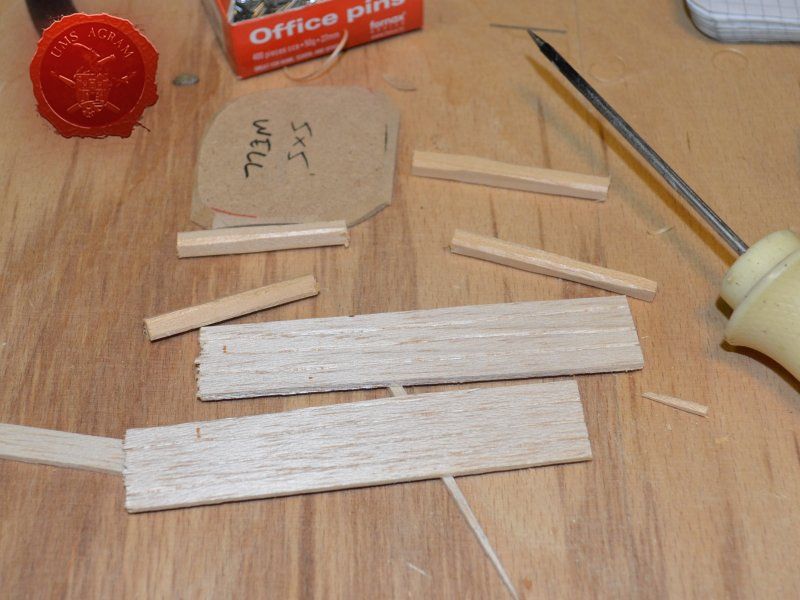
- one 5x5 mm linden slat (it comes in 1 m length)
- roughly one plank of 2 mm balsa wood (they come in 10 x 100 cm planks)
- roughly half a plank of 5 mm balsa wood
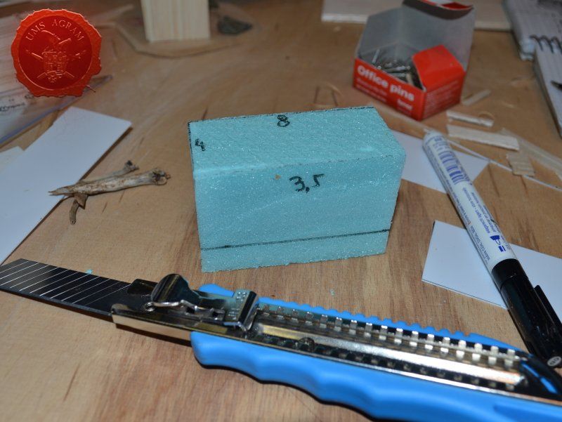
- a small piece of 5cm thick HD styrofoam
- about 50x30 cm piece of 4mm thick MDF board
- superglue
- PVA glue
- gravel (at least three sizes)
- static grass / tufts
- sanding paper (1 sheet)
- plasticard (0,75 mm thick, one sheet 20x30cm)
- masking tape
- office pins
- slate
- roots and twigs
- pine/fir trees
- Siligum (one package)
- plaster
The tools needed are:
- scalpel blade
- marker pen
- modelling saw
- pin vice (or an electric mini drill)
- brushes – various sizes – for painting/washing and for drybrushing
- pliers and pincers
- icepick
- plastic glue, PVA glue and superglue
- black primer spray
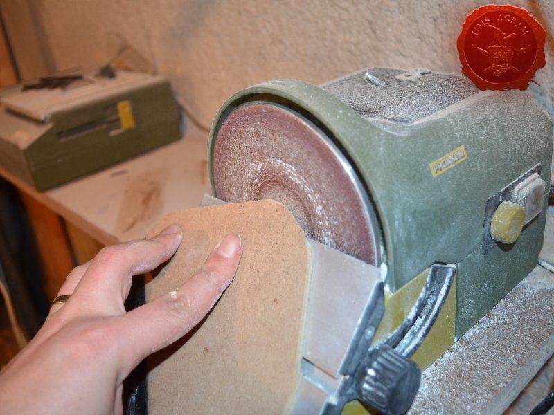
- electric jigsaw*
- electric disc sander*
* I will be using my Proxxon disc sander and jigsaw on the MDF to make the bases. However, the bases can be cut with hand held tools such as modeller's saw and be sanded down with sanding paper. It'll only require a bit more time and strength.
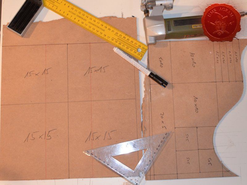
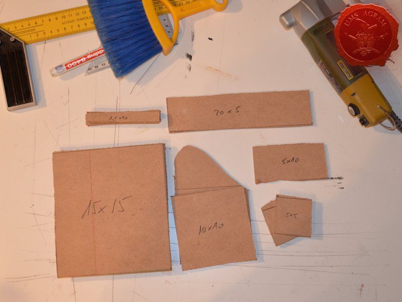
Building the bases
After drawing the rough outlines of my bases on the MDF board with a marker pen, I proceeded to cut it with my jigsaw. When the rough shapes, squares, were done, I drew the exact shapes of my terrain pieces on the MDF bases and again using the jigsaw I cut them to size. Once the cutting was done, I chamfered the base edges with my disc sander. This will ensure a nice transition between the table and the base of the terrain.


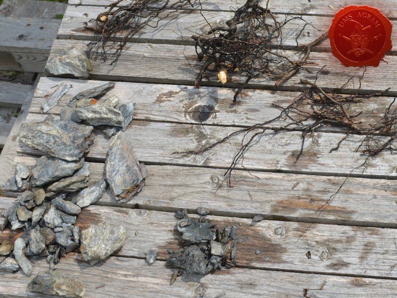
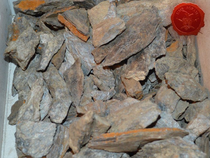
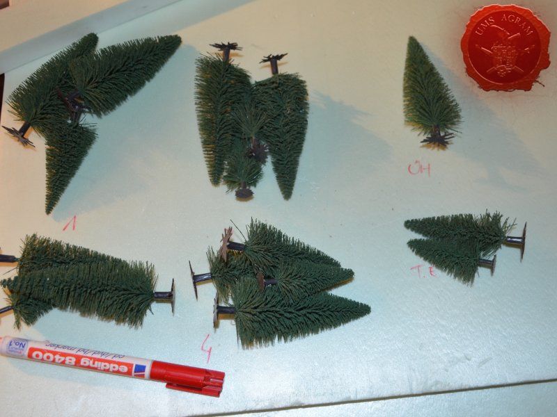
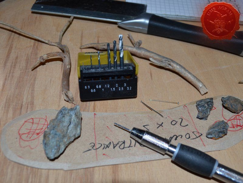
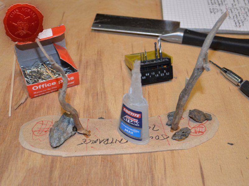
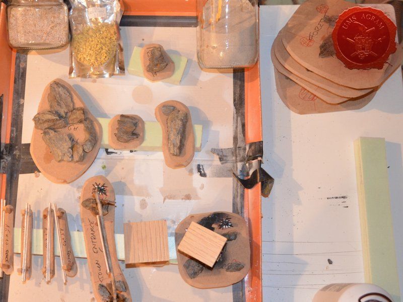
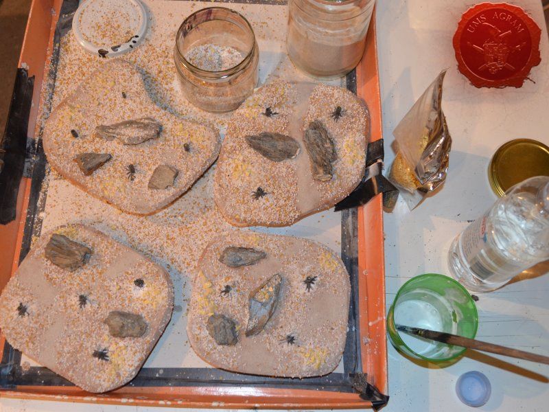
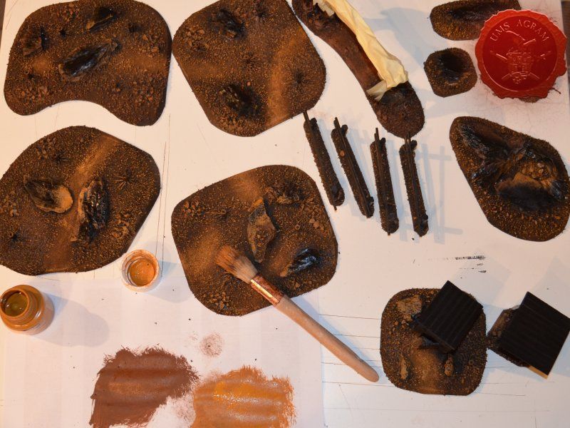
After the basic shapings of my terrain were done, I now had to distribute various scenic elements on the bases. This meant getting out my stash of fir/pine trees and pieces of slate I use for my terrain. Slate is an incredible type of stone which allows you to shape it without any effort (or at least with only minimum effort). It's built from many parallel layers that can be peeled off and when the stone's thickness is reduced enough it can even be broken with hands. This is especially useful in smaller scenic pieces such as bases for the miniatures themselves. If you are careful enough, you can even drill through it so you can even pin your models to the stones and subsequently to their bases as well. Other great thing is that the mountain right next to the city I live in is made of slate so it's really handy to get by. One other thing I discovered while hiking is that the forest usually has some upturned trees. These, obviously, have their roots out and these in turn look great as dried trees on your bases and even terrain which I'll demonstrate later on in this article. But for now, we'll turn to the slate. Before you use the slate pieces on your bases/terrain, I suggest washing them down with a hose (something I suggest you do with the roots as well) and dry them in the sun. First, you'll remove the dust of the stones which will prevent the stone (or root) from fully adhering to the surface of the base, but also the paint won't peel or fall off the stones. Second, and more important, the stones and roots coming from a forest, might contain some germs and other filth, even cause mouse fever so it's really important to wash them thouroughly. After washing, leave to dry slowly on the sun. Remember to always wash your hands thouroughly after handling the unwashed slate and roots! Also, if you have handy, use protective gloves when possible. With the slate now dry, I could place them and the fir/pine trees on my bases and dry-fit them to find a suitable size and pattern. Once I was satisfied with the placement, using PVA glue, I glued the pieces of slate to the bases in appropriate places. The trees were grouped according to the bases they would eventually be placed on and marked carefully (both the trees and the bases) so there would be no confusion later on. The trees I used are NOCH trees that come in a bag of 50 and cost about 40 USD (NOCH is a German model train accessories manufacturer). I removed the trunks of the trees and glued them to the bases. This will enable easier painting of the terrain and once the painting is done, I'll simply glue the rest of the trees back in their respective trunks.


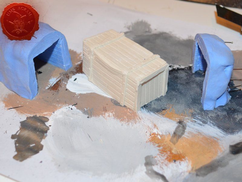
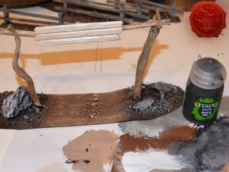
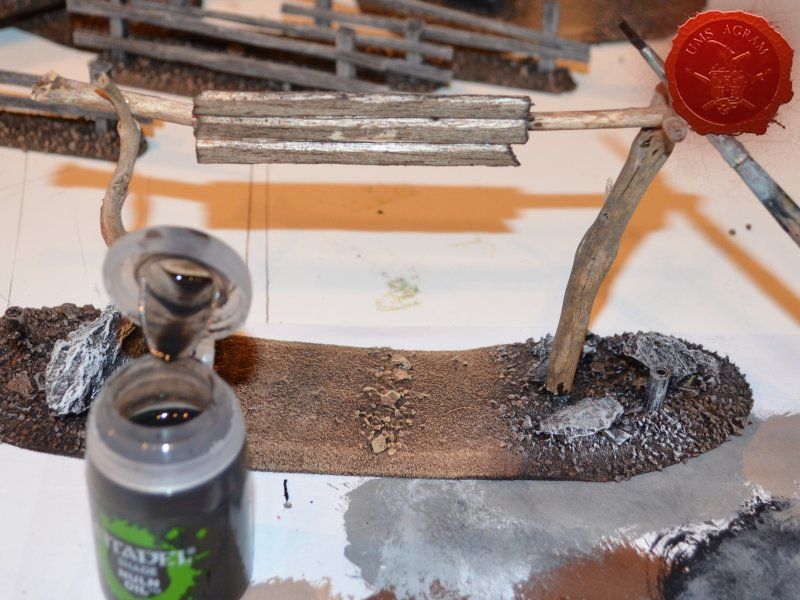
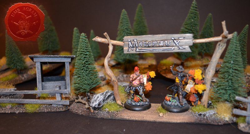
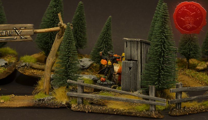
Town Entrance
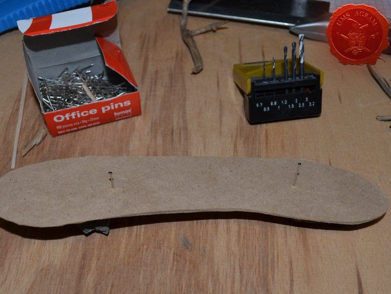
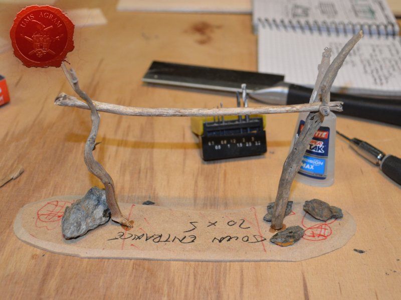
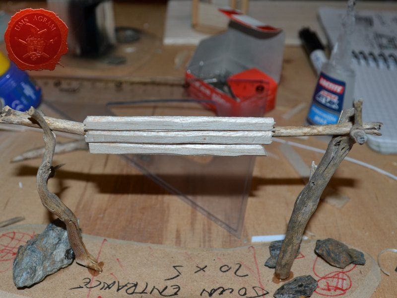
Once the glue on the tree trunks and small pieces of slate was dry, I could now turn myself to building the town entrance. At first I wanted to make it from man-carved wooden beams but looking at my roots and twigs stash, I found three twigs that were perfect for the Old West look I was after. Using my pin-vice, I drilled two holes in appropriate places on the base. I used a drill bit that was roughly the size of the office pin I was about to use as a pin. However, threading the pin through the bottom of the base would mean that the pin head would stick from the bottom and make the entire terrain wobbly. To prevent that from happening, I used a larger drill bit and just made a small insertion just big enough to house the entire pin head. Using superglue I glued the two Y-shaped twigs in place and connected them with a straight twig. Then I cut several 5 mm wide balsa pieces (about 7 cm long) and made the town sign.


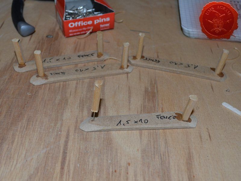
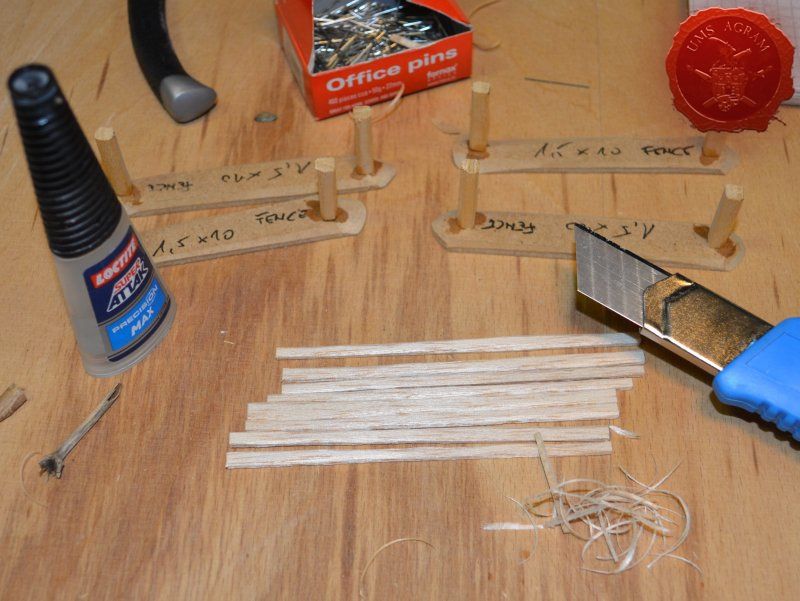
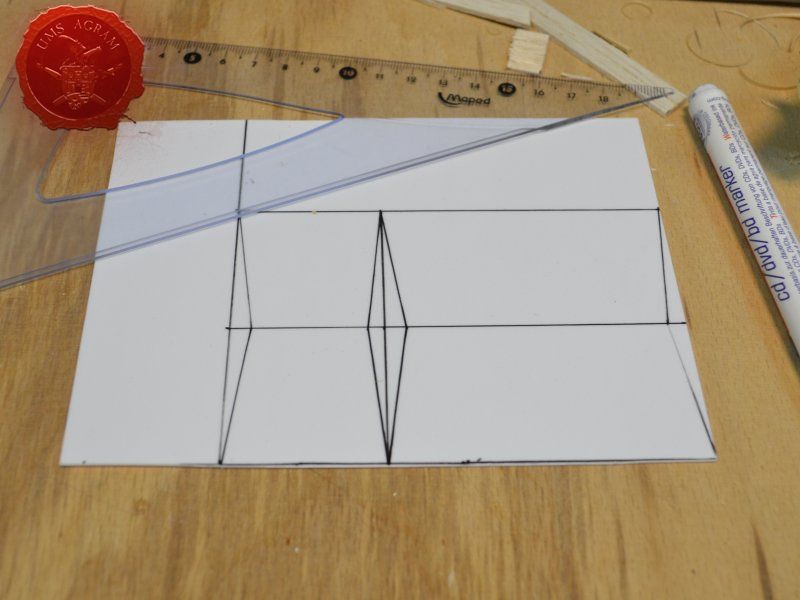
Fences
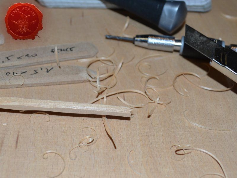
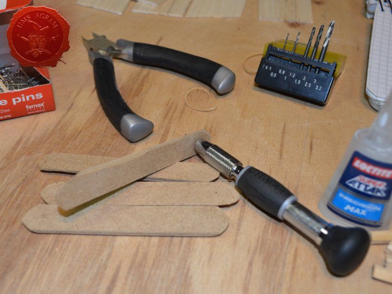
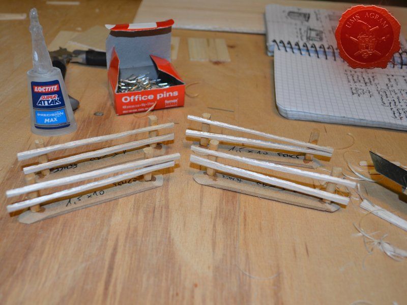
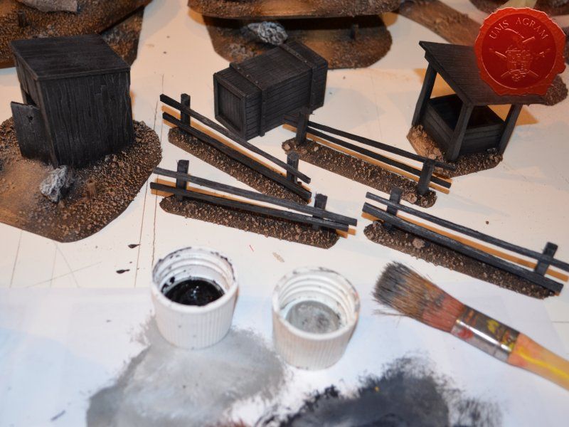
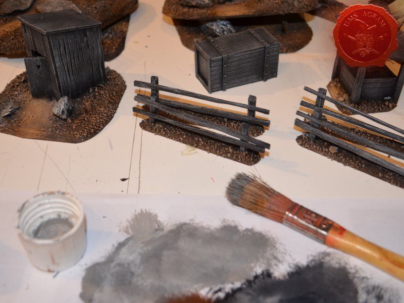
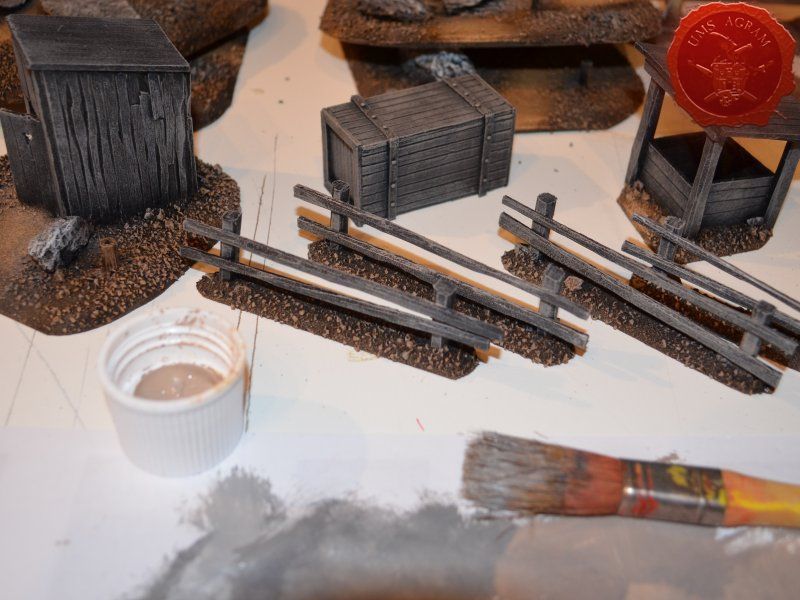
Same as with the town entrance, I drilled two holes per fence base to enable the pinning of the fence posts. Using 5 x 5 mm linden slat I made 8 fence posts (2 per base) which I chamfered along each edge to get a worn look. I pinned and glued the fence posts using superglue. Then I cut eight strips of 2 mm thick balsa wood (same as used on the town sign) roughly 12 cm in length and had their edges chamfered with the scalpel blade. Again, using superglue I glued them in place, two per fence. Intentionally, I didn't glue them perfectly aligned to acchieve that worn look.

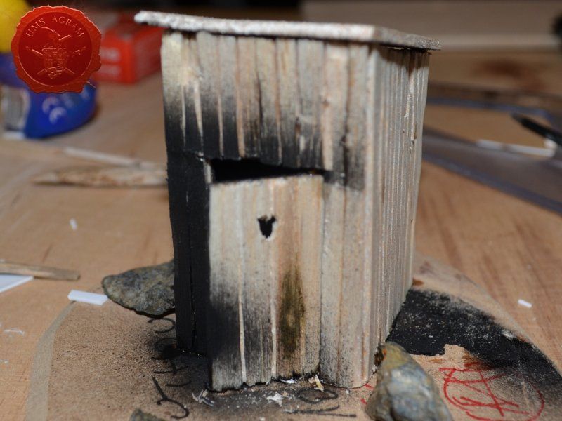
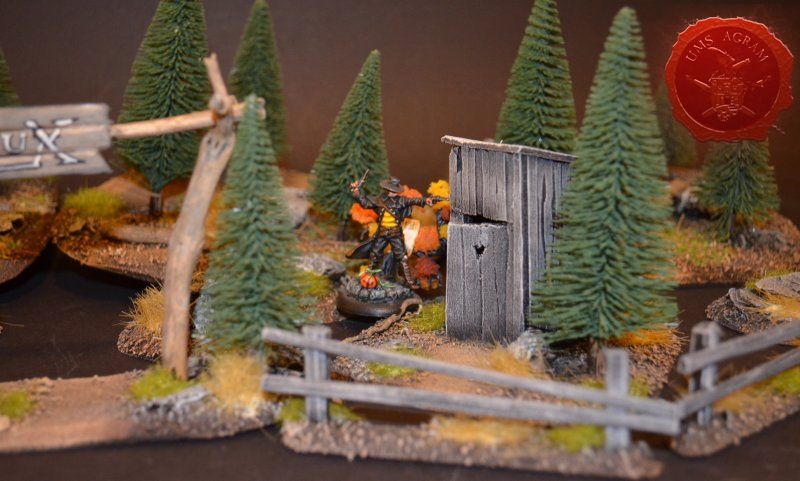
Outhouse
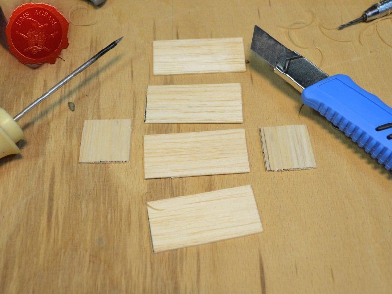
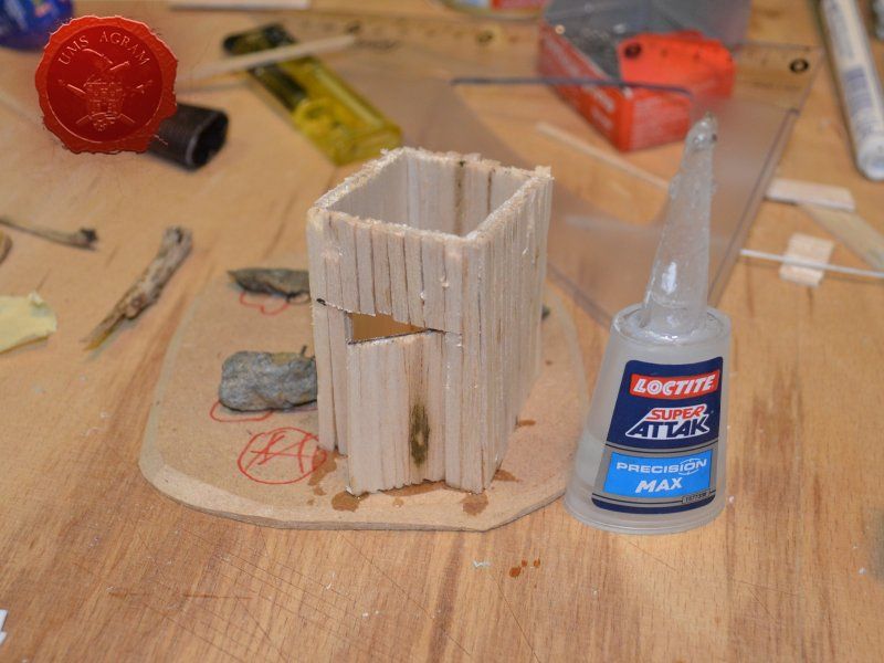
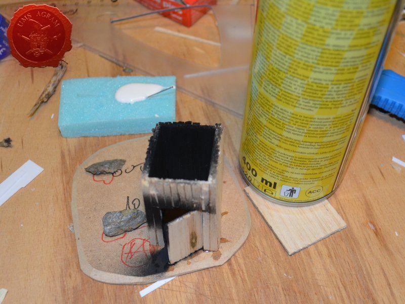
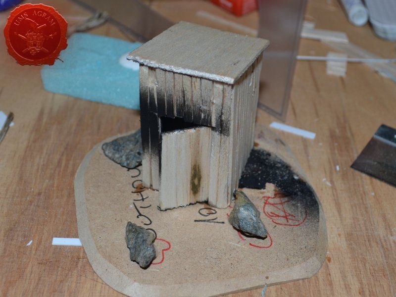
Next up was the outhouse. Using 2 mm thick balsa wood, I cut the four walls and a roof in desired sizes (written on the sketch during the design phase). I glued the wall pieces on the appropriate base with superglue. NOTE: All the wooden bits could be glued with PVA glue, but the PVA glue sets a lot longer so I opted for this quicker method. Once the structure was in place, I decided to add individual planks to the outer walls. This would make the worn effect even more highlighted. I cut individual planks at about 3 – 4 mm wide. When the walls were done, I spreyed the black primer inside – because the door would be slightly ajar and the inside would be visible if not painted. When the primer was dry, I glued the roof in place and made a small hole on the door.
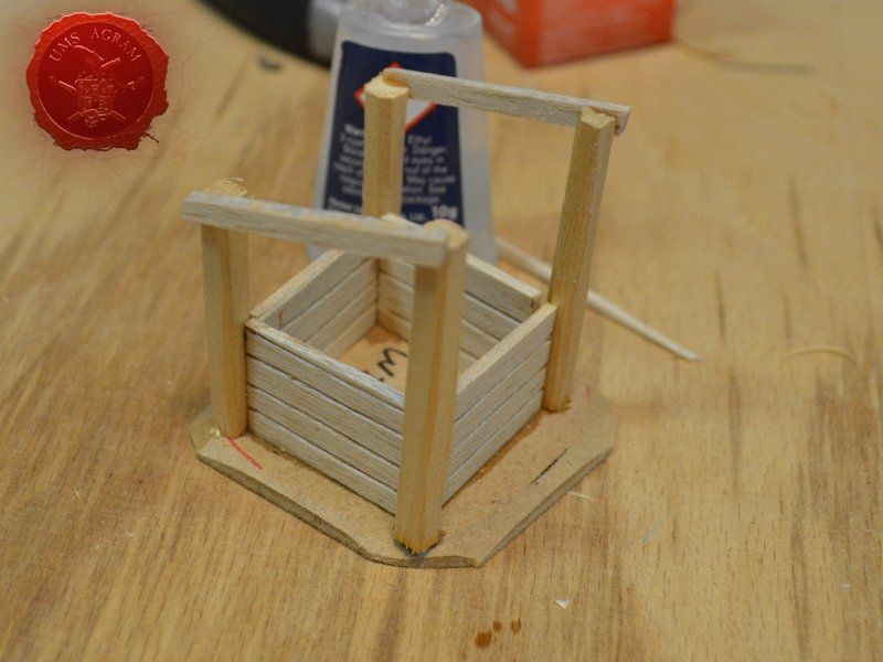
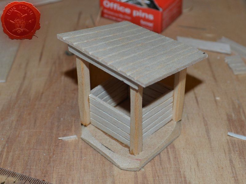
Well
I've decided not to make the well out of individual planks like the outhouse, but rather to use engraved balsa wood to mimic the wooden walls of the well. The vertical beams were once again made from linden slats to provide the whole well some structural integrity. The roof was once again made from 2 mm thick balsa wood.

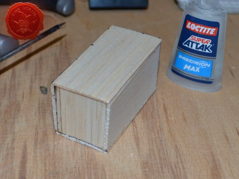
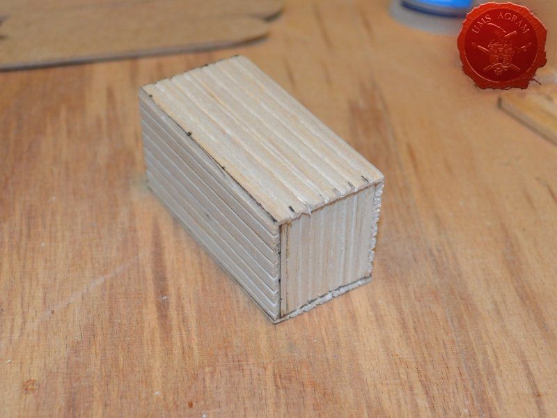
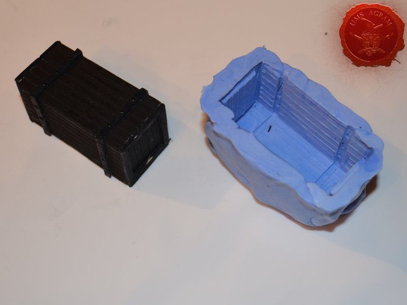
Crate
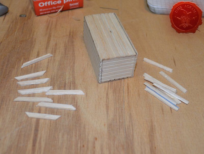
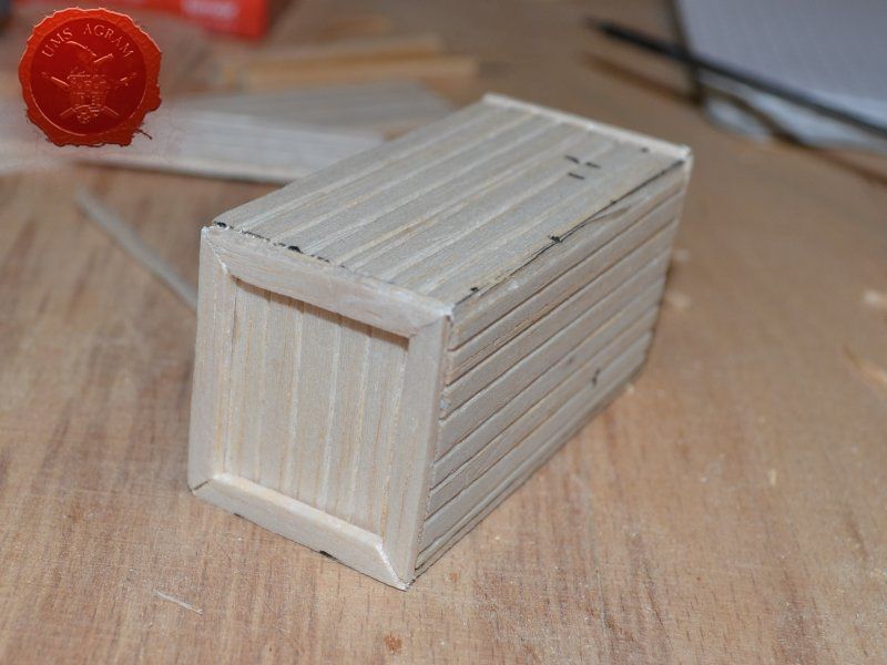
Just like the well, I used engraved balsa wood to make the sides of the crate. I glued the sides using superglue. The frame of the crate was done with balsa cut to size and I even added rivets using office pins. Since my crate was big enough to fit entire office pins, I didn't cut them. If you build smaller crates, then before sticking the pins, you should cut them to size first.

Making multiple crates
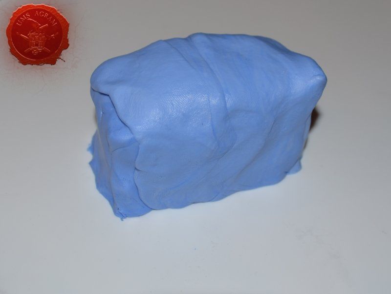
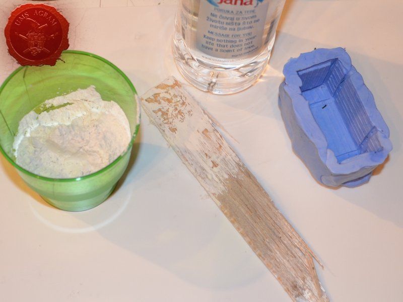
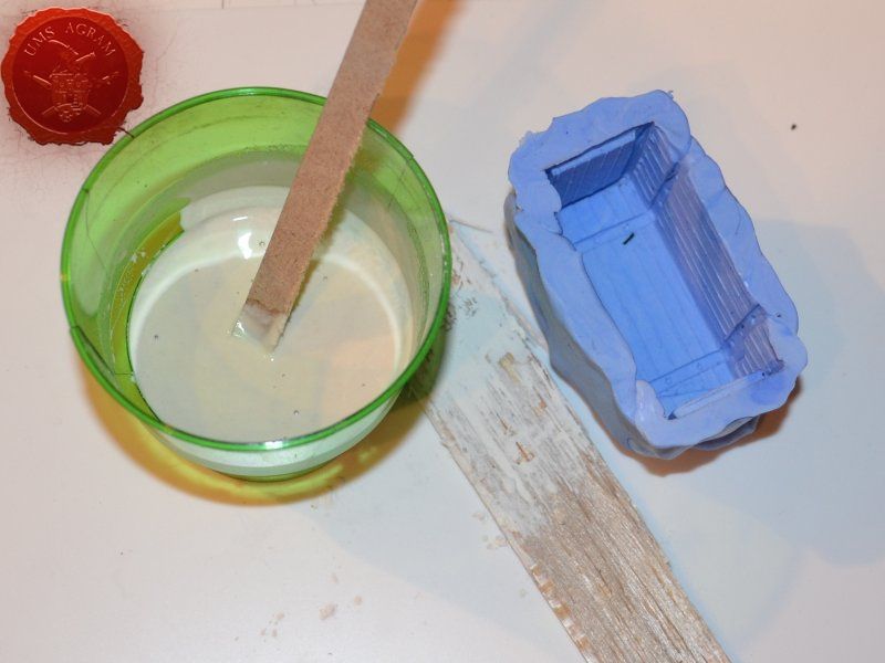
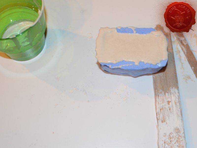
Once the crate was done, I decided to make a mould out of it. To make moulds I usually use Siligum. Siligum is a two component mix that once combined sets in 10 minutes and forms a rubbery supstance great for making molds. It comes in 100 g and 300 g packages. It is similar to green stuff in how it's gnawed to make the end product. Once the mould was done, I mixed some plaster of paris and poured it in my mould. About half an hour later, I had my first cast.
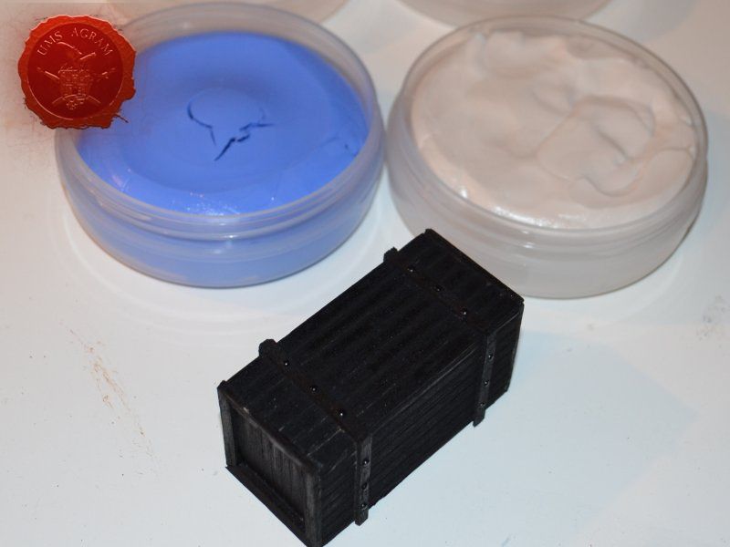

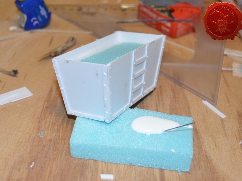
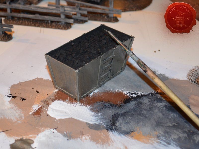
Coal Container
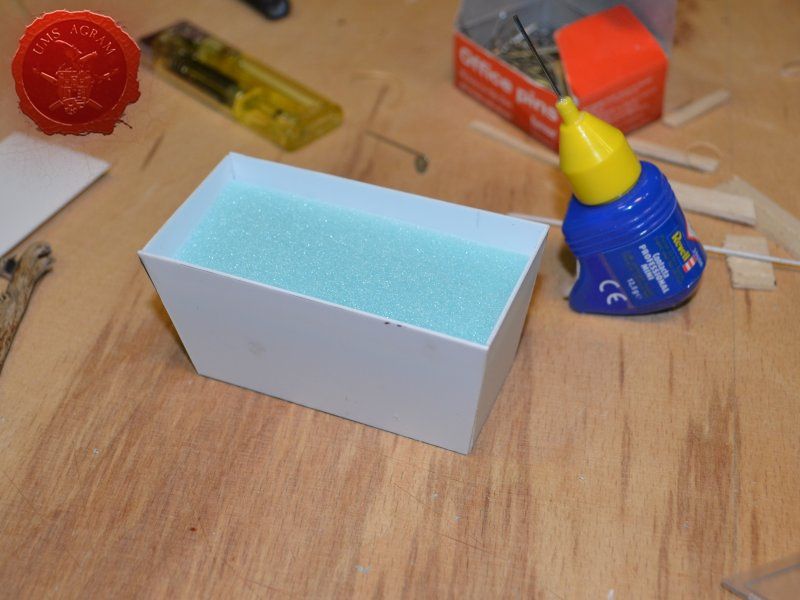
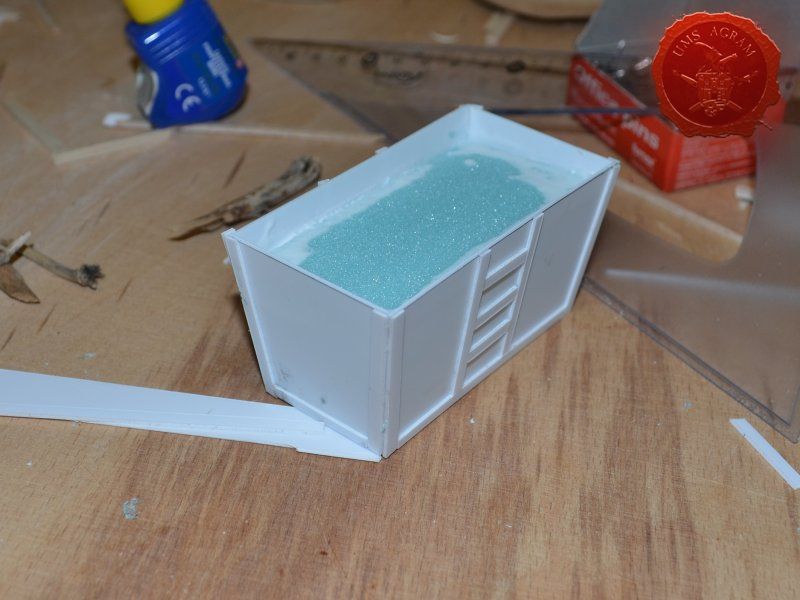
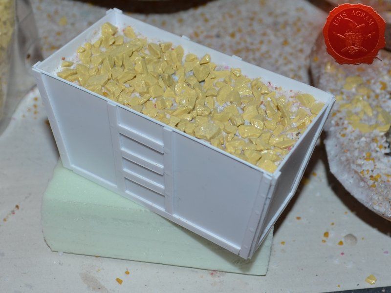
Coal container was made from 0,75 mm thick plasticard. Plasticard at this thickness is really easy to cut, but it does lack some structural strength. It bends quite a bit. For that reason, I cut some HD styrofoam to fit inside the plasticard frame and hold it in place. To glue the plasticard I used Revell plastic cement. When the frame was dry, I used the same thickness plasticard to add the detailing to the sides. The rivets were made from blobs of PVA glue. The inside of the container was covered with PVA glue and the largest pebbles were placed inside to represent coal once painted.

Adding texture
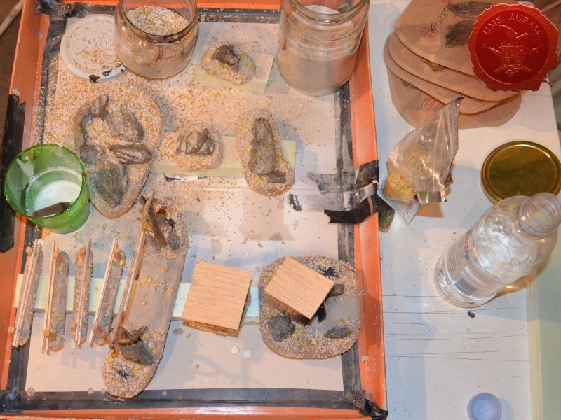
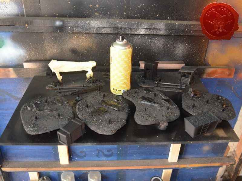
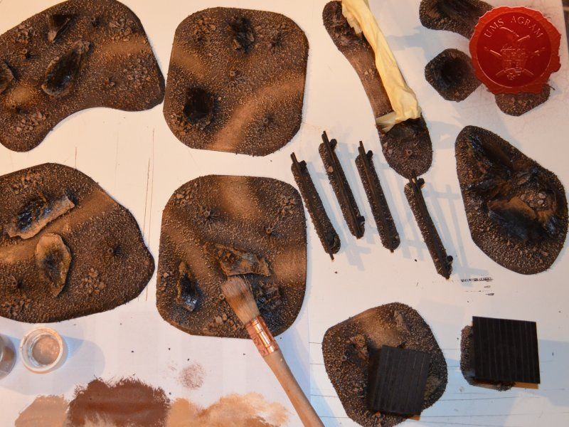
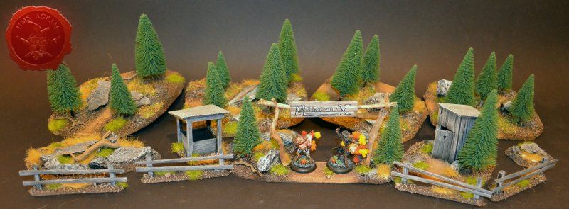
Next step on the bases was to add texture. I covered everything with diluted PVA glue and started adding the gravel. Remember, start with the biggest granulate and end with the smallest. I used three different sizes, from small pebbles to chinchilla sand. The larger pebbles and gravel I placed strategicly around the bases to form some clutter. The two smallest granulates were freely dispersed throughout the terrain making sure I get even coverage throughout and no area is left without texture. I also used chinchilla sand to mark the road (on the town entrance piece) and the paths (on the outhouse and through the forests) just to add some diversity. When the texture was dry, I undercoated everything in black matt primer.
Painting
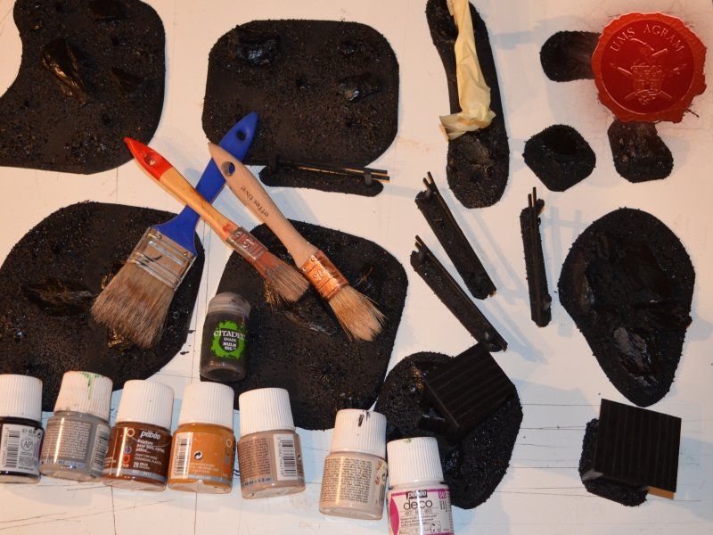
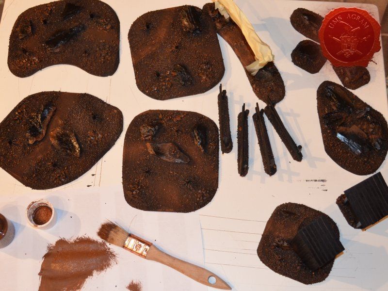
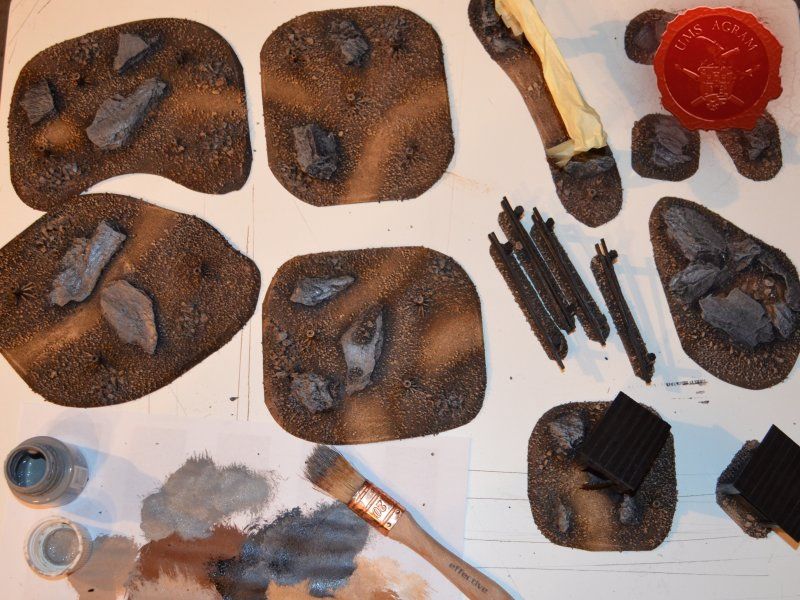
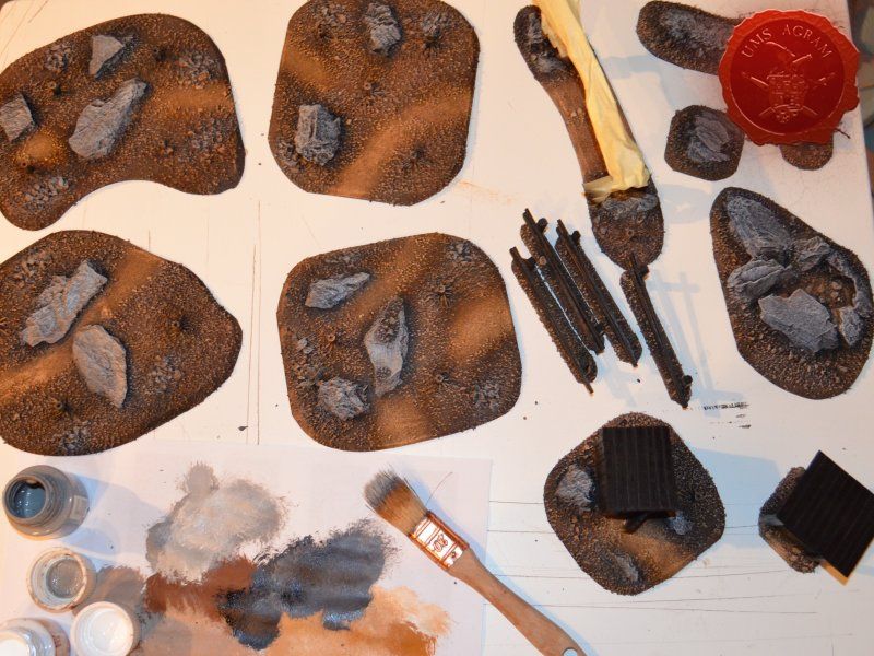
When the undercoat was dry, it was time to paint all the terrain. I started painting the bases first. Wanting all my terrain to fit one theme (and consequently one tabletop) it was only natural I use the same colours and colour scheme as on the earlier pieces. Therefore once again, I used Pebeo Deco color range. I used Brown (29) for the basecoat and continued drybrushing with Ocre (51). Lighter shades were done with a 50:50 mixture of Ocre (51) and White (41). The final highlight was done with Antique White (69). The road and paths were first basecoated with Brown (29) then heavily drybrushed with Ocre (51) and a 50:50 mixture of Ocre (51) and White (41). The last two highlights were Antique White (69) and pure White (41). This way, I had a visual difference between the normal groundwork and the worn out road.

The slate was painted by drybrushing a 50:50 mixture of Black (55) and Grey (54). Next layer was pure Grey (54) and the finishing highlight was pure White (41).

The buildings and structures have two different surfaces and consequently textures – roof and wooden walls. I proceeded to paint the wooden walls by drybrushing first using a 50:50 mixture of Black (55) and Grey (54). Next layer was pure Grey (54) and the finishing highlight was Ash Brown (70). I was not quite satisfied with the result, so I added another highlight of pure White (41). The roof was painted first with a mixture of Black (55) and Grey (54) and then a mixture of Grey (54) and Antique White (69) finishing with almost a pure coat of Antique White (69).
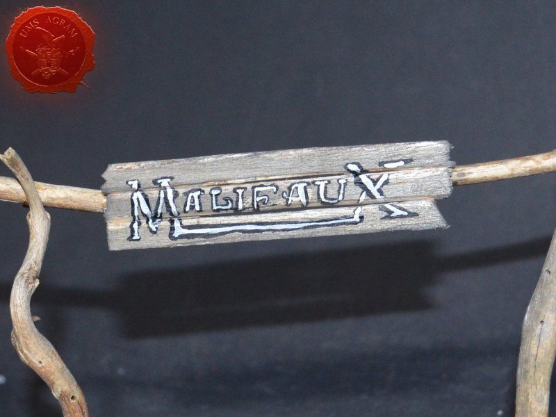
The wooden parts of the town entrance were covered using masking tape to prevent any paint from reaching it as the dried wood (from the roots) provided a good enough effect. Once the rest of the base was painted, I removed the masking tape and washed the balsa sign with a diluted mixture of black wash just to stain it a bit. When the wash was dry, I wrote Malifaux on the sign.
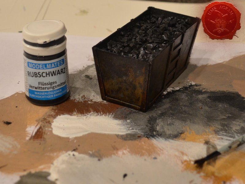
Metal coal containter was painted pure (old Citadel) Boltgun Metal. When the paint was dry, it was then covered generously with black wash (Nuln Oil, in this case). Once the wash was dry, I used Model Mates' Rust Effect on the metal bits and in the end I put Model Mates' Soot Black effect to mimic the coal residue on the metal parts. The coal inside was painted black with some dark grey highlights.


Vegetation
After the painting, it was time to add the vegetation to the bases. First up, I decided to re-plant my pine trees. Using superglue to fix the trees in place, I simply guided the wire on the bottom of the trees into the small hole of the plastic tree trunk. Before gluing, I made sure that the trees fit their trunks by doing a quick mock-up of the assembly.
With the trees in place, I could now add the static grass. I made a mixture using several green, brown, yellow and black shades of static grass and when I was satisfied with the end product, I glued it in random patches throughout the bases. One thing I made sure of is that I put static grass over any and all of the remaining holes where the wooden structures met their bases in order to hide the unintentional mistakes. Once the static grass was in place, I applied several shades of different tufts. Again, as in the former articles, I used tufts made by a Portuguese company called Gamer's Grass that is also available in USA.
For the forest and the rough terrain, I added some longer static grass bits as well as some pieces of wood (twigs, roots and whatnot from my forest hike). This will provide sufficient semblance of the rough terrain or forest floor without unnecessary hindrance of movement during gaming. This marked the end of the building process and I could now make my final shots of the finished terrain.
Latest articles
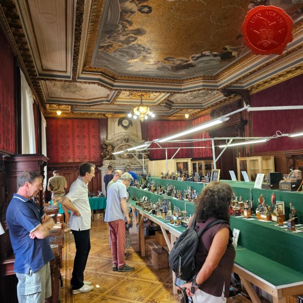
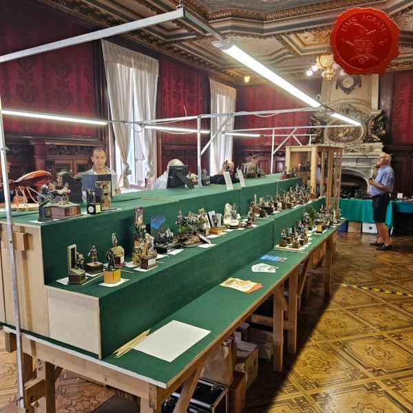
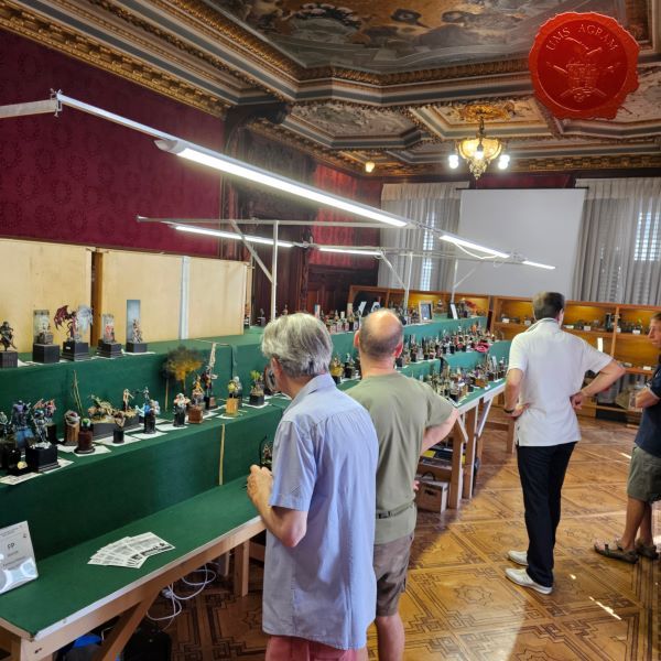
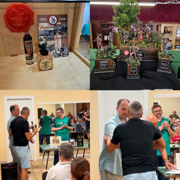
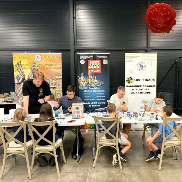
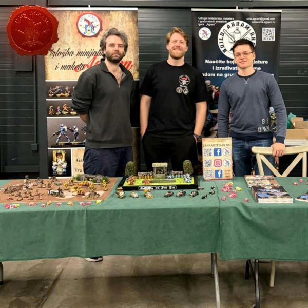
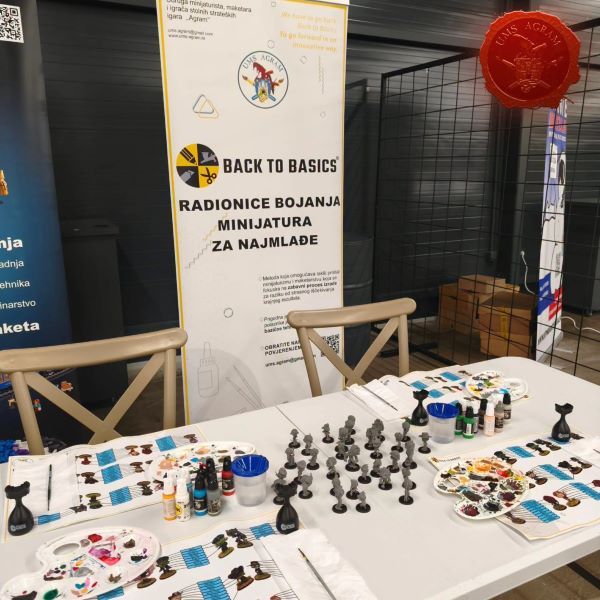
- We attended: Isle of Wonders 2026 Ili Said, 6th July 2026
- We attended: 13. Trofeo San Giusto 2026. Marko Paunović, 6th July 2026
- We attended: Zagreb Scale Model Show 2026 Mario Grgurev, 6th July 2026
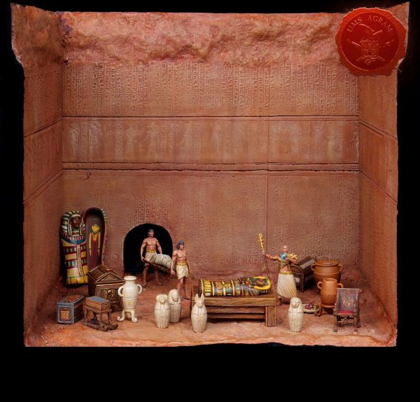
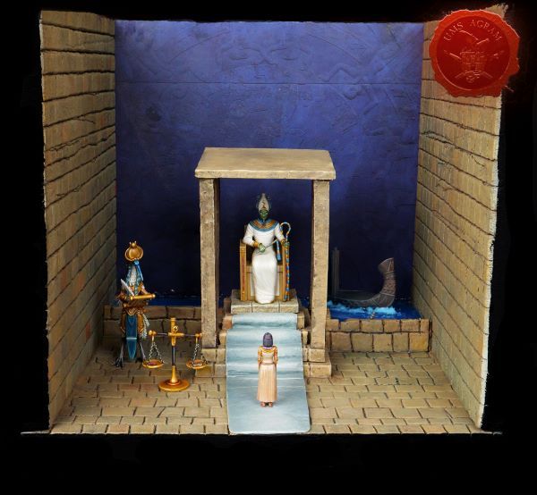
- Making of MUMMY dioramas Sebastian Søgård, 17th June 2026
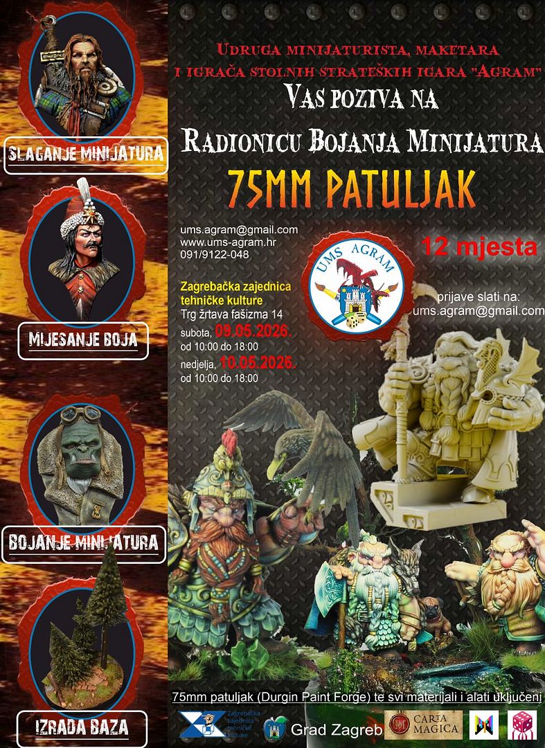
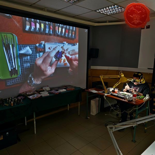
- Miniature Painting Workshop - 75mm Dwarf Ivan Knezović, 26th May 2026


Latest battle-reports
- Kill Team - Blooded vs. Vespid Stingwings 28th February 2025, GW - Warhammer 40.000, and Antoni Pastuović (Imperial Guard)
- 22nd April 2022, GW - Warhammer 40.000, Borna Pleše (Space Marines) and Kristijan Kliska (Tau Empire)
- 17th November 2021, GW - Warhammer 40.000, and Nino Marasović (Space Marines)