Building a Gaming Board – pt 1.
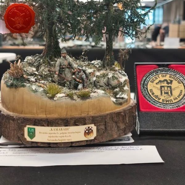
In the past issues I've been dealing with various forms of terrain for my Malifaux games and I've even done a modular gaming board for all the wild west themed terrain. These past few months I was busy participating in the Iron Painter so I welcomed the one issue break I've had with my Malifaux terrain builds. That said, I missed it. A lot. But participating in such a cool event like Iron Painter, where you are surrounded by great artists and are pushed to your limits, makes you improve your abbilities and more often than not provides you with plenty of ideas for future projects. This year was no different. So, even while competing, I've been drumming up ideas what to do next and I must admit up until the last round of Iron Painter I was unsure of what to do. But then the „Snowpocalypse“ theme was announced and I started doing a diorama out of a bust and there it hit me. Wouldn't it be really cool to have a whole gaming board that was done like that 8x8cm base? So, in this and the next issue I'll give it a go!
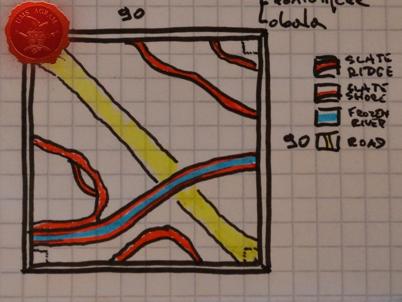
Careful readers will already know my mantra about any and all big projects I undertake. When starting a project of such magnitude, always plan ahead. Try to think of all the things you want featured in your project. From that, you'll be able to get the tools and materials you need. And once you finish that list, you'll have the outline of the activities you need to perform and what order they should come in. So, the idea is to have a single board for my Malifaux games which means I would require a 90x90cm (3'x3') board. At this point, presumably wooden. Then I started planning what features to place on my board. I decided to go with a frozen river, with a couple of crossings one of which would be a bridge. I'd also want at least one road and several paths that wouldn't be (entirely) covered with snow. I'd also want to add some levels to my board so it wouldn't be just flat. Two or three levels would be perfect. Since this wouldn't be a fixed terrain board, I'd still need plenty of flat areas to place the scenery before my games. Right about this time during the planning, I remembered I had some untouched resin terrain pieces from a Croatian company called Tabletop World. They produce high quality resin terrain. However, they only to fantasy/medieval type of buildings. I decided to use them as mock-up for my future terrain for Malifaux while planning out the outline.
Planning
So, once the planning was done, I compiled a list of needs and wants that would hopefully help me with the material and tool lists as well as keep me focused on the project itself (so I don't add too many extra details that would clutter the board):
1. one board, single piece, sturdy and not easily broken N
1.1. size of the entire board: 90 x 90cm (or as close as possible) N
2. Water feature N
2.1. frozen river N
2.2. several crossings of the river N
2.3. one of the crossings should be a proper bridge W
3. roads etc. W
3.1. dirt paths – several leading from areas reserved for buildings to the main road N
3.2. main road – leading to and from the bridge (or wide crossing) N
4. levels N
4.1. second level (2cm – height of a single HD styrofoam board) N
4.2. third level (if possible – 2x 2cm HD styrofoam board or single 5cm board) W
5. flat areas for future terrain and buildings N
6. materials to be used – as light as possible W
7. frame – sturdy that won't bend or break easily to protect the main body of the board N
After the list was compiled, already some things were begining to become clear so I could make my preliminary sketch. Fortunately, right about the time I was starting this project, the Mrs and I decided to get rid of our bed base that was made of two solid 19mm thick plywood boards which happened to be 90x200cm in size. So I figured, I'd cut one board into two 90x90cm piceces and have bases for two boards. Almost perfect as I would need to do some preparation work on the board to plug the holes and fill the edges where the board was cut. As for the rest of the needs and wants, I'd need something to make the frame (at this point, presumably some wooden slats), several pieces of HD styrofoam, some roots and some slate. Rest of the materials would be usual – super glue, PVA glue, several types of gravel and sand, some DAS clay and some plaster. For the river, I will need some resin – but not too much as the whole idea is to have a shallow, frozen river. In the end obviously, I'd also need copious ammounts of snow material, something to make ice and several packages of paste to make the icicles.
- glues - PVA 1kg, 1x10g Superglue
- paints and spreys - 6 Pebeo Deco Paints (Black, White, Grey, Brown, Ochre and Ash), one black, ash, off white and pure white matt acrylic spreys and one clear matt acrylic sprey
- large brushes No 90, No 40
- airbrush
- brush size 16
- high density styrofoam - 1 board (1200 x 600 x 20 mm)
- high density styrofoam – 1 board (1200 x 600 x 50 mm)
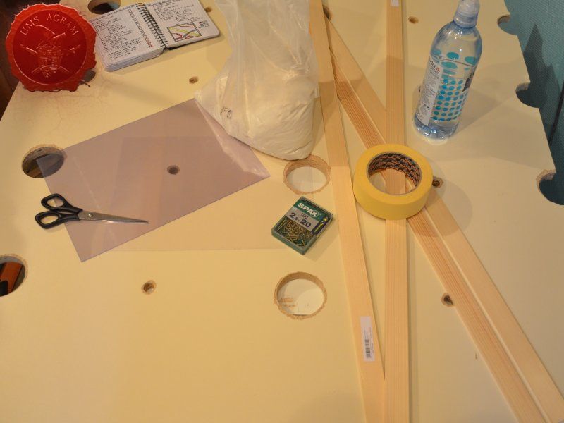
- wooden slats - four pieces (25 or 30 x 5 x 1000 mm)
- up to twenty M2,5x15 screws
- balsa wood 4mm thick (10 x 1000 mm)
- DAS air drying clay (1kg)
- plaster (1 kg)
- sand and gravel (four or five sizes)
- small bagful of slate
- several roots
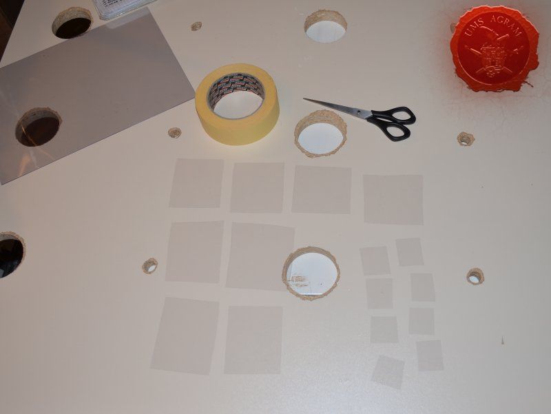
- plastic foil
- static grass and scatter (three to four sorts)
- Resin (Gedeo Crystal Resin or just Extra Heavy Gel by Vallejo)
- NOCH icicles
- NOCH snow products (2 packages)
- NOCH ice crystals
- scalpel blade
- scissors
- screwdriver
- chisel and hammer
- electric drill
- pin-vice
- circular saw
- jig saw
- disc sander
- vibro-sander
- modeller's saw
- sanding paper
- masking tape
Here, I included both electric and hand held tools. Obviously, you can use only one of these. If you don't have electric ones, the hand held ones will do the job just the same. It'll just take a bit longer and perhapes make you sweat a little bit. I don't like sweat, so I use electric ones.
Also, when doing such a list, you can also add the location of a store where you can buy those items and it'll make your shopping easier and faster. When all summed up, I reckon, my board wouldn't cost a lot (apart from the snow and water feature accessories).
Preparation work
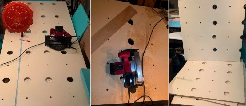
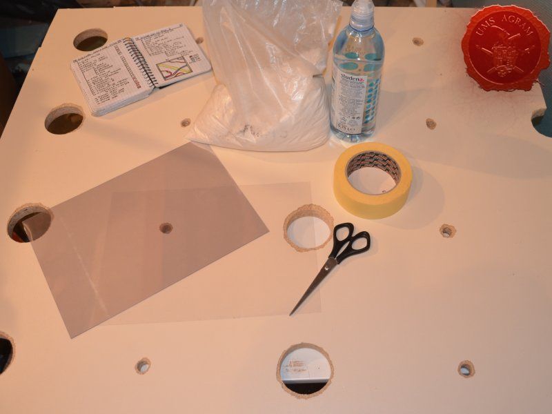
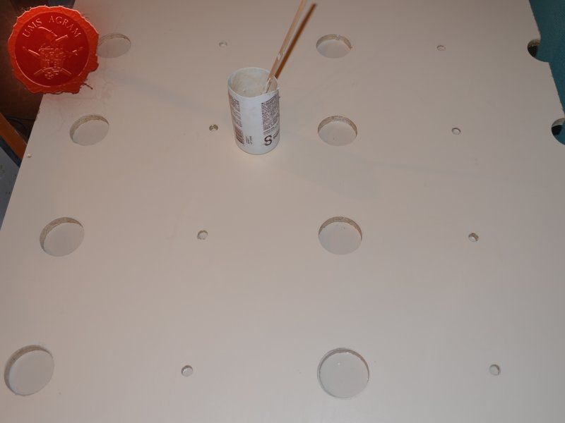
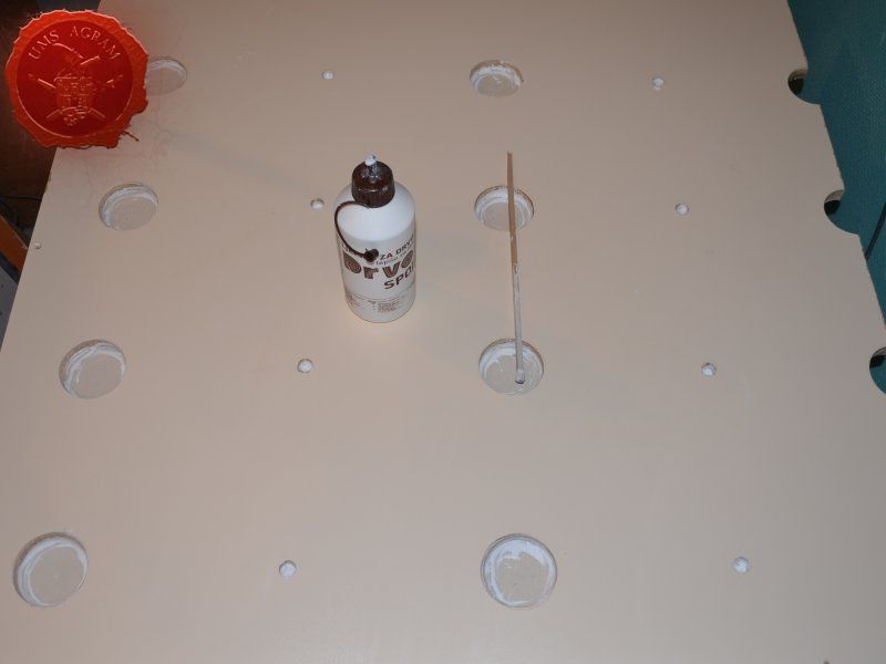
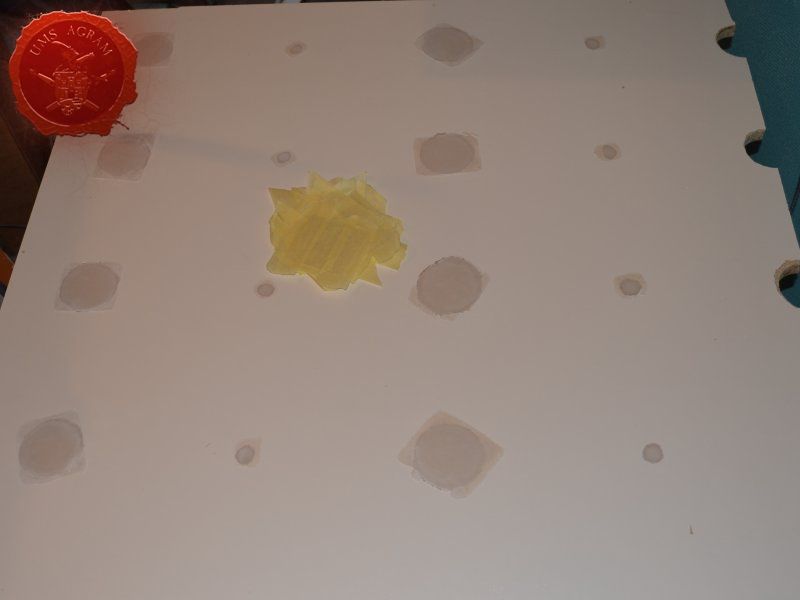
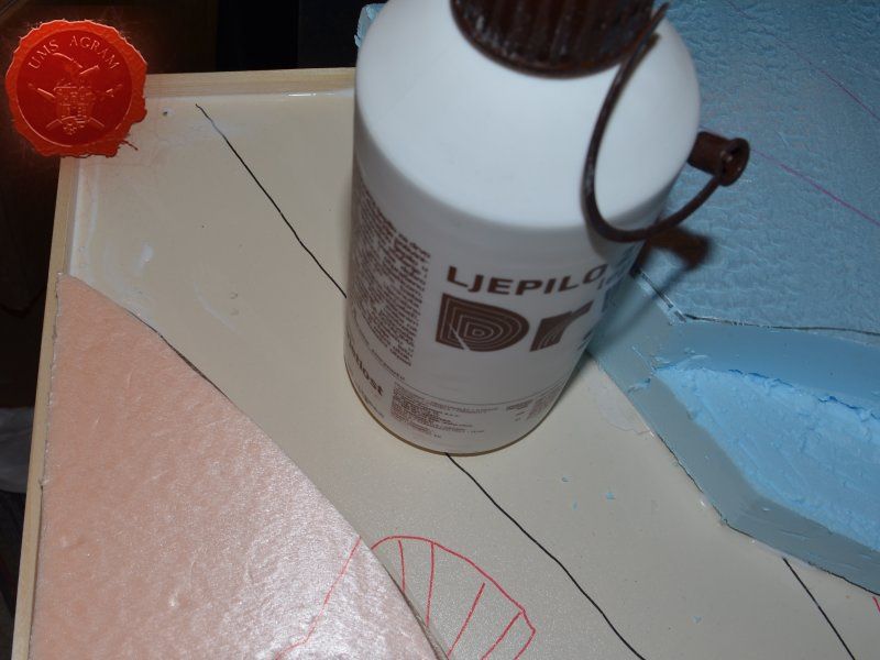
As mentioned above, the first thing I had to do was to fill the round holes in the board. I had a long debate how to do it, but in the end I decided the easiest way would be to fill it with plaster. So I cut enough pieces of plastic foil and taped them to one side (that would be the top side) of the board using masking tape. Then I flipped the board over and I mixed about half a litre of plaster and poured it in the holes. The plaster was about 0,5-1cm thick. Once it cured, I decided to use PVA glue for added strength. I left the glue and plaster to cure for a couple of days as we were in the middle of the winter and I do all my terrain work in an unheated garage.

Start of the build
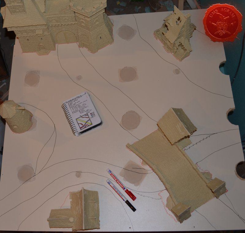
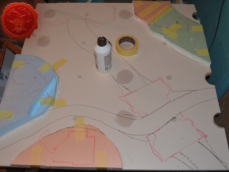
With the holes plugged, I could now finally start to build my board. Needless to say, I flipped the board over so the top side would be up and I removed the masking tape with the plastic foils. It was at this time that I took out the Tabletop World terrain and placed them around the board. Once I had them placed, I used my red and black markers to draw the design on the board itself. I wasn't quite satisfied with the setup so I replaced the bridge and drew its outline once again. I may actually use this bridge in my Malifaux games as well! When the outline was drawn, I cut the HD styrofoam bits to size and carefully placed them on my board. I also placed the TTW terrain on the styrofoam boards to make sure I have enough space around them for my models to move during games. When I was satisfied with the setup, I used PVA glue to glue the styrofoam boards in place. Also, I secured the bond using masking tape that would be removed once the PVA glue set.

Building the board frame
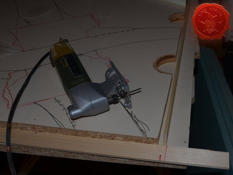
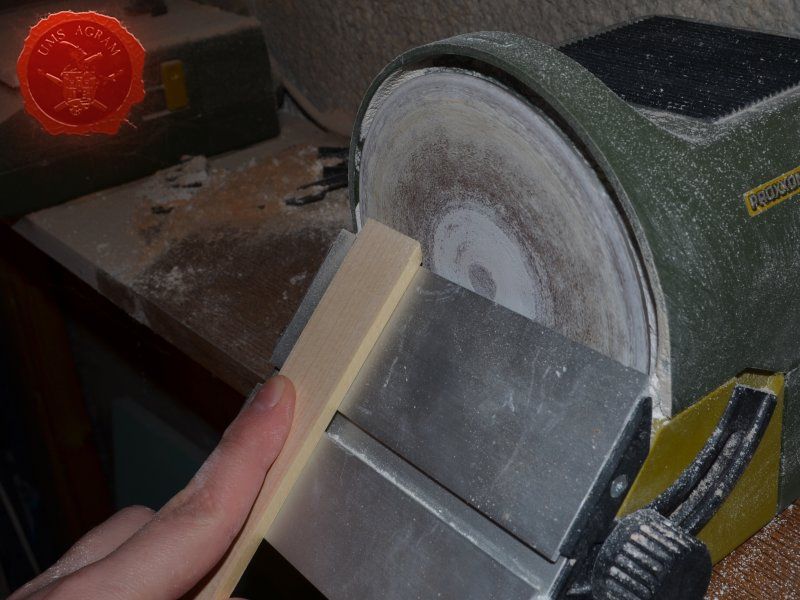
When the styrofoam bits were glued, I went on to do the frame of the board. In the DIY store, I managed to get four 25x5x1000mm linden slats. I cut them to size using my jig saw and making sure I had 1cm more than I needed to. This way, I could sand down the sides of the frames at 45 degree angle so they would fit perfectly.
Remember, you can always use a modeller's saw, sanding paper and screwdriver instead of jig saw, disc sander and a drill with screw end.
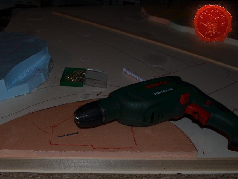
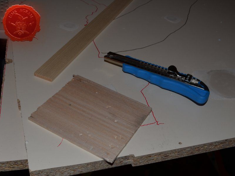
Using 5mm balsa wood, I cut several strips to plug the gap on one of the edges of the board and then proceeded to secure the frames to the board using M2,5x15 screws. I used three per side and once the screws were in place I filled the small crevices between the board and the frames using PVA glue for added strength of the bond.
IDEAS
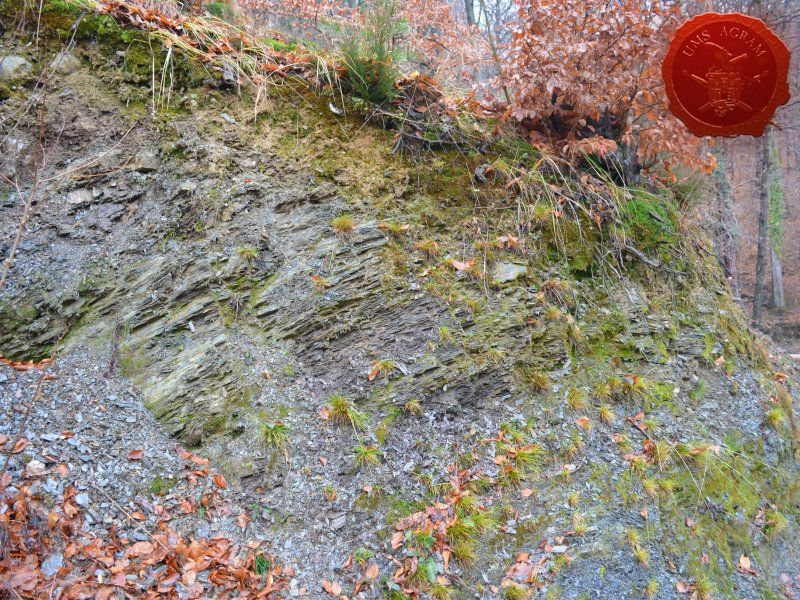
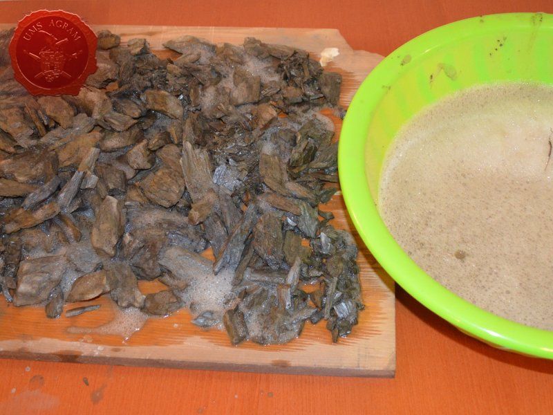
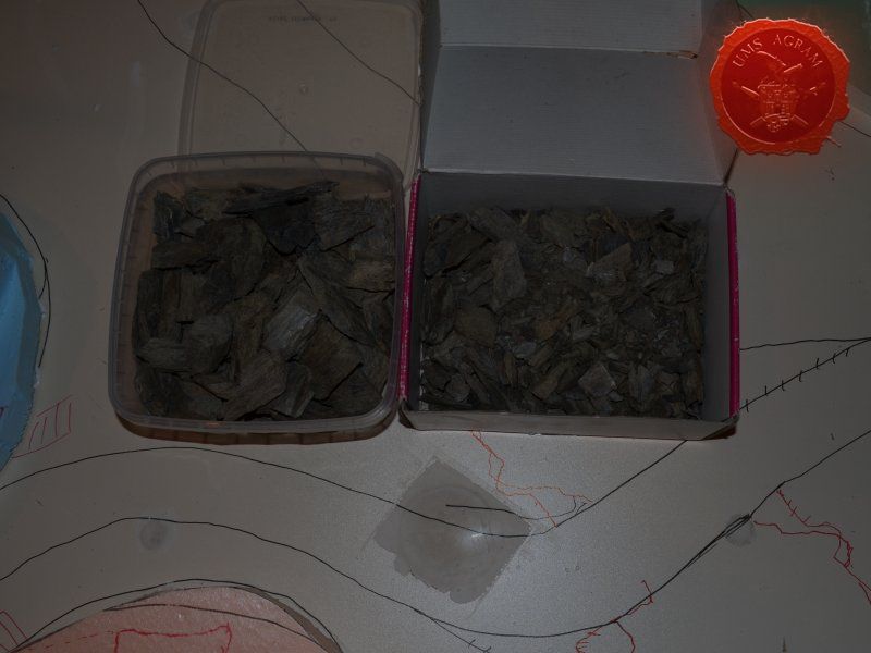
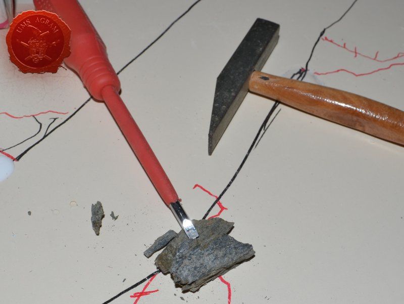
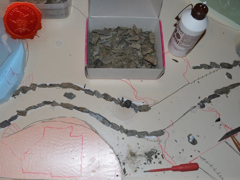
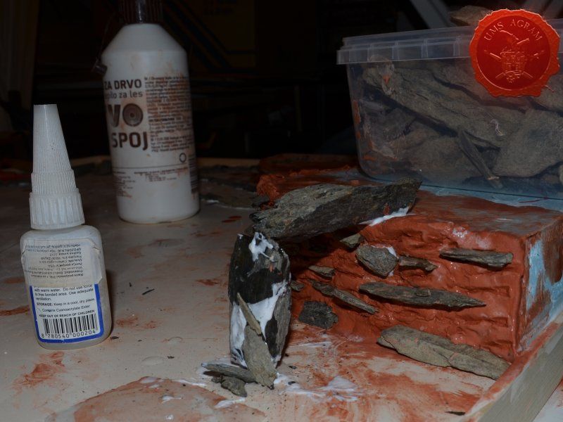
During my Snowpocalypse entry (Frozen Stiff, by the way), I used slate to make the cliffs. For that build, I needed only a handful. But for this, I figured I'd need a bit more. Fortunately for me, the Medvednica hill next to Zagreb where I live, is full of slate so I decided to take a hike with a mate and go gather a bagful of broken stones. During these hikes, I like to take photos of nature as it is really a good source of inspiration. Once back, I had to wash the stones in soapy water to remove the dirt because the paint wouldn't stick to the stones properly otherwise. I used warm water and several repeats of the process until I got almost clear soapy water. I left it to dry for a couple of days near a heater. When the slate was dry, I stored them in two boxes. One was for really large pieces and the other was for smaller ones and debris. This would speed up the proces of choosing the stones while making the river bank and cliffs.
Making the Terrain Features
Breaking of the pieces of slate
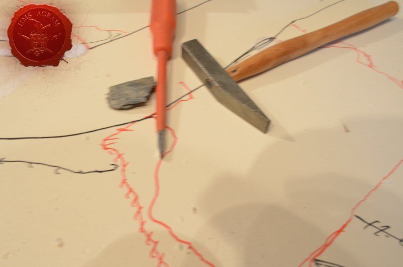
One of the advantages of using slate is that it is a really soft material that is a result of its metamorphosis. It is a fine-grained, foliated, homogeneous metamorphic rock derived from an original shale-type sedimentary rock composed of clay or volcanic ash through low-grade regional metamorphism. It is the finest grained foliated metamorphic rock. Foliation may not correspond to the original sedimentary layering, but instead is in planes perpendicular to the direction of metamorphic compression. In other words, it is full of layers and by using just a little force, you can split it into smaller/thinner pieces. For that I wanted to use a chisel which I couldn't find. Being lazy, I dropped the search and I ended up using a normal screwdriver instead.
River banks
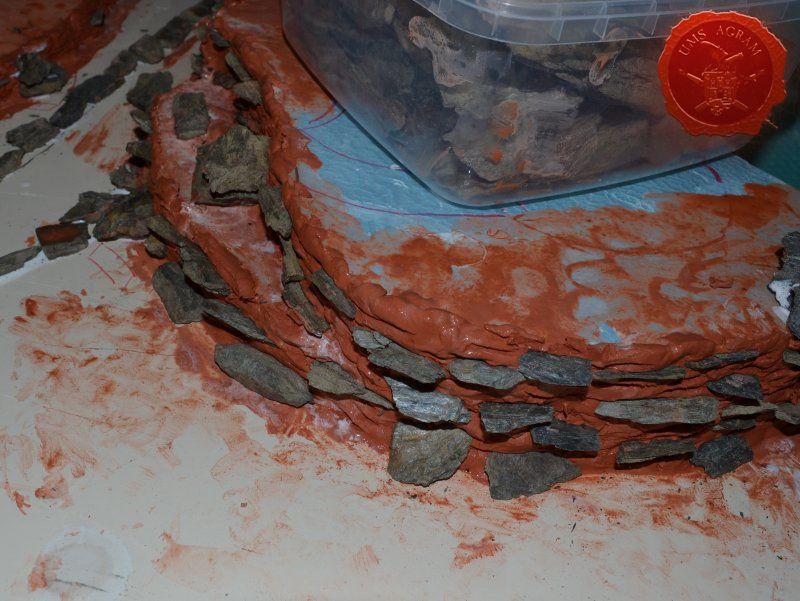
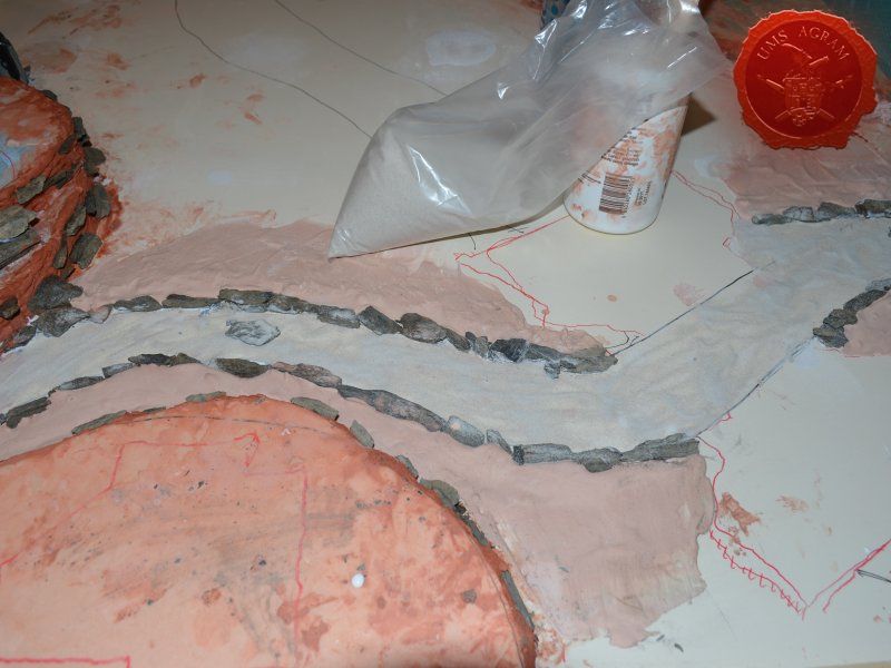
Once I had all the pieces of slate I needed, I proceeded to glue the slate along the future riverbank. I used pieces that were 0,5-1cm high and spread them evenly along the banks. I also glued several pieces inside the riverbed to form the future river crossings. It will be up to the players to decide whether it would be considered difficult terrain or not.
Cliffs
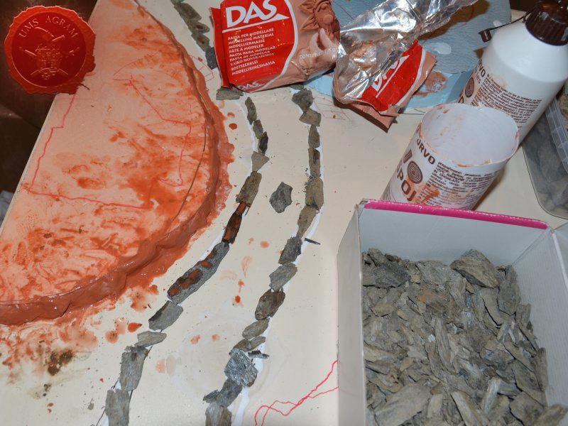
Originally, I wanted to make all the cliffs with slate. Just place them piece by piece and glue them in place. And afterwards, use plaster to plug the gaps between the styrofoam body of the „hill“ and the sides made from slate. However, overall there was over 3m of 2cm high cliffs so I decided against it. At least until I tried something first.
I placed a layer of DAS air drying clay around all my cliffs and I used a layer of watered down PVA glue to fix it better to the styrofoam sides. While the clay was still wet and malleable, I pressed a larger piece of slate into it to form the face of the cliff. Once I've done it to the entire cliff, I added smaller pieces of slate and stuck them into the clay and left them there to be glued. This way, I saved on rock and time as it was a really fast procedure with only slightly lower standard of finish.

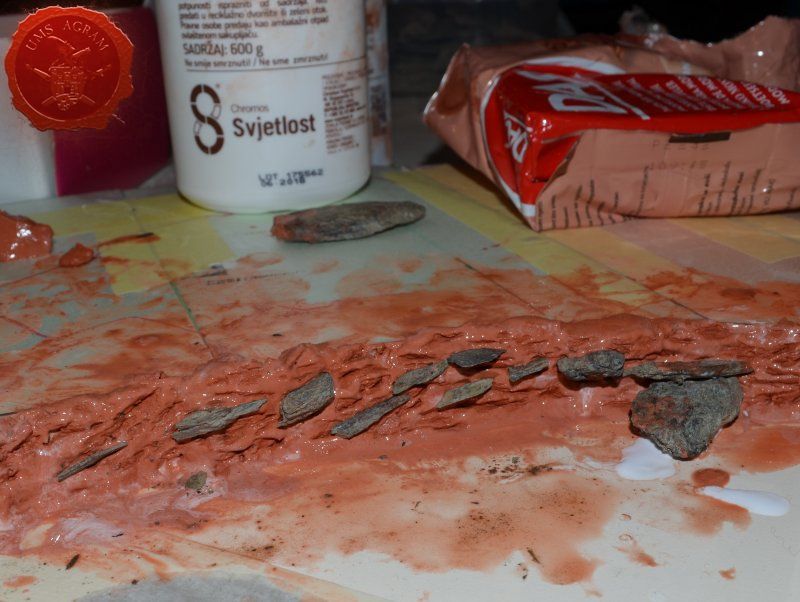
Leveling of the terrain around the rocky river banks
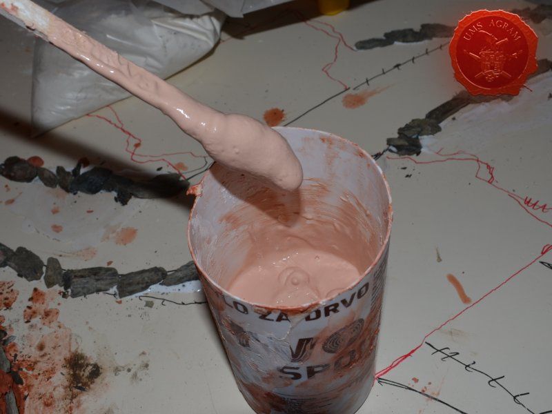
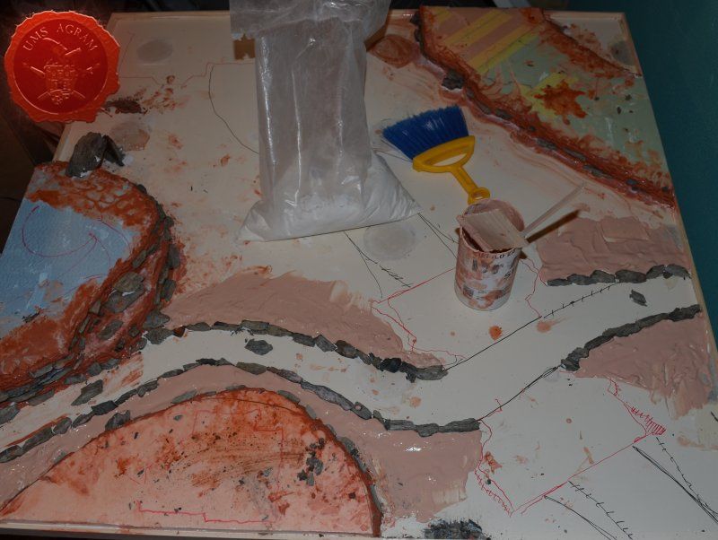
As the riverbanks and the cliffs were now dry, I now had to level out the slightly higher area around the riverbank to the rest of the board. To do that, I once again made some plaster. It is the same one I used to plug the gaps on the board, but it turned pinky because I used the same water I used to soften up the red clay and it coloured the plaster. I made sure the plaster wasn't too much like a liquid. I wanted a consistency of a paste so that I could form the angle that I wanted and not have it run.
Sanding the plaster
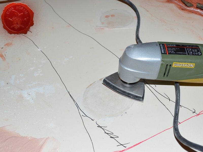
While I was pouring the plaster to level the ground around the riverbanks, I noticed some of my plaster fills of the holes in the board protruded slightly. Because the holes were perfect circles, I needed to sand down the excess material because once the board was textured and painted, I would definitely show as too regular a form. I used my vibro-sander, but you could use normal sanding paper as well. When I was done with sanding, I made sure I collected all the debris from the board because the next step was texture!

Adding texture
Adding the texture has two main purposes. First one, obviously is the aesthetics. The more texture, the better the terrain looks. However, in some places there is another purpose to the texture. Depending on the materials you use (like styrofoam), some spreys may melt the base of your terrain which is something you definitely do not want. That's why you use watered down PVA glue mixed with some sand.
Luckily for me, most of my board is wooden and/or covered with plaster so I don't need to take care that the mixture of water and PVA be in favour of PVA so it offers a protective coat. However, there are some places where there is only styrofoam. Here, I will need to take care. That said, due to the whole theme of the board, all would not be lost if I missed the texture in several places. Why? because even if the sprey melts the styrofoam in places, the board will be covered in snow in the end so I can always cover up my mistakes.
Riverbed
I started with the riverbed first. As the whole idea of the river is that it is mostly frozen, I decided to use the simplest method and use just one size of sand, the smallest. I covered the entire surface of the river with slightly watered down PVA and sprinkled a layer of chinchilla sand. I left it to dry overnight.
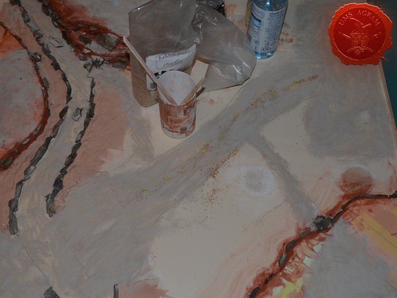
Road and the dirt paths
I used several sizes of sand and gravel on the main road. As with the river, I first covered the entire area using a slightly diluted PVA glue with water (just enough so it would spread easily). I then sprinkled the largest grain sporadically in the middle of the road. Around the largest pieces I then sprinkled slightly smaller pebbles. In the end I finished with the smallest grain chinchilla sand.
Dirt paths and the areas where the buildings/other terrain would be placed during the games, was done only using chinchilla sand.
Other textures
Rest of the textures were done using two different sizes of grain. Somewhere in the middle between the small pebbles and chinchilla sand used on the main road. Once again, I smeared the watered down mixture of PVA glue. However, this time before sprinkling the sand, I placed several pieces of slate. I carefully picked the places where I placed them so that they wouldn't be in the way of the future terrain. This would add some more detail to the whole board and would help break the large flat areas even if the terrain isn't there. When I was satisfied with the placement and the quantity of slate pieces, I sprinkled the larger of the two grains followed by the smaller grain.
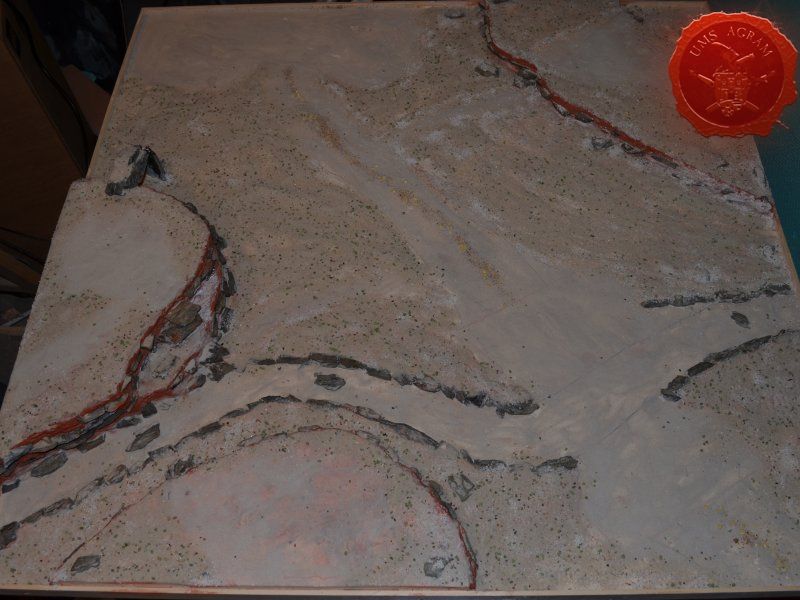
In the next article, I'll tackle the leftover sand and gravel that didn't glue to the base. Then I'll paint the board and add various vegetation. Water will also be added into the riverbed and I'll also be adding various winter accessories, like snow, ice and icicles.
Latest articles
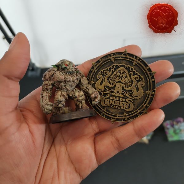
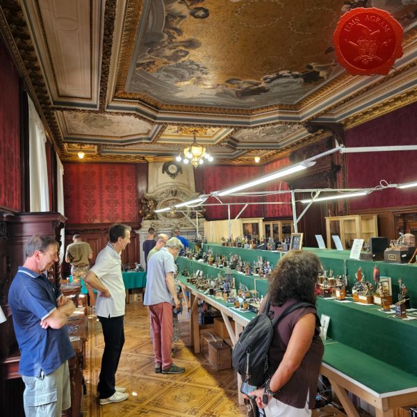
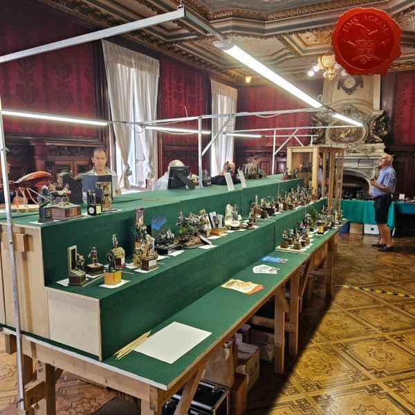
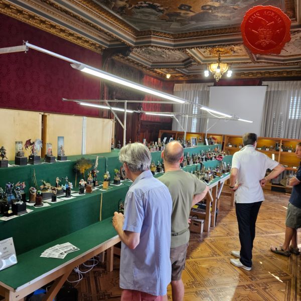
- We attended: Isle of Wonders 2026 Ili Said, 6th July 2026
- We attended: 13. Trofeo San Giusto 2026. Marko Paunović, 6th July 2026
- We attended: Zagreb Scale Model Show 2026 Mario Grgurev, 6th July 2026
- Making of MUMMY dioramas Sebastian Søgård, 17th June 2026
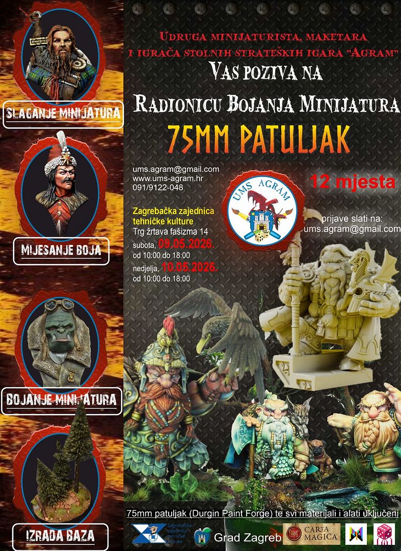
- Miniature Painting Workshop - 75mm Dwarf Ivan Knezović, 26th May 2026


Latest battle-reports
- Kill Team - Blooded vs. Vespid Stingwings 28th February 2025, GW - Warhammer 40.000, and Antoni Pastuović (Imperial Guard)
- 22nd April 2022, GW - Warhammer 40.000, Borna Pleše (Space Marines) and Kristijan Kliska (Tau Empire)
- 17th November 2021, GW - Warhammer 40.000, and Nino Marasović (Space Marines)