Quest for my new favourite washes
Note from the editor: This is an article published on Ana’s blog that she kindly agreed to share on our club web pages. If you like the article, go for more on her site Gardens of Hecate!
Sometime in November I had reached the end of my stock of old formula Agrax Earthshade and Nuln Oil, and cracked open the new ones (I say new, but they’re a few years old by now). I was disappointed with the currently standing product… I’ve been steadily using Citadel washes since they were first introduced. Originally it was Badab Black and Devlan Mud, and they were fantastic (yes, there were inks before that - but I never used those). At some point they got replaced by Nuln Oil and Agrax Earthshade, respectively. Frankly I don’t recall how big of a change that was; it was a fairly long time ago. However, I know that I’ve gradually phased out most Citadel paints from my arsenal in favour of other brands (predominantly Scale 75, but there are several others represented) - while still continuing to use and recommend Citadel’s black and brown wash. However, now they’ve changed too far for the worse that I decided it’s time to look elsewhere.
I asked my Instagram audience for viable alternatives on the market and I got 60+ responses with suggestions. Based on that I purchased a variety of options for brown and black washes and inks to test. Additionally, a significant number of commenters expressed they were in the same predicament, so I promised to share my findings in a blog post. This is it.
Since making the purchases I’ve made swatches, tests in controlled conditions, and tried them out in real situations on whatever painting projects I was working on at the time.
Disclaimer: I am not sponsored by or affiliated with the manufacturers of any of these products. They were purchased with funds contributed by my Patreon supporters (thank you!). I’m honestly looking for a better alternative for myself and taking you along for the ride.
I’d also like to thank @noe.hammer and @hinter_light for sending me bottles of unused old Agrax Earthshade they had lying around.
What am I even looking for in a wash?
I use brown and black washes frequently. It’s normally for shading things such as leather, armour, fabrics, wood, human skin, and more.
My ideal wash would be well pigmented acrylic, usable out of the pot but dilutable with water if I want a less stark shade, reliably matte when dry, and not brazenly overpriced.
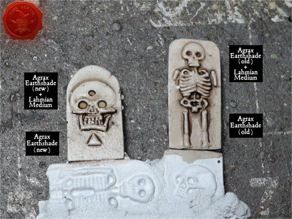
INTENSITY and HUE
Of the above, the current Citadel washes only fulfill the first thing on my list. They do still provide a good shade to those recesses and details on the sculpt. I also like the colour of the brown. Not too intense to be used as is, but often I want to dilute them slightly. I expected some brands of washes would be less intense, and if I wanted something stronger there are inks.
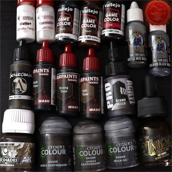
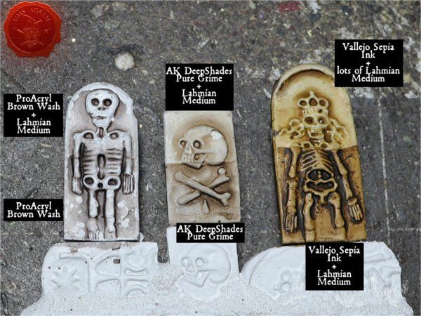
Inks definitely need to be combined with a medium for two reasons: they’re glossy and they’re too highly pigmented to be used straight out of the pot. I have the following three inks: AK Wood Brown, Vallejo Sepia, and Scale75 Inktense Wood. They all behaved as predicted, working nicely with Lahmian Medium. A little ink goes a long way and the medium successfully mattes out the ink’s original gloss. Each has its own hue, my favourite of the three being Vallejo’s.
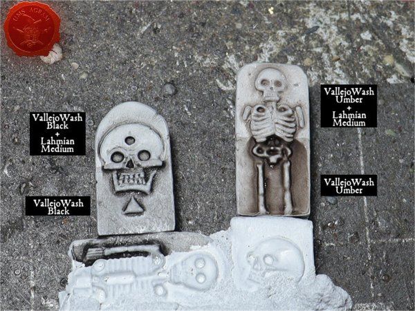
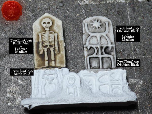
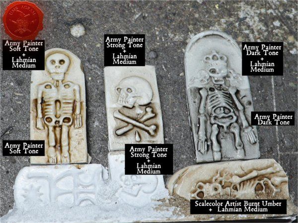
Army Painter Warpaints Soft Tone, Strong Tone, and Dark Tone are overall the most similar to Citadel’s washes, including the intensity. ProAcryl and Two Thin Coats are the least intense, but ultimately they’re all acceptable.
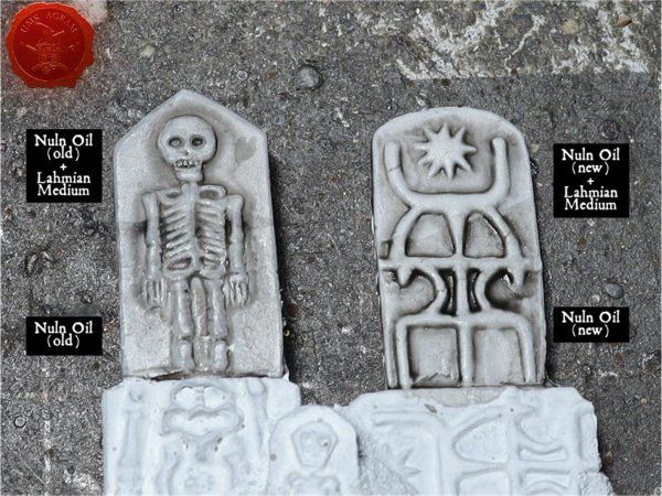
Each brown wash has a slightly different hue, as you can see on the tombstone swatches basecoated white. They all work fine and the difference was less apparent when I applied on a brown basecoat.
Some of my Instagram friends recommended oils to me. I do occasionally use oil and enamel washes when I paint scenery. They’re effective and cool to play with. However, they don’t get along with other paints I use - meaning varnishing in between and thinking several steps ahead. They also have annoyingly long drying times. This is ok for terrain, but simply doesn’t work for the way I paint miniatures and I don’t want to drastically change my process right now. I like how it is. Same reason my airbrush sits in the drawer seldom used. Their time may come, it’s just not today.
That’s why there are no oils or enamels in this story.
BEHAVIOUR WITH WATER
Mixing a wash with water can leave a cloudy/chalky residue in the recesses (see image below for examples). Of the washes I've tried, most experienced the chalky residue when mixed with water at some point. Sometimes it happens, sometimes it doesn’t. I hear hard water makes this worse. In any case, it’s safer to use an acrylic medium rather than water. With older Citadel Washes I usually used water and it would occasionally result in a nasty surprise. With the new formula the clouding happened most times I did it.
I can absolutely live with using medium instead of water to make sure the results are consistent. This is the part of my ideal wash I’m ready to forfeit easiest. Any matte medium will be more expensive than water, but there are way more affordable options than Citadel’s Lahmian Medium I currently use. It’s something to look into next.
MATTE FINISH
New Agrax and Nuln Oil straight out of the pot are glossy and this annoys me to no end. Mixing in Lahmian Medium, which normally does have a matting effect, is a must even if I don’t want to dilute my wash. But often that doesn’t help either. There were times new Agrax Earthshade refused to stop being glossy in the recesses even when I painted matte varnish over it.
Mind you, the shine in the recesses may also happen to other brands if one applies too much undiluted wash, or if not shaken properly before use.
A few people recommended a product called Instar Matte+. It’s a concentrated additive that’s meant to be mixed into paints to turn them matte. I got advice to put several drops directly into my bottle of my Agrax or Nuln. I did just that, and it actually killed the shine. That’s great news, since it means I can save those several bottles of new Citadel washes I stockpiled before I realised they were no good.
When playing around with Matte+ I tried mixing it with inks to see what happens. It does make them matte, but they get a similar residue problem washes get with water. In this case, though, the result looks like a decent rust effect. I’m not sure if it’s worth exploring further, but below is what it looks like.
PRICE
Price is not something I thought about too much before I started crunching these numbers. It was interesting and eye-opening.
Shipping is not included in the prices. Local tax of 25% is included. Keep in mind the price of each product can vary slightly from vendor to vendor. I had to order from multiple webshops depending on availability and stock. They come in different size vials so in order to compare properly I calculated their price per mL (given in brackets).
The most affordable was AK Deep Shade Grime at 4,89€ for a 30mL bottle (0,16€/mL). It’s closely followed by Vallejo washes at 3,10 € for 18 mL (0,17€/mL) and then The Army Painter tone trio at 3,49€ for 18mL (0,19€/mL).
Next tier are Pro Acryl 22mL for 5,99€ (0,27€/mL) and Duncan’s TTC washes at 4,41€ for 15mL (0.29€/mL).
And finally we have Citadel’s 18mL for 6.63€ (0,37€/mL), which makes it double the price of the stuff in the first group. Ugh.
I won’t compare the inks along with the washes because they must to be used with a hefty quantity of medium. A pot of ink will last you drastically longer than a pot of wash, but you need to purchase medium alongside it, complicating the calculation. I didn’t go into it this time. Here are the prices of the inks, though: AK Wood Brown INK was 4,68 € for 30mL (0,16€/mL), Vallejo Sepia Ink 18 ml was 3,10€ (0,17/mL), and S75 Inktense Wood 17mL for 4,04€ (0,24€/mL).
Instar Matte + additive was 2,03€ for their container of 10mL (0,20/mL). It gets cheaper if you buy a larger bottle, but you’re meant to be using it in very small doses anyway.
CONTAINER
This is not a deciding factor for me, but there are differences I can touch on briefly.
To get Citadel out of the way first: pot with a lid. Knocked it over and spilled so many times over the years. One may call that a skill issue. I don’t know. Dipping a brush in the pot rather than squirting it on the palette somehow makes more sense for washes to me, so that’s a point for it. When it comes to Citadel’s other paints I strongly dislike the pots, mostly because their design really helps the paint dry up faster. I’m not sure myself how I feel about it on the washes, though.
AK Pure Grime comes in a bottle with a screw-on cap. I haven’t used it enough to witness how easily it’s knocked over, but since it doesn’t have a lid sticking up my guess is it’s safer from spillage than Citadel.
Army Painter comes in a standard dropper bottle, same as Scale 75 uses. Vallejo used to have something just like it, but these washes and ink come in dropper bottles made of way thinner material. I accidentally squeezed them too hard lots of times, so not a fan. The reason behind it is ecological perhaps?
Two Thin Coats - bottle is fine but something is funky with the cap. The wash always heavily leaks inside it. Perhaps it must be screwed on 100% tight to stop doing that? Not happy about the mess. Again, you may say it’s a skill issue, but I haven’t had that problem with any other brand’s dropper bottle.
PorAcryl’s bottle has a special cap I hadn’t encountered before. It slightly twists off to allow drops to get out of the bottle. I’m pretty sure this is well resistant to clogging (which is an annoyance with dropper bottles) and doesn’t allow any air to get in. But it’s sort of messy to close it since there is always some paint stuck near the tip that has to be wiped off.
Finally, the AK Ink comes in a glass bottle with a dropper cap, and the Matte+ comes in a tiny dropper bottle with a safety cap. Works fine.
CONCLUSIONS
After this I’m definitely saying goodbye to Citadel’s washes. I’ll rescue the pots I already have with Instar Matte+ and never buy another again. The price is severly inflated when compared to any other brand, while the quality is poorer in most aspects and it requires me to spend even more money on third party products to make it work.
TwoThinCoats washes were a very common suggestion. It’s among the pricier options, but doesn’t stand out enought to compensate for that. It’s fine, but won’t be my new brand of choice.
Army Painter washes are a really popular option. They’re on the more affordable end and my LGS stocks them, making them extra accessible. They are also among the least matte ones, but matte medium consistently fixes that. Fine, but not a favourite.
Vallejo washes are high on my tier list. They’re nicely matte out of the pot and I rather like the hue of their Umber wash. The price is also among the best.
ProAcryl is also a good one. Nice flow, matte finish. The hue and price place it beneath Vallejo for me, though.
AK Deep Shades Pure Grime is quite a bit more viscous than the others. It stays where you put it, which usually means it will harder stain the areas you don’t want shaded. It was the least costly. The hue is nice, but the intensity feels lighter. Overall for me it’s mid.
The inks - AK, Vallejo, and S75 all three act the same in my limited experience. When it comes to hue I’m partial to Vallejo’s Umber. I’m actually interested in using them further in combination with matte medium. They are better value for money than an out of the pot wash.
Along similar lines, I tried to mix my own wash by combining Scalecolor Artist Burnt Umber with Lahmian Medium. It was prety good, and once again much cheaper than any out-of-the-pot wash.
If I had to choose which wash was my favourite I’d say Vallejo. But I think my future may be finding a decent but not overpriced matte medium and mixing my own washes. I already have to use a medium if I want to dilute a wash, so I migh as well get my pigment from an ink or a quality acrylic paint in the first place.
I’ll continue to use a selection of these washes further until they run out. If I change my mind about something I may revisit this topic in the future.
Everything in this article is my own opinion based on my experience trying the products.

Što uopće tražim u washevima?
Često koristim smeđu i crnu boju. Obično je za sjenčanje stvari kao što su koža, oklopi, tkanine, drvo, ljudska koža i drugo.
Moj idealan tuš bio bi dobro pigmentirani akril, koji bi se mogao koristiti i iz bočice, ali bi se mogao razrijediti vodom ako želim manje jaku nijansu, pouzdano mat kada se osuši, a ne drsko precijenjen.
INTENZITET i HUE
Od navedenog, trenutni washevi od Citadel ispunjavaju samo prvu uvjet na mom popisu. Još uvijek daju dobru sjenu u udubljenjima i detaljima na skulpturi. Sviđa mi se i smeđa boja. Nisu previše intenzivni da bi se koristili takvi kakvi jesu, ali često ih želim malo razrijediti. Očekivala sam da će neke marke washeva biti manje intenzivna, a ako sam htjela nešto jače tu su tinte.

Tinte svakako treba kombinirati s medijem iz dva razloga: sjajne su i previše su pigmentirane da bi se mogle koristiti izravno iz posude. Imam sljedeće tri tinte: AK Wood Brown, Vallejo Sepia i Scale75 Inktense Wood. Svi su se ponašali prema predviđanjima, dobro surađujući s Lahmian Mediumom. Malo tinte ide daleko i medij uspješno matira izvorni sjaj tinte. Svaka ima svoju nijansu, a meni je od te tri najdraža Vallejova.

Army Painter Warpaints Soft Tone, Strong Tone i Dark Tone općenito su najsličniji Citadel washevima, uključujući intenzitet. ProAcryl i Two Thin Coats su najmanje intenzivni, ali u konačnici svi su prihvatljivi.
Svaka smeđa boja ima nešto drugačiju nijansu, kao što možete vidjeti na uzorcima nadgrobnih spomenika s osnovnim bijelim premazom. Svi rade dobro i razlika je bila manje vidljiva kada sam nanijela smeđi bazni lak.

Što uopće tražim u washevima?
Često koristim smeđu i crnu boju. Obično je za sjenčanje stvari kao što su koža, oklopi, tkanine, drvo, ljudska koža i drugo.
Moj idealan tuš bio bi dobro pigmentirani akril, koji bi se mogao koristiti i iz bočice, ali bi se mogao razrijediti vodom ako želim manje jaku nijansu, pouzdano mat kada se osuši, a ne drsko precijenjen.
INTENZITET i HUE
Od navedenog, trenutni washevi od Citadel ispunjavaju samo prvu uvjet na mom popisu. Još uvijek daju dobru sjenu u udubljenjima i detaljima na skulpturi. Sviđa mi se i smeđa boja. Nisu previše intenzivni da bi se koristili takvi kakvi jesu, ali često ih želim malo razrijediti. Očekivala sam da će neke marke washeva biti manje intenzivna, a ako sam htjela nešto jače tu su tinte.
Tinte svakako treba kombinirati s medijem iz dva razloga: sjajne su i previše su pigmentirane da bi se mogle koristiti izravno iz posude. Imam sljedeće tri tinte: AK Wood Brown, Vallejo Sepia i Scale75 Inktense Wood. Svi su se ponašali prema predviđanjima, dobro surađujući s Lahmian Mediumom. Malo tinte ide daleko i medij uspješno matira izvorni sjaj tinte. Svaka ima svoju nijansu, a meni je od te tri najdraža Vallejova.
Army Painter Warpaints Soft Tone, Strong Tone i Dark Tone općenito su najsličniji Citadel washevima, uključujući intenzitet. ProAcryl i Two Thin Coats su najmanje intenzivni, ali u konačnici svi su prihvatljivi.
Svaka smeđa boja ima nešto drugačiju nijansu, kao što možete vidjeti na uzorcima nadgrobnih spomenika s osnovnim bijelim premazom. Svi rade dobro i razlika je bila manje vidljiva kada sam nanijela smeđi bazni lak.
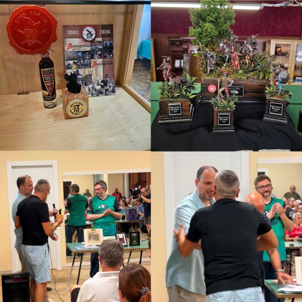
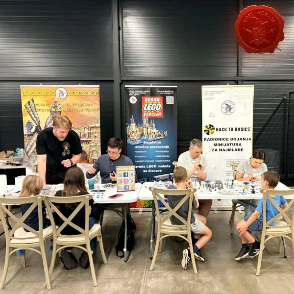
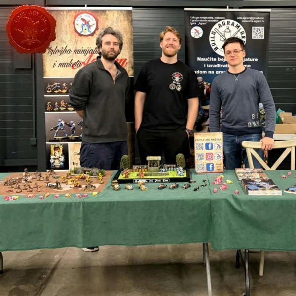
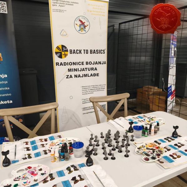
Latest articles
- We attended: Isle of Wonders 2026 Ili Said, 6th July 2026
- We attended: 13. Trofeo San Giusto 2026. Marko Paunović, 6th July 2026
- We attended: Zagreb Scale Model Show 2026 Mario Grgurev, 6th July 2026
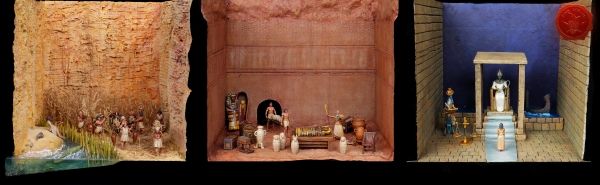
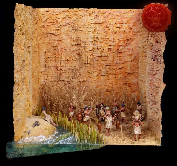
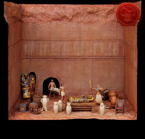
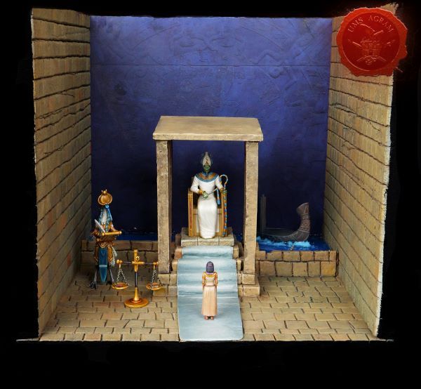
- Making of MUMMY dioramas Sebastian Søgård, 17th June 2026
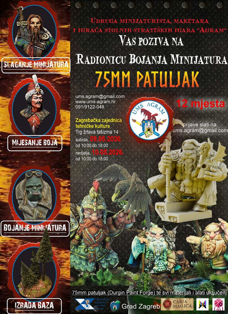
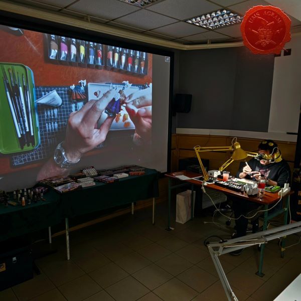
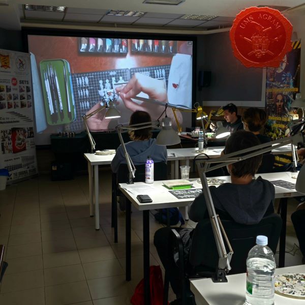
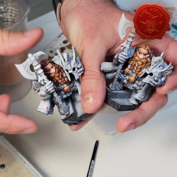
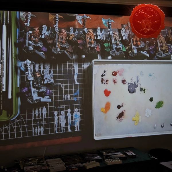
- Miniature Painting Workshop - 75mm Dwarf Ivan Knezović, 26th May 2026


Latest battle-reports
- Kill Team - Blooded vs. Vespid Stingwings 28th February 2025, GW - Warhammer 40.000, and Antoni Pastuović (Imperial Guard)
- 22nd April 2022, GW - Warhammer 40.000, Borna Pleše (Space Marines) and Kristijan Kliska (Tau Empire)
- 17th November 2021, GW - Warhammer 40.000, and Nino Marasović (Space Marines)